AWS Cloud Financial Management
A Detailed Overview of the Cost Intelligence Dashboard
Voiced by Amazon Polly
As your business grows on AWS, so too does the need for cost and usage visibility and custom cost reporting tailored for your organization. Good Cloud Financial Management (CFM) targets for your AWS usage can include (but are not limited to) Reserved Instance and Savings Plans coverage, average hourly cost of Compute, percentage of Spot vs. On Demand, average per GB cost of storage, and more. But before you can get a handle on what metrics or key performance indicators (KPIs) you should be tracking, you’ll need to make sure you can visualize and understand what is going on behind your AWS bill. AWS has many tools and services to help you better visualize and understand your cost and usage including AWS Cost Explorer, AWS Budgets, AWS Cost Anomalies, AWS Cost and Usage Report, AWS Compute Optimizer, AWS Recommendations, and more.
We’ve seen customers leverage the Cost Intelligence Dashboard to successfully manage and optimize their AWS bill. For example, a security and data solutions company used the hourly compute visualizations (more on that below) within the Cost Intelligence Dashboard to reduce their overall Amazon EC2 compute spend by roughly $20k per month (or 8% of their overall Compute spend). An educational technology company in India saved $23K per month by identifying more right-sizing opportunities using the same compute visualizations in the dashboard. And a construction machinery and equipment company in the US saved $12K per month by using the storage visualizations to identify opportunities to adjust their storage retention policies
In this blog post, we will introduce you the Cost Intelligence Dashboard, an interactive and customizable Amazon QuickSight dashboard template as part of the Cloud Intelligence Dashboards framework, which will help you create the foundation of your own cost management, optimization, and CFM goal tracking capabilities.
Behind the Scenes
The AWS Cost and Usage Reports (CUR) provide comprehensive data about your AWS costs, including information related to product, pricing, and usage. By including the Resource IDs and choosing hourly time granularity, CUR allows you to analyze your costs in greater detail and accuracy. You can download the CUR reports from the Amazon Simple Storage Service (Amazon S3) console, query the reports using Amazon Athena or load the reports into Amazon Redshift or visualize in Amazon QuickSight.
The Cloud Intelligence Dashboards Well-Architected labs will provide guidance and step by step instruction for how to establish the necessary data transformation pipeline to make cost and usage data within the CUR accessible. Serverless services such as Amazon S3, AWS Glue, Amazon Athena, and Amazon QuickSight power the Cost Intelligence Dashboard found within your QuickSight console. After completing this Well-Architected Lab, you will be able to use the Cost Intelligence Dashboard to dive deeper and customize reporting for your organization’s AWS cost and usage.
The Cost Intelligence Dashboard
When you first open the Cost Intelligence Dashboard, you will see these 7 tabs: Billing Summary, Usage Cost Summary, Compute Summary, Storage Summary, RI/SP Summary, OPTICS Explorer, and MoM Pivot.
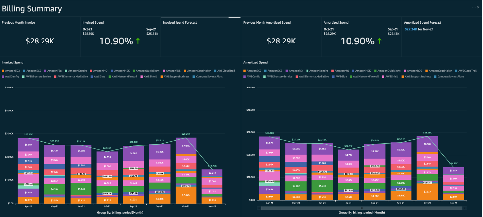
The Billing Summary tab is a generalized overview of two types of information: your invoiced spend and your amortized spend. Your invoiced spend is the sum of your previous month’s invoice, whereas your amortized spend is the cost of your usage of AWS that month including any fees (upfront and partial) paid for Reserved Instances of Savings Plan (even if they were paid in another account such as a payer account). You can use these visuals to change how the information is categorized (i.e. by account, service, charge type, region, product code, etc.) and see forecasts based on the results of a machine learning model using your previous spend data to predict your future cost.
This tab, and in particular the amortized spend graph, is useful for high-level or executive financial reporting mechanisms such as chargebacks and showbacks, since you can group the spend by any field available including your Cost Allocation Tags and Cost Categories. The Billing Summary is designed to remove a lot of work that is done manually today by customers saving you time.
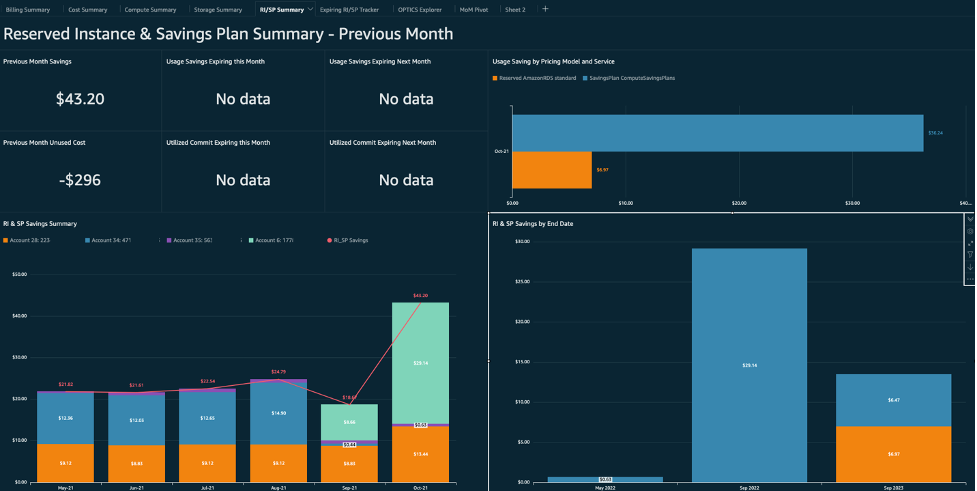
The Reserved Instance and Savings Plan Summary tab and Expiring RI/SP Tracker tab summarize the savings you’ve realized from using Reserved Instances and Savings Plan across all of your accounts independent from the services they were used for. It tracks where the savings came from (by grouping savings by Reserved Instance or Savings Plan type), where the savings were realized (by grouping savings by account, tag, cost category, service, etc.), and when those savings will expire. Your organization can use a savings amount as a KPI, and track how each team or business unit performs compared to your goals over time. You can also see the impact of letting these purchase options expire by visualizing the monthly savings each Reserved Instance of Savings Plan is realizing by expiration date.
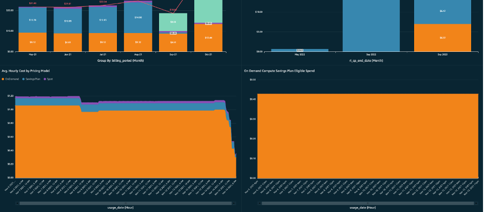
At the bottom of this tab is visualization that formulates your average hourly spend using On-Demand instances, where you can see if that average tends to never go below a certain amount. All of the spend on this graph is Savings Plan eligible, meaning you can consider further Savings Plan commitments at an amount you’re comfortable with based on your previous hourly averages.
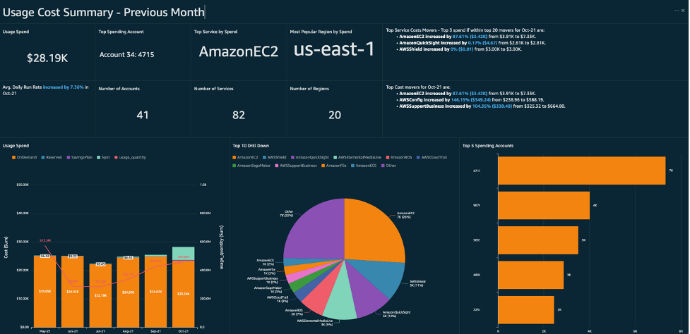
The Usage Cost Summary tab is dedicated to only the cost associated with your usage, excluding fees, taxes, and marketplace purchases. This lets you focus on your overall usage of AWS and how it correlates or directly leads to your costs. Some key visuals on this tab include a top services cost mover analysis that helps you see what are the major changes happening month-over-month in terms of service usage and spend and an anomaly detection visual (uses Amazon QuickSight’s Anomaly Detection feature) that can alert you to spend that the machine learning thought was not part of normal usage.
This tab helps you stay on top of the usage trends across all of your accounts and catch anything that doesn’t meet or work towards your CFM goals. You can categorize visuals by account, cost category, tag, or other mappings to drive accountability for any spend or usage that needs attention.
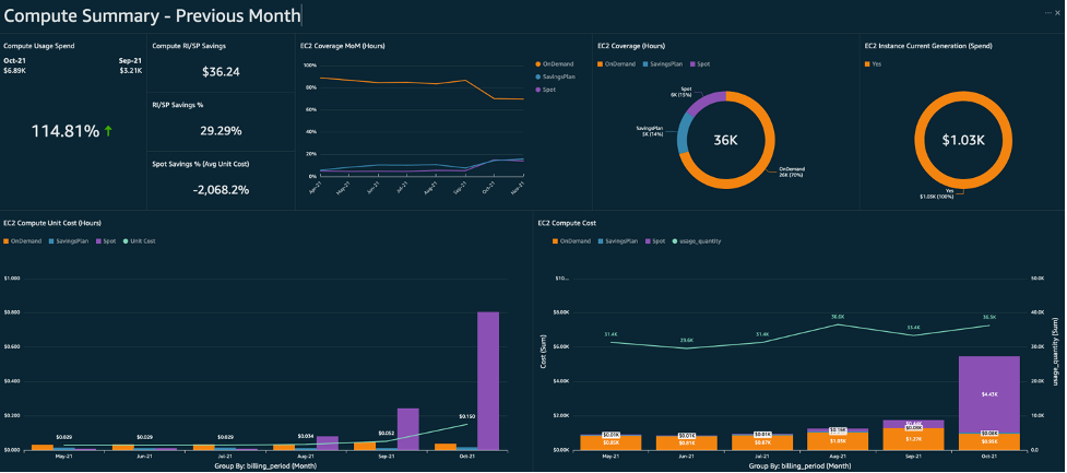
The Compute Summary tab is dedicated to trends, KPIs, and cost optimization for AWS Compute services such as Elastic Compute Cloud (Amazon EC2) and AWS Lambda. You can see what savings you realized last month using Reserved Instances, Savings Plan, and Spot Instances, and keep track of how they covered your Amazon EC2 hours over the course of time. You can also see how much money was spent last month on previous generation instances. By adopting policies and best-practices for using Savings Plans, Reserved Instances, Spot Instances, and current generation instances you can optimize your average, hourly cost of Amazon EC2. The unit cost of Amazon EC2 is a good CFM KPI to track using this dashboard.
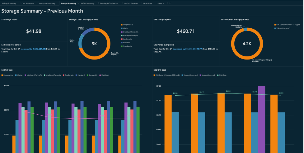
The Storage Summary tab is dedicated to trends, KPIs, and cost optimization for Simple Storage Service (Amazon S3) and Elastic Block Store (Amazon EBS). Similar to the Compute Summary tab, the Storage Summary tab has visuals dedicated to your storage and associated costs over time as well as how they’ve been spread out across different storage tiers. If you take Amazon S3 for example, you can use the visuals on this tab to keep track of your cost per tier, and how moving objects from one tier to another over the course of time has impacted your unit cost of storage (or the average per GB cost). You can also see your cost per Amazon S3 bucket, and spot some of the largest buckets by spend which might make good candidates for migration to S3 Glacier or S3 Glacier Deep Archive.
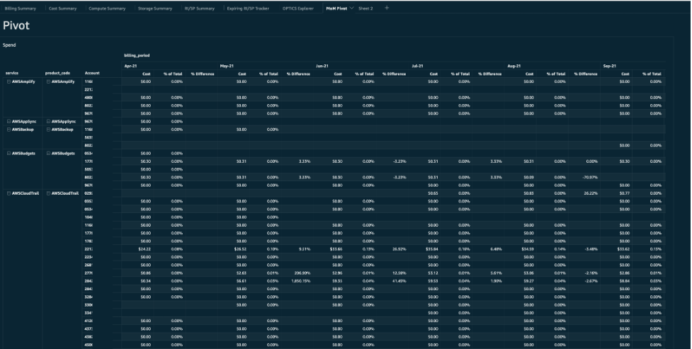
The MoM Pivot tab consists of two large pivot tables grouped by month; one is dedicated to spend and the other usage. These month-over-month pivot tables of all spend and usage can be used for financial reporting.

The OPTICS Explorer tab is an ad hoc query tool built into the dashboard that allows you to make customized queries (by adding filters and group by arguments) of your cost and usage data. For example, you might use this tool to visualize your month-over-month spend on Relational Database Service (Amazon RDS) and group it by product family so you know how much of that spend was on storage.
The OPTICS explorer lets you explore the data you have available to you through the Cloud Intelligence Dashboards framework by way of grouping and filtering various fields. But this is just scratching the surface in terms of customizing the Cost Intelligence Dashboard to suit your needs.
Customizing the Dashboard
Many customers have different needs and use cases when it comes to CFM. The Cost Intelligence Dashboard is an Amazon QuickSight template, which means you’re able to fully customize the dashboard by altering or adding visuals, creating custom calculated fields, or including 3rd party data sources to introduce new metrics and KPIs to track.
AWS Customers have customized the Cost Intelligence Dashboard in many ways. For example, some customers have mapped internal business unit names to account IDs so they could group all visuals by the names of their internal organizations. Other customers have joined a third-party data source with data they have on their customers to build out new unit economic visuals (for example a per subscriber cost).
Conclusion
In this post, we explained how the Cost Intelligence Dashboard can help you visualize your cost and usage data, learn about and track key CFM KPIs, and generally create a foundation for your own cost management and optimization reporting. Visit the Cloud Intelligence Dashboards labs today to get started on onboarding the dashboard today.
And as always, we are here to help! To get started with your customization journey on the Cost Intelligence Dashboard, provide feedback on features and functionality, or ask questions about how it all works please reach out to us directly via cudos-feedback@amazon.com or talk to your AWS account team.
Disclaimer
Customers are responsible for making their own independent assessment of this dashboard and its content. This dashboard and its content: (a) is for informational purposes only, (b) represents current AWS product offerings and practices, which are subject to change without notice, and (c) does not create any commitments or assurances from AWS and its affiliates, suppliers or licensors. AWS content, products or services are provided “as is” without warranties, representations, or conditions of any kind, whether express or implied. The responsibilities and liabilities of AWS to its customers are controlled by AWS agreements, and this document is not part of, nor does it modify, any agreement between AWS and its customers.