AWS Marketplace
Create catchment areas using drive times with Redshift and AWS Data Exchange
Spatial data is a key ingredient for many analytical use cases, such as route optimization, location-based marketing, asset tracking, or environmental risk assessment. Bulk geospatial tasks like geocoding and generating isoline polygons have traditionally required complex APIs or highly specialized software—not to mention the Extract Transform Load (ETL) processes involved in those approaches. CARTO has enabled Redshift users to perform these operations directly on your databases with the new Location Data Services (LDS) module of the CARTO Analytics Toolbox for Redshift.
In this post, I will show you how to create a catchment area analysis. A catchment area analysis enables you to gain insights into the relationship between points of interest and the populations that they capture. To do that, I use a table of fictional grocery store locations and their associated revenues. I’ll show how to geocode a table of stores, generate their isochrones to use as your catchment areas, and enrich them with data via AWS Data Exchange. Then I will build an interactive report to share using CARTO Builder.
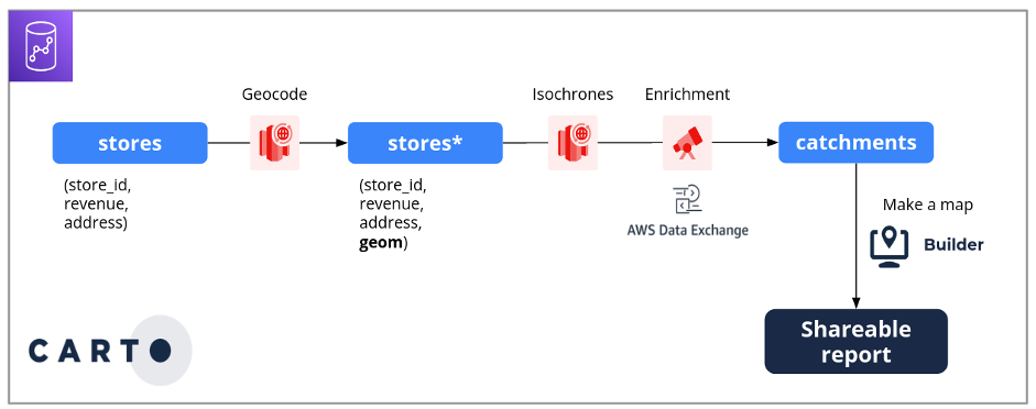
Following is a process diagram, showing the flow from grocery stores through geocoding, isochrones, enrichment in AWS Data Exchange, and catchments, resulting in a shareable report.
Background on Location Data Services (LDS)
The two primary functions that comprise the LDS module are geocoding and isolines. This section serves as a brief introduction to each, so if you’re already familiar with these two concepts, you can skip to Prerequisites.
Geocoding
Geocoding is the process of converting a street address, typically from a single variable character field (VARCHAR) column, into a spatial data type by identifying its corresponding longitude and latitude on the globe. Geocoding is the first step in many spatial data science workflows, since it enables you to display your data on a map and then perform subsequent spatial analyses.
This process may seem familiar, since you perform geocoding every time you type an address into a map app on your phone. Later on in the tutorial, you’ll learn how to do this efficiently at scale with a table of addresses.
Isoline polygon
An isoline polygon as it relates to travel covers the area that can be reached from a point within a given time or distance by a given mode of transport. You may be familiar with the concept of a buffer, which only takes into account true (Euclidean) distances. Euclidean distances are not good indicators for how a population actually moves about space, unless that population is birds! Isolines, on the other hand, take into account both the mode of transport and the road network that must be traversed. There are two types of isoline polygons related to travel: isodistances and isochrones.
| Type of distance polygon | Example input(s) | Interpretation |
| Buffer | ½ mile | Area within a ½ mile Euclidean distance (“as the crow flies”) |
| Isodistance | ½ mile, car | Area accessible by driving ½ a mile or less |
| Isochrone | 3 minutes, car | Area accessible by driving 3 minutes or les |
Following is a graphic of the output of each of the distance polygons computed from the inputs in the previous table, all from the same point. All are maps from a central point, the Amazon Spheres, in Seattle.
- The buffer is represented on the map by a radial circle from the central point. Every point within that circle is less than half mile away from the Spheres.
- The second image, the isodistance polygon, is the area I can reach by car before my odometer reaches half a mile. It’s a smaller, more irregular polygon around the central point because it’s bound to the street network.
- The isochrone polygon does not factor distance into its calculation at all, only time and the mode of transport. It is similar to the isodistance polygon in that it creates an irregular in shape around the central point, as it’s also bound to the road network. However, since it factors in time and mode of transport, it’s slightly larger than the isodistance polygon.

For this catchment area analysis, I am using isochrone polygons, since I want to know who can access each of my grocery stores within a given drive time.
Prerequisites
To follow this tutorial, you’ll need the following:
- A CARTO account: if you’re new to CARTO, you can trial it with CARTO’s free 14-day trial with no payment information required. Also, check out the User Manual which includes a handy Quickstart guide.
- An encrypted Amazon Redshift cluster running on an RA3 instance.
- The table stores loaded into a Redshift database inside that cluster. Download the CSV File (2.5 KB).
- Access the advanced CARTO Analytics Toolbox for Redshift. Email support@carto.com to get access as part of your trial.
- A connection between CARTO and Redshift. Once you have the Analytics Toolbox installed on your Redshift cluster, create a new connection in CARTO. To do this, in CARTO Workspace, on the left sidebar, choose Connections, and then in the upper right, choose the New connection Enter your Redshift credentials, using the database where you’ve loaded the stores table.
Walkthrough: Create catchment areas using drive times with Redshift and AWS Data Exchange
A. Geocode the table of addresses
The stores table you downloaded in step 3 of the Prerequisites contains 45 fictional grocery stores in the state of Massachusetts, each defined by a unique identifier, last year’s revenue, and their address. From your Redshift console or your preferred SQL client, run the following query, which calls a function from the CARTO Analytics Toolbox:
CALL carto.GEOCODE_TABLE('stores', 'address');The GEOCODE_TABLE function adds a new column, geom, to your grocery stores table, which contains the point location of each store.
B. Generate isochrones with spatial SQL
- For your catchment area analysis, calculate the area that can reach each grocery store by car within a 10-minute time interval. With this criterion in mind, to calculate each store’s isochrone, in your Redshift console or SQL client, run the following query using the CREATE_ISOLINES procedure:
CALL carto.CREATE_ISOLINES(
'select * from my_schema.stores',
'my_schema.isochrones',
'geom',
'car', 10*60, 'time'
);
With this query, you’ve created a new table called isochrones, which includes all the data from the stores table, but replaces the geom column with polygon geometry. Now you have two tables with geometry columns: stores, which has the point locations of each store, and isochrones, which are the polygons of drive time that surround each store.
- In CARTO Builder, add these tables to the map. To do this, at the bottom left, choose Add source from…. Choose a basemap that suits your cartographic style. In this tutorial, I’m using an Amazon Location Service. Learn more about how you can integrate your Amazon Location Service maps in CARTO Builder.
- Rename your layers so they are recognizable in the legend. As shown in the following image, these names will appear in the legend, which you can activate at the bottom right of the map.
The following image shows a dark basemap that covers the eastern part of Massachusetts. There are several dozen small navy-blue dots which represent the grocery stores. Surrounding each dot is a jagged mint-green polygon that represents the isochrones.

You now have your catchment areas defined. The next step is to learn more about the underlying population for each store.
C. Spatial enrichment via AWS Data Exchange and CARTO Data Observatory
As part of the CARTO Spatial Extension for Redshift, CARTO offers access to thousands of spatial datasets through the CARTO Data Observatory. In this analysis, I use this census dataset, available as an Amazon Redshift datashare through AWS Data Exchange.
- In AWS Marketplace, subscribe to the CARTO ACS – Sociodemographics (USA, Census Block Groups, 2018) To do this, follow the steps under Subscribing to products containing Amazon Redshift data sets.
- Connect the datashare to the database. In the following example, this is carto_data. This is where you have saved the stores table and create a new datashare-specific database in order to query it. To do this, follow the steps under Creating databases from datashares.
And that’s it! Now you can query the datashare with Redshift by calling the carto_data database.
- To enrich your isochrones with population data, compute a simple spatial join. To do this, intersect your isochrones with the centroids of the census block groups, a common technique employed when joining polygons to polygons. In the same query, join back to the grocery stores table in order to retrieve the point geometry and revenue fields.
- Back in CARTO Builder, add another source to the map, this time using the Custom Query option. Run the following SQL query, which employs several Redshift native spatial functions.
WITH catchments AS (
SELECT store_id, SUM(total_pop) pop
FROM isochrones iso
INNER JOIN carto_data.carto.geography_usa_blockgroup_2015 do_geo -- geometry of census data
ON ST_Intersects(ST_SetSRID(iso.geom, 4326), ST_Centroid(do_geo.geom)) -- SRID required for ST_Intersects
INNER JOIN carto_data.usa_acs.demographics_sociodemographics_usa_blockgroup_2015_5yrs_20142018 do_data
ON do_geo.geoid=do_data.geoid -- join attributes of census data
GROUP BY store_id
)
SELECT c.store_id, revenue, pop "catchment population", ROUND(revenue/pop, 2) "revenue per capita", s.geom
FROM catchments c
INNER JOIN stores s ON c.store_id=s.store_id -- join grocery stores to retrieve point geometry & revenue
The result of this query contains a record for each store, each with its respective unique identifier, revenue, total population in its catchment area, sales per person in its catchment area, and original point geometry you obtained in step A.
D. Create a shareable report in CARTO Builder
You can use cartographic styling options to build a sharable report. To symbolize your data using fill color and radius style options, do the following:
- Navigate to CARTO builder. In the Layers menu, choose the layer created from your SQL query from step C.3.
- Under Fill Color, expand the options and choose the sales per capita This classifies the colors based on the ratio of each store’s revenue to the number of people in its respective catchment area.
- Repeat step D.2 for Radius, this time choosing the field population, so the size of the point is proportional to the population inside the catchment area.
- Unleash your inner cartographer and play around with the other settings!
Following is a screenshot of the CARTO Builder interface. The left sidebar shows the settings achieved by following the preceding steps. To the right, the resulting map is shown. Each store is represented by a circle, whose radius is drawn proportional to its catchment population. The circles’ fill colors, determined by their respective sales per capita, are classed into six quantiles on a yellow-to-red sequential color scheme, with darker and redder colors indicating larger values.
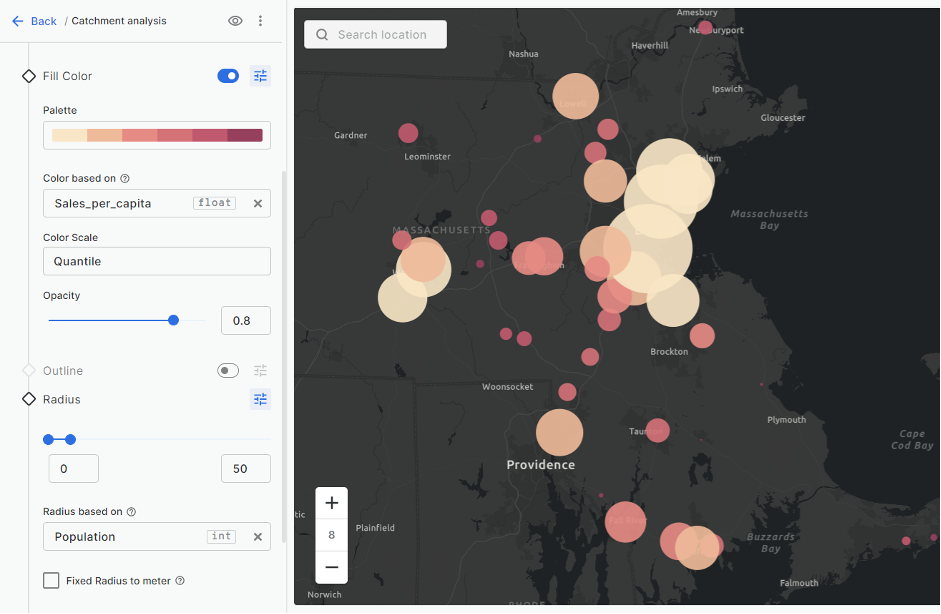
From this cartographic visualization, you can already glean some interesting insights. For example, there’s a pattern where the stores with smaller catchment populations (drawn with smaller circles) tend to have a higher sales per capita (filled with darker color). They are likely capturing a higher percentage of available revenue in their respective catchment, despite reaching a smaller number of people.
- To make the data insights easier to understand, supplement your map with interactive widgets. For your report, add two Formula widgets and one Histogram widget with the settings outlined in the following steps. By selecting the Filter by viewport option for each, the widgets automatically adjust when you move the map around and zoom in and out, so their values reflect what’s currently visible on the map. To do this, in the CARTO Builder, select the Widgets tab, and follow the steps in the CARTO User Manual to make your widgets. The following table indicates the settings to be configured for each widget.
- Add a second map to your report using the dual map view. In CARTO Builder’s top navigation, toggle it using the Map view options, and then show/hide layers as necessary in the respective legends of each of the two maps.
- To make the map more useful and interactive, add Interactions in the form of pop-ups by hovering and choose the fields you want to show. To learn more, check out the Interactions section in the CARTO User Manual.
Once you’ve reached cartographic perfection, you can share your report with the world (or just your teammates).
A final report showing the results of this walkthrough is available here:
Conclusion
With the addition of the LDS module in the CARTO Spatial Extension for Redshift, AWS users can now geocode tables and generate isoline polygons using simple SQL directly in Redshift, natively in the cloud. You can use Redshift with CARTO to enable data-driven, location-based decision making for a wide range of use cases.
Next steps
Get started today by visiting carto.com to learn more and sign up to test-drive the platform with CARTO’s no-cost 14-day trial. Insightful spatial analyses are just a few queries away.
The content and opinions in this post are those of the third-party author, and AWS is not responsible for the content or accuracy of this post.
About the author
 Javier de la Torre is founder and Chief Strategy Officer of CARTO. One of the pioneers of location intelligence, Javier founded the company with a vision to democratize data analysis and visualization. Under his leadership, CARTO has grown from a groundbreaking idea into one of the fastest growing geospatial companies in the world. In 2007, he founded Vizzuality, a renowned geospatial company dedicated to bridging the gap between science and policy making by the better use of data.