Front-End Web & Mobile
NEW: Build responsive Figma-to-React components with almost no code
Amplify Studio is excited to announce significant enhancements to responsive component design through Figma-to-Code! Just build your variants and customize your breakpoints – Amplify Studio does the heavy lifting by generating React components with your design decisions already built in.
How it works
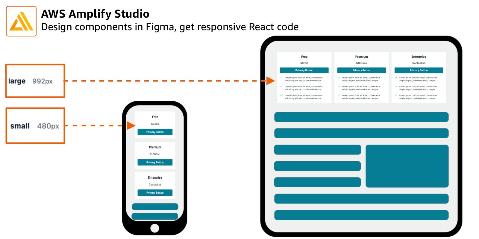
Modern application design requires developers to design for all different screen sizes. This often means making multiple versions of your React components, and triggering them to render based on the screen size.
Amplify’s Theme Editor plugin for Figma lets designers and developers leverage Figma variants, and then bind these variants to breakpoint values. Then, Amplify Studio generates your component for you, with the variants and breakpoints baked-in. A single component – with no additional code – will automatically adapt to the screen size.
Customize your breakpoints
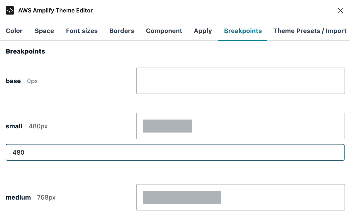
You can now use the AWS Amplify Theme Editor plugin for Figma to customize your breakpoints across an entire Figma project. If you haven’t used the Amplify Theme Editor before, read through the documentation on this tool – it’s a powerful way to control project-wide design, from colors to spacing.
To customize your breakpoints:
- Right click in your Figma project and select “Plugins” > “AWS Amplify Theme Editor”
- Select the “Breakpoints” Tab
- Click on any breakpoint to customize the pixel value
Build variants with breakpoints
This feature requires that you have a Figma component with variants. If you have never used Figma variants before, you can read more in Figma’s documentation. Look out for our next blog post, when we will walk through building a responsive component from beginning to end!
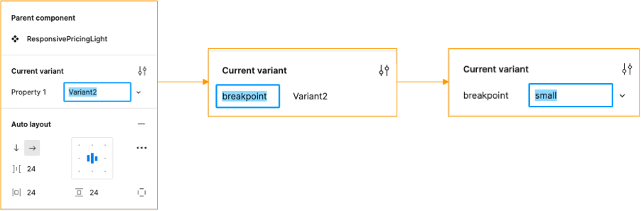
By applying breakpoints to specific variants of a component, you tell Amplify when to exchange the currently rendered component for one of a different size or design. This is accomplished by naming a Figma variant property to breakpoint.
A new variant property is automatically be generated when you create a variant. To use this variant property as a breakpoint, take the following steps:
- Change the property name to
breakpoint– this will apply to all variants in the component - Change
breakpoint’s value for each component to your preferred size
IMPORTANT NOTE
Your value for breakpoint must match one of the predefined values in the Theme Editor – this value is case sensitive. The predefined options are:
- base
- small
- medium
- large
- xl
- xxl
Sync and render your React component
To use your new responsive component, you’ll need to sync your Figma file with Amplify, and then pull the newly generated component. This process might sound familiar – it’s the same process used for generating all Figma-to-code components with Amplify Studio!
First, you’ll sync your Figma file with Amplify Studio:
- Go your the AWS Console, and log in
- Navigate to AWS Amplify and launch Studio
- Navigate to the UI Library tab on the left-hand nav bar
- Click the “Sync with Figma” button
- Note: if you’ve never synced Figma with Studio before, you can follow these instructions to sync for the first time
- Accept the inbound components
Next, you’ll want to import your component and your theme, and render them in your project:
- Navigate to your local device and run
amplify pullto pull your newly generated React component and theme - If this is your first time
importyour new component and render it in your application
When the component renders, it will already contain your variants and breakpoints. Try adjusting your screen size – the component should automatically adjust!
With only a few clicks and almost no code, you have a responsive component that can be layered into your application. You can even enhance your new component with other Amplify features, like adding slots and generating nested collections, for a truly first-in-class web application experience!
Want to learn more? Next post, we’ll walk through how to build component variants from beginning to end, and how to apply them in real-world design. Make sure to share your ideas and feedback with us on Twitter, and join the community conversation on Discord!