AWS Big Data Blog
Create stunning, pixel perfect dashboards with the new free-form layout mode in Amazon QuickSight
The latest update of Amazon QuickSight introduces a new free-form dashboard layout option, along with granular per-visual interaction controls and conditional rendering options that open up a range of creative possibilities for dashboard authors. In this post, we look at the new capabilities available and how you can use them to create and share stunning dashboards, whether for QuickSight readers in your organization or to embed in your application for end-users.
What’s new in QuickSight dashboard layouts?
Layout modes in QuickSight determine how visuals in a dashboard are sized and presented to end-users, and the degree of flexibility authors have in modifying the dashboard to meet their visual styling needs. QuickSight now supports three layout options for dashboards:
- Tiled – Visuals snap to a grid layout, minimizing effort needed to resize and arrange visuals. Authors can choose the base screen size they’re building for (for example, laptops or HD monitors), and the dashboard scales automatically to any screen width or display, zooming in or out as needed to scale and display the content on the user’s screen as designed by the author. In mobile view, the visuals display as designed when in landscape mode and automatically arrange to a single column when in portrait mode. As the name suggests, visuals are tiled in this mode, and can’t overlap each other.
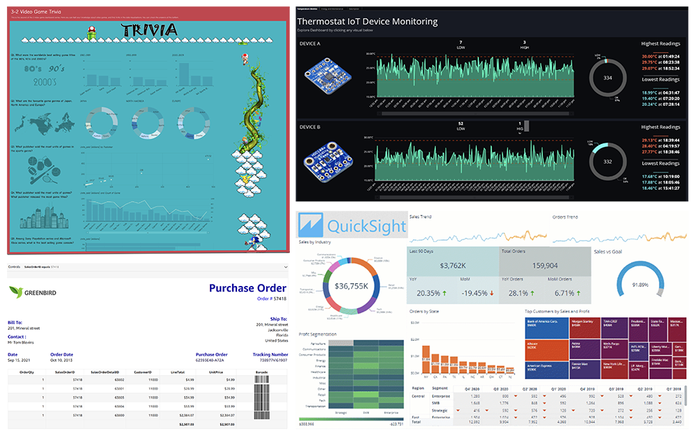
- Free-form (new!) – This mode allows visuals to be placed anywhere, including overlapping other visuals, along with pixel-level control over elements on the dashboard. This offers very precise control and detail-oriented design approaches. In this mode, authors still pick a screen size they’re designing for, and dashboards display as designed on all screens, zooming in or out as needed. Because dashboards are designed intricately with overlaps and images, QuickSight doesn’t automatically adjust this view for mobile access, and so mobile users see the author-created layout as is, scaled to fit on their landscape or portrait screen orientation on smaller screens. This mode also offers a new capability of conditionally rendering a visual based on QuickSight parameter-based rules, which opens up creative possibilities for interactive dashboards.
- Classic – This is the legacy layout mode, where visuals snap to a grid layout. In this mode, QuickSight might show or hide content based on screen sizes, which can cause dashboards to display content differently on different devices.
Existing dashboards will remain in classic mode until authors explicitly modify and republish them in tiled or free-form mode as necessary.
Get started with free-form mode
You can get started with free-form mode in five easy steps:
- Open a new QuickSight analysis and change the layout setting to Free-form.
- Optionally, set the View to Fit to window if you prefer seeing the full canvas (scaled up or down).
- Try resizing and moving the initial visual around. See how the visual stays where you drop it.
When using mouse to move the visuals, they still snap to the closest grid for ease of alignment. Try using the arrow keys for finer adjustments.
- Add another visual and move it on top of the first visual. See how the visual overlaps the first visual.
- Make the second visual fully overlap the first visual.
- To access the first visual without moving the second visual, choose the visual menu of the second bigger visual and send it backward.

Wondering if you can switch your existing analysis to free-form mode? Sure thing! Choose Settings on the left panel of the analysis and choose Free-form from the Layout options.
Get proficient in free-form layout
Now that you know the basics, let’s dive deeper. Four groups of settings are key to building in free-form layout: placement, style, interactions, and rules.
You can access these settings from each visual’s Format visual panel.
- Placement – This lets you control the exact position and size of each visual on your dashboard. You do this by specifying the X,Y coordinates (for the top left corner of your visual) and the desired height and width. Keep in mind that the X,Y coordinates start from the top left of your dashboard (the top left point of your dashboard is 0,0 (X,Y)). You can use the mouse to resize and position a visual, but the placement control gives you an easier way to get perfect alignment.

- Style – With style controls, you can set the background, border and selection colors, their transparencies, or turn these off. Disabling the background makes the visual fully transparent. This is extremely useful when you’re layering visuals on top of other visuals for awesome effects.

- Interactions – With these controls, you can remove all the visual-level interactions (like drill-downs, sorting, maximizing visuals, and exporting data) when desired. These settings apply to the dashboard view only, and allow you to overlay charts on other charts or images to create the impression of a single composite visual to the end-user.
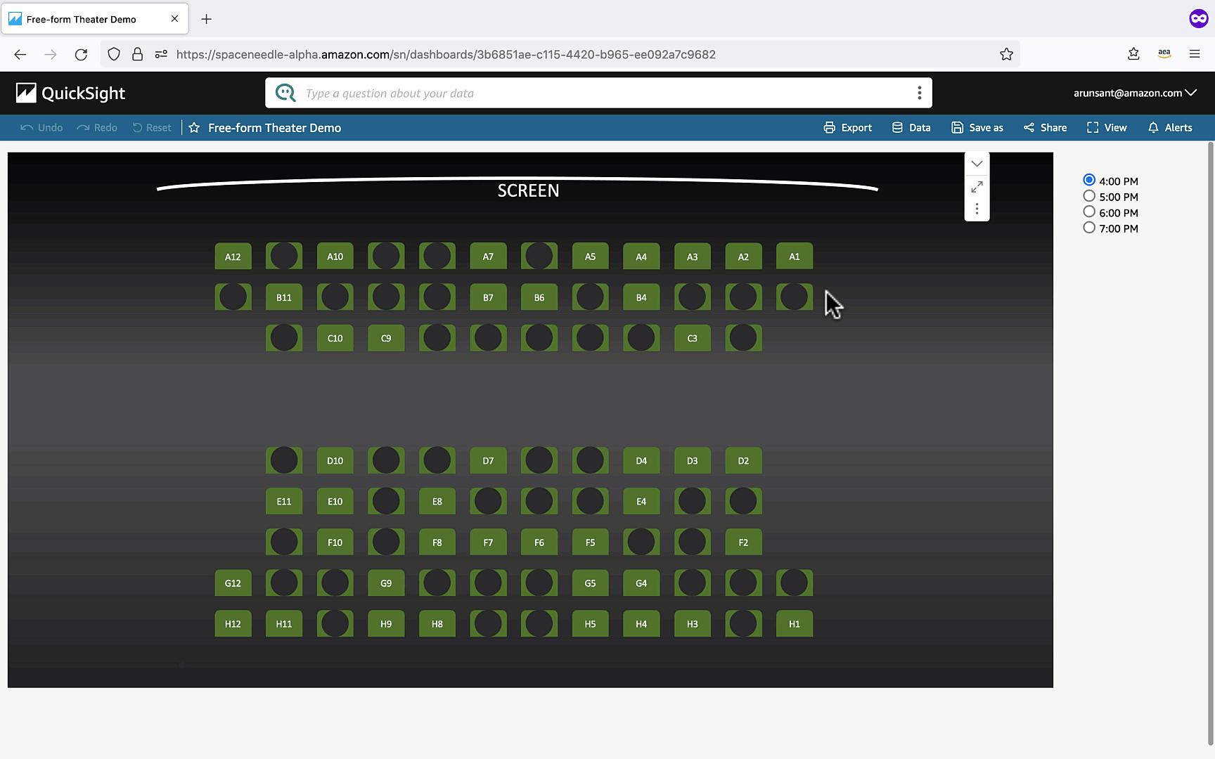
- Rules – You can set rules to show or hide visuals based on parameter values. All visuals are visible by default. You can add rules on when they should be hidden. Alternatively, you can flip the default state of the visual to hidden and configure rules on when to show the visual. Pair this with overlaid placement of visuals to build dynamic dashboards that respond to user selections or inputs from the parent application (when used in embedded context).

You can explore a sample dashboard for inspiration, and examine the analysis view to see how it is built.
Also check out the QuickSight dashboard gallery with samples from our partners.
Conclusion
With the new free-form layout, QuickSight enables you to build dashboards that can be tailored to meet your exact dashboard specifications, which can then be distributed to hundreds of thousands of users via the QuickSight portal, mobile app, email, or embedded within your own applications.
About the Authors
 Jose Kunnackal, is a principal product manager for Amazon QuickSight, AWS’ cloud-native, fully managed BI service. Jose started his career with Motorola, writing software for telecom and first responder systems. Later he was Director of Engineering at Trilibis Mobile, where he built a SaaS mobile web platform using AWS services. Jose is excited by the potential of cloud technologies and looks forward to helping customers with their transition to the cloud.
 Arun Santhosh is a Senior Solution Architect for Amazon QuickSight. Arun started his career at IBM as a developer and progressed on to be an Application Architect. Later, he worked as a Technical Architect at Cognizant. Business Intelligence has been his core focus in these prior roles as well.