AWS Big Data Blog
Create threshold alerts on tables and pivot tables in Amazon QuickSight
Amazon QuickSight previously launched threshold alerts on KPIs and gauge charts. Now, QuickSight supports creating threshold alerts on tables and pivot tables—our most popular visual types. This allows readers and authors to track goals or key performance indicators (KPIs) and be notified via email when they are met. These alerts allow readers and authors to relax and rely on notifications for when their attention is needed. In this post, we share how to create threshold alerts on tables or pivot tables to track important metrics.
Background information
Threshold alerts are a QuickSight Enterprise Edition feature and available for dashboards consumed on the QuickSight website. Threshold alerts aren’t yet available in embedded QuickSight dashboards or on the mobile app.
Alerts are created based on the visual at that point in time and are not affected by potential future changes to the visual’s design. This means the visual can be changed or deleted and the alert continues to work as long as the data in the dataset remains valid. In addition, you can create multiple alerts off of one visual, and rename them as appropriate.
Finally, alerts respect RLS and CLS rules.
Set up an alert on a table or pivot table
Threshold alerts are configured for dashboards. On a dashboard, there are three different ways to create an alert on a table or pivot table.
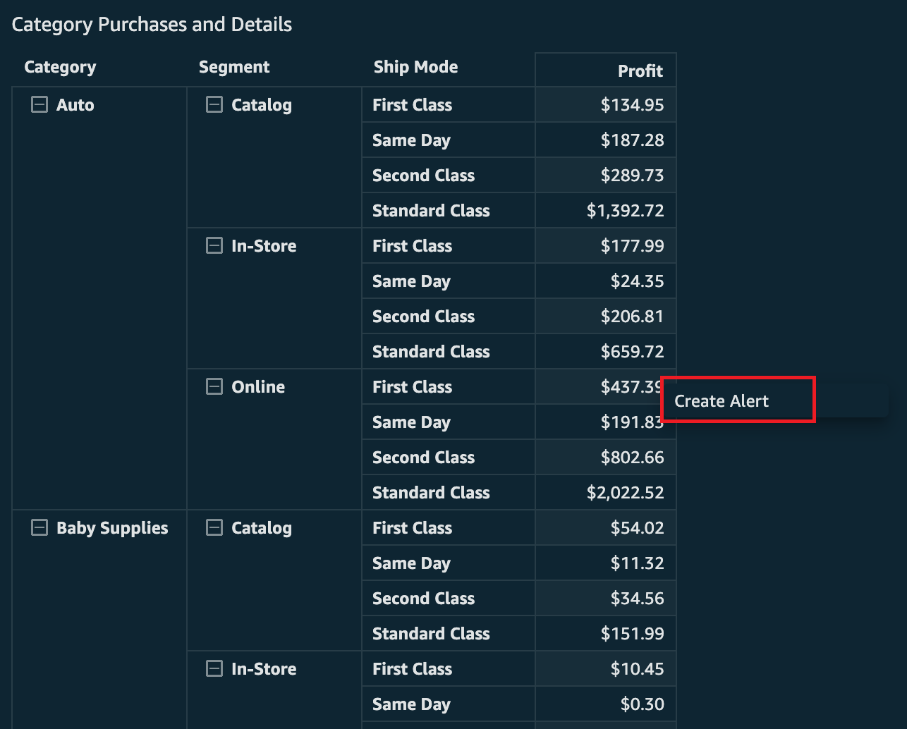
First, you can create directly from a pivot table or table. You click directly on the cell you would like to create an alert on (if there is another action enabled, you may have to right-click to get this option to show). This needs to be on a numeric value (no dates or strings allow for creation of alerts). Then choose Create Alert to start creating the alert.
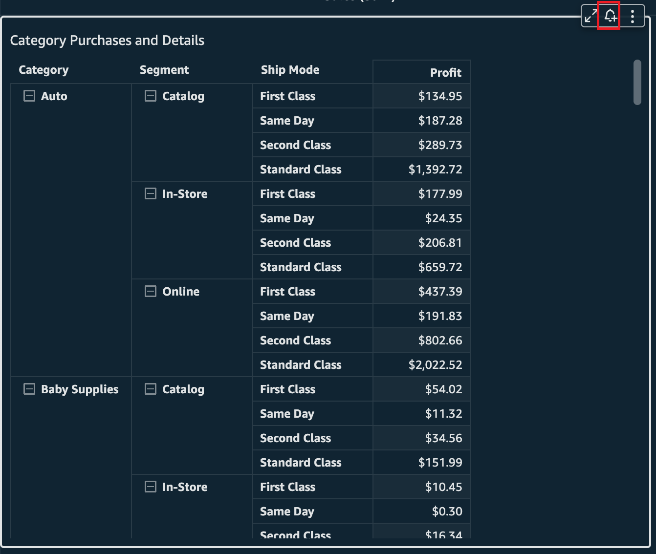
Let’s assume you want to track the profit coming from online purchases for auto-related merchandise being shipped first class. Choose the appropriate cell and then choose Create Alert.
You’re presented with the creation pane for alerts. The only difference from KPIs or gauge visual alerts is that here you’ll find the other dimensions in the row that you’re creating the alert on. This will help you identify what value from the table you have selected, because there can be duplicates of the numeric values.
In the following screenshot, the value to track is profit, which currently is $437.39. This is the value that will be compared to the threshold you set. You will also see the dimensions being used to define this alert, which are taken from the row of the table. In this case, the Category is Auto, the Segement is Online, and the Ship Mode is First Class.

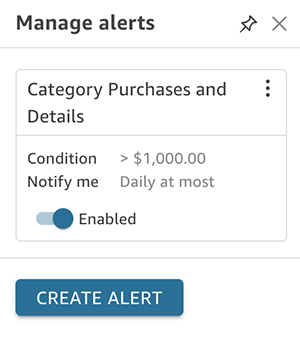
Now that you have checked that the value is correct, you can update the name of the alert that is automatically filled with the name of the visual it is created off of, set the condition (between Is above, Is below, and Is equal to), and pick the threshold value, notification frequency, and whether you want to be emailed when there is no data.
In the following example, the alert has been configured so that you will receive an email when the profit is above the threshold of $1,000. You’ve also left the notification frquency at Daily at most and haven’t requested to be emailed when there is no data.

If you have a date field, you also will see an option to control the date. This will automatically set the date field to be the most recent of whatever aggregation you’re looking at, such as hour, week, day, month. However, you could override to use the specific date applied to the value you have selected if you would prefer.
Below is an example where the data was aggregated based on the week and so Latest Week has been selected rather than the historical Week of Jan 4, 2015.

You can then choose Save if you’re happy with the alert and it will load the Manage alert pane.
The Create Alert button is also at the bottom of the pane. This is the second way you can start creating an alert off of a table or pivot table.
You can also get to this pane from the upper right alert button on the dashboard.

If you have no alerts, this will automatically drop you into the creation pane. There you will be asked to select a visual that supports alerts to begin creating an alert. If you already have alerts (as previously demonstrated), then all you need to do is choose Create Alert.
Then select a visual and choose Next.
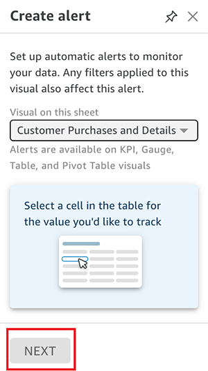
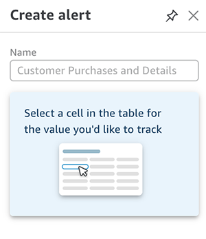
You’re prompted to select a cell if you have picked a table or pivot table visual.
Then you repeat the same steps as creating off a cell within a table or pivot table.
Finally, you can start creating an alert from the bell icon on the pivot table or table. This is the third way to create an alert.
You’ll be prompted to select a cell from the table, and the creation pane appears.
After you choose the cell that you want to track, you start the creation process just like the first two examples.
Update and delete alerts
To update or delete an alert, you need to navigate back to the Manage alerts pane. You get there from the bell icon on the top right corner of the dashboard.
You can then choose the options menu (three dots) on the alert you want to manage. Three options appear: Edit alert, View history (to view recent times the alert has breached and notified you), and Delete.

Notifications
You’ll receive an email when your alert breaches the rule you set. The following is an example of what that looks like (the alert has been adjusted to be alerted if profit is over $100 and to be notified as frequently as possible).

The current profit breach is highlighted and the historical numbers are shown along with the date and time of the recorded breaches. You can also navigate to the dashboard by choosing View Dashboard.
Evaluate alerts
The evaluation schedule for threshold alerts is based on the dataset. For SPICE datasets, alert rules are checked against the data after a successful data refresh. With datasets querying your data sources directly, alerts are evaluated daily at a random time between 6:00 PM and 8:00 AM. This is based on the the timezone of the AWS Region your dataset was created in. Dataset owners can set up their own schedules for checking alerts and increase the frequency up to hourly (to learn more, refer to Working with threshold alerts in Amazon QuickSight).
Restrict alerts
The admin for the QuickSight account can restrict who has access to set threshold alerts through custom permissions. For more information, see the section Customizing user permissions in Embed multi-tenant analytics in applications with Amazon QuickSight.
Pricing
Threshold alerts are billed for each evaluation, and follow the familiar pricing used for anomaly detection, starting at $0.50 per 1,000 evaluations. For example, if you set up an alert on a SPICE dataset that refreshes daily, you have 30 evaluations of the alert rule in a month, which costs 30 * $0.5/1000 = $0.015 in a month. For more information, refer to Amazon QuickSight Pricing.
Conclusion
In this post, you learned how to create threshold alerts on tables and pivot tables within QuickSight dashboards so that you can track important metrics. For more information about how to create threshold alerts on KPIs or gauge charts, refer to Create threshold-based alerts in Amazon QuickSight. Additional information is available in the Amazon QuickSight User Guide.
About the Author
 Lillie Atkins is a Product Manager for Amazon QuickSight, Amazon Web Service’s cloud-native, fully managed BI service.