AWS Big Data Blog
Introducing new dashboard experience on Amazon QuickSight
This post was last updated August 2022, to include new experiences such as Analysis and Embedding.
Amazon QuickSight launches the new look and feel for your dashboards. In this post, we will walk through the changes and improvements introduced with the new look. The new dashboard experience includes the following improvements:
- Simplified toolbar
- Discoverable visual menu
- Polished controls, menu, and submenus
- Non-blocking right pane for secondary experiences like filters, threshold alerts, and downloads
Simplified toolbar
The simplified toolbar experience offers updated icons for key actions for better visual clarity.
The following screenshot shows the old look.
The following screenshot shows the new look with updated icons.
Discoverable visual menu
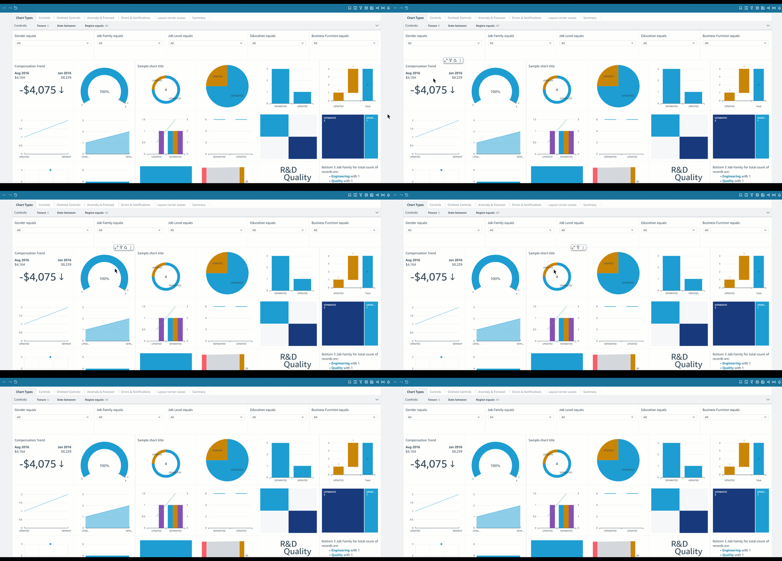
The visual menu is visible on-hover to improve the discoverability of drills, export, and filter restatements.
To use the visual menu with the old version, you needed to select the visual.
With the new look, you can view the menu by hovering over it.
Polished controls, menu, and submenus
The new look features improved controls, menu, submenus, toast notifications, and other dashboard elements to provide more polished visual experience.
For example, the following screenshot shows the old look for calendar controls.
The following screenshot shows the new look.
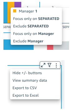
The following screenshot shows the old look for the menu and submenus.
The following screenshot shows the new look.
Non-blocking right pane
The new look features a non-blocking right pane for secondary experiences like filters, threshold alerts, and downloads, to improve focus on the content of the dashboard.‘
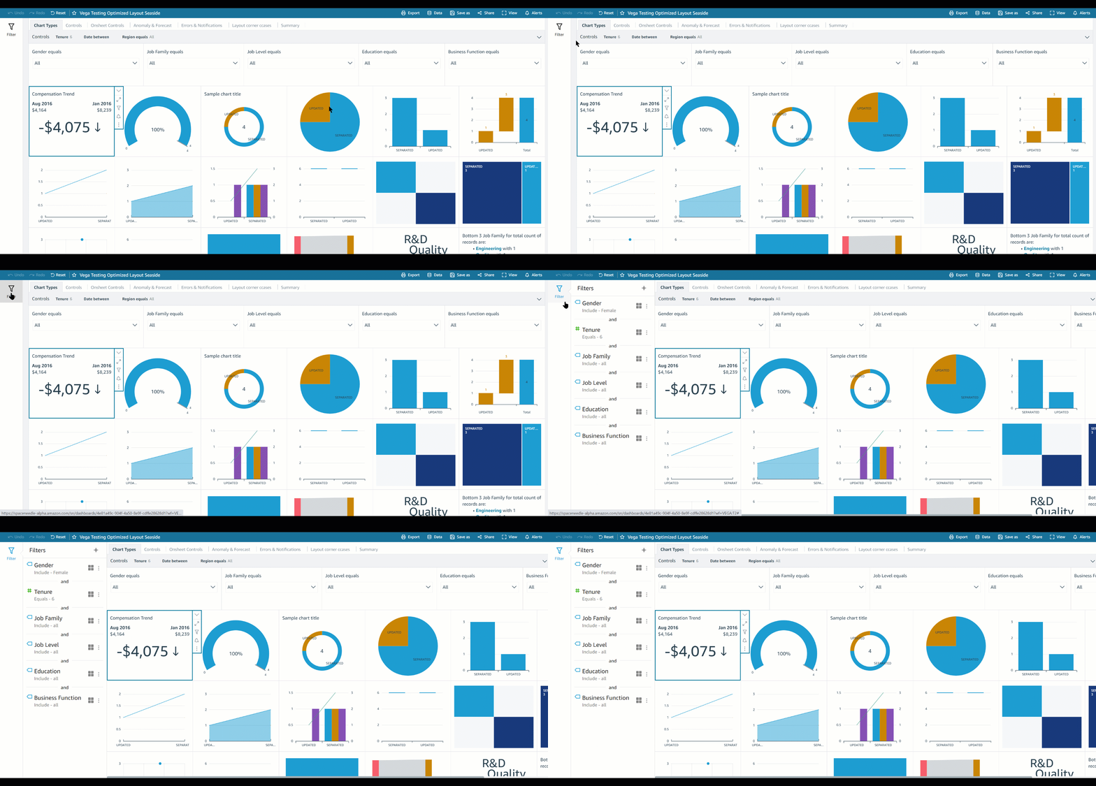
The following animation shows the old look for ad-hoc filtering.
The filters are now moved to the right pane.
The following animation shows the old look for creating threshold alerts.
Threshold alert creation is now in the right pane.
The following animation shows the old look for the downloading experience.
The new look offers a downloads pane.
Analysis Experience:
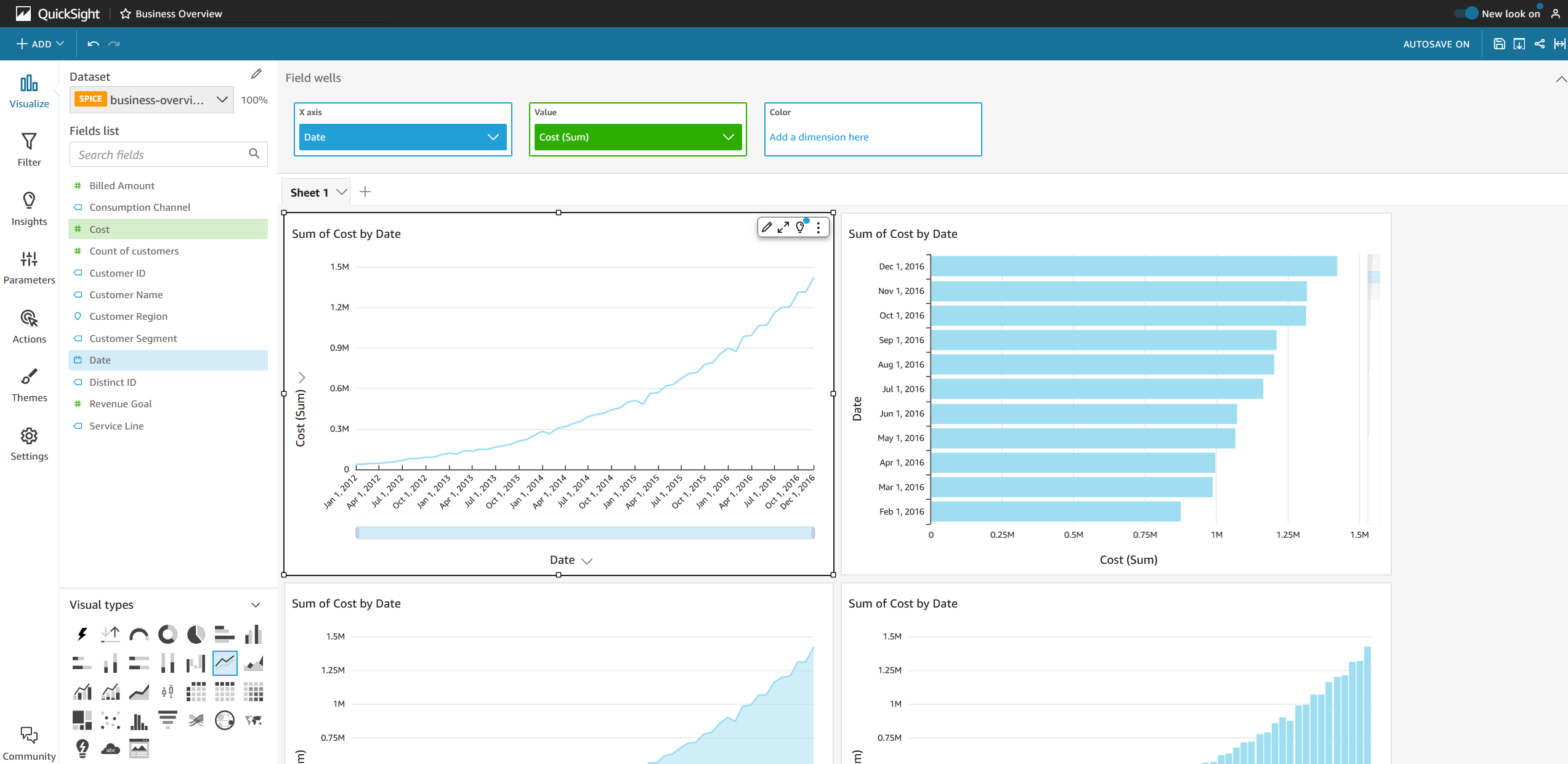
In order to provide an unified experience, the new experiences like simplified toolbar and visual menu are also launched for analysis.
The following image shows the new look for Analysis experience with simplified toolbar and visual menu
Embedding Experience
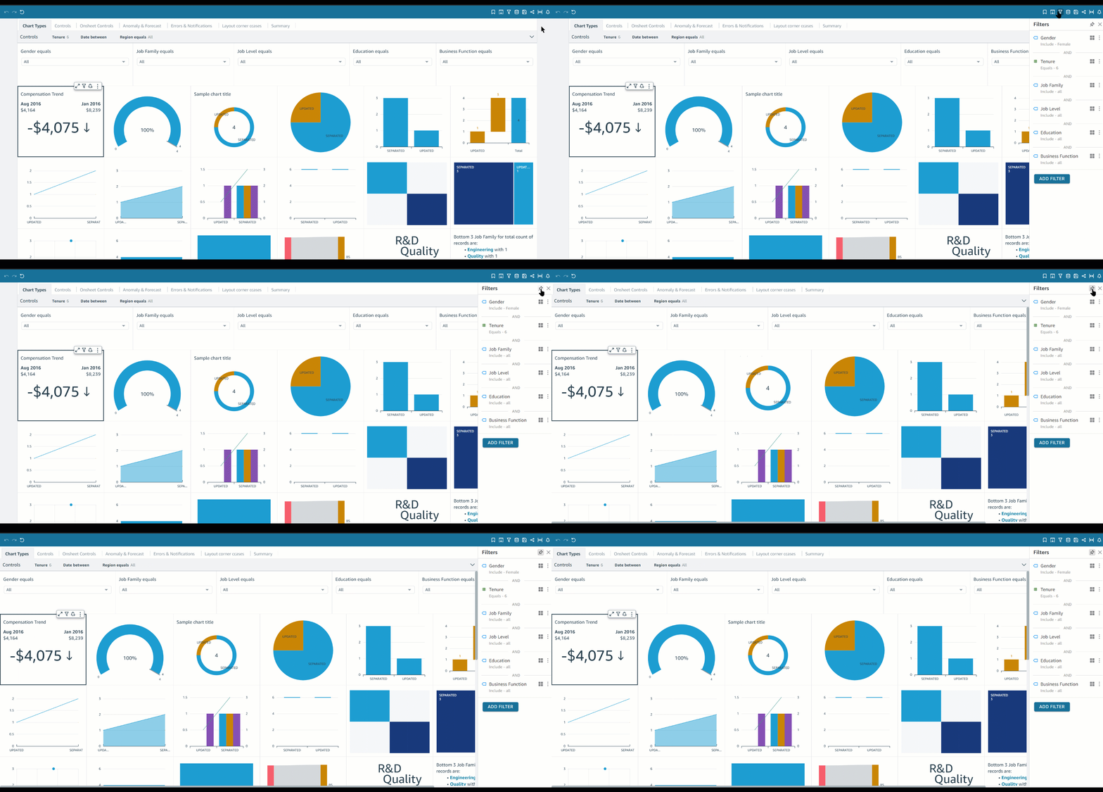
The new experiences is also be available for customers using QuickSight in embedding mode. The ingress for the right pane experience for customers using embedded dashboards without the QuickSight toolbar would be available through the Filter icon in the upper right of each visual (visible on hover).
The following animation shows the ingress for the filter pane for embedded dashboards with QuickSight toolbar and without QuickSight toolbar.
Summary
The new look for the QuickSight dashboard experience is now available in all supported Amazon QuickSight regions. If you have any questions or feedback, please reach out to us by leaving a comment.
About the Author
 Rushabh Vora is a Senior Technical Product Manager for Amazon QuickSight, Amazon Web Service’s cloud-native, fully managed BI service. He is passionate about Data Visualization. Prior to QuickSight, he was working with Amazon Business as a Product Manager.


