AWS Database Blog
Let Me Graph That For You – Part 1 – Air Routes
December 2022: Neptune Notebooks now include an air-routes tutorial.
We’re pleased to announce the start of a multi-part series of posts for Amazon Neptune in which we explore graph application datasets and queries drawn from many different domains and problem spaces.
Amazon Neptune is a fast and reliable, fully-managed graph database, optimized for storing and querying highly connected data. It is ideal for online applications with highly connected data where the query workloads require you to take advantage of this connectedness – navigating connections and leveraging the strength, weight or quality of the relationships between entities. If you’ve ever had to answer questions such as:
- Which friends and colleagues do we have in common?
- Which applications and services in my network will be affected if a particular network element – a router or switch, for example – fails? Do we have redundancy throughout the network for our most important customers?
- What’s the quickest route between two stations on the underground?
- What do you recommend this customer should buy, view, or listen to next?
- Which products, services and subscriptions does a user have permission to access and modify?
- What’s the cheapest or fastest means of delivering this parcel from A to B?
- Which parties are likely working together to defraud their bank or insurer?
– then you’ve already encountered the need to manage and make sense of highly connected data.
We kick off our series with an open source air routes dataset that models the world airline route network. This dataset accompanies the book Practical Gremlin.
The Air Routes Dataset
The air routes dataset models a large part of the world airline route network. It contains vertices representing 3,397 airports, 237 countries and provinces, and the 7 continents. Edges are used to represent the routes between the airports and the links between continents, countries and airports. There are 52,639 edges in the graph, of which 45,845 represent airline routes.
Let’s find out a bit about the graph
We start with a simple query just to make sure our connection to Neptune is working. The queries below look at all of the vertices and edges in the graph and create two maps that show the demographic of the graph. As we are using the air routes data set, not surprisingly the values returned are related to airports and routes.
When you execute these queries in the notebook, you’ll see the following results:
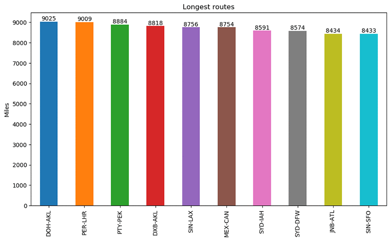
Find routes longer than 8,400 miles
In the next query we find routes in the graph that are longer than 8,400 miles. This is done by examining the dist property of the routes edges in the graph. Having found some edges that meet our criteria we sort them in descending order by distance. The where step filters out the reverse direction routes for the ones that we have already found because we only want one result for each route. Finally, we generate some path results using the airport codes and route distances.
(Notice how in the notebook code we have laid the Gremlin query out over multiple lines to make it easier to read. To avoid errors, when you lay out a query in this way using Python, each line must end with a backslash character, “\”.)
The results from running the query will be placed into the variable paths. Notice how we ended the Gremlin query with a call to toList(). This tells Gremlin that we want our results back in a list. We can then use a Python for loop to print those results. Each entry in the list will itself be a list containing the starting airport code, the length of the route and the destination airport code.
Here’s the query:
Executing the code in the notebook generates the following results:
Draw a Bar Chart that represents the routes we just found
One of the nice things about using Python to work with our graph is that we can take advantage of the larger Python ecosystem of libraries such as matplotlib, numpy and pandas to further analyze our data and represent it pictorially. So, now that we have found some long airline routes we can build a bar chart that represents them graphically:
Running this code in the notebook generates the following chart:
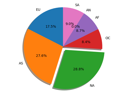
Explore the distribution of airports by continent
The next example queries the graph to find out how many airports are in each continent. The query starts by finding all vertices that are continents. Next, the query groups the vertices to create a map (or dict) whose keys are the continent descriptions and whose values represent the counts of the outgoing edges with a contains label. Finally, the resulting map is sorted using the keys in ascending order. That result is then returned to our Python code as the variable m, which we iterate over and print to the output:
Executing the code in the notebook generates the following results:
Draw a pie chart representing the distribution by continent
Rather than return the results as text like we did above, it might be nicer to display them as percentages on a pie chart. That is what the next piece of code does, using the two-digit character code for each continent to label the chart:
This code generates the following pie chart:
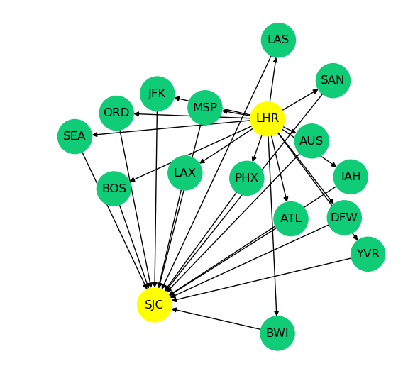
Find some routes from London to San Jose and draw them
One of the nice things about connected graph data is that it lends itself nicely to creating useful visualizations. The Python networkx library makes it fairly easy to draw a graph. The next example in our notebook takes advantage of this capability to draw a directed graph (DiGraph) of a few airline routes.
The query below starts by finding the vertex that represents London’s Heathrow (LHR) airport. It then finds 15 routes from LHR that end up in San Jose California (SJC) with one stop on the way. Those routes are returned as a list of paths. Each path will contain the three-character IATA codes representing the airports found.
The main purpose of this example is to show that we can easily extract part of a larger graph and render it graphically in a way that is easy for an end user to understand.
Here’s the graphical output of executing this code in the notebook:
Conclusion
In this post we’ve shown how to load and query a highly connected air routes dataset, and produce bar charts, pie charts and graph diagrams based on the results of those queries.
Look out for subsequent posts in the Let Me Graph That For You series. If you’ve a particular application use case you’d like us to address, let us know in the comments.
About the Authors
 Kelvin Lawrence is a Principal Data Architect in the Database Services Customer Advisory Team focused on Amazon Neptune and many other related services. He has been working with graph databases for many years, is the author of the book “Practical Gremlin” and is a committer on the Apache TinkerPop project.
 Ian Robinson is an architect with the Database Services Customer Advisory Team. He is a coauthor of ‘Graph Databases’ and ‘REST in Practice’ (both from O’Reilly) and a contributor to ‘REST: From Research to Practice’ (Springer) and ‘Service Design Patterns’ (Addison-Wesley)