Front-End Web & Mobile
Build a newsfeed with AWS Amplify Studio
AWS Amplify has announced AWS Amplify Studio, a visual development environment that offers frontend developers new features (public preview) to accelerate UI development with minimal coding, all while integrating Amplify’s powerful backend configuration and management capabilities. Amplify Studio automatically translates designs made in Figma to human-readable React UI component code. Within Amplify Studio, developers can visually connect the UI components to app backend data.
For configuring and managing backends, Amplify Admin UI’s existing capabilities (such as “data”, “authentication”, “storage”, and more) will be part of Amplify Studio going forward, thereby providing a unified interface to enable developers to build full-stack apps faster.
To showcase the new UI capabilities, let’s build a “Newsfeed” application that shows off users posts and interaction counts.
Build your backend and frontend in one visual development environment
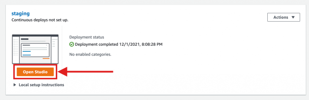
First let’s create an app backend. To do so, navigate to the AWS Amplify console and select New app > Create backend. Once deployed, select Open Studio to browse your Amplify app configurations.
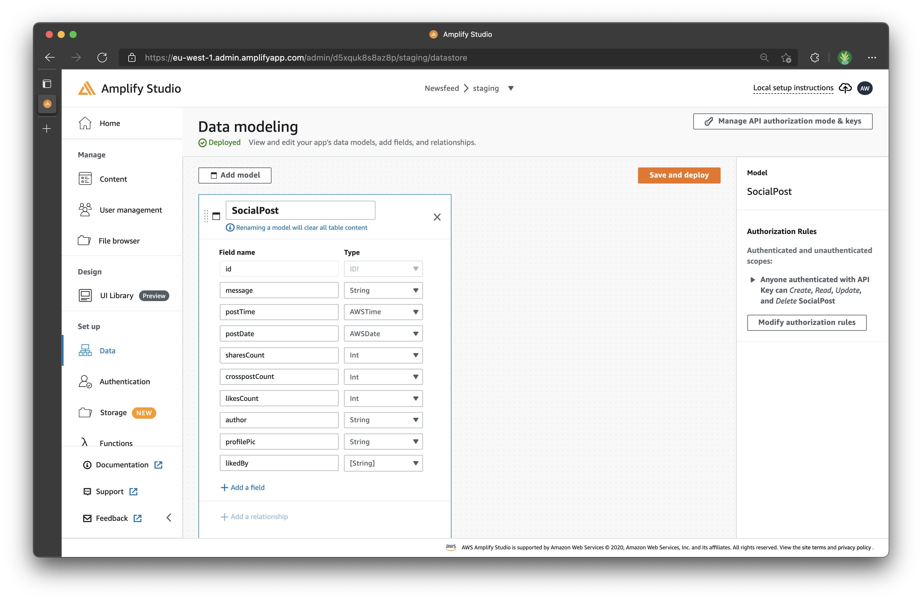
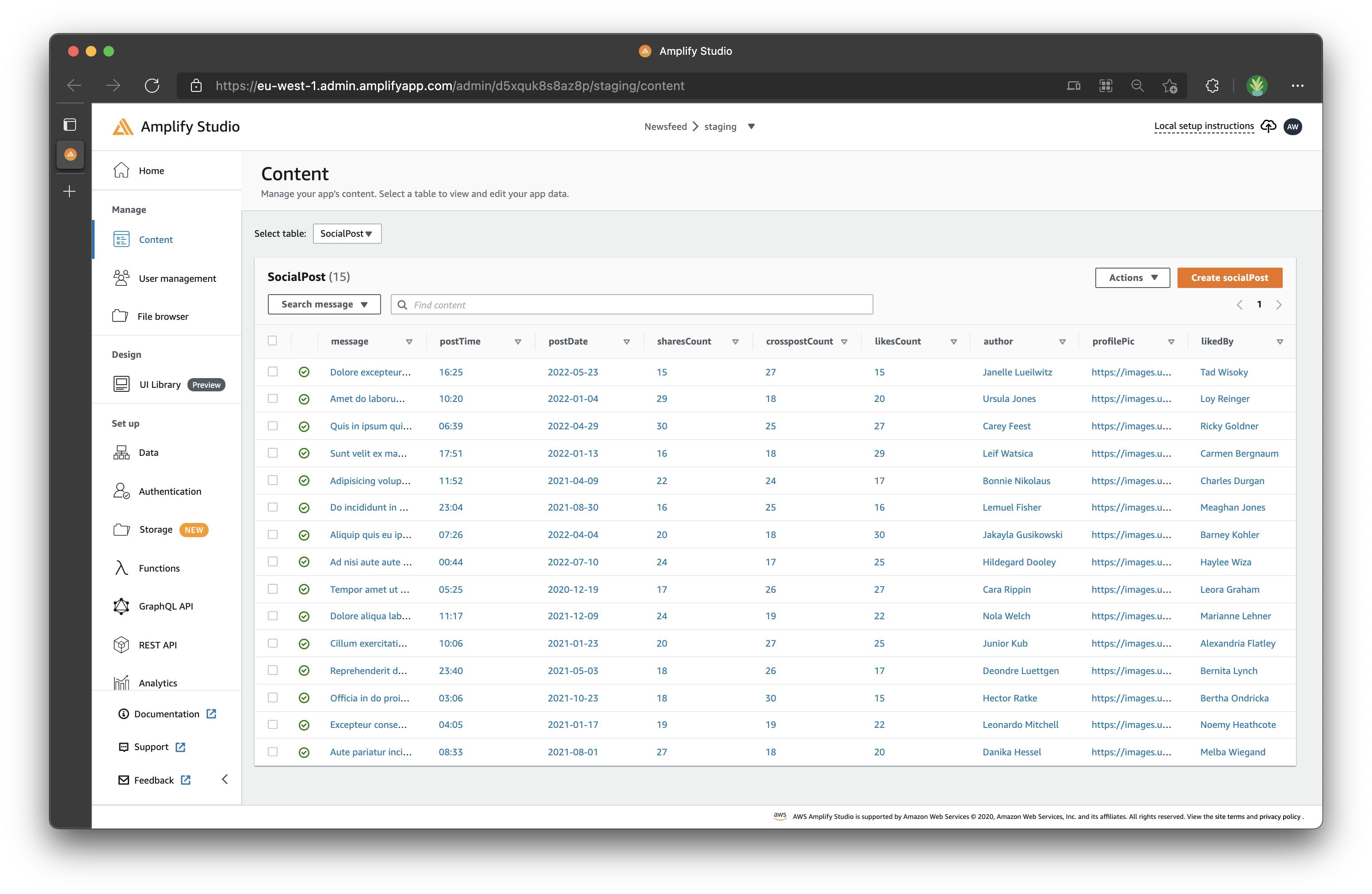
Explore the data model in the “Data model” section. In this post, we are creating a “SocialPost” model with nine fields to represent a newsfeed post. These fields are “message”, “author”, and “profilePic” as String, as well as “postTime” as AWSTime, “postDate” as AWSDate, “sharesCount”, “crosspostCount” and “likesCount” as integers, and “likedBy” as an array of String. To change your field type to an array, select “likedBy” and select the checkbox marked “Is array”. Once you are done, select “Save and deploy” to deploy your data model.
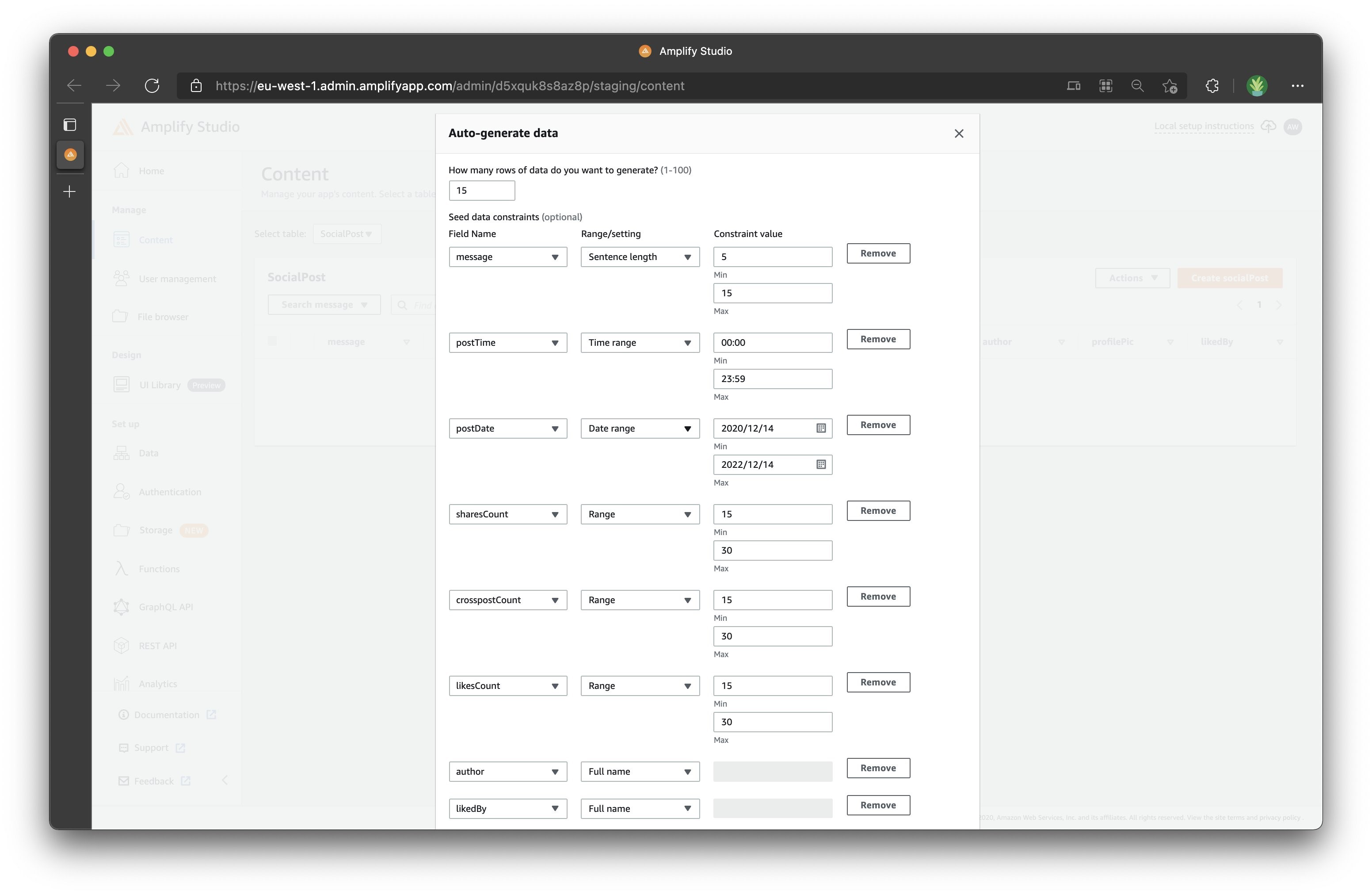
Next, let’s use the content tab to generate some random seed data for your app.
Select “Content”, and then select “Auto-generate seed data” under the “Actions” menu to seed your database with sample data. Let’s create six records for now with the appropriate Range/settings to make the data look relevant, found under the seed data constraints. For “message”, we’ll use sentence length, for “postTime” we’ll use time range, for “postDate” we’ll use date range, for “sharesCount” we’ll use range, for “crosspostCount” we’ll use range, for “likesCount” we’ll use range, for “author” we’ll use full name,, and for “likedBy” we’ll also use full name.
We will populate profilePic with our own images from Unsplash (Tip: if you don’t have any image URLs handy, check out Unsplash’s people photo gallery).
Seamless designer-to-developer hand-off
Studio’s new “UI Library (Preview)” lets you sync components from Figma to Amplify Studio. Amplify also provides you with a handy Figma file to get started faster. The Amplify Figma file includes both UI primitives and prebuilt components. Moreover, Studio can sync any new components created in Figma!
Let’s clone the Figma file as Amplify Studio suggests. Note that this step will require you to have a free Figma account.
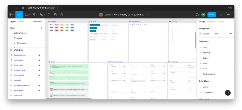
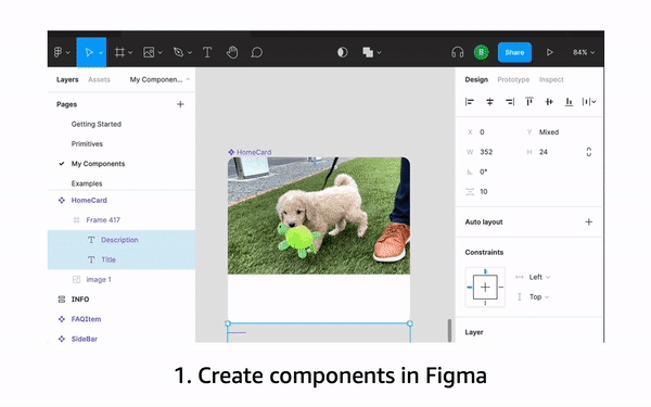
Explore the Amplify UI component primitives in the “Primitives” Figma page. You can also find a range of prebuilt UI components in the “My Components” page. In this post, we’ll be creating a website similar to what you can see under Examples > Newsfeed example. You can see that it takes advantage of the SideBar, NavBar, and a collection of SocialB components.

Duplicate the Figma file and paste in the Figma file link to import all of the components from your Figma file.
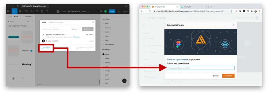
You can either choose individual components to import or import all of them via the “Accept all” button in the top-right corner. For now, select “Accept all”.
Bind UI components to data
With your UI library populated, let’s bind some of these components to data.
Select the SocialB component, and select “Configure”. In the UI component editor, you can define component properties, and then bind them to different UI elements. For our app, let’s add a new property called “post”, and select the “SocialPost” type.
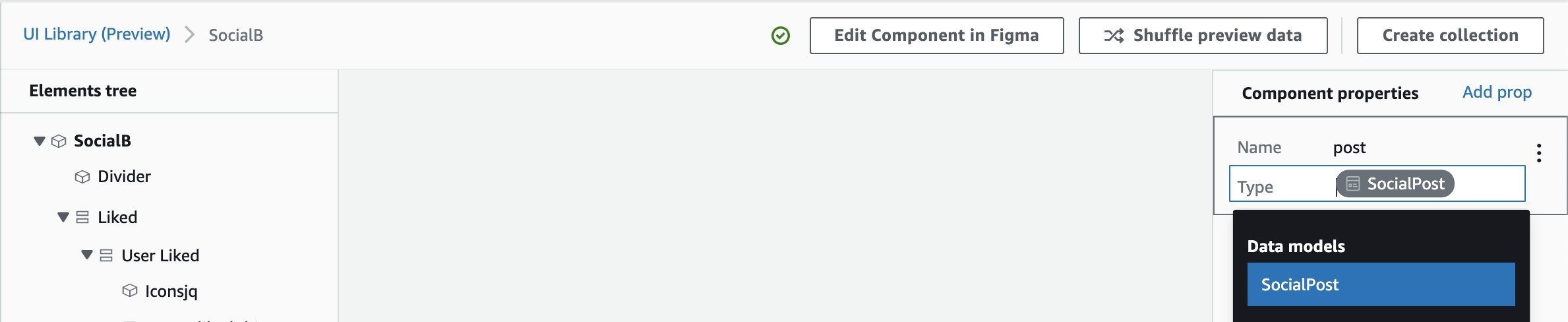
To bind images, you can simply select the “src” property and bind it to the post’s “profilePic” field.
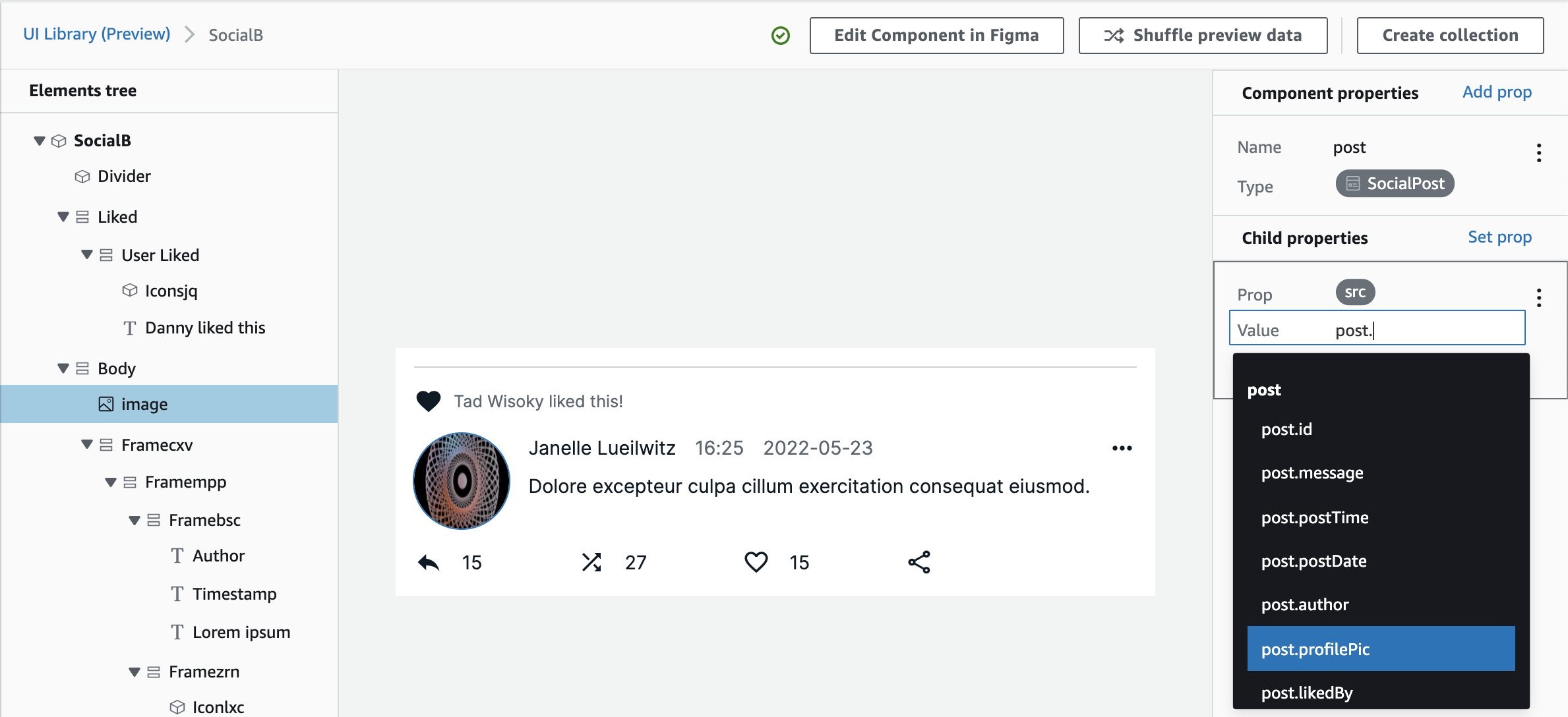
Next, select the child elements and bind their “label” to a value from the post property. We can bind the text element to the post message. For the “Danny liked this” message, we can even use some lightweight syntax expression to have the UI render “post” + “ liked this!”.
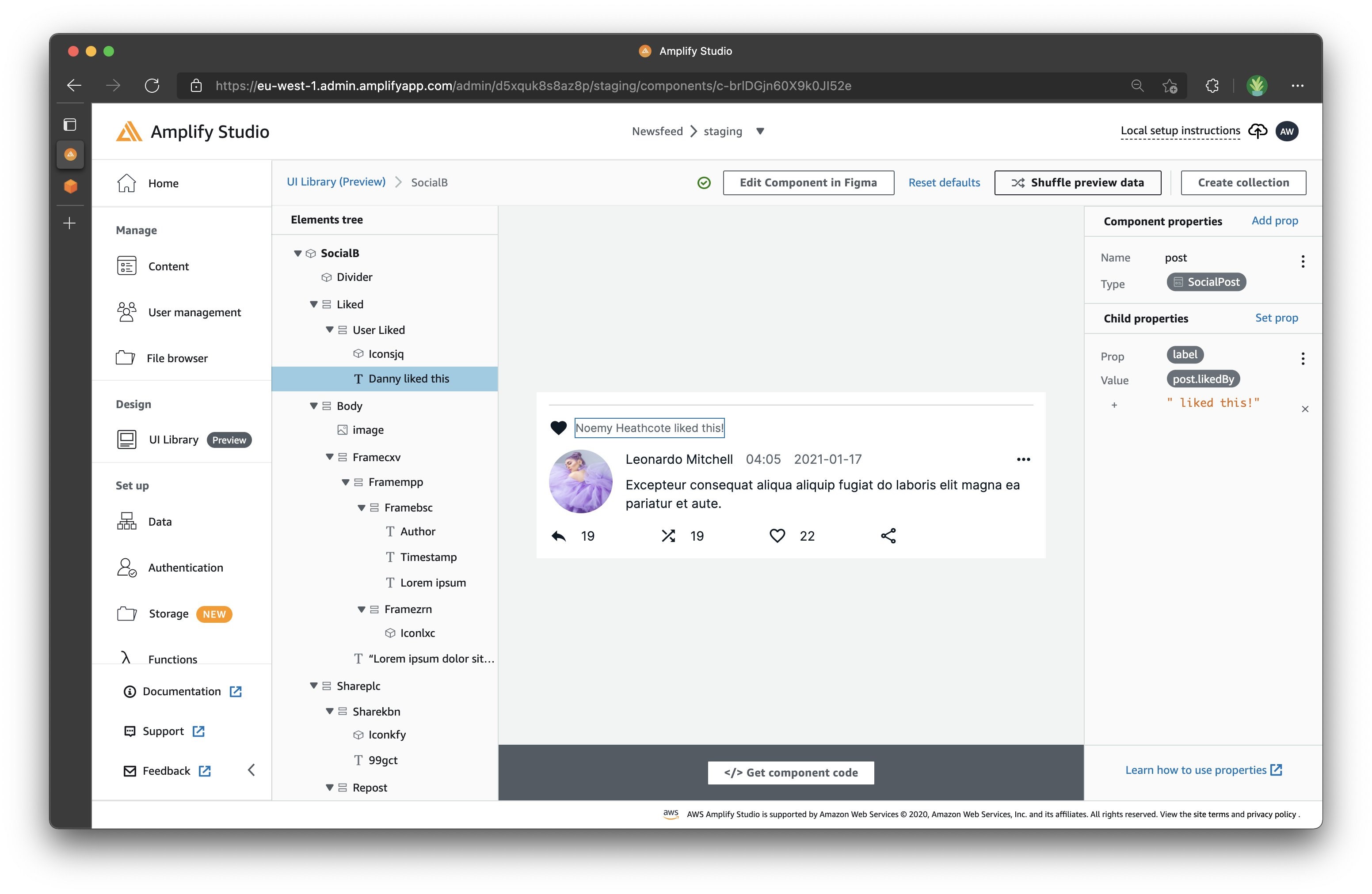
Continue binding the author, publish time, publish date, and social media button counts with the appropriate post’s’ fields until your preview of SocialB looks the way you want your post to look!
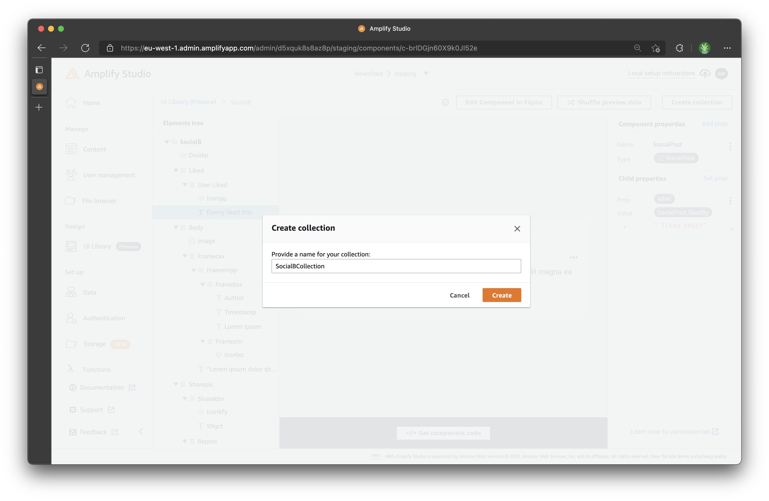
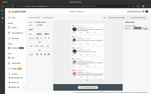
Create a collection
Individual components are great, but most of the time you’ll want to show a “collection” of a component. Amplify Studio lets you make a collection of any component by clicking the “Create collection” button in the top-right corner. I’ve named my collection “SocialBCollection”.
Configure all of your layout options on the left-hand side, and then configure your data sources on the right-hand side.
Let’s use a list layout for this collection.
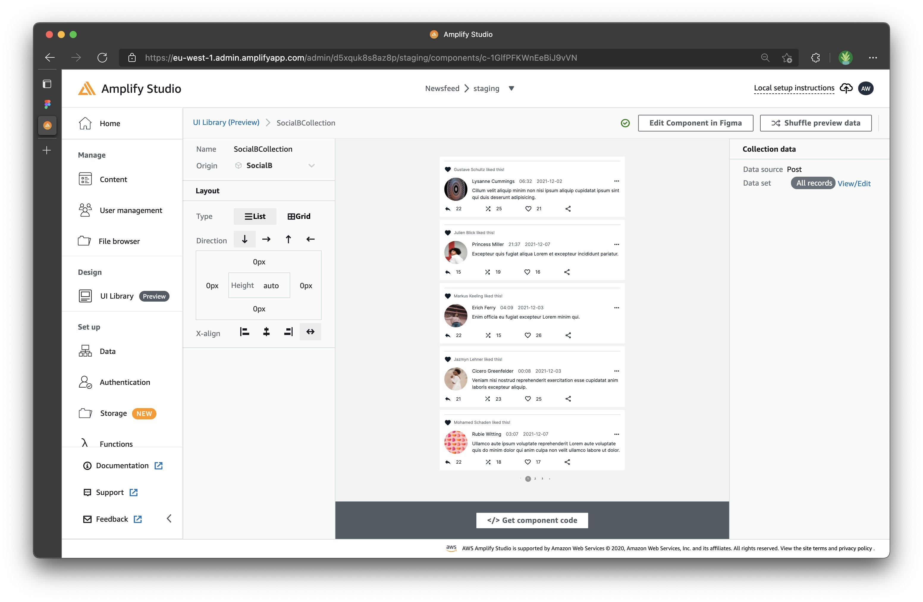
We can even sort the order of the posts. You could choose to sort them chronologically, or by popularity of likes. To do so, select View/Edit in the top-right corner under Collection data. From there, use the dialog box to choose what you want to sort by and how you want it sorted.
Pull into your React app
Now that all of our UI components are ready, let’s start the process of pulling them into a local React app. First, create a new React app. Simply run the following command in your Terminal:
Change into the studionewsfeed directory:
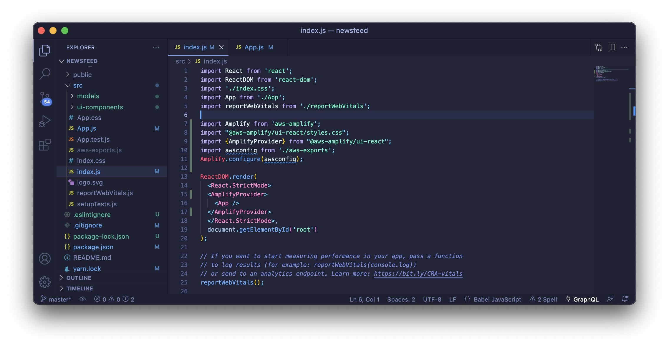
Then, complete the initial project setup for your React app in your index.js file:
- If this is your first time setting up an Amplify project locally, you must install the Amplify CLI by running:
You may have to run yarn upgrade depending on your version number.
- Configure Amplify by copying the following code into your index.js file:
- Wrap your App in AmplifyProvider:
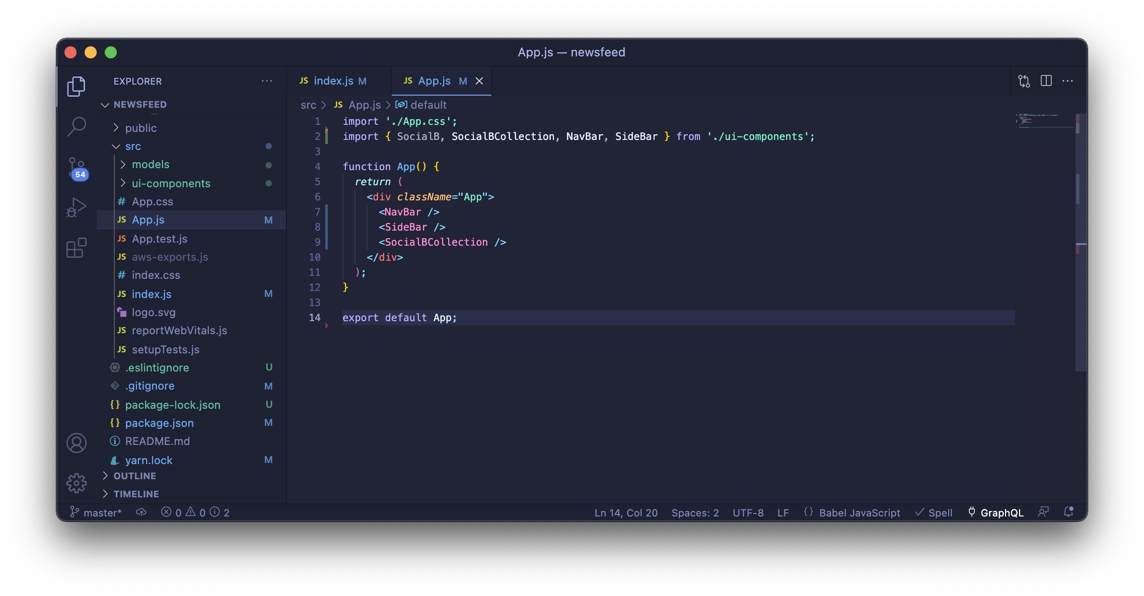
Now we can follow the steps to use your new SocialBCollection component in your App.js file!
- Pull in the latest components by running the following command in Terminal, adding in your app ID and environment name. This can be found auto-populated under Studio’s “Local Setup Instructions”:
You will be prompted with several configuration questions. Accept all default answers.
After the amplify pull, a few key files have been added to your React code base:
- “ui-components/” contains all UI components from your Figma file as React code
- “models/” contains all of the local representation of your data model, allowing you to use it with DataStore to fetch, update, and subscribe to your app data
- “aws-exports.js” defines all of the backend connection details, such as API endpoints, API keys, or Amazon Cognito user pool IDs
- Import the component:
- And now you can render the component wherever you need it:
We’re also adding the NavBar and SideBar component above the SocialBCollection.
Now, with that, your alignment might look a little wonky. All that’s required to make this look exactly like the mock is to use Flex! After importing Flex, wrap your code so it looks like following snippet:
To test your app, run the following in your terminal:
You should see something like this in your browser:

Amplify UI Library – from Preview to General Availability
Amplify Studio’s UI library feature is currently still in developer preview. There is a range of improvements we’re making before general availability:
- Ability to define event-based actions within Studio (e.g., on clicking a component, go to a specific page)
- Add search, pagination, and filtering on collections
- Ability to define Amazon Simple Storage Service (S3)storage bindings (e.g., link an avatar to a user’s profile picture)
- More UI components (e.g., color pickers, maps, avatar, file uploader)
Success
Success! ? Your app is built! Ready to get started with your own brand new app? Get Started with Amplify Studio.
If you have feedback about the new UI Library feature of Amplify Studio, send it to us via GitHub or our Discord community.
Clean up
Now that you have finished this walkthrough, we recommend that you delete your Amplify app if you aren’t going to use it anymore. This makes sure that your resources won’t be abused in the event that someone gains access to your project’s credentials.
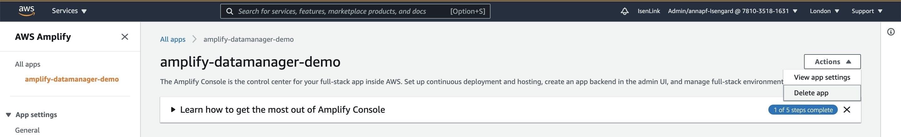
To delete all of the local Amplify associated files and the Amplify project in the backend, go to your Amplify console, select the app you want to delete, and expand the dropdown in the top right to delete your app.
Alternatively, you can run the following command in your working directory:
This action cannot be undone. Once the project is deleted, you can’t recover it and will have to reconfigure the categories and the project configuration files if you need to use the project again.