AWS Big Data Blog
Amazon QuickSight adds support for on-sheet filter controls
Amazon QuickSight now supports easy and intuitive filter controls that you can place beside visuals on dashboards, allowing readers to quickly slice and dice data in the context of its visual representation. You can create these filter controls from existing or new filters with a single click, and configure them to support different operations, such as filtering specific dates, relative dates, or date rages; setting upper and lower thresholds for numeric values; adding drop-downs with single-select or multi-select options; and more.
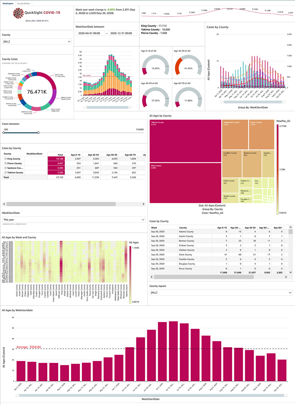
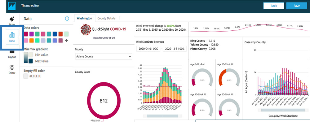
In this post, we review how these filtering improvements, together with themes and dashboard layout options, let you create stunning, interactive dashboards that you can share with tens of thousands of users, whether in QuickSight or using embedded dashboards within apps, without any server provisioning or management needed, and paying for what you use. For this use case, we use the COVID-19 public dataset for Washington state. The following screenshot shows the dashboard with on-sheet filters added.
Using the new filter controls
Let us take a deeper look at the new filter controls, which are now placed across the sheet between visuals. Creating these controls is easy— simply add a new filter on the required dimension or metric, set the scope to either filter the entire dashboard or specific visuals within, and add it to the sheet. QuickSight now automatically maps filters across multiple datasets used within a sheet, so actions on the filter can apply to every visual on the sheet if so desired. For example, to add a new filter on the county field, create a filter on the field using the left hand navigation pane when authoring the dashboard.
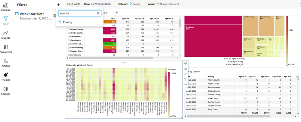
Set the scope of the filter as desired, and choose Add to sheet to add a control to the sheet.
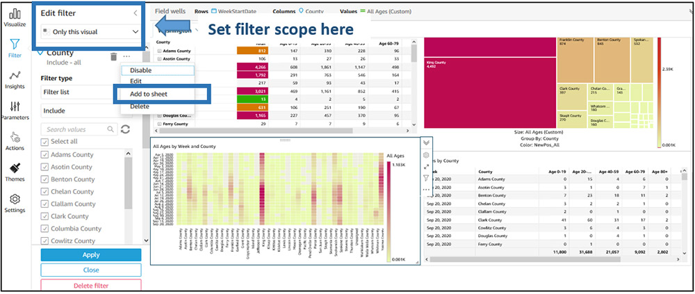
QuickSight then creates a moveable control that you can place anywhere on the sheet. QuickSight chooses the control type depending on the type of filter created. For example, when creating filters on dimensional fields, QuickSight adds a multi-select drop-down control by default. You can change the control type by choosing the Settings icon in the control’s visual menu.

In the Edit control section, you can make further updates to your control.

You can also place these controls in the control drawer on top of the sheet by choosing Pin to top.

On-sheet controls
The on-sheet controls currently supported include those previously supported with QuickSight parameter controls (single-select drop-downs, multi-select drop-downs, date and time picker, single-sided slider, single-line text box). QuickSight now supports new controls for date and time range selection, relative date selection, and numeric range selection. You can move existing parameter controls on the sheet and place them beside the new filter controls.
Let’s take a quick look at these new controls. You can use date and time range selection controls when you have a BETWEEN date range filter on your dashboard.

Relative date controls provide readers with powerful functionality to apply date filters at yearly, quarterly, monthly, weekly, daily, hourly, and minute levels. For example, you can choose to filter by current year, previous year, year to date, and last or next N years. These controls provide a great way to ensure your users always see the latest data whether viewing data in dashboards or email reports.

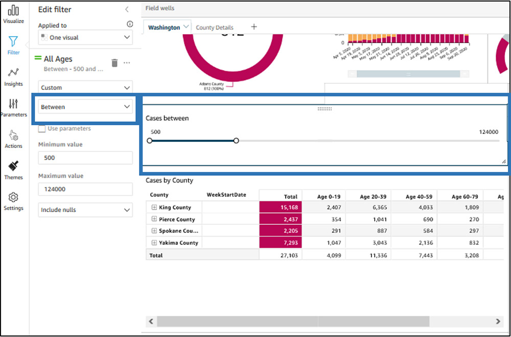
With a two-sided slider control, you can set lower and upper bounds on metric filters. To add a two-sided filter, you simply add the numeric BETWEEN filter to the sheet.
Additional dashboard features
In this section, we look at some other aspects of the dashboard.
Customizing your dashboard layout and theme
This dashboard uses a different set of colors and highlights than the regular palette in QuickSight. We achieve this by using a custom theme, which lets you pick a color palette for data values, background and foreground colors, fonts, and more. You can also choose to remove borders around the visual, show or remove spacing between visuals, and add margins around the sheet.
To create themes for your dashboards, go to the Themes from the left hand menu when authoring the dashboard. You can choose one of starter themes available in QuickSight and choose Save as to customize your own and use the theme editor to visualize changes before saving the theme.

On the Main page of the theme editor, you can customize your background color, foreground color, and font.

On the Data page, you can customize your data colors.
For more information about QuickSight themes, see Evolve your analytics with Amazon QuickSight’s new APIs and theming capabilities.
Images and rich text
You can use the QuickSight insight editor (available in Enterprise Edition) to add rich text and images to dashboards. To add an image, go to the insight editor, choose the Image icon, and provide the hosted location of the image. You can also hyperlink this image to any URL.

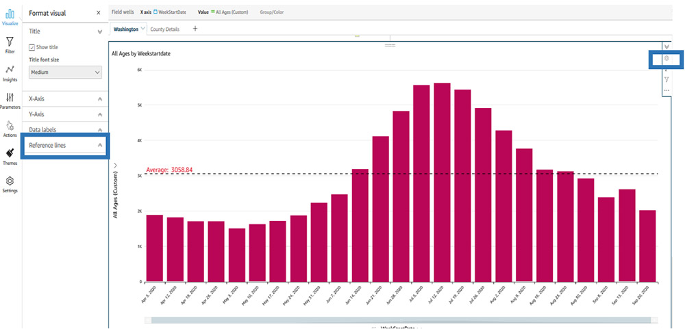
Reference lines
The bar chart within the dashboard also includes a reference line, which you can easily add to a QuickSight line or bar visual. You can configure a reference line from the visual menu.
Conditional formatting
Tables in the dashboard use conditional formatting, which you can add from the table menu.

Scaling
QuickSight dashboards default to auto-fit mode, so they are responsive based on screen size. Instead, you can choose to pick a specific screen resolution to optimize for, based on the devices your audience most commonly uses to view the dashboard. To adjust the scaling mode, choose Settings in the navigation pane while in dashboard authoring (analysis) mode.

For this post, our dashboard was built for a 1366px screen, and scales that view to a larger or smaller screen to ensure that all users see the same content (mobile devices continue to fall back to a single column, mobile-specific layout to ensure usability). Opting for the optimized mode also makes sure that your email reports look exactly like the dashboard that your viewers interact with.
Conclusion
With denser dashboards, custom themes, and new on-sheet filter controls in QuickSight, you can provide richer dashboards for your readers. Visit our user guide to learn more about on-sheet filter controls, themes, dashboard scaling options and more. For more information about authoring dashboards in QuickSight, watch Part 1 and Part 2 of our two-part interactive workshop.
About the authors
 Jose Kunnackal John is a principal product manager for Amazon QuickSight.
 Sahitya Pandiri is a technical program manager with Amazon Web Services.