AWS Big Data Blog
Using QuickSight parameters and controls to drive interactivity in your dashboards
June 2025: This post was reviewed and updated for accuracy.
In this blog post, we walk through several examples of Amazon QuickSight parameters to show how you can use the capabilities within interactive dashboards for your audience.
The basics
Parameters are new variables that you can add to your dashboards. You can use parameters in Amazon QuickSight for filtering, for allowing users to customize what data is being used in the visual, for what-if analysis, and also to drill through from one dashboard to another. After you create a parameter, you nearly always create a control for it. These controls allow your users to change the value of the parameter with intuitive UIs like drop-downs, slider bars, text boxes, and date selectors. A value set for the parameter becomes available in the context of the dashboard.
Keep in mind that parameters and their controls don’t affect any of your visuals unless you use or reference the parameter somewhere else, such as in a filter, calculated field, or URL action. After you use your parameter in one of these places, your users (readers who have access to your dashboard) can use the control to interact with your dashboard in new ways. If you don’t create a control, you can pass a value to your parameter using the dashboard’s URL. For more details, see the Amazon QuickSight documentation.
URL actions enable you to launch any URL from a given data point in a visual and pass the user to another webpage. You can also pass values into the URL so that they are dynamic. For a simple example, suppose that you have a column in your data that contains a URL. In this case, you can create a URL action in Amazon QuickSight and pass that whole field as the URL to launch when a user clicks a given data point. In addition to launching URLs, you can also trigger other URIs like mailto: to trigger an email compose window to open as an action result.
Navigation Actions are custom actions which allow you to navigate to different sheets in the same analysis or dashboard. During navigation to other sheet, you can pass along filter values or parameters based on your selection. Navigation actions are designed to take users from a summary or high-level sheet to a more detailed sheet, typically filtering the data shown on the target sheet to match the user’s selection.
For more details on any of these topics, see the Amazon QuickSight documentation.
Let’s jump into some use cases and see how we can use these features.
Use case 1: adding easy filter controls on your dashboards
Within Amazon QuickSight, you can create filters that affect either one visual, multiple visuals, or all the visuals that use the related data set in your analyses and dashboards. You can find these filters in a panel on the left side of the screen, which users can expand to change the filters. Amazon QuickSight allows advanced filtering through use of all fields present in the data set and use of and/or conditions between clauses. However, if you want to add more quick and easy filters, such as drop-downs, search boxes, or slider bars, we can use parameters and controls to perform the filtering.

To create the parameter, choose + Add in your analysis, and then choose Add parameter. Give it a name and choose the data type for the parameter. If you want a text box or drop-down, choose String.


You can optionally set a default value or a dynamic default value per user. Dynamic defaults allow you to set a custom default value depending on the viewer of the dashboard, which can enable a personalized view for each user. After the dashboard is loaded, the viewer can change the default if desired.
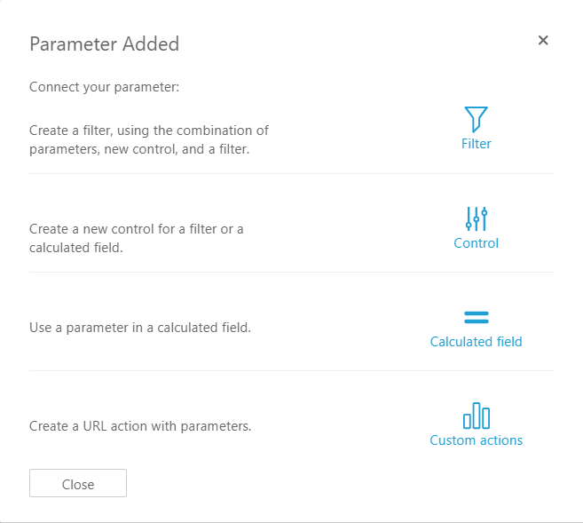
After you choose Create, it prompts you to create a control, a filter, a calculated field, or a custom action to use the parameter. Choose Control first.
This control is what the users see on the dashboard. Because we chose a String parameter type, we get the options to use a text box or a drop-down for our control. Choose Drop down.
Next, we need to tell Amazon QuickSight what the choices or values should be when using the drop-down. Although you can enter specific values manually, we can also link the values to a field from the data set. Doing this is useful if you want the choices or values in the drop-down menu to update whenever new values are added to a given column in your data. In other words, doing this makes the parameter values dynamic—as your data changes, so do the values in the drop-down.

After you choose Add, you see the control on the top of your analysis. If the Controls section is collapsed, click it and it will expand.
Now use the parameter somewhere. In this example, we use it in a filter. On the top of your screen, choose Filter and add a filter for the field you want this parameter to control. In this example, we use the segment field.

In the filter settings, change it to Custom Filter, select Use parameters, and then select the parameter we created earlier.

Note: After you check Use parameters, you might see a prompt asking if you want to change the scope of the filter to affect all visuals and sheets. If you want the filter to apply to all the visuals and sheets from the data set, then choose Yes. Otherwise, the filter only affects the visual that was selected when you created the filter.

Choose Apply on your filter. Now you can play around with the control, and it will filter all visuals that use that data set! Notice that when you change the values, your visuals are filtered.


This was a simple first example, where we added one parameter and one control to filter both visuals on our dashboard. You can repeat these steps to add more parameters, controls, and filters to your dashboard.
Use case 2: filtering across multiple data sets
In the last example, our parameter and control filtered all the visuals on our dashboard, and all our visuals shared the same data set. What if we use multiple data sets in our dashboard, and we want to filter across them using a single control? This is another great use of parameters.
Consider the dashboard following, which uses two data sets: SaaS Sales and Opportunity. They might be from the same type of data source (such as Amazon Redshift), or they might be from completely different data sources (such as Amazon Redshift and Microsoft Excel or Amazon Athena, and so on).

Very similar to the first use case, we create a parameter and a control. When creating the control and linking it to a field in the data set, choose the column that is common to the two data sets to be the values (in this example, we use Region). You can choose the column from either data set, or enter the values manually in the control defaults.

Now that we have our parameter and control created, we add a filter to each data set that references this parameter. Choose your first visual, which uses Data Set 1 (Web Orders), and add a filter for the column that represents State.

Repeat for the second visual, which uses data set 2 (Opportunity).

Now you have added both filters, you should see that your control now affects both visuals, even though they are using different data sets.

Use case 3: using parameters in calculated fields to allow users to select what column to display in a visual
Besides using them for filtering, you can use parameters and controls to drive all kinds of interactivity when you use them inside of calculated fields. In this example, we use an ifElse() statement inside a calculated field in a direct query data set to allow our users to select what metric they want to display in the visual or visuals. This is just one use case—there are myriad possibilities with using parameters along with calculated fields.
Going back to the visuals used in the first example, the situation is we now want to allow our users to select what metric is displayed in the KPI and bar chart. First step, we create a parameter and a control for KPIMetric. When creating the control, instead of choosing Link to a data set field, we choose Specific values. Then we type in the names of the fields that we want our users to choose among. The names don’t need to match the field names exactly—they can be more user-friendly.

Now we create a calculated field by choosing + CALCULATED FIELD.

The main concept here is to use the ifElse() function to look at what the user has selected in the parameter control and then return a metric accordingly. Following is the formula, along with what it looks like in the calculated field window.

The result of this calculation is a metric (a decimal field). We can drag this result to any field well that we like, and our parameter control drives which metric is actually plugged into it.


Finally, see how both visuals change when you change the parameter control.


In this example, we use the parameter to allow the user to select what metric was being plotted in the visual. Keep in mind that you can use this same technique to allow the user to select what dimension is used on a given axis or as the color grouping.
Use case 4: using parameters and URL actions to connect one dashboard to another
Another way to use parameters is to allow users to drill from one dashboard to another. You might have some summary metrics on your main dashboard but also have multiple other dashboards that contain more details about a given subject area. Being able to launch another dashboard and optionally send filter values by using the URL is a great way to organize drill paths for your users.
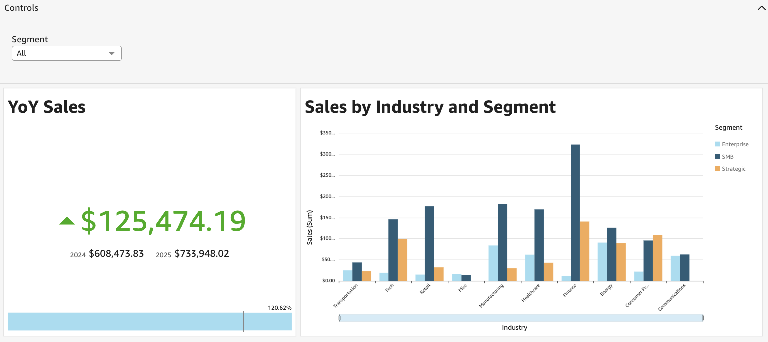
In this example, we launch a second dashboard from the first one and send a filter by using a parameter value in the URL. Consider a similar dashboard in use case 1, where we have YoY sales metrics along with sales by industry and segment on the same summary dashboard. I have a second dashboard that is dedicated to the sales order details and contains much more detail.
Dashboard 1:

Dashboard 2:

Go back to the analysis that was used to publish dashboard 1, click the pencil edit in the upper-right corner of the Sales by Industry and Segment visual. Go to the Interactions tab in the Properties. Setup the Actions as described below.

The Action name is what the user sees when they right click on the visual. The URL is the destination dashboard (dashboard 2 in our example). Both of these can accept dynamic values by adding fields using the + button on the right.
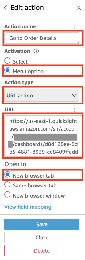

The example preceding takes the user to dashboard 2 but doesn’t apply any filters. If you want also to apply filters, we can add the parameters into the URL. For instance, if we have a parameter in dashboard 2 called Industry that is used as a filter, we can filter the dashboard by the URL like this:
https://us-east-1.quicksight.aws.amazon.com/sn/account/.../dashboards/...#p.Industry=<<Industry>>.Source=Feed
Let’s create a second URL action on that visual, which not only launches Dashboard 2, but also drills down to the Industry the user clicked in dashboard 1. (You could also add the week as a drilldown by creating parameters in each dashboard for the week and used them to filter the week field too.)

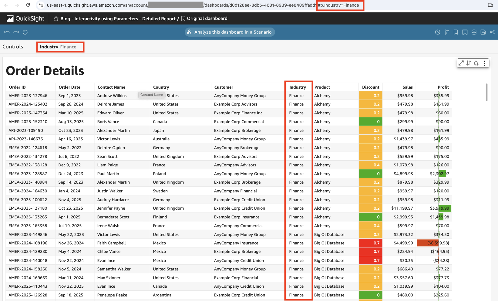
Let’s see what this looks like from dashboard 1. Notice that it dynamically passes in the Source value into Action name.

After we choose it, we go to Dashboard 2. The parameter is automatically set to Referral, which filters our whole dashboard to just Industry=Finance data.
Use case 5: using navigation actions to drill down into different sheets
Navigation actions are designed to take the user to other sheets based on a selection, often with filters. For example, these actions could take the user from a sheet with summary metrics to another sheet with more detail on the selected values. Parameters can be used to pass the selection criteria between different sheets in the same analysis.
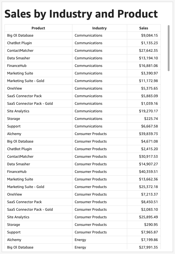
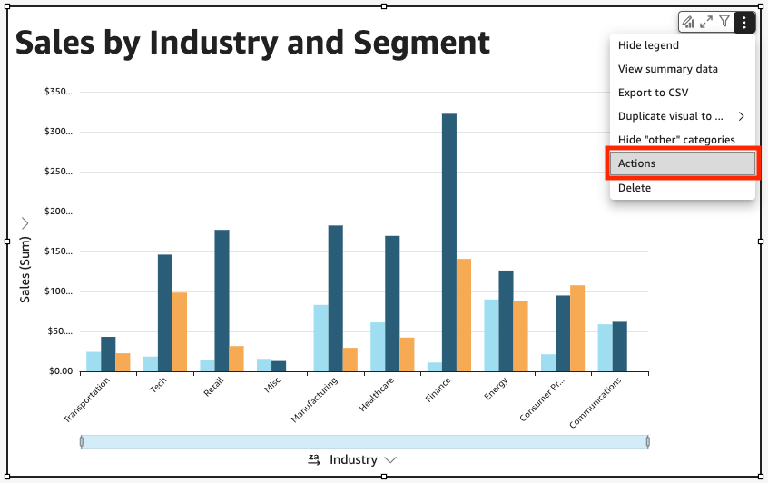
In this use case, we will consider a similar dashboard to the previous use cases. The first sheet (Sheet 1) describes the sales by industry and segment as seen in the previous use cases, whilst the second sheet (Sheet 2) provides further detail by depicting the sales by industry and product. We will create a navigation action which would allow the user to click on an industry on Sheet 1 and directly jump into Sheet 2 to discover more about the products involved with the selected industry.
Sheet 1:
Sheet 2:
Firstly, ensure that you have created a parameter as demonstrated in Use Case 1. Here, we will use a parameter called ‘Industry’ to drill down to a specific industry. As we are navigating from Sheet 1, we will click on the bar chart’s three dots on the right-hand corner and click Actions.
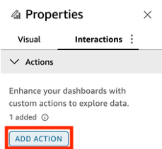
Click Add Action in the next window to start creating the navigation action.
After naming the navigation action, set the Action type to Navigation action. We will set the Target sheet to Sheet 2, as this is where we will be navigating to from Sheet 1.
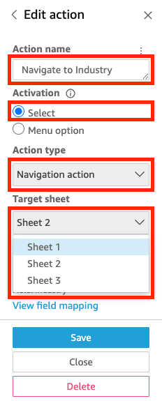
Under Parameters, click the + icon to add the parameter. This will open a new window in which you can select the Parameter and scope of values intended to be filtered. Here, we will select the Industry parameter and set the parameter value to Field: Industry.
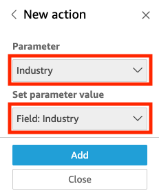
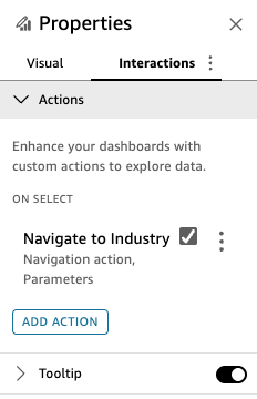
Click Add to finalize the creation. Afterwards, the navigation action should appear under Properties as below.
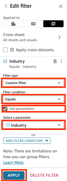
If you now try clicking on the graph in Sheet 1, you will notice how the created action will navigate us to Sheet 2. However, the visual in Sheet 2 will not drill down selected industry yet. To do this, we will set a filter to the visual in Sheet 2.
Click on the Filter icon in the top pane.
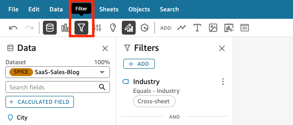
Click ‘+ADD’. Select the Industry field.
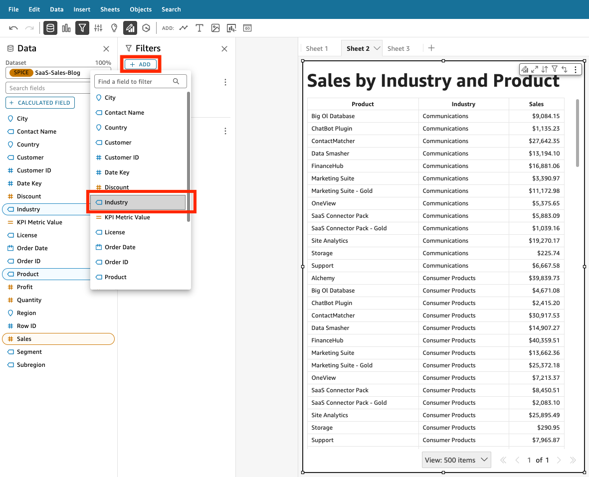
In the next window, set the Filter type to Custom filter, and tick the Use Parameters checkbox underneath. As with Use Case 1, a prompt may appear. If you want the filter to apply to all the visuals and sheets from the data set, you can simply click Yes. Afterwards, we will select the Industry parameter. Click Apply at the bottom of the window to finalize the filter creation.
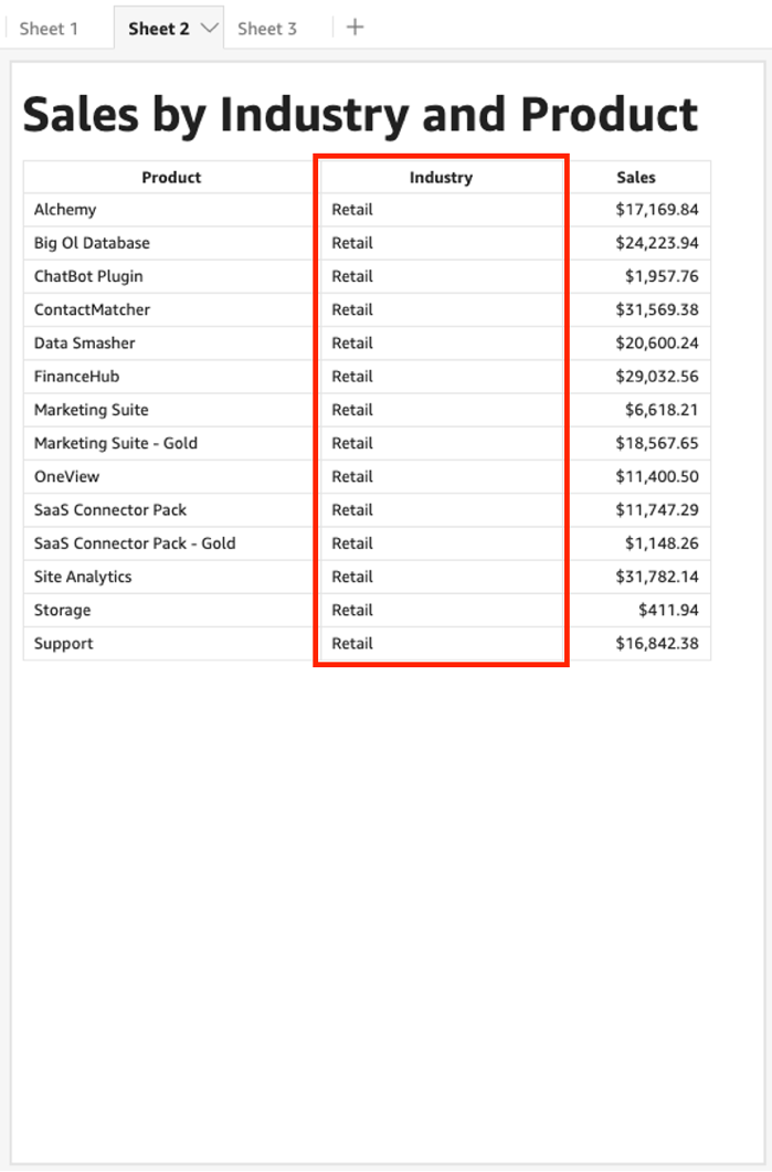
We will now head back to Sheet 1, and try clicking on a random industry. For example, we will try clicking on the Retail column.
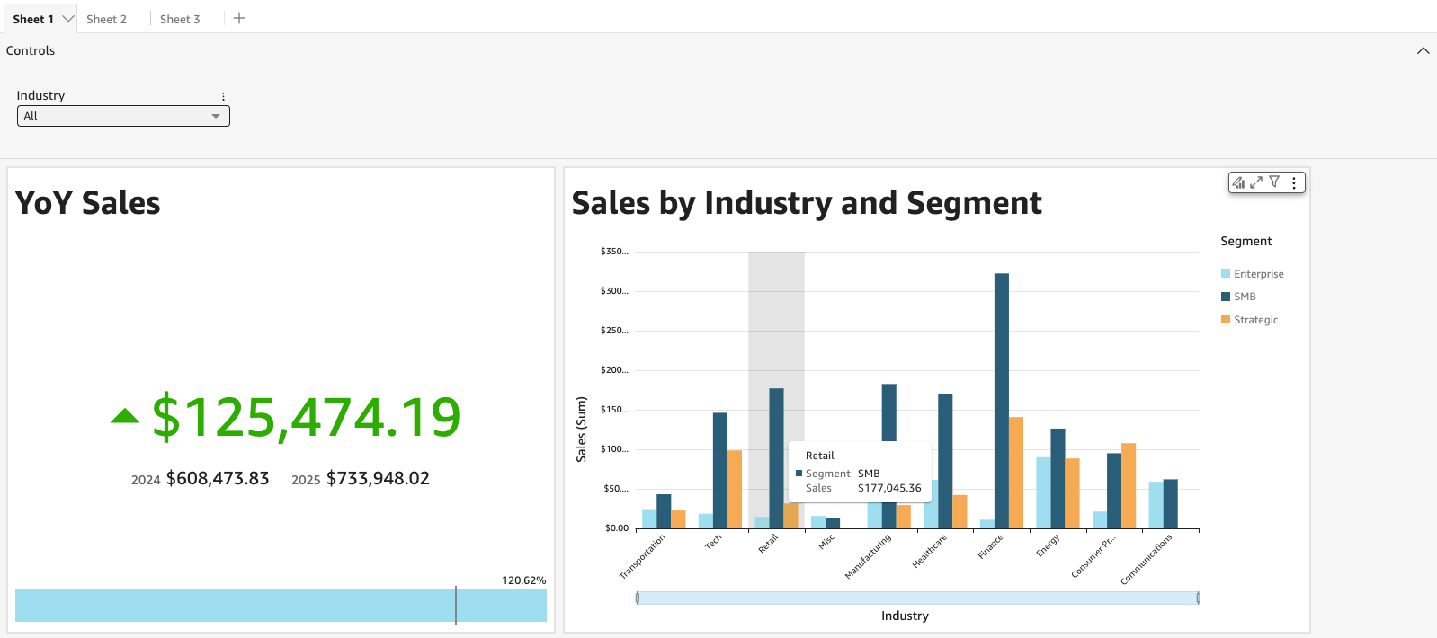
You will now notice how this will not only navigate us to Sheet 2, but also filters the graph in Sheet 2 to the values relevant to the Retail industry.
As such, parameters can be used in navigations actions to filter across different sheets. This makes it possible to access data between various sheets in the same dashboard.
Use Case 6: using parameters to create dynamic titles
Parameters can also be used throughout visuals to dynamically display titles and descriptions according to the selected data. This is useful when you wish to mention the selected category in the title to allow a quicker understanding of the visual.
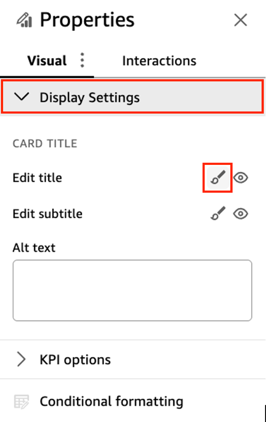
In this example, we will try modifying the visual’s title by adding parameters. We will head back to the visual used in Use Case 3 with the KPIMetric parameter. Click on ‘Format Visual’ on the top right-hand corner to open the Properties pane.
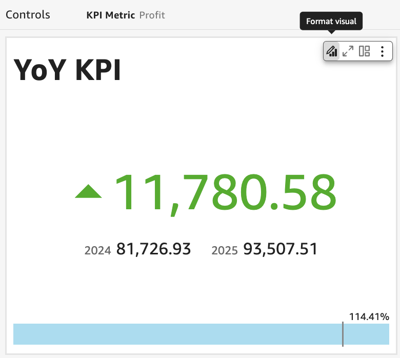
Open the drop-down menu for Display Settings. Click on the icon next to Edit title to start modifying the visual title.
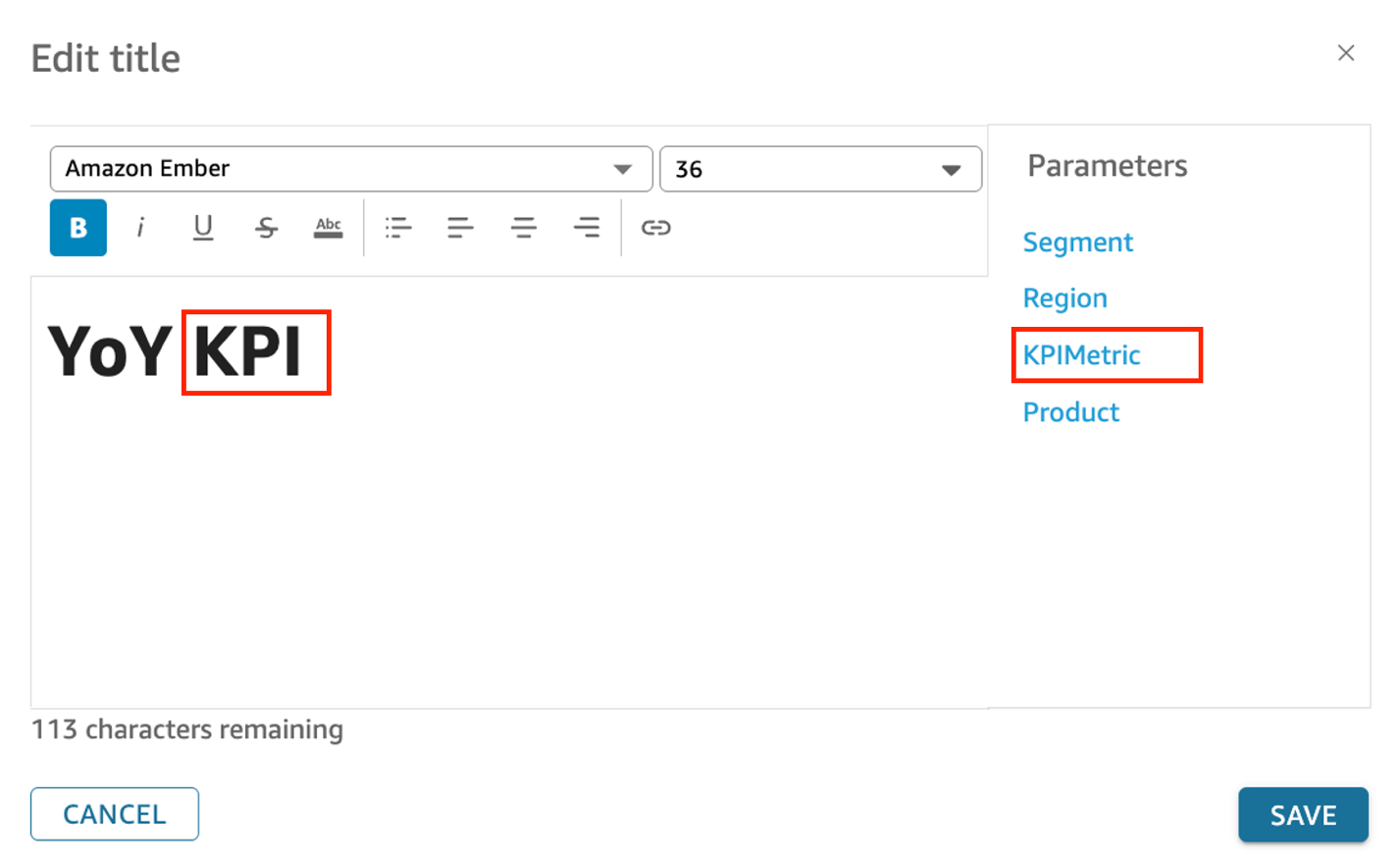
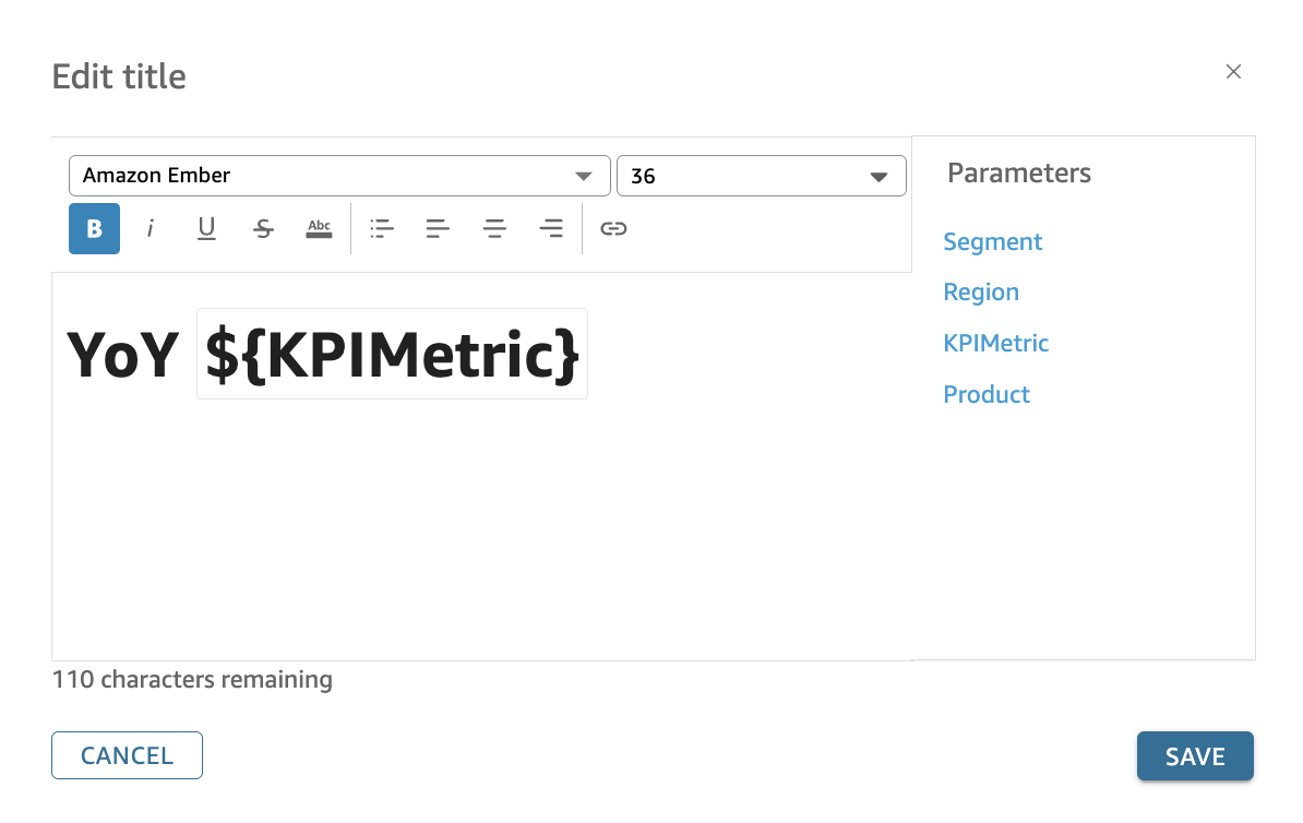
Select the desired parameter from the right pane to display in the visual title. In this example, we will replace KPI which is written in plain text with the KPIMetric parameter to allow the title to dynamically change according to the selected metric. Afterwards, click Save in the bottom right hand corner of the window to finalize the modification.
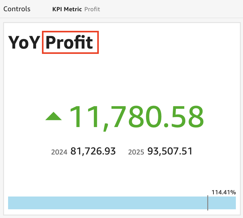
You should now notice how the visual title has dynamically shifted to the filtered KPI metric, instead of simply saying ‘YoY KPI’. As our visual is from where we left off in Use Case 3, the visual title now mentions ‘YoY Profit’ according to the selected KPI metric as seen in the screen shot below.
You can also leverage the similar mechanism to dynamically change the values of visual subtitles or descriptions, visual X and Y axis titles, control names, and sheet titles using parameters.
In summary, you can use parameters, on-screen controls, URL actions and navigation actions to create more engaging and interactive Amazon QuickSight dashboards. We saw some of the most common use cases in this blog post, and hope that these will be useful in your Amazon QuickSight journey.
Additional Reading
If you found this post useful, be sure to check out the blog on Perform secure database write-backs with Amazon QuickSight. You can use values, parameters from the dashboard to write back to the database.
About the Authors
 Debaprasun Chakraborty is an AWS Solutions Architect, specializing in the analytics domain. He has around 20 years of software development and architecture experience. He is passionate about helping customers in cloud adoption, migration and strategy.
 Christine Kim is an AWS Solutions Architect currently specialising in analytics with a competency in Amazon Quicksight. She has a strong interest in Business Intelligence, and is passionate about helping customers find value in how they store and manage data.
 Jesse Gebhardt is a senior global business development manager focused on analytics. He has spent over 10 years in the Business Intelligence industry. At AWS, he aids customers around the globe gain insight and value from the data they have stored in their data lakes and data warehouses. Jesse lives with his wife and mini Australian Shepherd in sunny Phoenix, and is an amateur electronic music producer.