AWS Public Sector Blog
Interactive access and visualization of geospatial data from the AWS Open Data Program

Open data is reshaping how we understand and respond to global challenges. From climate change to disaster recovery, the ability to access and analyze large-scale geospatial datasets is critical for scientific research, policy-making, and real-world applications. Leading the charge are several open data initiatives designed to lower access barriers and accelerate innovation: Open Data on AWS, the Amazon Sustainability Data Initiative (ASDI), and the Maxar Open Data Program on Amazon Web Services (AWS).
The AWS Open Data program and the ASDI work in tandem to democratize access to critical datasets that drive environmental research and innovation. Although the AWS Open Data program provides the foundational infrastructure by hosting a diverse range of datasets on AWS—from satellite imagery to machine learning (ML) benchmarks—ASDI specifically uses this framework to accelerate sustainability-focused research and solutions. Through strategic collaborations with organizations such as National Aeronautics and Space Administration (NASA), National Oceanic and Atmospheric Administration (NOAA), and the United Nations (UN), these programs support open access to essential environmental datasets including weather forecasts, satellite observations, air quality indices, and hydrological models. These datasets are stored in Amazon Simple Storage Service (Amazon S3), enabling cloud-based analysis without requiring massive local downloads. Researchers and developers can process data directly in the cloud using scalable tools such as Amazon Athena, Amazon SageMaker, and open source Python libraries, fostering solutions in critical areas such as climate resilience, renewable energy, conservation, and disaster risk management. Together, these complementary initiatives create a powerful ecosystem that enables global collaboration and drives real-world impact in addressing environmental challenges.
The Maxar Open Data program makes their data available through AWS Open Data and ASDI to provide high-resolution satellite imagery in the aftermath of natural disasters and humanitarian crises. Unlike continuous monitoring programs, Maxar’s initiative is event-driven—activated during emergencies such as hurricanes, wildfires, earthquakes, and conflicts. By releasing timely, publicly available imagery, Maxar empowers responders, analysts, and volunteers with actionable insights for damage assessment, response coordination, and recovery planning.
Together, these programs demonstrate the power of cloud-enabled open data to democratize access to geospatial information, promote global collaboration, and drive real-world impact. In this post, we demonstrate how to explore and visualize these datasets using interactive web applications and Jupyter notebooks.
Interactive web applications for geospatial data exploration
To make these datasets more accessible to a wider audience, we’ve developed two interactive web applications that demonstrate how to simplify data discovery and visualization across complex datasets. The tools are built with Python and modern web technologies, so users can explore AWS and Maxar open data directly in the browser.
ASDI Data Explorer demo
The ASDI Data Explorer demo provides a user-friendly interface for browsing and visualizing datasets available through ASDI and the broader AWS Open Data program. You can use the demo for catalog browsing with spatial and temporal filtering, SpatioTemporal Asset Catalog (STAC)-based search for satellite and environmental data, and interactive map-based visualization. This ASDI data Explorer demo is powered by Leafmap, an open source Python package for interactive visualization of geospatial data, and deployed using the Solara web framework on Hugging Face Spaces. The web app and the source code are available at:
The following image shows the demo interface.
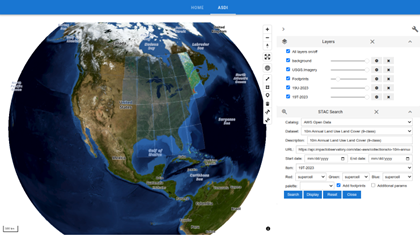
Figure 1: You can interactively search and visualize datasets made available through ASDI using the ASDI Data Explorer demo
To use the ASDI Data Explorer demo, follow these steps:
- Visit the ASDI Data Explorer demo.
- Choose the ASDI tab to launch the interactive map.
- Zoom and pan to your region of interest. Optionally, you can use the drawing tool to draw a polygon on the map to select a region of interest.
- In the STAC Search sidebar, choose AWS Open Data as the catalog source.
- Select a dataset (for example, 10m Annual Land Use Land Cover) and customize the date range as needed.
- Choose Search to search for the datasets. The footprints of the available datasets will be displayed on the map.
- Select an item from the search results and choose Display to overlay the data on the map.
- Use the Layers panel to adjust layer visibility and opacity.
- Repeat steps 2–8 to search and visualize other datasets or change the region of interest.
You can follow this workflow to access and explore complex geospatial datasets in a few clicks—ideal for educators, researchers, and analysts alike.
Maxar Open Data explorer
The Maxar Open Data explorer focuses on disaster response and humanitarian mapping by providing interactive access to event-based satellite imagery released through the Maxar Open Data program. You can use the explorer to browse available disaster events, view satellite image footprints on the map, and compare pre- and post-disaster imagery side by side. The explorer is powered by Leafmap and deployed using the Solara web framework on Hugging Face Spaces. The web app and the source code are available at:
The following image shows the Libya imagery.
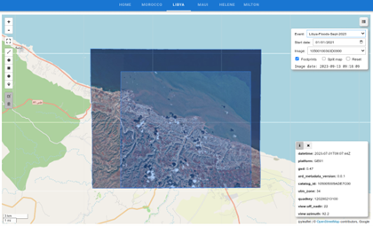
Figure 2: You can visualize and compare Maxar satellite imagery for disaster events using the Maxar Open Data explorer
To use the Maxar Open Data explorer, follow these steps:
- Visit the Maxar Open Data explorer.
- Choose a tab (for example, Libya) to view an event dataset.
- The application displays the imagery footprints on the map.
- Pick a start date (for example, September 2023) to filter the imagery taken after the start date.
- Hover over any footprint to view its metadata displayed in the information panel in the lower left corner.
- Select any footprint to view the satellite imagery.
- In the top right corner, select the icon for the Layer Manager to open the layers panel to control visibility and opacity.
- Select Split map to compare before-and-after images.
This tool is especially useful for emergency responders, humanitarian agencies, and open-source mapping communities involved in real-time crisis mapping and assessment.
Accessing and visualizing Maxar Open Data in Jupyter notebook
Before you can explore the datasets, you need to install Leafmap. Leafmap is a Python package that makes it straightforward to visualize and analyze geospatial data interactively. It provides seamless integration with Amazon S3, STAC catalogs, and various geospatial data formats. With Leafmap, you can create interactive maps, perform geospatial analysis, and visualize results—all within a few lines of Python code.
If you’re running this in a Jupyter notebook, you can enter the following cell:
%pip install leafmap
This will install Leafmap and its dependencies, including support for various geospatial data formats, cloud-optimized imagery, and interactive mapping capabilities.
If you’re working in Amazon SageMaker, enter the following command and then reload your browser tab to ensure the map widget functions correctly (refer to ipyleaflet GitHub issue for details):
!python3 -m pip install ipyvuetify ipyvue bqplot ipyvolume ipywebrtc ipyleaflet anywidget
You can download the complete Jupyter notebook containing the code examples from the aws-open-data-blogpost GitHub repository.
To access and visualize Maxar Open Data, you need to import the necessary libraries:
import leafmap
import geopandas as gpd
You’re importing leafmap for geospatial visualization and geopandas for working with geospatial data structures. GeoPandas extends the popular pandas library to handle geographic data efficiently.
Each collection in the Maxar Open Data catalog represents a single disaster event with associated satellite imagery. Enter the following code to explore which disaster events are available in the catalog:
leafmap.maxar_collections()
This function retrieves all available collections from the Maxar Open Data STAC catalog. The output will show you a list of disaster events, each with a unique collection ID you can use to access the specific imagery data.
Example 1: Turkey-Syria earthquake (February 2023)
This example focuses on the devastating earthquake that struck Turkey and Syria in February 2023. The collection ID for this event is Kahramanmaras-turkey-earthquake-23. You can retrieve the geographic footprints of all available satellite images for this event from the Maxar Open Data GitHub repository, which provides both GeoJSON and TSV formats.
collection = "Kahramanmaras-turkey-earthquake-23"
url = leafmap.maxar_collection_url(collection, dtype="geojson")
url
This function generates a URL pointing to the GeoJSON file containing the spatial footprints and metadata for all satellite images related to the Turkey earthquake event. The GeoJSON format is particularly useful because it includes both the geographic boundaries of each image and associated metadata.
To explore what’s available, load the data:
gdf = gpd.read_file(url)
print(f"Total number of images: {len(gdf)}")
gdf.head()
You’re using GeoPandas to read the remote GeoJSON file directly from the URL. The gdf.head() command shows the first few rows of the dataset, revealing important metadata columns such as:
geometry– The spatial footprint of each satellite imagecatalog_id– A unique identifier for grouping related imagesquadkey– Microsoft’s quadkey system for tile identificationtimestamp– When the image was capturedvisual– Direct download link to the satellite image
Use the following code to create an interactive map to visualize where all these satellite images are located geographically:
m = leafmap.Map()
m.add_gdf(gdf, layer_name="Footprints", zoom_to_layer=True)
m
This creates an interactive map, shown in the following image, centered on the earthquake region, with blue polygons showing the spatial coverage of each satellite image. You can zoom in, pan around, and select individual footprints to see their metadata. This visualization helps can help you understand the geographic extent of the available imagery and identify areas with dense coverage.
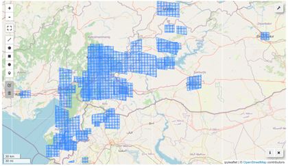
Figure 3: The interactive map shows the spatial coverage of the satellite images for the Turkey earthquake
The earthquake struck on February 6, 2023, making temporal analysis crucial for damage assessment. Separate the imagery into pre-event and post-event datasets using the earthquake date as the temporal boundary. First, get all images captured before the earthquake:
pre_gdf = leafmap.maxar_search(collection, end_date="2023-02-06")
print(f"Total number of pre-event images: {len(pre_gdf)}")
pre_gdf.head()
The leafmap.maxar_search() function allows you to filter the imagery collection by date. By setting end_date="2023-02-06", you can retrieve only images captured before the earthquake occurred. These pre-event images serve as the baseline for comparison.
Next, get all images captured after the earthquake:
post_gdf = leafmap.maxar_search(collection, start_date="2023-02-06")
print(f"Total number of post-event images: {len(post_gdf)}")
post_gdf.head()
By setting start_date="2023-02-06", you can retrieve all images captured from the earthquake date onwards. These post-event images will show the immediate aftermath and damage caused by the earthquake.
Create a comparative visualization showing both pre-event and post-event image footprints on the same map:
m = leafmap.Map()
pre_style = {"color": "red", "fillColor": "red", "opacity": 1, "fillOpacity": 0.5}
m.add_gdf(pre_gdf, layer_name="Pre-event", style=pre_style, info_mode="on_click", zoom_to_layer=True)
m.add_gdf(post_gdf, layer_name="Post-event", info_mode="on_click", zoom_to_layer=True)
m
In the following visualization, red polygons represent pre-earthquake imagery while blue polygons show post-earthquake coverage. As expected with Maxar’s event-driven data acquisition, there are more post-earthquake images, since imagery is typically captured in response to the event. The info_mode="on_click" parameter enables interactive information popups when you select any footprint. You can toggle layers on and off using the layer control panel, and the different colors help distinguish the temporal coverage patterns.
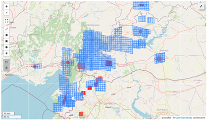
Figure 4: The interactive map shows the spatial coverage of pre-event (red) and post-event (blue) satellite images for the Turkey earthquake
To focus your analysis on a specific area, you can define a region of interest (ROI). You can either draw a polygon on the map using the drawing tools, or you can use predefined coordinates for a particularly affected area:
bbox = m.user_roi_bounds()
if bbox is None:
bbox = [36.8715, 37.5497, 36.9814, 37.6019]
The m.user_roi_bounds() function attempts to get the bounding box coordinates from any region you’ve drawn on the map. If no region is drawn, it falls back to predefined coordinates that cover a significantly impacted area near Kahramanmaraş. The bounding box format follows [min_longitude, min_latitude, max_longitude, max_latitude] convention.
To search for satellite images that specifically cover your region of interest, filter by both geographic bounds and temporal constraints. Find pre-earthquake images within your ROI:
pre_event = leafmap.maxar_search(collection, bbox=bbox, end_date="2023-02-06")
pre_event.head()
This search combines spatial filtering (using the bounding box) with temporal filtering (images before February 6, 2023). The result shows only images that both intersect your geographic area of interest and were captured before the earthquake.
Similarly, this code finds post-earthquake images within the same area:
post_event = leafmap.maxar_search(collection, bbox=bbox, start_date="2023-02-06")
post_event.head()
This gives us the corresponding post-earthquake imagery for the same geographic region, enabling direct before-and-after comparison.
Maxar organizes satellite images into tiles, where each tile can contain multiple individual images identified by unique quadkeys. Extract the tile identifiers you need for visualization:
pre_tile = pre_event["catalog_id"].values[0]
pre_tile
This gets the catalog ID for the first pre-event tile in your search results. The catalog ID serves as a unique identifier for a collection of related satellite images covering the same geographic area.
post_tile = post_event["catalog_id"].values[0]
post_tile
Similarly, this extracts the catalog ID for the post-event tile. Having both pre- and post-event tile IDs means you can create comparative visualizations.
To display these high-resolution satellite images efficiently in a web browser, you need to convert them to MosaicJSON format, which enables dynamic tiling and streaming:
pre_stac = leafmap.maxar_tile_url(collection, pre_tile, dtype="json")
pre_stac
This generates a MosaicJSON URL for the pre-event tile. MosaicJSON is a specification that allows multiple raster files to be presented as a single web-optimized layer, enabling efficient visualization of large satellite imagery datasets.
post_stac = leafmap.maxar_tile_url(collection, post_tile, dtype="json")
post_stac
Similarly, this creates the MosaicJSON URL for the post-event imagery. These URLs point to tile services that can stream the imagery directly to our interactive map.
Now comes the powerful part—creating a side-by-side comparison to visualize the earthquake’s impact:
m = leafmap.Map()
m.split_map(
left_layer=pre_stac,
right_layer=post_stac,
left_label="Pre-event",
right_label="Post-event",
)
m.set_center(36.9265, 37.5762, 16)
m
This creates an interactive split-screen map, shown in the following image, where you can view the area before the earthquake on the left side and, on right side, view the same area after the earthquake. Drag the vertical divider left or right to compare different parts of the scene. The images are synchronized so that both sides pan and zoom together, maintaining perfect geographic alignment.
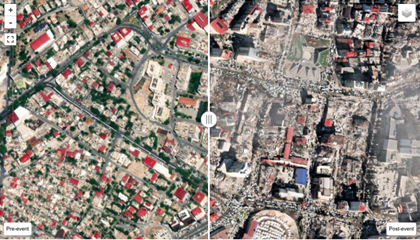
Figure 5: The split map shows the pre-event (left) and post-event (right) satellite images for the Turkey earthquake
If you need to perform detailed analysis or store images locally, you can download the original high-resolution imagery:
pre_images = pre_event["visual"].tolist()
post_images = post_event["visual"].tolist()
This extracts the direct download URLs from the filtered datasets. The “visual” column contains links to the processed, analysis-ready satellite images in RGB format that are optimized for visual interpretation.
Download the pre-event images:
leafmap.maxar_download(pre_images)
The leafmap.maxar_download() function handles the download process, saving images to your local directory with organized naming conventions. These high-resolution images can then be used for detailed damage assessment, ML training datasets, offline mapping applications, and scientific research and analysis.
# leafmap.maxar_download(post_images)
There are a lot more post-event images available for the Turkey earthquake. It might take a while to download all the images. Uncomment the preceding cell to download the post-event images if needed.
Example 2: Texas flooding (July 2025)
In July 2025, destructive and deadly flooding took place in the Texas Hill Country, particularly in Kerr County. This section explores how to visualize the Maxar imagery captured during this event. Enter the following code to examine this disaster event collection:
collection = "Texas-Flooding-July-2025"
url = leafmap.maxar_collection_url(collection, dtype="geojson")
gdf = gpd.read_file(url)
print(f"Total number of images: {len(gdf)}")
gdf.head()
This loads the footprints and metadata for all available satellite images captured during the Texas flooding event. You can visualize the spatial coverage of the imagery:
m = leafmap.Map()
m.add_gdf(gdf, layer_name="Footprints", zoom_to_layer=True)
m
The following image shows this spatial coverage.
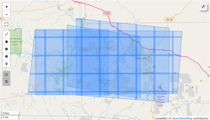
Figure 6: The interactive map shows the spatial coverage of the satellite images for the Texas flooding
For this event, you can examine the timing of image acquisitions:
sorted(gdf["datetime"])
Note that all the images were acquired after July 8, 2025, which is after the flooding event started on July 4, 2025. There are no pre-event images available for this event.
To check the unique catalog IDs, enter the following code:
gdf["catalog_id"].unique()
There are four unique catalog IDs, which means there are four tiles in this collection.
Because this collection only contains post-event imagery, we can create a comparison between a standard satellite basemap and the Maxar post-flooding imagery. You can use the first tile for demonstration:
post_tile = gdf["catalog_id"].unique()[0]
post_stac = leafmap.maxar_tile_url(collection, post_tile, dtype="json")
To create a split-map comparison showing standard satellite imagery alongside the flood imagery, enter the following code:
m = leafmap.Map()
m.split_map(
left_layer="Esri.WorldImagery",
right_layer=post_stac,
left_label="Standard imagery",
right_label="Post-flooding",
)
m.set_center(-99.573265, 30.751277, 7)
m
The following image shows the split-map comparison for the Texas flood imagery.
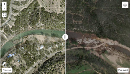
Figure 7: The split map shows the standard imagery (left) and post-flooding imagery (right) for the Texas flooding
Using this visualization, you can compare normal conditions (left side) with the flooding aftermath (right side), which helps identify affected areas, assess damage extent, and support emergency response efforts.
For offline analysis or detailed assessment, you can also download the high-resolution imagery:
post_images = gdf["visual"].tolist()
# leafmap.maxar_download(post_images)
This example demonstrates how Maxar Open Data provides rapid access to critical imagery during ongoing disasters, enabling real-time assessment and response coordination.
Conclusion
Access to high-quality geospatial data is no longer limited to technical experts with large computing resources. Thanks to collaborations between open data initiatives such as AWS Open Data, ASDI, and the Maxar Open Data program, coupled with intuitive tools such as Leafmap and Solara, anyone can explore and visualize critical Earth data in minutes.
Whether you’re a researcher investigating climate trends, a student exploring land cover dynamics, or a volunteer aiding in disaster mapping, these tools offer a powerful gateway to cloud-hosted open data—turning raw datasets into actionable insights.
The Registry of Open Data on AWS contains over 700 datasets available to the public. Check out the registry to learn if there are datasets available for you to use with your next project.