Artificial Intelligence
Automatically generate model evaluation metrics using SageMaker Autopilot Model Quality Reports
Amazon SageMaker Autopilot helps you complete an end-to-end machine learning (ML) workflow by automating the steps of feature engineering, training, tuning, and deploying an ML model for inference. You provide SageMaker Autopilot with a tabular data set and a target attribute to predict. Then, SageMaker Autopilot automatically explores your data, trains, tunes, ranks and finds the best model. Finally, you can deploy this model to production for inference with one click.
What’s new?
The newly launched feature, SageMaker Autopilot Model Quality Reports, now reports your model’s metrics to provide better visibility into your model’s performance for regression and classification problems. You can leverage these metrics to gather more insights about the best model in the Model leaderboard.
These metrics and reports that are available in a new “Performance” tab under the “Model details” of the best model include confusion matrices, an area under the receiver operating characteristic (AUC-ROC) curve and an area under the precision-recall curve (AUC-PR). These metrics help you understand the false positives/false negatives (FPs/FNs), tradeoffs between true positives (TPs) and false positives (FPs), as well as the tradeoffs between precision and recall to assess the best model performance characteristics.
Running the SageMaker Autopilot experiment
The Data Set
We use UCI’s bank marketing data set to demonstrate SageMaker Autopilot Model Quality Reports. This data contains customer attributes, such as age, job type, marital status, and others that we’ll use to predict if the customer will open an account with the bank. The data set refers to this account as a term deposit. This makes our case a binary classification problem – the prediction will either be “yes” or “no”. SageMaker Autopilot will generate several models on our behalf to best predict potential customers. Then, we’ll examine the Model Quality Report for SageMaker Autopilot’s best model.
Prerequisites
To initiate a SageMaker Autopilot experiment, you must first place your data in an Amazon Simple Storage Service (Amazon S3) bucket. Specify the bucket and prefix that you want to use for training. Make sure that the bucket is in the same Region as the SageMaker Autopilot experiment. You must also make sure that the Identity and Access Management (IAM) role Autopilot has permissions to access the data in Amazon S3.
Creating the experiment
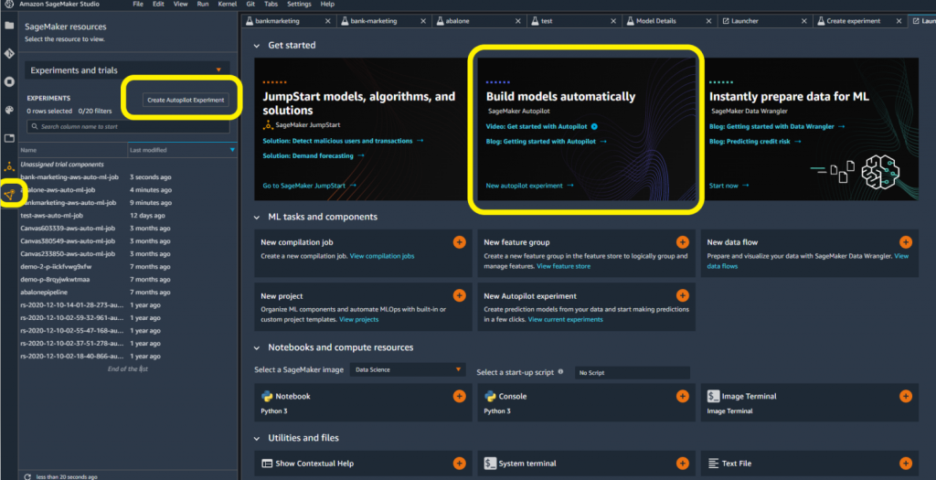
You have several options for creating a SageMaker Autopilot experiment in SageMaker Studio. By opening a new launcher, you may be able to access SageMaker Autopilot directly. If not, then you can select the SageMaker resources icon on the left-hand side. Next, you can select Experiments and trials from the drop-down menu.
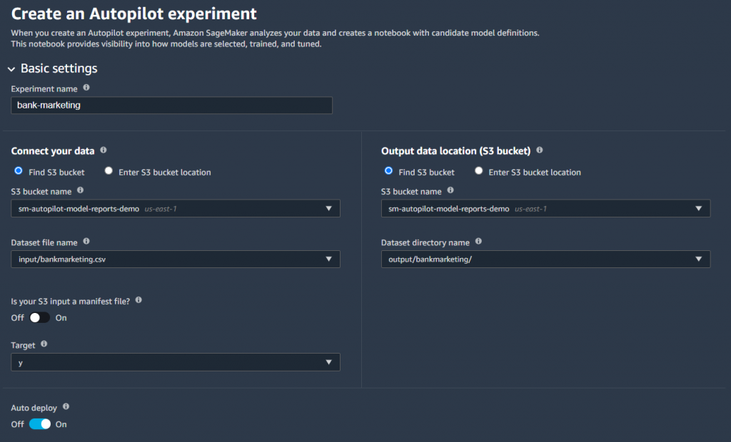
- Give your experiment a name.
- Connect to your data source by selecting the Amazon S3 bucket and file name.
- Choose the output data location in Amazon S3.
- Select the target column for your data set. In this case, we’re targeting the “y” column to indicate yes/no.
- Optionally, provide an endpoint name if you wish to have SageMaker Autopilot automatically deploy a model endpoint.
- Leave all of the other advanced settings as default, and select Create Experiment.
Once the experiment completes, you can see the results in SageMaker Studio. SageMaker Autopilot will present the best model among the different models that it trains. You can view details and results for different trials, but we’ll use the best model to demonstrate the use of Model Quality Reports.
- Select the model, and right-click to Open in model details.
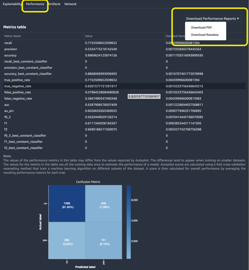
- Within the model details, select the Performance tab. This shows model metrics through visualizations and plots.
- Under Performance, select Download Performance Reports as PDF.
Interpreting the SageMaker Autopilot Model Quality Report
The Model Quality Report summarizes the SageMaker Autopilot job and model details. We’ll focus on the report’s PDF format, but you can also access the results as JSON. Because SageMaker Autopilot determined our data set as a binary classification problem, SageMaker Autopilot aimed to maximize the F1 quality metric to find the best model. SageMaker Autopilot chooses this by default. However, there is flexibility to choose other objective metrics, such as accuracy and AUC. Our model’s F1 score is 0.61. To interpret an F1 score, it helps to first understand a confusion matrix, which is explained by the Model Quality Report in the outputted PDF.
Confusion Matrix
A confusion matrix helps to visualize model performance by comparing different classes and labels. The SageMaker Autopilot experiment created a confusion matrix that shows the actual labels as rows, and the predicated labels as columns in the Model Quality Report. The upper-left box shows customers that didn’t open an account with the bank that were correctly predicted as ‘no’ by the model. These are true negatives (TN). The lower-right box shows customers that did open an account with the bank that were correctly predicted as ‘yes’ by the model. These are true positives (TP).
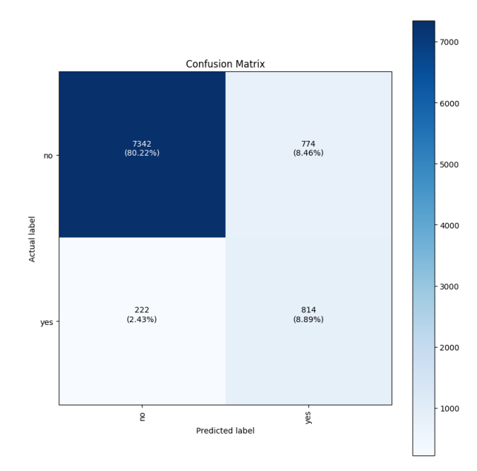
The bottom-left corner shows the number of false negatives (FN). The model predicted that the customer wouldn’t open an account, but the customer did. The upper-right corner shows the number of false positives (FP). The model predicted that the customer would open an account, but the customer did not actually do so.
Model Quality Report Metrics
The Model Quality Report explains how to calculate the false positive rate (FPR) and the true positive rate (TPR).
Recall or False Positive Rate (FPR) measures the proportion of actual negatives that were falsely predicted as opening an account (positives). The range is 0 to 1, and a smaller value indicates a better predictive accuracy.

Note that the FPR is also expressed as 1-Specificity, where Specificity or True Negative Rate (TNR) is the proportion of the TNs correctly identified as not opening an account (negatives).

Recall/Sensitivity/True Positive Rate (TPR) measures the fraction of actual positives that were predicted as opening an account. The range is also 0 to 1, and a larger value indicates a better predictive accuracy. This is also known as Recall/Sensitivity. This measure expresses the ability to find all of the relevant instances in a dataset.

Precision measures the fraction of actual positives that were predicted as positives out of all of those predicted as positive. The range is 0 to 1, and a larger value indicates better accuracy. Precision expresses the proportion of the data points that our model says was relevant and that were actually relevant. Precision is a good measure to consider, especially when the costs of FP is high – for example with email spam detection.

Our model shows a precision of 0.53 and a recall of 0.72.
F1 Score demonstrates our target metric, which is the harmonic mean of precision and recall. Because our data set is imbalanced in favor of many ‘no’ predictions, F1 takes both FP and FN into account to give the same weight to precision and recall.
The report explains how to interpret these metrics. This can help if you’re unfamiliar with these terms. In our example, precision and recall are important metrics for a binary classification problem, as they’re used to calculate the F1 score. The report explains that an F1 score can vary between 0 and 1. The best possible performance will score 1, whereas 0 will indicate the worst. Remember that our model’s F1 score is 0.61.

Fβ Score is the weighted harmonic mean of precision and recall. Moreover, the F1 score is the same as Fβ with β=1. The report provides the Fβ Score of the classifier, where β takes 0.5, 1, and 2.

Metrics Table
Depending on the problem, you may find that SageMaker Autopilot maximizes another metric, such as accuracy, for a multi-class classification problem. Regardless of the problem type, Model Quality Reports produce a table that summarizes your model’s metrics available both inline and in the PDF report. You can learn more about the metric table in the documentation.
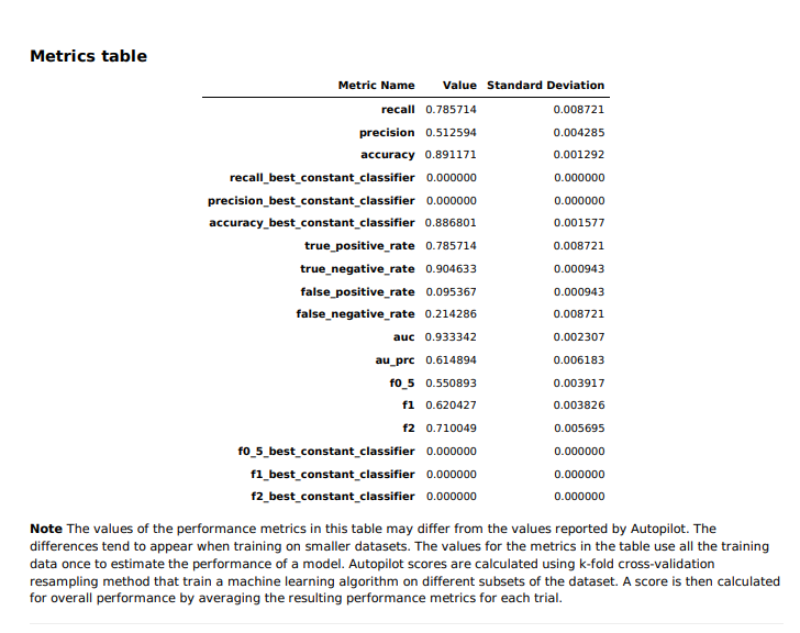
The best constant classifier – a classifier that serves as a simple baseline to compare against other more complex classifiers – always predicts a constant majority label that is provided by the user. In our case, a ‘constant’ model would predict ‘no’, since that is the most frequent class and considered to be a negative label. The metrics for the trained classifier models (such as f1, f2, or recall) can be compared to those for the constant classifier, i.e., the baseline. This makes sure that the trained model performs better than the constant classifier. Fβ scores (f0_5, f1, and f2, where β takes the values of 0.5, 1, and 2 respectively) are the weighted harmonic mean of precision and recall. This reaches its optimal value at 1 and its worst value at 0.
In our case, the best constant classifier always predicts ‘no’. Therefore, accuracy is high at 0.89, but the recall, precision, and Fβ scores are 0. If the dataset is perfectly balanced where there is no single majority or minority class, we would have seen much more interesting possibilities for the precision, recall, and Fβ scores of the constant classifier.
Furthermore, you can view these results in JSON format as shown in the following sample. Υou can access both the PDF and JSON files through the UI, as well as Amazon SageMaker Python SDK using the S3OutputPath element in OutputDataConfig structure in the CreateAutoMLJob/DescribeAutoMLJob API response.
{
  "version" : 0.0,
  "dataset" : {
    "item_count" : 9152,
    "evaluation_time" : "2022-03-16T20:49:18.661Z"
  },
  "binary_classification_metrics" : {
    "confusion_matrix" : {
      "no" : {
        "no" : 7468,
        "yes" : 648
      },
      "yes" : {
        "no" : 295,
        "yes" : 741
      }
    },
    "recall" : {
      "value" : 0.7152509652509652,
      "standard_deviation" : 0.00439996600081394
    },
    "precision" : {
      "value" : 0.5334773218142549,
      "standard_deviation" : 0.007335840278445563
    },
    "accuracy" : {
      "value" : 0.8969624125874126,
      "standard_deviation" : 0.0011703516093899595
    },
    "recall_best_constant_classifier" : {
      "value" : 0.0,
      "standard_deviation" : 0.0
    },
    "precision_best_constant_classifier" : {
      "value" : 0.0,
      "standard_deviation" : 0.0
    },
    "accuracy_best_constant_classifier" : {
      "value" : 0.8868006993006993,
      "standard_deviation" : 0.0016707401772078998
    },
    "true_positive_rate" : {
      "value" : 0.7152509652509652,
      "standard_deviation" : 0.00439996600081394
    },
    "true_negative_rate" : {
      "value" : 0.9201577131591917,
      "standard_deviation" : 0.0010233756436643213
    },
    "false_positive_rate" : {
      "value" : 0.07984228684080828,
      "standard_deviation" : 0.0010233756436643403
    },
    "false_negative_rate" : {
      "value" : 0.2847490347490348,
      "standard_deviation" : 0.004399966000813983
    },
………………….
ROC and AUC
Depending on the problem type, you may have varying thresholds for what’s acceptable as an FPR. For example, if you’re trying to predict if a customer will open an account, then it may be more acceptable to the business to have a higher FP rate. It can be riskier to miss extending offers to customers who were incorrectly predicted ‘no’, as opposed to offering customers who were incorrectly predicted ‘yes’. Changing these thresholds to produce different FPRs requires you to create new confusion matrices.
Classification algorithms return continuous values known as prediction probabilities. These probabilities must be transformed into a binary value (for binary classification). In binary classification problems, a threshold (or decision threshold) is a value that dichotomizes the probabilities to a simple binary decision. For normalized projected probabilities in the range of 0 to 1, the threshold is set to 0.5 by default.
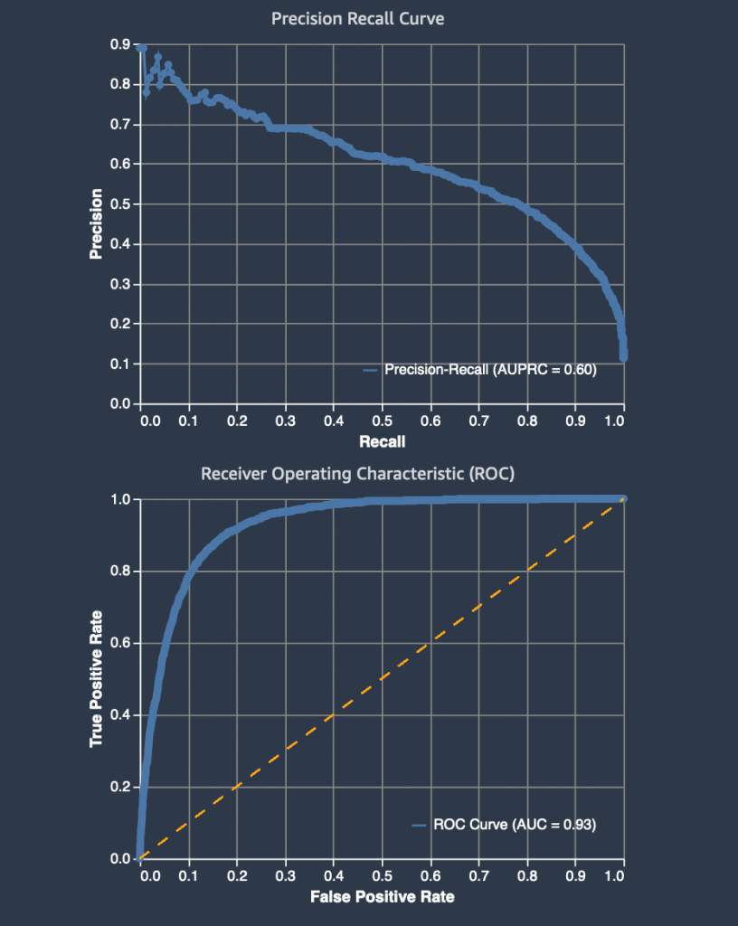
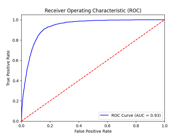
For binary classification models, a useful evaluation metric is the area under the Receiver Operating Characteristic (ROC) curve. The Model Quality Report includes a ROC graph with the TP rate as the y-axis and the FPR as the x-axis. The area under the receiver operating characteristic (AUC-ROC) represents the trade-off between the TPRs and FPRs.
You create a ROC curve by taking a binary classification predictor, which uses a threshold value, and assigning labels with prediction probabilities. As you vary the threshold for a model, you cover from the two extremes. When the TPR and the FPR are both 0, it implies that everything is labeled “no”, and when both the TPR and FPR are 1 it implies that everything is labeled “yes”.
A random predictor that labels “Yes” half of the time and “No” the other half of the time would have a ROC that’s a straight diagonal line (red-dotted line). This line cuts the unit square into two equally-sized triangles. Therefore, the area under the curve is 0.5. An AUC-ROC value of 0.5 would mean that your predictor was no better at discriminating between the two classes than randomly guessing whether a customer would open an account or not. The closer the AUC-ROC value is to 1.0, the better its predictions are. A value below 0.5 indicates that we could actually make our model produce better predictions by reversing the answer that it gives us. For our best model, the AUC is 0.93.
Precision Recall Curve
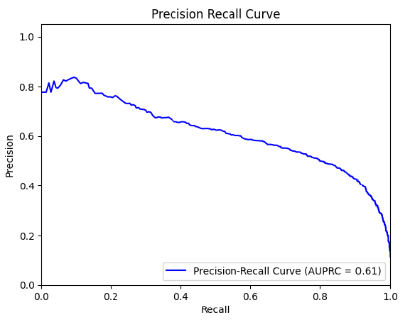
The Model Quality Report also created a Precision Recall (PR) Curve to plot the precision (y-axis) and the recall (x-axis) for different thresholds – much like the ROC curve. PR Curves, often used in Information Retrieval, are an alternative to ROC curves for classification problems with a large skew in the class distribution.
For these class imbalanced datasets, PR Curves especially become useful when the minority positive class is more interesting than the majority negative class. Remember that our model shows a precision of 0.53 and a recall of 0.72. Furthermore, remember that the best constant classifier can’t discriminate between ‘yes’ and ‘no’. It would predict a random class or a constant class every time.
The curve for a balanced dataset between ‘yes’ and ‘no’ would be a horizontal line at 0.5, and thus would have an area under the PR curve (AUPRC) as 0.5. To create the PRC, we plot various models on the curve at varying thresholds, in the same way as the ROC curve. For our data, the AUPRC is 0.61.
Model Quality Report Output
You can find the Model Quality Report in the Amazon S3 bucket that you specified when designating the output path before running the SageMaker AutoPilot experiment. You’ll find the reports under the documentation/model_monitor/output/<autopilot model name>/ prefix saved as a PDF.

Conclusion
SageMaker Autopilot Model Quality Reports makes it easy for you to quickly see and share the results of a SageMaker Autopilot experiment. You can easily complete model training and tuning using SageMaker Autopilot, and then reference the generated reports to interpret the results. Whether you end up using SageMaker Autopilot’s best model, or another candidate, these results can be a helpful starting point to evaluating a preliminary model training and tuning job. SageMaker Autopilot Model Quality Reports helps reduce the time needed to write code and produce visuals for performance evaluation and comparison.
You can easily incorporate autoML into your business cases today without having to build a data science team. SageMaker documentation provides numerous samples to help you get started.
About the Authors
 Peter Chung is a Solutions Architect for AWS, and is passionate about helping customers uncover insights from their data. He has been building solutions to help organizations make data-driven decisions in both the public and private sectors. He holds all AWS certifications as well as two GCP certifications. He enjoys coffee, cooking, staying active, and spending time with his family.
 Arunprasath Shankar is an Artificial Intelligence and Machine Learning (AI/ML) Specialist Solutions Architect with AWS, helping global customers scale their AI solutions effectively and efficiently in the cloud. In his spare time, Arun enjoys watching sci-fi movies and listening to classical music.
 Ali Takbiri is an AI/ML specialist Solutions Architect, and helps customers by using Machine Learning to solve their business challenges on the AWS Cloud.
 Pradeep Reddy is a Senior Product Manager in the SageMaker Low/No Code ML team, which includes SageMaker Autopilot, SageMaker Automatic Model Tuner. Outside of work, Pradeep enjoys reading, running and geeking out with palm sized computers like raspberry pi, and other home automation tech.