AWS Cloud Financial Management
AWS Billing and Cost Management Introduces Managed Dashboards for Instant Cloud Financial Visibility
We’re excited to announce Managed Dashboards in AWS Billing and Cost Management (BCM). Starting today, a collection of preconfigured, read-only dashboards appear automatically in your BCM Dashboards list. They are populated with your account data and ready to deliver actionable cost insights the moment you open them. No widget selection, no configuration, no layout decisions. You get five curated dashboards covering three layers of cloud financial visibility. Cost Overview and Trends tracks your spending patterns and forecasts. Two service category dashboards (Compute and Database) provide detailed breakdowns of your largest cost drivers. Two commitment dashboards (Reservations, Savings Plans) monitor how well your purchased commitments are performing. Whether you’re a FinOps practitioner running daily analysis, a finance executive preparing board reports, or an infrastructure lead looking for optimization opportunities, Managed Dashboards give you immediate visibility into your cloud spending.
Why Managed Dashboards
BCM Dashboards give you powerful capabilities to build custom views of your cost and usage data, combining AWS Cost Explorer reports with Savings Plans and Reserved Instance metrics, AWS Budgets widget, and more. Managed Dashboards make these capabilities instantly accessible by providing curated starting points that reflect how thousands of organizations structure their cost reporting. A FinOps practitioner wanting to understand commitment performance no longer needs to build separate widgets for each service. They open the Reservations dashboard and see coverage and utilization across Amazon Elastic Compute Cloud (Amazon EC2), Amazon Relational Database Service (Amazon RDS), Amazon ElastiCache, Amazon OpenSearch Service, etc. in one view. A finance executive needing a spending summary opens Cost Overview and Trends and gets 12 months of trends with forecasts, ready to export as PDF for their next meeting.
Managed Dashboards also introduce you to widget types you might not have explored yet. If you started using BCM Dashboards early on, you may only be familiar with cost widgets. Managed Dashboards showcase Savings Plans utilization, Reserved Instance coverage, and cost breakdowns, expanding your toolkit for building custom dashboards tailored to your needs.
What You Get
Five Managed Dashboards organized around three layers of analysis appear automatically in your dashboard list.
Cost and Usage Trends
Cost Overview and Trends serves as your financial summary. It tracks spending across services, accounts, regions, charge types, and billing entities over 12 months, and includes forward looking forecasts. This is the dashboard you open for monthly reviews, executive briefings, or when you want to understand your overall spending trajectory at a glance.
Key Service Categories
Two dashboards cover your largest and fastest growing cost drivers with service specific depth.
- Compute shows your EC2, Amazon Elastic Container Service, Amazon Elastic Kubernetes Service, AWS Lambda, and other compute costs broken down by instance type, platform, and availability zone, paired with Savings Plans and Reserved Instance utilization and coverage. You can see where compute spend is concentrated, identify rightsizing opportunities, and evaluate whether your commitments are well matched to your workloads.
- Database covers RDS, ElastiCache, OpenSearch, Amazon DynamoDB, Amazon Redshift, and other data services with breakdowns by database engine, instance type, purchase option, and usage type. Per service Reserved Instance coverage and Savings Plans coverage widgets show you exactly where commitment gaps exist across your database portfolio.
Commitment Reporting
Reservations gives you a consolidated view of Reserved Instance performance across all Reserved Instances eligible services. Each service is shown with its cost by instance type alongside its utilization and coverage metric, so you can scan all services at once and identify where coverage gaps or underutilization exists.
Savings Plans does the same for your Savings Plans portfolio across all four types: Compute, EC2 Instance, Database, and SageMaker. You see utilization and coverage for each alongside on-demand spend composition, helping you assess whether your commitments are optimally sized.
How Managed Dashboards Work
Managed Dashboards appear in your dashboard list alongside your custom and shared dashboards. You’ll notice them marked with a lock icon indicating they are read only, and you can filter to see only Managed Dashboards using the dedicated “Managed” tab.
Viewing and Exploring
Open any Managed Dashboard and you will see your account data rendered across all widgets. You can temporarily adjust widget filters and layout while viewing, for example changing a time range to focus on a specific period. These adjustments are not saved, and the dashboard returns to its original configuration when you navigate away. This ensures a consistent baseline that’s always available in its intended form.
Duplicating and Customizing
If a Managed Dashboard closely matches what you need, you can duplicate it as a custom dashboard with a single click. This creates an independent copy that you fully own and can modify: add widgets, change time ranges, apply cost allocation tags, adjust dimensions, or rearrange the layout. You can also add individual widgets from any Managed Dashboard into your existing custom dashboards without duplicating the entire dashboard.
Exporting and Sharing
You can export an entire Managed Dashboard as a PDF. You can also export any individual widget on its own, either as a PDF or as a CSV download for further analysis. Once you duplicate a Managed Dashboard as a custom copy, you can schedule email delivery to stakeholders and share it with other accounts, giving you full reporting capabilities starting from an expert foundation.
Example Walkthrough
Let’s walk through a typical scenario. Arya is a FinOps practitioner who has just joined a new organization, and her first task is the one every FinOps hire starts with: establish a baseline. What are we spending, where is it going, is it under control, and what should we fix first? Normally she would spend her first week building reports before she could answer any of that.
Step 1: Starting with Managed Dashboards
Instead, Arya opens BCM Dashboards and finds five dashboards already waiting for her under the Managed tab (Figure 1). They follow the way FinOps work actually progresses: one dashboard to inform, two to investigate her largest service categories, and two to check how the commitments the organization already owns are performing. She has not created a widget, chosen a dimension, or set a date range. She starts where every baseline starts, with the overall picture.
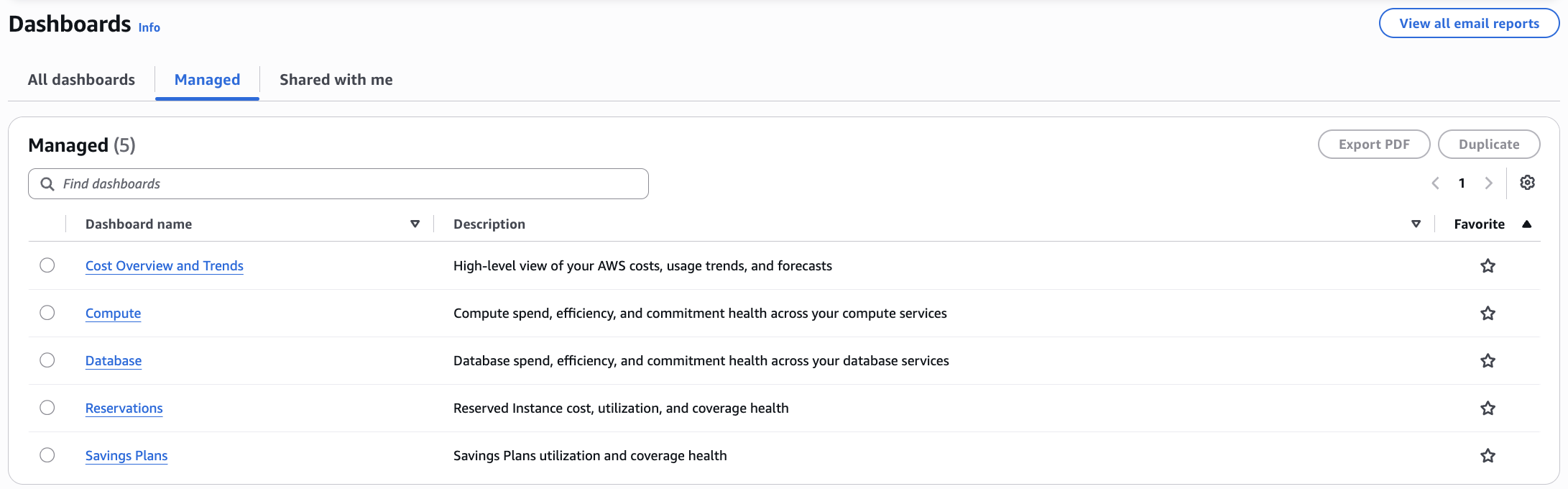
Figure 1: Managed Dashboards appear automatically in your dashboard list, ready to explore without any setup.
Step 2: Understanding the Big Picture
Cost Overview and Trends dashboard opens with her account data already rendered (Figure 2). Twelve months of spend, a forecast carried forward with an 80% prediction interval, and one detail that reframes everything else on the page: almost the entire monthly bill is On Demand, with only a thin layer of Savings Plans and Reserved coverage underneath it. Spend is growing, the forecast says it keeps growing, and none of that growth is discounted. Budget health tells her how much room she has to work with, and several budgets are already past their limits, so this is not a next quarter problem. Two minutes in, having configured nothing, Arya has a baseline and a hypothesis: the fastest money here is not in cutting usage, it is in paying a better rate for the usage the organization is already running.
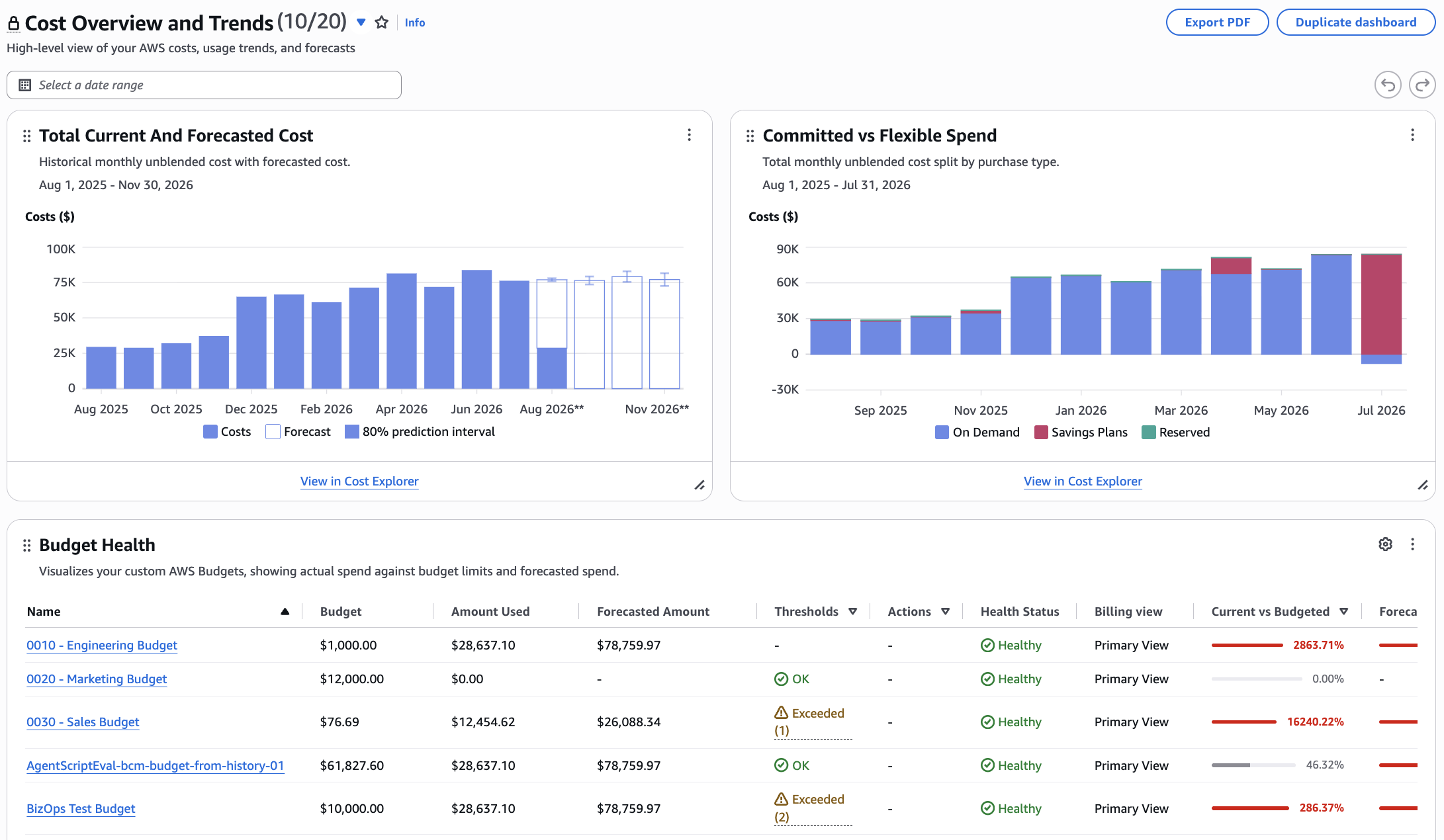
Figure 2: Cost Overview & Trends delivers a complete financial picture with spending trends, forecasts, commitments, budget health and service level breakdowns.
Step 3: Investigating Compute Costs
Before she recommends buying anything, Arya has to know whether the growth is durable, because a commitment made against a temporary spike becomes a liability. She starts with Compute dashboard (Figure 3), where usage is measurable in running hours and where commitments apply most broadly. The pattern is unambiguous: running hours have climbed month over month while the cost per hour has held. This is genuine usage growth rather than a pricing change, and the higher run rate is likely to persist. A handful of instance families account for most of it. That leaves her with two recommendations rather than one, aimed at different owners: rightsize the concentrated families with the engineering teams, and cover the steady baseline underneath them with a commitment. The Database dashboard is structured the same way, so she can run the identical read against her data services next.
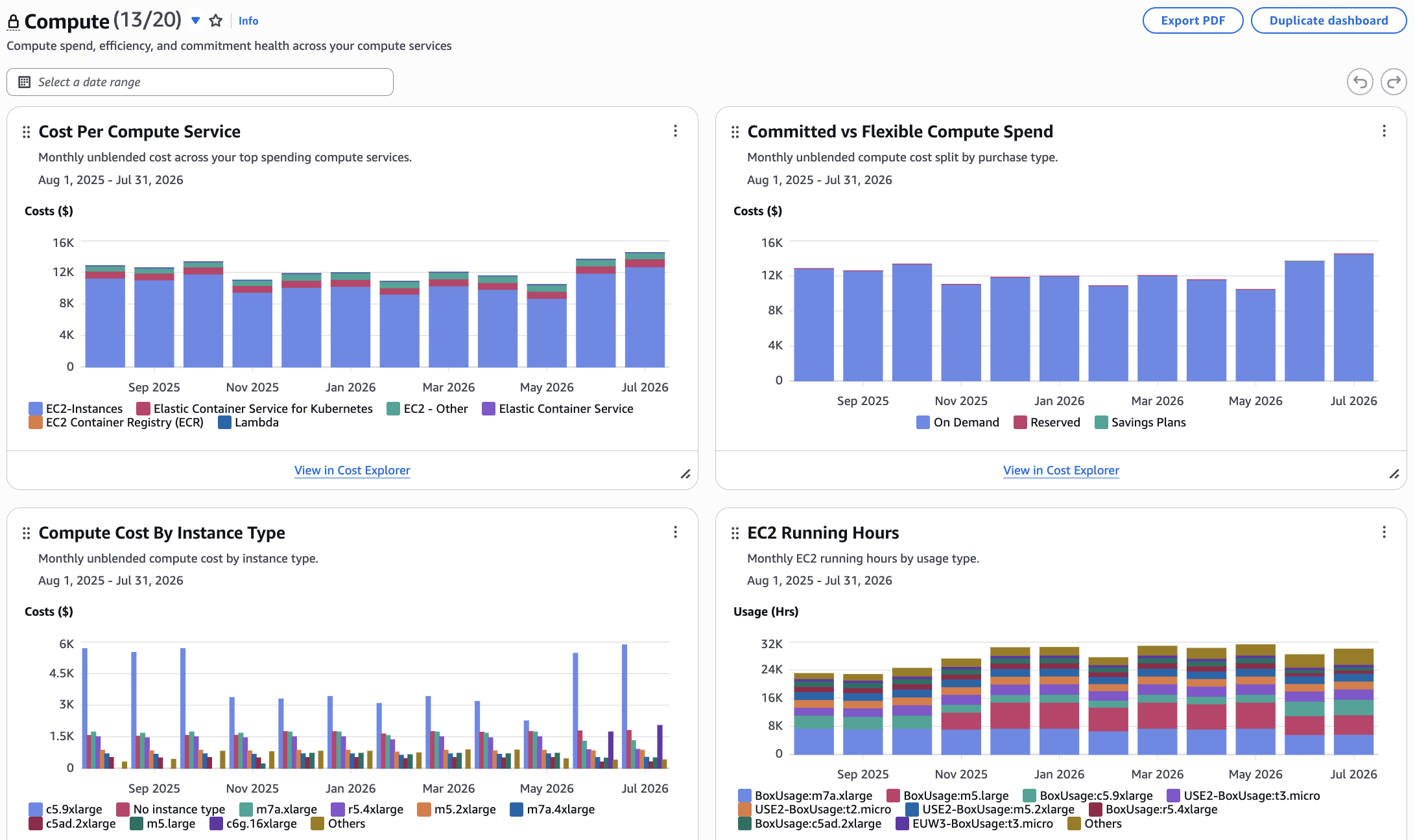
Figure 3: The Compute dashboard pairs cost breakdowns by service, instance type, and running hours with on demand spend visibility.
Step 4: Confirming the Savings Opportunity
The last thing to check is what the organization already owns, and this is where Arya finds the part nobody mentioned in her onboarding. On the Savings Plans dashboard (Figure 4) she can see every plan on the account with its type, scope, commitment and how much of that commitment is actually being consumed. Some plans have lapsed and others are barely used. A share of the coverage gap she found is not a purchasing problem at all. It is a renewal and tracking problem. The uncovered spend that genuinely remains is concentrated in a few services rather than spread thin, so a commitment can be aimed instead of hedged. She now has a defensible number: the steady, uncovered baseline she is confident will still be there in a year, which is the only part of the bill worth committing to.
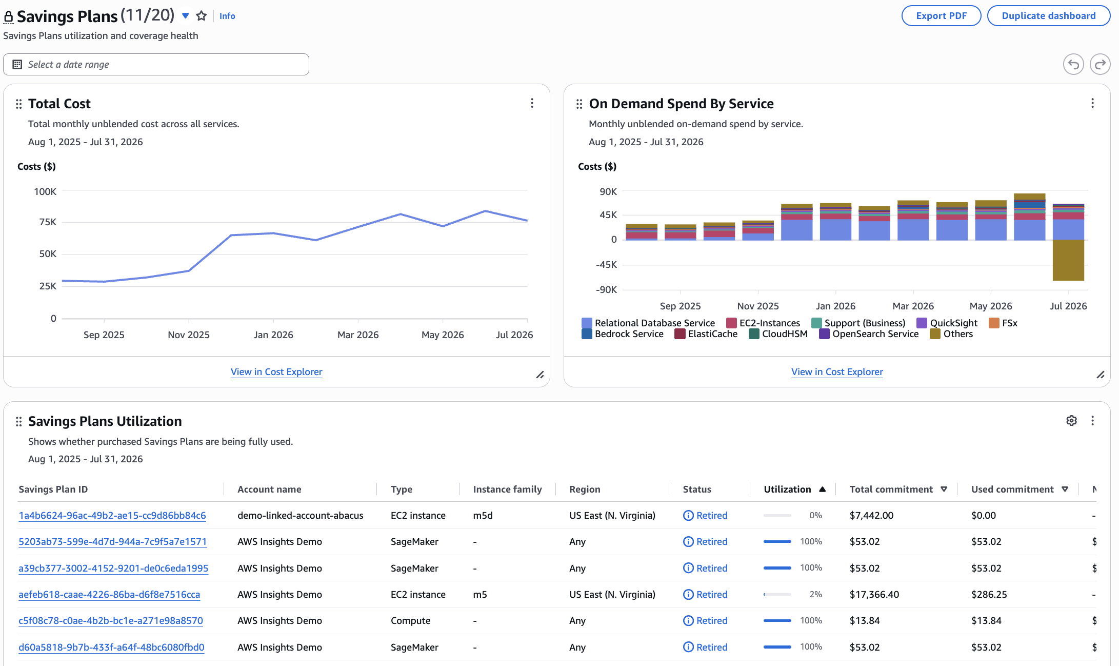
Figure 4: The Savings Plans dashboard shows utilization and coverage across all plan types alongside on demand spend composition.
Step 5: Taking Action
In one session, without building anything, Arya has gone from no visibility to a recommendation she can defend in front of leadership: renew what lapsed, rightsize a named set of instance families, and commit to the baseline underneath. Then she makes it repeatable. She duplicates the Compute dashboard into one she owns, applies her team’s cost allocation tags so each business unit sees its own spend, and schedules a weekly email to her VP. Her recurring report starts from an expert baseline rather than a blank canvas, and because the Managed Dashboard itself stays as it was, the number she quotes in a meeting is the same number everyone else sees.
Getting Started
AWS Managed Dashboards require no setup or configuration. They are automatically available in your BCM Dashboards list today. Simply navigate to AWS Billing and Cost Management, select “Dashboards” from the left navigation, and you’ll see Managed Dashboards alongside your existing custom dashboards.
Available in all commercial AWS Regions at no additional cost. To get started, navigate to Dashboards in the AWS Billing and Cost Management console or view the user guide.