Artificial Intelligence
Measuring forecast model accuracy to optimize your business objectives with Amazon Forecast
September 2021: This blog has been updated to include three recently launched accuracy metrics in Amazon Forecast and the ability to select an accuracy metric to optimize AutoML.
We’re excited to announce that you can now measure the accuracy of your forecasting model to optimize the trade-offs between under-forecasting and over-forecasting costs, giving you flexibility in experimentation. Costs associated with under-forecasting and over-forecasting differ. Generally, over-forecasting leads to high inventory carrying costs and waste, whereas under-forecasting leads to stock-outs, unmet demand, and missed revenue opportunities. Amazon Forecast allows you to optimize these costs for your business objective by providing an average forecast as well as a distribution of forecasts that captures variability of demand from a minimum to maximum value. With this launch, Forecast now provides accuracy metrics for multiple distribution points when training a model, allowing you to quickly optimize for under-forecasting and over-forecasting without the need to manually calculate metrics.
Retailers rely on probabilistic forecasting to optimize their supply chain to balance the cost of under-forecasting, leading to stock-outs, with the cost of over-forecasting, leading to inventory carrying costs and waste. Depending on the product category, retailers may choose to generate forecasts at different distribution points. For example, grocery retailers choose to over-stock staples such as milk and eggs to meet variable demand. While these staple foods have relatively low carrying costs, stock-outs may not only lead to a lost sale, but also a complete cart abandonment. By maintaining high in-stock rates, retailers can improve customer satisfaction and customer loyalty. Conversely, retailers may choose to under-stock substitutable products with high carrying costs when the cost of markdowns and inventory disposal outweighs the occasional lost sale. The ability to forecast at different distribution points allows retailers to optimize these competing priorities when demand is variable.
Anaplan Inc., a cloud-native platform for orchestrating business performance, has integrated Forecast into its PlanIQ solution to bring predictive forecasting and agile scenario planning to enterprise customers. Evgy Kontorovich, Head of Product Management, says, “Each customer we work with has a unique operational and supply chain model that drives different business priorities. Some customers aim to reduce excess inventory by making more prudent forecasts, while others strive to improve in-stock availability rates to consistently meet customer demand. With forecast quantiles, planners can evaluate the accuracy of these models, evaluate model quality, and fine-tune them based on their business goals. The ability to assess the accuracy of forecast models at multiple custom quantile levels further empowers our customers to make highly informed decisions optimized for their business.”
Although Forecast provided the ability to forecast at the entire distribution of variability to manage the trade-offs of under-stocking and over-stocking, the accuracy metrics were only provided for the minimum, median, and maximum predicted demand, providing an 80% confidence band centered on the median. To evaluate the accuracy metric at a particular distribution point of interest, you first had to create forecasts at that point, and then manually calculate the accuracy metrics on your own.
With today’s launch, you can assess the strengths of your forecasting models at any distribution point within Forecast without needing to generate forecasts and manually calculate metrics. This capability enables you to experiment faster, and more cost-effectively arrive at a distribution point for your business needs.
To use this new capability, you select forecast types (or distribution points) of interest when creating the predictor. Forecast splits the input data into training and testing datasets, trains and tests the model created, and generates accuracy metrics for these distribution points. You can continue to experiment to further optimize forecast types without needing to create forecasts at each step.
Understanding Forecast accuracy metrics
Forecast provides different model accuracy metrics for you to assess the strength of your forecasting models. We provide the weighted quantile loss (wQL) metric for each selected distribution point, the average weighted quantile loss (Average wQL) of all selected distribution points, and weighted absolute percentage error (WAPE), mean absolute percentage error (MAPE), mean absolute scaled error (MASE), and root mean square error (RMSE), calculated at the mean forecast. For each metric, a lower value indicates a smaller error and therefore a more accurate model. All these accuracy metrics are non-negative.
Let’s take an example of a retail dataset as shown in the following table to understand these different accuracy metrics. In this dataset, three items are being forecasted for 2 days.
| Item ID | Remarks | Date | Actual Demand | Mean Forecast | P75 Forecast |
P75 Error (P75 Forecast – Actual) |
Mean Absolute error |Actual – Mean Forecast| |
Mean Squared Error (Actual – Mean Forecast)2 |
| Item1 | Item 1 is a popular item with a lot of product demand | Day 1 | 200 | 195 | 220 | 20 | 5 | 25 |
| Day 2 | 100 | 85 | 90 | -10 | 15 | 225 | ||
| Item2 | With low product demand, Item 2 is in the long tail of demand | Day 1 | 1 | 2 | 3 | 2 | 1 | 1 |
| Day 2 | 2 | 3 | 5 | 3 | 1 | 1 | ||
| Item3 | Item 3 is in the long tail of demand and observes a forecast with a large deviation from actual demand | Day 1 | 5 | 45 | 50 | 45 | 40 | 1600 |
| Day 2 | 5 | 35 | 40 | 35 | 30 | 900 | ||
| Total Demand = 313 | Used in wQL[0.75] | Used in WAPE | Used in RMSE |
The following table summarizes the calculated accuracy metrics for the retail dataset use case.
| Metric | Value |
| wQL[0.75] | 0.21565 |
| Average wQL | 0.21565 |
| WAPE | 0.29393 |
| MAPE | 2.61250 |
| MASE | 0.36667 |
| RMSE | 21.4165 |
In the following sections, we explain how each metric was calculated and recommendations for the best use case for each metric.
Weighted quantile loss (wQL)
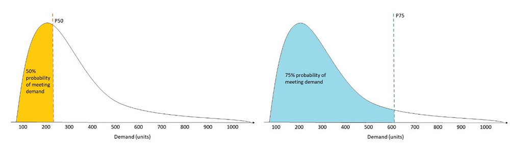
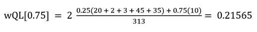
The wQL metric measures the accuracy of a model at specified distribution points called quantiles. This metric helps capture the bias inherent in each quantile. For a grocery retailer who prefers to over-stock staples such as milk, choosing a higher quantile such as 0.75 (P75) better captures spikes in demand and therefore is more informative than forecasting at the median quantile of 0.5 (P50).
In this example, more emphasis is given to over-forecasting than under-forecasting and suggests that a higher amount of stock is needed to satisfy customer demand with 75% probability of success. In other words, the actual demand is less than or equal to forecasted demand 75% of the time, allowing the grocer to maintain target in-stock rates with less safety stock.
We recommend using the wQL measure at different quantiles when the costs of under-forecasting and over-forecasting differ. If the difference in costs is negligible, you may consider forecasting at the median quantile of 0.5 (P50) or use the WAPE metric, which is evaluated using the mean forecast. The following figure illustrates the probability of meeting demand dependent on quantile.
For the retail dataset use case, the P75 forecast indicates that we want to prioritize over-forecasting and penalize under-forecasting. To calculate the wQL[0.75], sum the values for the positive terms in the P75 Error column and multiply them by a smaller weight of 1-0.75 = 0.25, and sum the absolute values of the negative terms in the P75 Error column and multiply them by a larger weight of 0.75 to penalize under-forecasting. The wQL[0.75] is as follows:
Average weighted quantile loss (Average wQL)
The Average wQL metric is the mean of wQL values for all quantiles (forecast types) selected during predictor creation. This metric helps evaluate the forecast as a whole by considering all selected quantiles while still capturing the bias inherent in each quantile. Depending on the selection of quantiles, the Average wQL can give more emphasis to either over-forecasting or under-forecasting. We recommend using the Average wQL metric to evaluate the overall model accuracy if you are interested in evaluating forecasts at multiple quantiles together.
For the retail dataset use case, with just one quantile (P75), the Average wQL is equal to the P75 wQL. The averageWQL = wQL[0.75] = 0.21565. If you are had selected two quantiles such as (P25) and (P75), then the AverageWQL = (wQL[0.25] + wQL[0.75])/2.
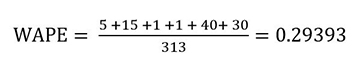
Weighted absolute percentage error (WAPE)
The WAPE metric is the sum of the absolute error normalized by the total demand. The WAPE equally penalizes for under-forecasting or over-forecasting, and doesn’t favor either scenario. We use the average (mean) expected value of forecasts to calculate the absolute error. We recommend using the WAPE metric when the difference in costs of under-forecasting or over-forecasting is negligible, or if you want to evaluate the model accuracy at the mean forecast. For example, to predict the amount of cash needed at a given time in an ATM, a bank may choose to meet average demand because there is less concern of losing a customer or having excess cash in the ATM machine. In this example, you may choose to forecast at the mean and choose the WAPE as your metric to evaluate the model accuracy.
The normalization or weighting helps compare models from different datasets. For example, if the absolute error summed over the entire dataset is 5, it’s hard to interpret the quality of this metric without knowing the scale of total demand. A high total demand of 1000 results in a low WAPE (0.005) and a small total demand of 10 results in a high WAPE (0.5). The weighting in the WAPE and wQL allows these metrics to be compared across datasets with different scales.
The normalization or weighting also helps evaluate datasets that contain a mix of items with large and small demand. The WAPE metric emphasizes accuracy for items with larger demand. You can use WAPE for datasets where forecasting for a small number of SKUs drives majority of sale. For example, a retailer may prefer to use the WAPE metric to put less emphasis on forecasting errors related to special edition items, and prioritizes forecasting errors for standard items with most sales.
In our retail dataset use case, the WAPE is equal to the sum of the absolute error column divided by the sum of the actual demand column (total demand).
Because the sum of the total demand is mostly driven by Item1, the WAPE gives more importance to the accuracy of the popular Item1.
Many retail customers work with sparse datasets, where most of their SKUs are sold infrequently. For most of the historical data points, the demand is 0. For these datasets, it’s important to account for the scale of total demand, making wQL and WAPE a better metric over RMSE to evaluate sparse datasets. The RMSE metric doesn’t take into account the scale of total demand, and returns a lower RMSE value by considering the total number of historical data points and the total number of SKUs, giving you a false sense of security that you have an accurate model.
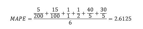
Mean absolute percentage error (MAPE)
The MAPE metric is the percentage error (percentage difference of the mean forecasted and actual value) averaged over all time points. The MAPE equally penalizes for under-forecasting or over-forecasting, and doesn’t favor either scenario. We use the average (mean) expected value of forecasts to calculate the percentage error. We recommend using the MAPE metric when the difference in costs of under-forecasting or over-forecasting is negligible, or if you want to evaluate the model accuracy at the mean forecast.
Since the MAPE metric is a percentage error, it is useful for comparing models from different datasets. The percentage error is normalized by the scale of demand for each time point, so two datasets with a MAPE of 0.05 both have a 5% error on average, irrespective of their total demands. The normalization in the MAPE allows this metric to be compared across datasets with different scales.
The MAPE metric uses an unweighted average, which emphasizes the forecasting error on all items equally, regardless of their demands. You can use MAPE for datasets where forecasting for all SKUs should be equally weighted regardless of sales volume. For example, a retailer may prefer to use the MAPE metric to equally emphasize forecasting errors on both items with low sales and items with high sales.
In our retail dataset use case, the MAPE is calculated by first dividing the absolute error column by the actual demand column, then taking the mean of the result.
Due to the large forecast errors for Item2 and Item3, the MAPE value is also large.
Mean absolute scaled error (MASE)
The MASE metric is the mean of the absolute error normalized by the mean absolute error of the naïve forecast. The naïve forecast refers to a simple forecasting method that uses the demand value of a previous time point as the forecast for the next time point. Based on the frequency of the dataset, a seasonality value is derived and used in the calculation of the naïve forecast. For the MASE, a value under 1 indicates that the forecast is better than the naïve forecast, while a value over 1 indicates that the forecast is worse than the naïve forecast. The MASE equally penalizes for under-forecasting or over-forecasting, and doesn’t favor either scenario. We use the average (mean) expected value of forecasts to calculate the absolute error. We recommend using the MASE metric when you are interested in measuring the impact of seasonality on your model. If your dataset does not have seasonality, we recommend using other metrics.
The MASE is a scale-free metric, which makes it useful for comparing models from different datasets. MASE values can be used to meaningfully compare forecast error across different datasets regardless of the scale of total demand. Additionally, the MASE metric is symmetrical, meaning that it emphasizes the forecasting error equally on both items with small demand and items with large demand.
In our retail dataset use case, the MASE is equal to the mean of the absolute error column divided by the mean absolute error of the naïve forecast. The MASE is calculated at an item-level (for each item separately), then averaged together for the final value.
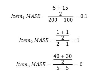
For Item3, the denominator is 0, so the MASE is evaluated as 0. The overall MASE is calculated as follows:
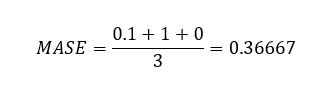
Root mean square error (RMSE)
The RMSE metric is the square root of the sum of the squared errors (differences of the mean forecasted and actual values) divided by the product of the number of items and number of time points. The RMSE also doesn’t penalize for under-forecasting or over-forecasting, and can be used when the trade-offs between under-forecasting or over-forecasting are negligible or if you prefer to forecast at mean. Because the RMSE is proportional to the square of the errors, it’s sensitive to large deviations between the actual demand and forecasted values.
However, you should use RMSE with caution, because a few large deviations in forecasting errors can severely punish an otherwise accurate model. For example, if one item in a large dataset is severely under-forecasted or over-forecasted, the error in that item skews the entire RMSE metric drastically, and may make you reject an otherwise accurate model prematurely. For use cases where a few large deviations are not of importance, consider using wQL or WAPE.
In our retail dataset example, the RMSE is equal to square root of the sum of the squared error column divided by the total number of points (3 items * 2 days = 6).
The RMSE gives more importance to the large deviation of forecasting error of Item3, resulting in a higher RMSE value.
We recommend using the RMSE metric when a few large incorrect predictions from a model on some items can be very costly to the business. For example, a manufacturer who is predicting machine failure may prefer to use the RMSE metric. Because operating machinery is critical, any large deviation from the actual and forecasted demand, even infrequent, needs to be over-emphasized when assessing model accuracy.
The following table summarizes our discussion on selecting an accuracy metric dependent on your use case.
| Use case | wQL | Avg.WQL | WAPE | RMSE | MAPE | MASE |
| Optimizing for under-forecasting or over-forecasting, which may have different implications | X | X | ||||
| Prioritizing popular items or items with high demand is more important than low-demand items | X | X | X | |||
| Emphasizing business costs related to large deviations in forecasts errors | X | X | ||||
| Assessing sparse datasets with 0 demand for most items and historical data points | X | X | X | |||
| Measuring seasonality impacts | X |
Selecting custom distribution points for assessing model accuracy in Forecast
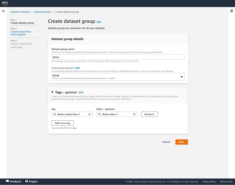
You can measure model accuracy in Forecast through the CreatePredictor API and GetAccuracyMetrics API or using the Forecast console. In this section, we walk through the steps to use the console.
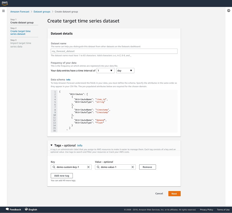
- On the Forecast console, create a dataset group.
- Upload your dataset.
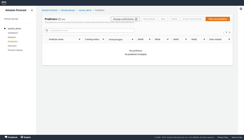
- In the navigation pane, choose Predictors.
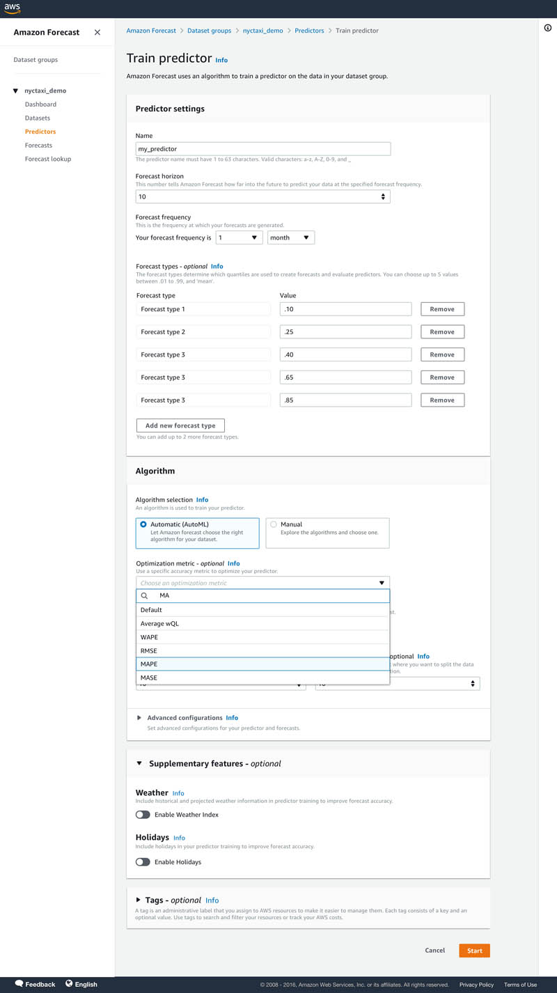
- Choose Train predictor.
- Under Predictor Settings for Forecast types, you can enter up to five distribution points of your choosing. Mean is also accepted.
If unspecified, default quantiles of 0.1, 0.5, and 0.9 are used to train a predictor and calculate accuracy metrics.
- For Algorithm selection, select Automatic (AutoML).
AutoML optimizes a model for the specified quantiles. Here, you have the option to select an optimization metric to optimize AutoML to tune a model for a specific accuracy metric of your choice by selecting a metric from the drop down menu. AutoML will use the specified accuracy metrics to decide on the winning model.
- Optionally, for Number of backtest windows, you can select up to five to assess your model strength.
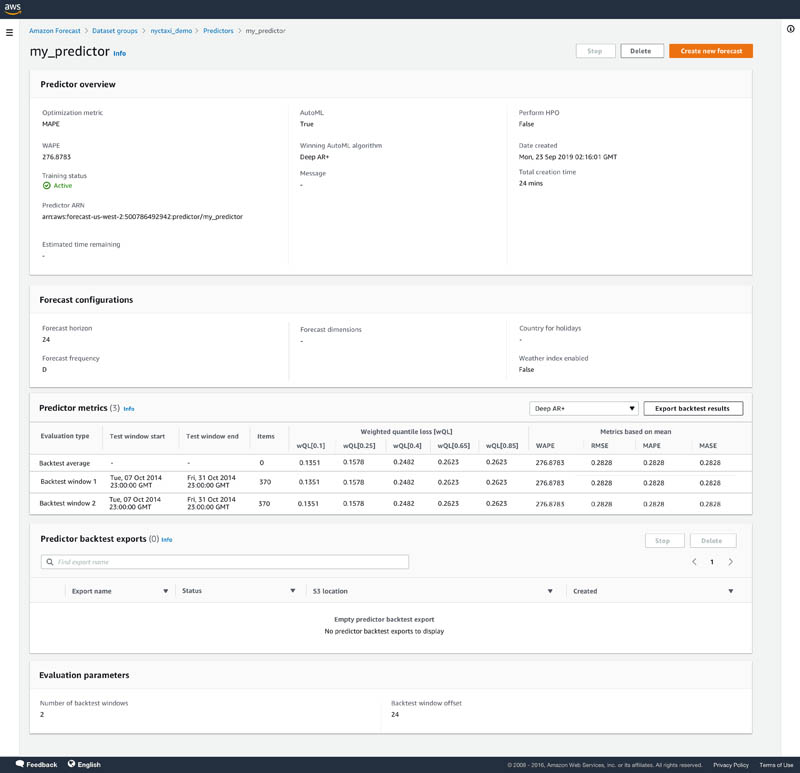
- After your predictor is trained, choose your predictor on the Predictors page to view details of the accuracy metrics.
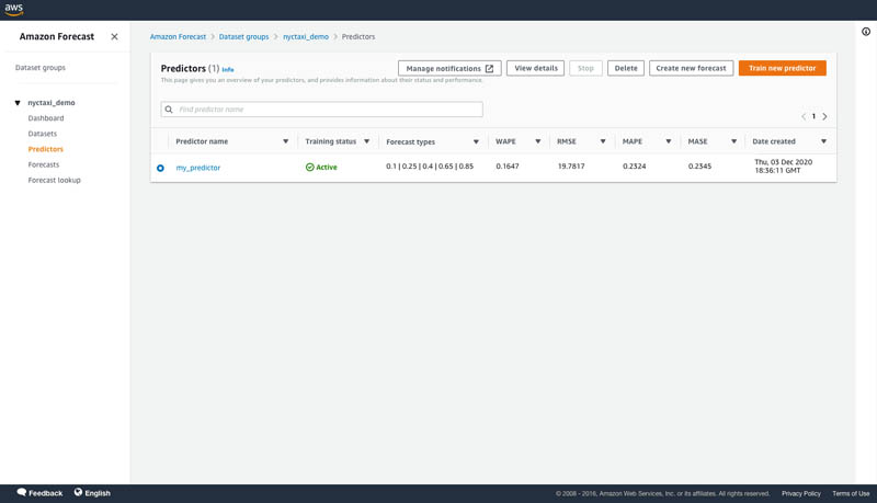
On the predictor’s details page, you can view the overall model accuracy metrics and the metrics from each backtest windows that you specified. Overall model accuracy metrics are calculating by averaging the individual backtest window metrics. In our example, we selected the MAPE accuracy metric as the optimization metric for AutoML. You can see below that the predictor has been optimized for MAPE.
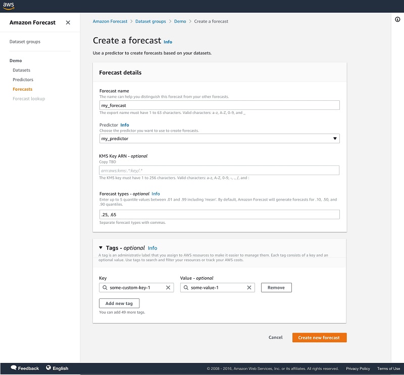
- Now that your model is trained, choose Forecasts in the navigation pane.
- Choose Create a forecast.
- Select your trained predictor to create a forecast.
Forecasts are generated for the distribution points used during training a predictor. You also have the option to specify different distribution points for generating forecasts.
Tips and best practices
In this section, we share a few tips and best practices when using Forecast:
- Before experimenting with Forecast, define your business problem related to costs of under-forecasting or over-forecasting. Evaluate the trade-offs and prioritize if you would rather over-forecast than under.
- Experiment with multiple distribution points to optimize your forecast model to balance the costs associated with under-forecasting and over-forecasting.
- If you’re comparing different models, use the wQL metric at the same quantile for comparison. The lower the value, the more accurate the forecasting model.
- Forecast allows you to select up to five backtest windows. Forecast uses backtesting to tune predictors and produce accuracy metrics. To perform backtesting, Forecast automatically splits your time-series datasets into two sets: training and testing. The training set is used to train your model, and the testing set to evaluate the model’s predictive accuracy. We recommend choosing more than one backtest window to minimize selection bias that may make one window more or less accurate by chance. Assessing the overall model accuracy from multiple backtest windows provides a better measure of the strength of the model.
Conclusion
You can now measure the accuracy of your forecasting model at multiple distribution points of your choosing with Forecast. This gives you more flexibility to align Forecast with your business, because the impact of over-forecasting frequently differs from under-forecasting. You can use this capability in all Regions where Forecast is publicly available. For more information about Region availability, see Region Table. For more information about APIs specifying custom distribution points when creating a predictor and accessing accuracy metrics, see the documentation for the CreatePredictor API and GetAccuracyMetrics API. For more details on evaluating a predictor’s accuracy for multiple distribution points, see Evaluating Predictor Accuracy.
About the Authors
Namita Das is a Sr. Product Manager for Amazon Forecast. Her current focus is to democratize machine learning by building no-code/low-code ML services. On the side, she frequently advises startups and is raising a puppy named Imli.
Danielle Robinson is an Applied Scientist on the Amazon Forecast team. Her research is in time series forecasting and in particular how we can apply new neural network-based algorithms within Amazon Forecast. Her thesis research was focused on developing new, robust, and physically accurate numerical models for computational fluid dynamics. Her hobbies include cooking, swimming, and hiking.
Vidip Mankala is a Summer 2021 SDE Intern on the Amazon Forecast team. During his time at Amazon, he worked on implementing several customer-requested features for Forecast. On his free time, he enjoys playing video games, watching movies, and hiking.