Artificial Intelligence
Train a time series forecasting model faster with Amazon SageMaker Canvas Quick build
Today, Amazon SageMaker Canvas introduces the ability to use the Quick build feature with time series forecasting use cases. This allows you to train models and generate the associated explainability scores in under 20 minutes, at which point you can generate predictions on new, unseen data. Quick build training enables faster experimentation to understand how well the model fits to the data and what columns are driving the prediction, and allows business analysts to run experiments with varied datasets so they can select the best-performing model.
Canvas expands access to machine learning (ML) by providing business analysts with a visual point-and-click interface that allows you to generate accurate ML predictions on your own—without requiring any ML experience or having to write a single line of code.
In this post, we showcase how to to train a time series forecasting model faster with quick build training in Canvas.
Solution overview
Until today, training a time series forecasting model took up to 4 hours via the standard build method. Although that approach has the benefit of prioritizing accuracy over training time, this was leading frequently to long training times, which in turn wasn’t allowing for fast experimentation that business analysts across all sorts of organizations usually seek. Starting today, Canvas allows you to employ the Quick build feature for training a time series forecasting model, adding to the use cases for which it was already available (binary and multi-class classification and numerical regression). Now you can train a model and get explainability information in under 20 minutes, with everything in place to start generating inference.
To use the Quick build feature for time series forecasting ML use cases, all you need to do is upload your dataset to Canvas, configure the training parameters (such as target column), and then choose Quick build instead of Standard build (which was the only available option for this type of ML use case before today). Note that quick build is only available for datasets with fewer than 50,000 rows.
Let’s walk through a scenario of applying the Quick build feature to a real-world ML use case involving time series data and getting actionable results.
Create a Quick build in Canvas
Anyone who has worked with ML, even if they possess no relevant experience or expertise, knows that the end result is only as good as the training dataset. No matter how much of a good fit the algorithm is that you used to train the model, the end result will reflect the quality of the inferencing on unseen data, and won’t be satisfactory if the training data isn’t indicative of the given use case, is biased, or has frequent missing values.
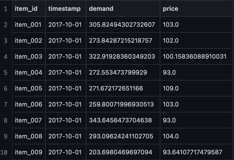
For the purposes of this post , we use a sample synthetic dataset that contains demand and pricing information for various items at a given time period, specified with a timestamp (a date field in the CSV file). The dataset is available on GitHub. The following screenshot shows the first ten rows.
Solving a business problem using no-code ML with Canvas is a four-step process: import the dataset, build the ML model, check its performance, and then use the model to generate predictions (also known as inference in ML terminology). If you’re new to Canvas, a prompt walking you through the process appears. Feel free to spend a couple of minutes with the in-app tutorial if you want, otherwise you can choose Skip for now. There’s also a dedicated Getting Started guide you can follow to immerse yourself fully in the service if you want a more detailed introduction.
We start by uploading the dataset. Complete the following steps:
- On the Datasets page, choose Import Data.
- Upload data from local disk or other sources, such as Amazon Simple Storage Service (Amazon S3), Amazon Redshift, and Snowflake, to load the sample dataset.The
product_demand.csvnow shows in the list of datasets. - Open
product_demand.csvand choose Create a model to start the model creation process.
 You’re redirected to the Build tab of the Canvas app to start the next step of the Canvas workflow.
 - First, we select the target variable, the value that we’re trying to predict as a function of the other variables available in the dataset. In our case, that’s the
demandvariable.
Canvas automatically infers that this is a time series forecasting problem.
 For Canvas to solve the time series forecasting use case, we need to set up a couple of configuration options.
 - Specify which column uniquely identifies the items in the dataset, where the timestamps are stored, and the horizon of predictions (how many months into the future we want to look at).
- Additionally, we can provide a holiday schedule, which can be helpful in some use cases that benefit from having this information, such as retail or supply chain use cases.
- Choose Save.

Choosing the right prediction horizon is of paramount importance for a good time series forecasting use case. The greater the value, the more into the future we will generate the prediction—however, it’s less likely to be accurate due to the probabilistic nature of the forecast generated. A higher value also means a longer time to train, as well as more resources needed for both training and inference. Finally, it’s best practice to have data points from the past at least 3–5 times the forecast horizon. If you want to predict 6 months into the future (like in our example), you should have at least 18 months’ worth of historical data, up to 30 months. - After you safe these configurations, choose Quick Build.
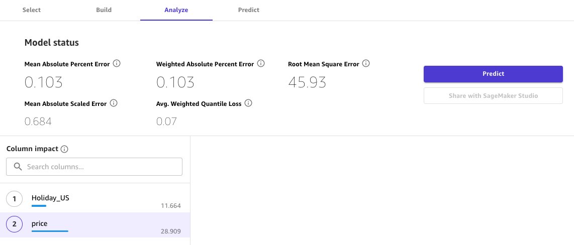
Canvas launches an in-memory AutoML process that trains multiple time series forecasting models with different hyperparameters. In less than 20 minutes (depending on the dataset), Canvas will output the best model performance in the form of five metrics.
Let’s dive deep into the advanced metrics for time series forecasts in Canvas, and how we can make sense of them:
- Average weighted quantile loss (wQL) – Evaluates the forecast by averaging the accuracy at the P10, P50, and P90 quantiles. A lower value indicates a more accurate model.
- Weighted absolute percent error (WAPE) – The sum of the absolute error normalized by the sum of the absolute target, which measures the overall deviation of forecasted values from observed values. A lower value indicates a more accurate model, where WAPE = 0 is a model with no errors.
- Root mean square error (RMSE) – The square root of the average squared errors. A lower RMSE indicates a more accurate model, where RMSE = 0 is a model with no errors.
- Mean absolute percent error (MAPE) – The percentage error (percent difference of the mean forecasted value versus the actual value) averaged over all time points. A lower value indicates a more accurate model, where MAPE = 0 is a model with no errors.
- Mean absolute scaled error (MASE) – The mean absolute error of the forecast normalized by the mean absolute error of a simple baseline forecasting method. A lower value indicates a more accurate model, where MASE < 1 is estimated to be better than the baseline and MASE > 1 is estimated to be worse than the baseline.
For more information about advanced metrics, refer to Use advanced metrics in your analyses.
Built-in explainability is part of the value proposition of Canvas, because it provides information about column impact on the Analyze tab. In this use case, we can see that price has a great impact on the value of demand. This makes sense because a very low price would increase demand by a large margin.
Predictions and what-if scenarios
After we’ve analyzed the performance of our model, we can use it to generate predictions and test what-if scenarios.
- On the Predict tab, choose Single item.
- Choose an item (for this example,
item_002).
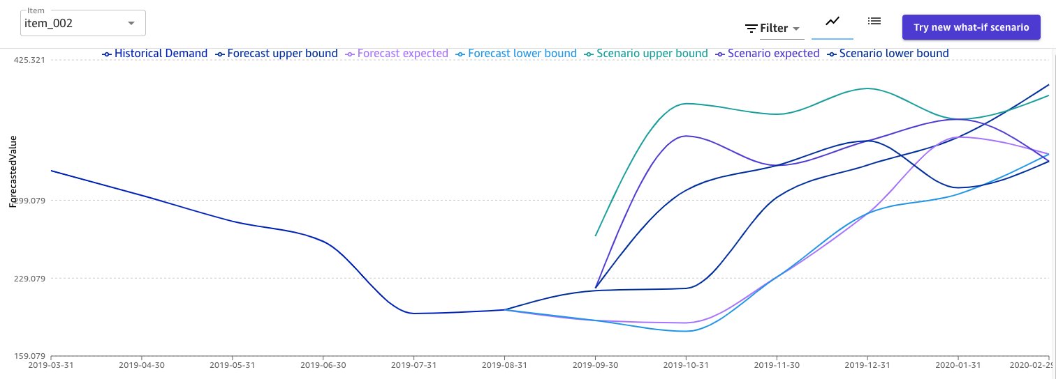
The following screenshot shows the forecast for item_002.
We can expect an increase in demand in the coming months. Canvas also provides a probabilistic threshold around the expected forecast, so we can decide whether to take the upper bound of the prediction (with the risk of over-allocation) or the lower bound (risking under-allocation). Use these values with caution, and apply your domain knowledge to determine the best prediction for your business.
Canvas also support what-if scenarios, which makes it possible to see how changing values in the dataset can affect the overall forecast for a single item, directly on the forecast plot. For the purposes of this post, we simulate a 2-month campaign where we introduce a 50% discount, cutting the price from $120 to $60.
- Choose What if scenario.
- Choose the values you want to change (for this example, November and December).
- Choose Generate prediction.

We can see that the changed price introduces a spike with the demand of the product for the months impacted by the discount campaign, and then slowly returns to the expected values from the previous forecast.
 As a final test, we can determine the impact of definitively changing the price of a product.
 - Choose Try new what-if scenario.
- Select Bulk edit all values.
- For New Value, enter 70.
- Choose Generate prediction.

This is a lower price than the initial $100–120, therefore we expect a sharp increase in product demand. This is confirmed by the forecast, as shown in the following screenshot.
Clean up
To avoid incurring future session charges, log out of SageMaker Canvas.
Conclusion
In this post, we walked you through the Quick build feature for time series forecasting models and the updated metrics analysis view. Both are available as of today in all Regions where Canvas is available. For more information, refer to Build a model and Use advanced metrics in your analyses.
To learn more about Canvas, refer to these links:
- Enable intelligent decision-making with Amazon SageMaker Canvas and Amazon QuickSight
- Provision and manage ML environments with Amazon SageMaker Canvas using AWS CDK and AWS Service Catalog
- Build, Share, Deploy: how business analysts and data scientists achieve faster time-to-market using no-code ML and Amazon SageMaker Canvas
To learn more about other use cases that you can solve with Canvas, check out the following posts:
- Predict customer churn with no-code machine learning using Amazon SageMaker Canvas
- Reinventing retail with no-code machine learning: Sales forecasting using Amazon SageMaker Canva
- Predict types of machine failures with no-code machine learning using Amazon SageMaker Canvas
- Predict shipment ETA with no-code machine learning using Amazon SageMaker Canvas
Start experimenting with Canvas today, and build your time series forecasting models in under 20 minutes, using the 2-month Free Tier that Canvas offers.
About the Authors
 Davide Gallitelli is a Specialist Solutions Architect for AI/ML in the EMEA region. He is based in Brussels and works closely with customers throughout Benelux. He has been a developer since he was very young, starting to code at the age of 7. He started learning AI/ML at university, and has fallen in love with it since then.
 Nikiforos Botis is a Solutions Architect at AWS, looking after the public sector of Greece and Cyprus, and is a member of the AWS AI/ML technical community. He enjoys working with customers on architecting their applications in a resilient, scalable, secure, and cost-optimized way.


