AWS Cloud Financial Management
How to track your cost optimization KPIs with the KPI Dashboard
As a growing organization on AWS, it is important to set and track goals for cost optimization. These goals or key performance indicators (KPIs) can include things like percent of spend on-demand, or adoption of certain optimized services such as AWS Graviton instances or gp3 EBS volume types.
AWS has many ways you can optimize your spend, and some important tools to implement and track them. If you’re using Savings Plans (SP) or Reserved Instances (RI), you can use AWS Cost Explorer to get utilization reports or recommendations for additional plans and RIs. In Amazon Elastic Compute Cloud (Amazon EC2), you have the option of using AWS Graviton or Spot Instances to get up to a 40% better price performance ratio.
Now, with the KPI Dashboard, customers can track cost optimization across their organization and visualize realized savings. In this blog, we’re going to introduce you to the KPI Dashboard, which is included as part of the suite of CFM dashboards called the Cloud Intelligence Dashboards. The KPI Dashboard uses your AWS Cost and Usage Reports (CUR) to generate a series of cost optimization KPIs we recommend you track. The dashboard makes it easy for anyone in your organization to see their progress, set new goals, and track realized savings. The immediate feedback teams get is accessible to executives in the other dashboards within the Cloud Intelligence Dashboards suite (for example, the Cloud Intelligence Dashboard or CUDOS). Recommending goals, taking action, and seeing impact becomes a virtuous cycle your organization can use to grow and innovate faster on AWS.
Behind the Scenes
The AWS Cost and Usage Reports (CUR) provide comprehensive data about your AWS costs, including information related to product, pricing, and usage. By including the Resource IDs and choosing hourly time granularity, CUR allows you to analyze your costs in greater detail and accuracy. You can download the CUR reports from the Amazon Simple Storage Service (Amazon S3) console, query the reports using Amazon Athena, load the reports into Amazon Redshift, or visualize in Amazon QuickSight.
The Cloud Intelligence Dashboards Well-Architected Labs will provide you access to a Cloud Formation template and some instructions that will create the Cloud Intelligence Dashboards within your account, including the necessary CUR data pipeline.
Serverless services such as Amazon S3, AWS Glue, Athena, and QuickSight power the KPI Dashboard found within your QuickSight console. After completing this Well-Architected Lab, you will be able to use the KPI Dashboard to track your cost optimization posture and get tailor-made recommendations on how to save.
The KPI Dashboard
Now, let’s walk through the various ways you can visualize and use the data in your KPI dashboard. When you first open the KPI Dashboard, you will be presented with a table that lists the 18 (as of this writing) cost optimization KPIs with recommended goals we think you should track. These goals are a generic recommendation we make to all customers based on our Cloud Financial Management experts’ experience helping hundreds of customers optimize their environments on AWS. These goals may need to be different for your organization which is why they’re fully adjustable.
KPI goal tracking
The goals are based on the following KPIs:
- Amazon Elastic Compute Cloud (Amazon EC2): % spend on previous generation EC2 Instances; EC2 Spot, EC2 Graviton, EC2AMD;
- Amazon Elastic Block Store (Amazon EBS): EBS gp3 to gp, EBS Snapshots older than 12 months;
- Amazon Simple Storage Service (Amazon S3): standard
- AWS Graviton: RDS, ElastiCache, OpenSearch, Lambda;
- On-demand: Compute, Amazon Sagemaker, RDS, ElasticCache, OpenSearch, Redshift, Amazon DynamoDB
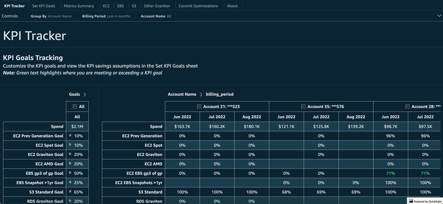
Image 1. Initial KPI dashboard view showing cost optimization KPIs with recommended goals
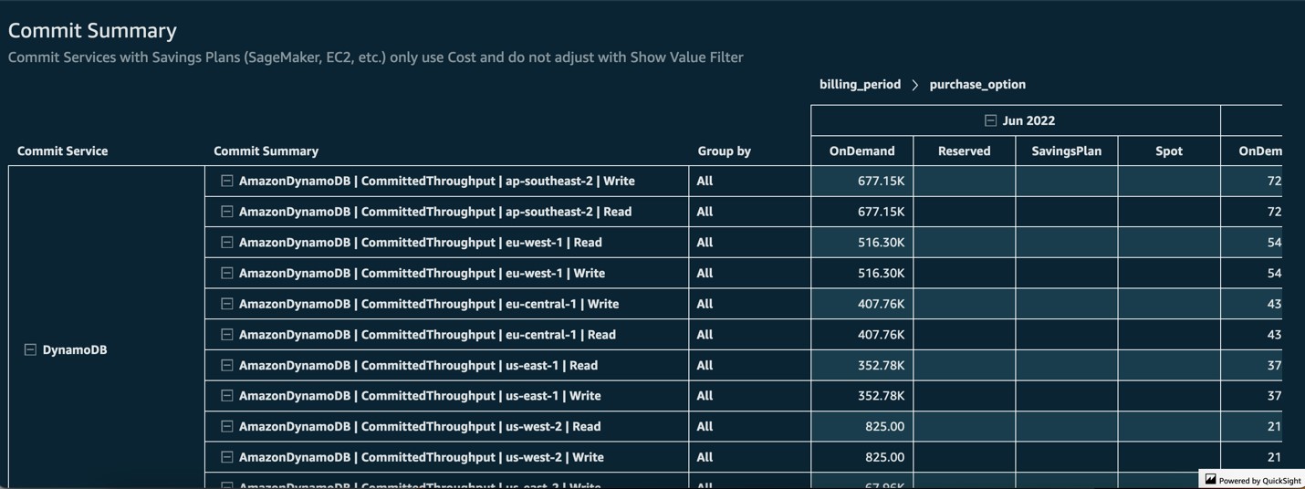
Image 2. Sample commitment summary of on-demand Amazon DynamoDB
Next to these KPIs you will see the recommended goal. For example, we recommend that 10% or less of your EC2 instance spend be on previous generation instances.
You will then see the percentage of your organization’s spend in the table to the right for the prior 3 months. Green numbers indicate your organization has reached or surpassed the set goal. Using the control drop down on the top, users can change the table to show KPIs per account, so you can see which teams are falling behind in their goals.
Scrolling down, you will see the estimated savings your organization will realize if it meets these goals. This is important because refactoring your code for Graviton, for example, may have a cost associated with it. Understanding the potential savings lets you make an informed decision.
Customizable KPI goals
The goals and recommendations that come in the dashboard are meant to be a starting point. In the next tab, you’re able to set or change your KPI goals. For example, you may want to be more aggressive with your EC2 on-demand goal, changing it to 20%. When you return to the prior tab, you will see the updated savings estimation.
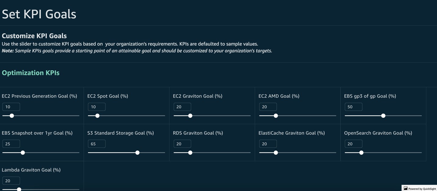
Image 3. Setting or changing your KPI goals
If you scroll down on this tab, you can see details about how each KPI is calculated and why we make the recommendations we do.
Service breakdown by KPIs in dashboard
In the Metrics Summary tab, you will see a breakdown of each service covered by the KPIs present in the dashboard, with the option to adjust whether you are looking at percent of spend or percent of usage. This is an important distinction as you may have 20% of the GB stored in S3 on Standard representing 30% of your S3 spend. Although the KPI goals in this dashboard are based on percent of spend, understanding percent of usage helps you see how usage correlates to cost and savings.
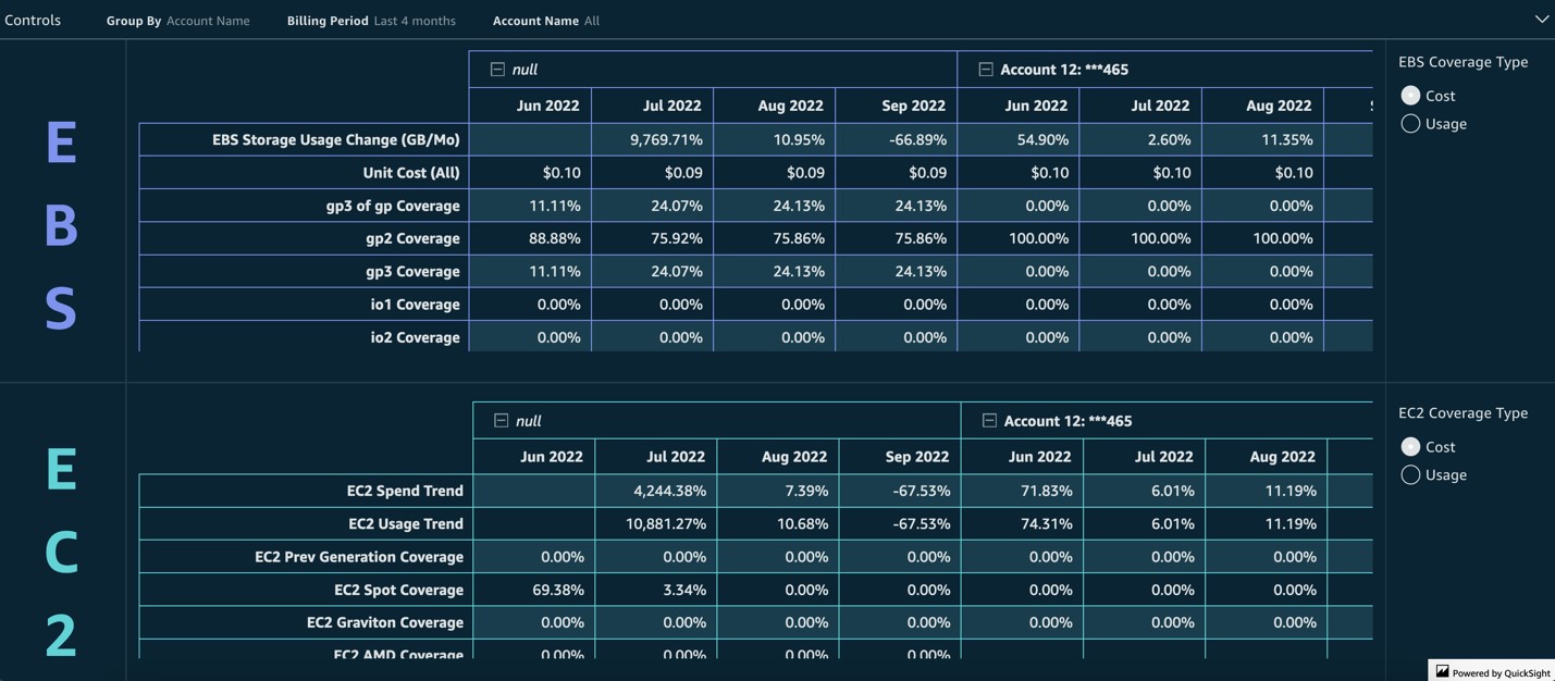
Image 4. Breakdown of each service covered by the KPIs
Graviton and AMD adoption
The EC2 tab is where you’ll go if you want to understand a bit more about your Graviton and AMD adoption. The first visuals will help you estimate how much you’ve already saved using Graviton and AMD. Understanding past savings is critical to getting your teams to buy-in on adopting more Graviton and AMD.
The rest of the tab will help you break down all the potential, estimated savings you’d realize by moving your workloads to Graviton and AMD. You can even see a per-instance breakdown of the potential savings in a table that can be grouped by account and exported to the teams that can take action right away.
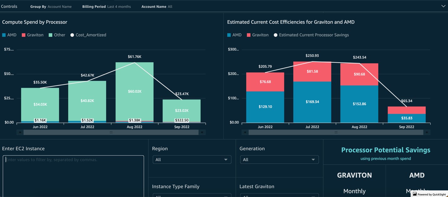
Image 5. Data on AWS Graviton and AMD adoption
EBS gp3 adoption and EBS snapshots
The EBS tab is broken down into two sections, one dedicated to helping you track your gp3 adoption and the other dedicated to EBS snapshots. In the first section, you can use the visuals here to see how much you’ve already saved by adopting gp3. Pay close attention to the unit cost (per GB cost) of gp3 when compared to your gp2 usage. The estimated annual savings should help you team adopt more gp3, and the table with the per-volume detail should help them do so quickly.
The Snapshots section helps your teams quickly pinpoint old snapshots and take action on them. One of the KPI is to have a minimum amount of snapshots older than 1 year. This will tell you exactly where those old snapshots are and how much space/cost they’re taking up. Export the table to give to your engineers to take action on and realize savings almost immediately.
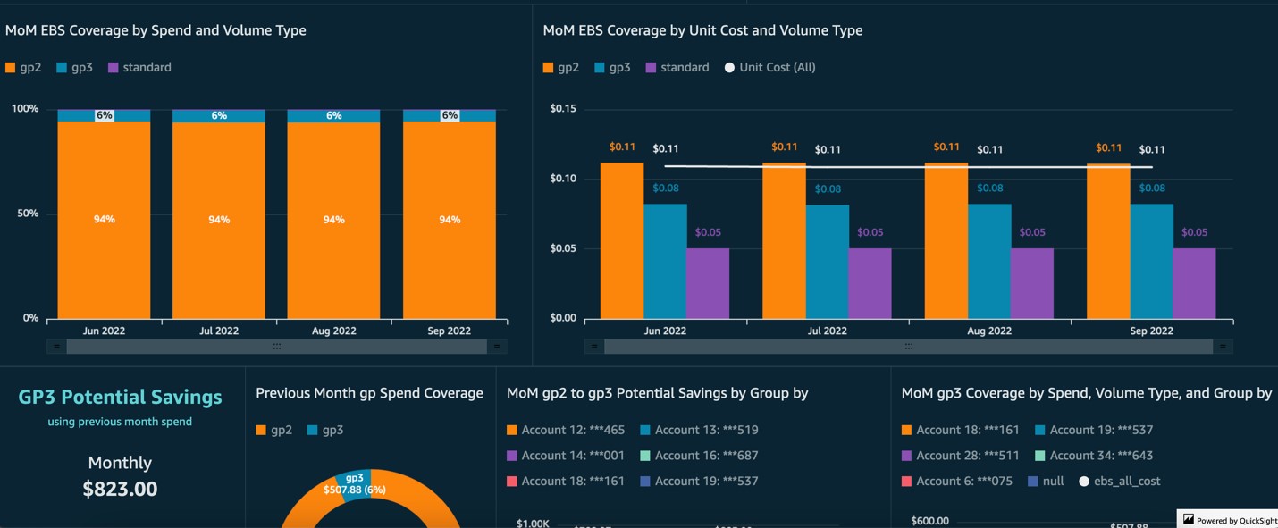
Image 6. Sample view of data on EBS coverage
S3 buckets and potential savings
The S3 tab is broken down into two sections as well. The top section is dedicated to helping you find stale S3 buckets. These are buckets that haven’t been touched in as long as a year, and should be considered for Glacier or even deletion. The second section will help you find more information on per-bucket costs in S3 and what potential savings there is in your accounts for Glacier and Infrequent Access storage tiers. Optimizing your S3 spend is an important step an organization can take at anytime to realize quick savings and impact their overall unit cost of storage (dollar per GB).
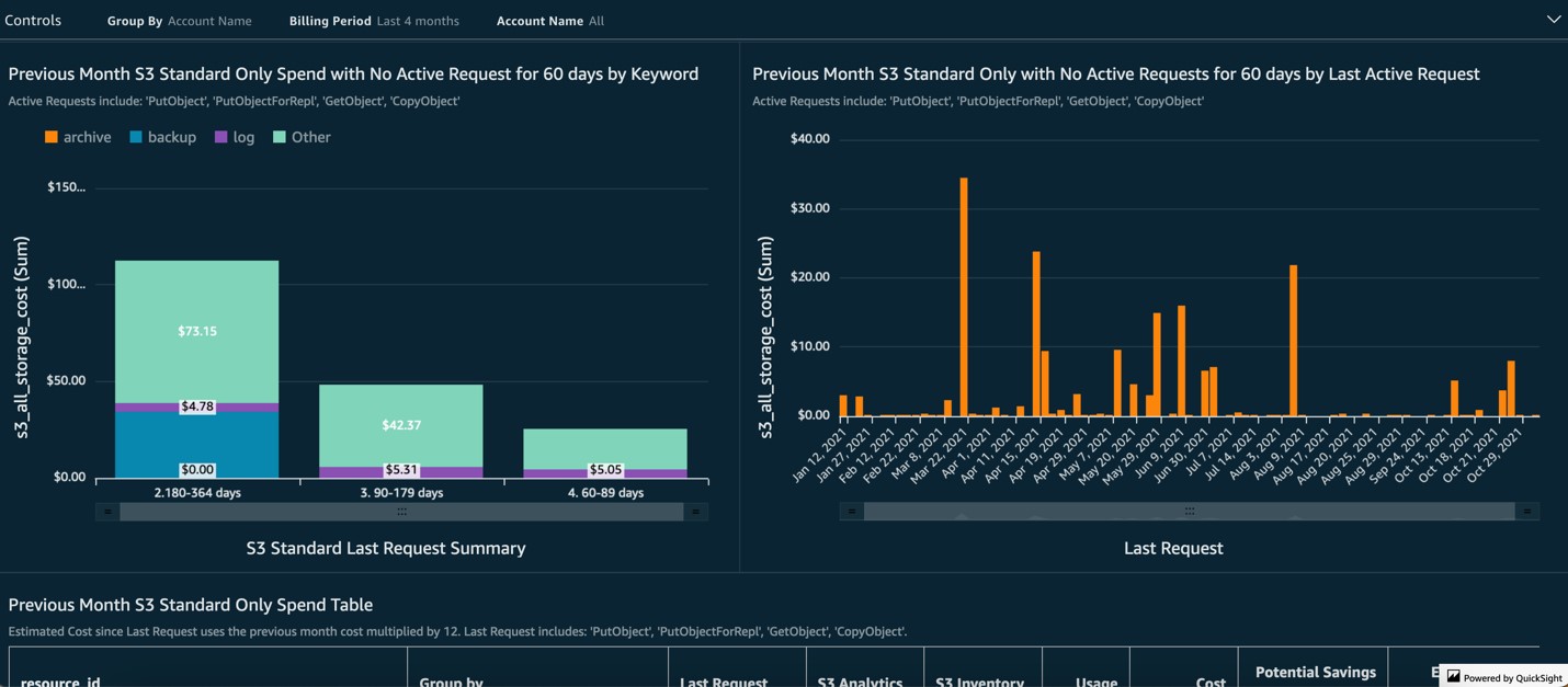
Image 7. Example view of S3 data to identify optimization opportunities
Other Graviton processor efficiency assumptions
The Other Graviton tab will provide you a way to see the estimated future savings by migrating all of your managed services to Graviton. You can see these potential savings by month and by the relevant managed service. For example, your Lambda functions may already support ARM architecture, so the potential savings preset in this dashboard could represent another quick win for your teams. This tab also gives you a table with per-resource level granularity so you can see exactly where the potential savings is. Group the table by Account, export these lists, and send them to your teams so they can start migrating your managed service usage to Graviton right away.
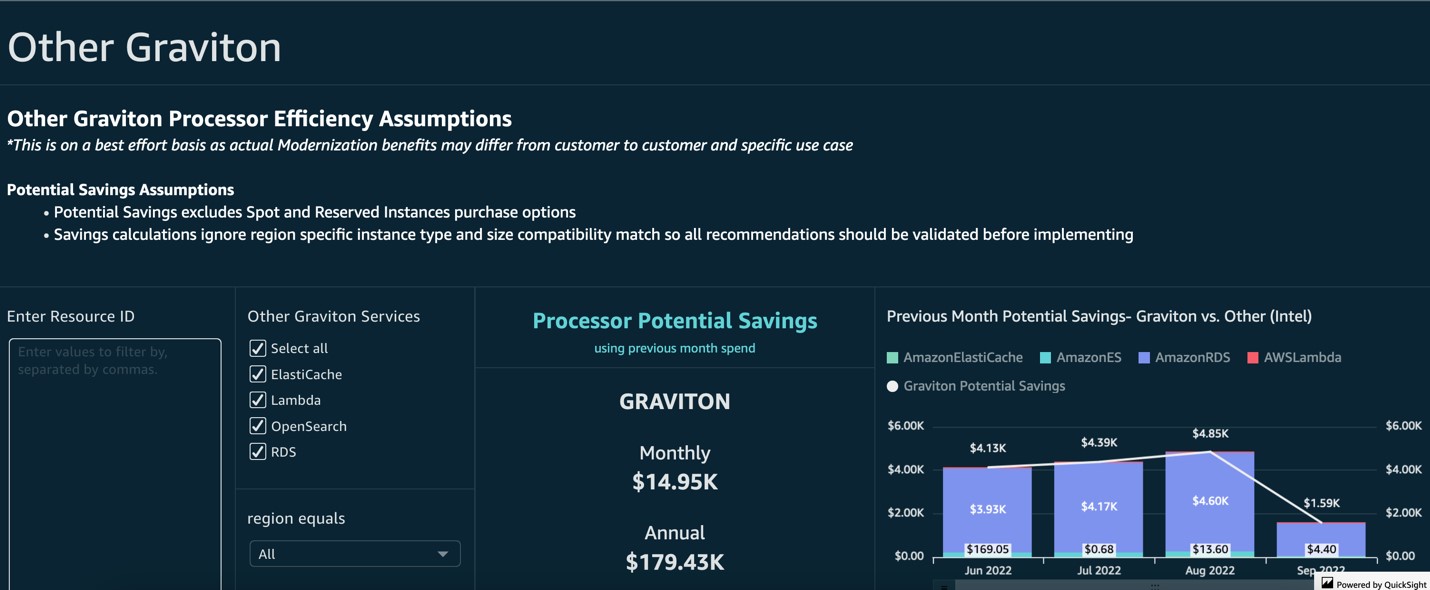
Image 8. Sample view of Graviton processor efficiency assumptions
Commit optimizations for Savings Plans and Reserved Instances
The Commit Optimizations tab lets you dive deep into all the Savings Plans and Reserved Instances you purchased from within the AWS Billing and Cost Management Console and see how the spend compares to on-demand. This information can be filtered by service or purchase option, and also grouped by account, so you can see which teams are taking advantage of these pricing options. Be sure to visit AWS Cost Explorer for more recommendations on additional Savings Plans and Reserved Instances.
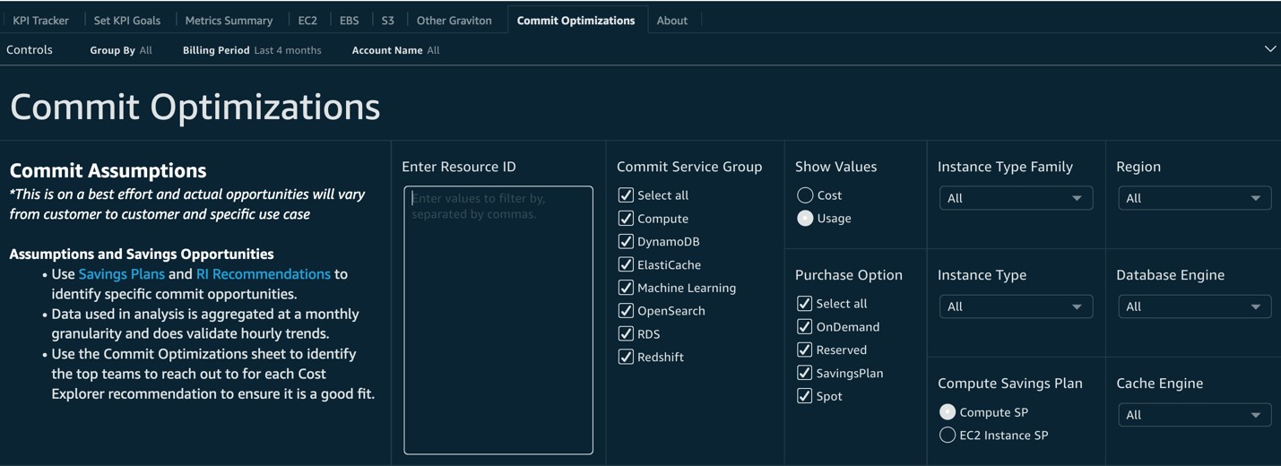
Image 9. Example view of data on Savings Plans and Reserved Instances purchased
Conclusion
In this post, we explained how the KPI Dashboard can help you visualize and track your cost optimization KPIs, your past savings, and the estimated impact on future cost optimization. Every business is unique and should be making a plan for its KPIs that matter most to their success in the cloud. Enabling your team’s success by including them in the setting and tracking of goals is critical to encouraging everyone to adopt Cloud Financial Management best practices.
Visit the Cloud Intelligence Dashboards labs today to get started on onboarding the dashboard.
Disclaimer
Customers are responsible for making their own independent assessment of this dashboard and its content. This dashboard and its content: (a) is for informational purposes only, (b) represents current AWS product offerings and practices, which are subject to change without notice, and (c) does not create any commitments or assurances from AWS and its affiliates, suppliers or licensors. AWS content, products or services are provided “as is” without warranties, representations, or conditions of any kind, whether express or implied. The responsibilities and liabilities of AWS to its customers are controlled by AWS agreements, and this document is not part of, nor does it modify, any agreement between AWS and its customers.