AWS Open Source Blog
Root Cause Analysis with DoWhy, an Open Source Python Library for Causal Machine Learning
Identifying the root causes of observed changes in complex systems can be a difficult task that requires both deep domain knowledge and potentially hours of manual work. For instance, we may want to analyze an unexpected drop in profit of a product sold in an online store, where various intertwined factors can impact the overall profit of the product in subtle ways.
Wouldn’t it be nice if we had automated tools to simplify and accelerate this task? A library that can automatically identify the root causes of an observed effect with a few lines of code?
This is the idea behind the root cause analysis (RCA) features of the DoWhy open source Python library, to which AWS contributed a large set of novel causal machine learning (ML) algorithms last year. These algorithms are the result of years of Amazon research on graphical causal models and were released in DoWhy v0.8 in July last year. Furthermore, AWS joined forces with Microsoft to form a new organization called PyWhy, now home of DoWhy. PyWhy’s mission, according to the charter, is to “build an open source ecosystem for causal machine learning that moves forward the state of the art and makes it available to practitioners and researchers. We build and host interoperable libraries, tools, and other resources spanning a variety of causal tasks and applications, connected through a common API on foundational causal operations and a focus on the end-to-end-analysis process.”
In this article, we will have a closer look at these algorithms. Specifically, we want to demonstrate their applicability in the context of root cause analysis in complex systems.
Applying DoWhy’s causal ML algorithms to this kind of problem can reduce the time to find a root cause significantly. To demonstrate this, we will dive deep into an example scenario based on randomly generated synthetic data where we know the ground truth.
The scenario
Suppose we are selling a smartphone in an online shop with a retail price of $999. The overall profit from the product depends on several factors, such as the number of sold units, operational costs or ad spending. On the other hand, the number of sold units, for instance, depends on the number of visitors on the product page, the price itself and potential ongoing promotions. Suppose we observe a steady profit of our product over the year 2021, but suddenly, there is a significant drop in profit at the beginning of 2022. Why?
In the following scenario, we will use DoWhy to get a better understanding of the causal impacts of factors influencing the profit and to identify the causes for the profit drop. To analyze our problem at hand, we first need to define our belief about the causal relationships. For this, we collect daily records of the different factors affecting profit. These factors are:
- Shopping Event?: A binary value indicating whether a special shopping event took place, such as Black Friday or Cyber Monday sales.
- Ad Spend: Spending on ad campaigns.
- Page Views: Number of visits on the product detail page.
- Unit Price: Price of the device, which could vary due to temporary discounts.
- Sold Units: Number of sold phones.
- Revenue: Daily revenue.
- Operational Cost: Daily operational expenses which includes production costs, spending on ads, administrative expenses, etc.
- Profit: Daily profit.
Looking at these attributes, we can use our domain knowledge to describe the cause-effect relationships in the form of a directed acyclic graph, which represents our causal graph in the following. The graph is shown here:
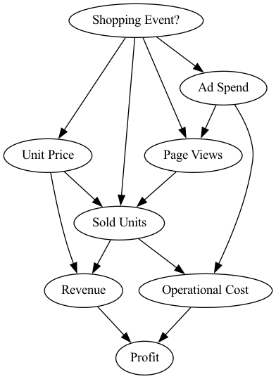
An arrow from X to Y, X → Y in this diagram describes a direct causal relationship, where X is the cause of Y. In this scenario we know the following:
Shopping Event? impacts:
→ Ad Spend: To promote the product on special shopping events, we require additional ad spending.
→ Page Views: Shopping events typically attract a large number of visitors to an online retailer due to discounts and various offers.
→ Unit Price: Typically, retailers offer some discount on the usual retail price on days with a shopping event.
→ Sold Units: Shopping events often take place during annual celebrations like Christmas, Father’s day, etc, when people often buy more than usual.
Ad Spend impacts:
→ Page Views: The more we spend on ads, the more likely people will visit the product page.
→ Operational Cost: Ad spending is part of the operational cost.
Page Views impacts:
→ Sold Units: The more people visiting the product page, the more likely the product is bought. This is quite obvious seeing that if no one would visit the page, there wouldn’t be any sale.
Unit Price impacts:
→ Sold Units: The higher/lower the price, the less/more units are sold.
→ Revenue: The daily revenue typically consist of the product of the number of sold units and unit price.
Sold Units impacts:
→ Sold Units: Same argument as before, the number of sold units heavily influences the revenue.
→ Operational Cost: There is a manufacturing cost for each unit we produce and sell. The more units we well the higher the revenue, but also the higher the manufacturing costs.
Operational Cost impacts:
→ Profit: The profit is based on the generated revenue minus the operational cost.
Revenue impacts:
→ Profit: Same reason as for the operational cost.
Step 1: Define causal models
Now, let us model these causal relationships with DoWhy’s graphical causal model (GCM) module. In the first step, we need to define a so-called structural causal model (SCM), which is a combination of the causal graph and the underlying generative models describing the data generation process.
To model the graph structure, we use NetworkX, a popular open source Python graph library. In NetworkX, we can represent our causal graph as follows:
import networkx as nx

causal_graph = nx.DiGraph([('Page Views', 'Sold Units'),
                           ('Revenue', 'Profit'),
                           ('Unit Price', 'Sold Units'),
                           ('Unit Price', 'Revenue'),
                           ('Shopping Event?', 'Page Views'),
                           ('Shopping Event?', 'Sold Units'),
                           ('Shopping Event?', 'Unit Price'),
                           ('Shopping Event?', 'Ad Spend'),
                           ('Ad Spend', 'Page Views'),
                           ('Ad Spend', 'Operational Cost'),
                           ('Sold Units', 'Revenue'),
                           ('Sold Units', 'Operational Cost'),
                           ('Operational Cost', 'Profit')])
Next, we look at the data from 2021:
import pandas as pd

pd.options.display.float_format = '${:,.2f}'.format  # Format dollar columns
data_2021 = pd.read_csv('2021 Data.csv', index_col='Date')
data_2021.head()

As we see, we have one sample for each day in 2021 with all the variables in the causal graph. Note that in the synthetic data we consider in this blog post, shopping events were also generated randomly.
We defined the causal graph, but we still need to assign generative models to the nodes. With DoWhy, we can either manually specify those models, and configure them if needed, or automatically infer “appropriate” models using heuristics from data. We will leverage the latter here:
from dowhy import gcm

# Create the structural causal model object
scm = gcm.StructuralCausalModel(causal_graph)

# Automatically assign generative models to each node based on the given data
gcm.auto.assign_causal_mechanisms(scm, data_2021)
Whenever available, we recommend assigning models based on prior knowledge as then models would closely mimic the physics of the domain, and not rely on nuances of the data. However, here we asked DoWhy to do this for us instead.
Step 2: Fit causal models to data
After assigning a model to each node, we need to learn the parameters of the model:
gcm.fit(scm, data_2021)
The fit method learns the parameters of the generative models in each node. The fitted SCM can now be used to answer different kinds of causal questions.
Step 3: Answer causal questions
What are the key factors influencing the variance in profit?
At this point, we want to understand which factors drive changes in the Profit. Let us first have a closer look at the Profit over time. For this, we are using pandas to plot the Profit over time for 2021, where the produced plot shows the Profit in dollars on the Y-axis and the time on the X-axis.
data_2021['Profit'].plot(ylabel='Profit in $', figsize=(15,5), rot=45)

We see some significant spikes in the Profit across the year. We can further quantify this by looking at the standard deviation, which we can estimate using the std() function from pandas:
data_2021['Profit'].std()
259247.66010978
The estimated standard deviation of ~259247 dollars is quite significant. Looking at the causal graph, we see that Revenue and Operational Cost have a direct impact on the Profit, but which of them contribute the most to the variance? To find this out, we can make use of the direct arrow strength algorithm that quantifies the causal influence of a specific arrow in the graph:
import numpy as np


def convert_to_percentage(value_dictionary):
    total_absolute_sum = np.sum([abs(v) for v in value_dictionary.values()])
    return {k: abs(v) / total_absolute_sum * 100 for k, v in value_dictionary.items()}


arrow_strengths = gcm.arrow_strength(scm, target_node='Profit')

gcm.util.plot(causal_graph,
              causal_strengths=convert_to_percentage(arrow_strengths),
              figure_size=[15, 10])

In this causal graph, we see how much each node contributes to the variance in Profit. For simplicity, the contributions are converted to percentages. Since Profit itself is only the difference between Revenue and Operational Cost, we do not expect further factors influencing the variance. As we see, the Revenue contributes 74.45 percent and has more impact than the Operational Cost which contributes 25.54 percent. This makes sense seeing that the Revenue typically varies more than the Operational Cost due to the stronger dependency on the number of sold units. Note that DoWhy also supports other kinds of measures, for instance, KL divergence.
While the direct influences are helpful in understanding which direct parents influence the most on the variance in Profit, this mostly confirms our prior belief. The question of which factor is now ultimately responsible for this high variance is, however, still unclear. Revenue itself is simply based on Sold Units and the Unit Price. Although we could recursively apply the direct arrow strength to all nodes, we would not get a correctly weighted insight into the influence of upstream nodes on the variance.
What are the important causal factors contributing to the variance in Profit? To find this out, we can use DoWhy’s intrinsic causal contribution method that attributes the variance in Profit to the upstream nodes in the causal graph. For this, we first define a function to plot the values in a bar plot and then use this to display the estimated contributions to the variance as percentages:
import matplotlib.pyplot as plt


def bar_plot(value_dictionary, ylabel, uncertainty_attribs=None, figsize=(8, 5)):
    value_dictionary = {k: value_dictionary[k] for k in sorted(value_dictionary)}
    if uncertainty_attribs is None:
        uncertainty_attribs = {node: [value_dictionary[node], value_dictionary[node]] for node in value_dictionary}

    _, ax = plt.subplots(figsize=figsize)
    ci_plus = [uncertainty_attribs[node][1] - value_dictionary[node] for node in value_dictionary.keys()]
    ci_minus = [value_dictionary[node] - uncertainty_attribs[node][0] for node in value_dictionary.keys()]
    yerr = np.array([ci_minus, ci_plus])
    yerr[abs(yerr) < 10**-7] = 0
    plt.bar(value_dictionary.keys(), value_dictionary.values(), yerr=yerr, ecolor='#1E88E5', color='#ff0d57', width=0.8)
    plt.ylabel(ylabel)
    plt.xticks(rotation=45)
    ax.spines['right'].set_visible(False)
    ax.spines['top'].set_visible(False)

    plt.show()


iccs = gcm.intrinsic_causal_influence(scm, target_node='Profit', num_samples_randomization=500)

bar_plot(convert_to_percentage(iccs), ylabel='Variance attribution in %')

The scores shown in this bar chart are percentages indicating how much variance each node is contributing to Profit — without inheriting the variance from its parents in the causal graph. As we see quite clearly, the Shopping Event has by far the biggest influence on the variance in our Profit. This makes sense, seeing that the sales are heavily impacted during promotion periods like Black Friday or Prime Day and, thus, impact the overall profit. Surprisingly, we also see that factors such as the number of sold units or number of page views have a rather small influence, i.e., the large variance in profit can be almost completely explained by the shopping events. Let’s check this visually by marking the days where we had a shopping event. To do so, we use the pandas plot function again, but additionally mark all points in the plot with a vertical red bar where a shopping event occured:
data_2021['Profit'].plot(ylabel='Profit in $', figsize=(15,5), rot=45)
plt.vlines(np.arange(0, data_2021.shape[0])[data_2021['Shopping Event?']], data_2021['Profit'].min(), data_2021['Profit'].max(), linewidth=10, alpha=0.3, color='r')

We clearly see that the shopping events coincide with the high peaks in profit. While we could have investigated this manually by looking at all kinds of different relationships or using domain knowledge, the tasks gets much more difficult as the complexity of the system increases. With a few lines of code, we obtained these insights from DoWhy.
What are the key factors explaining the Profit drop on a particular day?
After a successful year in terms of profit, newer technologies come to the market and, thus, we want to keep the profit up and get rid of excess inventory by selling more devices. In order to increase the demand, we therefore lower the retail price by 10% at the beginning of 2022. Based on a prior analysis, we know that a decrease of 10% in the price would roughly increase the demand by 13.75%, a slight surplus. Following the price elasticity of demand model, we expect an increase of around 37.5% in number of Sold Units. Let us take a look if this is true by loading the data for the first day in 2022 and taking the fraction between the numbers of Sold Units from both years for that day:
first_day_2022 = pd.read_csv('2022 First Day.csv', index_col='Date')
(first_day_2022['Sold Units'][0] / data_2021['Sold Units'][0] - 1) * 100
18.946914113077252
Surprisingly, we only increased the number of sold units by ~19%. This will certainly impact the profit given that the revenue is much smaller than expected. Let us compare it with the previous year at the same time:
(1 - first_day_2022['Profit'][0] / data_2021['Profit'][0]) * 100
8.57891513840979
Indeed, the profit dropped by ~8.5%. Why is this the case seeing that we would expect a much higher demand due to the decreased price? Let us investigate what is going on here.
In order to figure out what contributed to the Profit drop, we can make use of DoWhy’s anomaly attribution feature. Here, we only need to specify the target node we are interested in (the Profit) and the anomaly sample we want to analyze (the first day of 2022). These results are then plotted in a bar chart indicating the attribution scores of each node for the given anomaly sample:
attributions = gcm.attribute_anomalies(scm, target_node='Profit', anomaly_samples=first_day_2022)

bar_plot({k: v[0] for k, v in attributions.items()}, ylabel='Anomaly attribution score')

A positive attribution score means that the corresponding node contributed to the observed anomaly, which is in our case the drop in Profit. A negative score of a node indicates that the observed value for the node is actually reducing the likelihood of the anomaly (e.g., a higher demand due to the decreased price should increase the profit). More details about the interpretation of the score can be found in our research paper. Interestingly, the Page Views stand out as a factor explaining the Profit drop that day as indicated in the bar chart shown here.
While this method gives us a point estimate of the attributions for the particular models and parameters we learned, we can also use DoWhy’s confidence interval feature, which incorporates uncertainties about the fitted model parameters and algorithmic approximations:
median_attributions, confidence_intervals, = gcm.confidence_intervals(
    gcm.fit_and_compute(gcm.attribute_anomalies,
                        scm,
                        bootstrap_training_data=data_2021,
                        target_node='Profit',
                        anomaly_samples=first_day_2022),
    num_bootstrap_resamples=10)

bar_plot(median_attributions, 'Anomaly attribution score', confidence_intervals)

Note, in this bar chart we see the median attributions over multiple runs on smaller data sets, where each run re-fits the models and re-evaluates the attributions. We get a similar picture as before, but the confidence interval of the attribution to Sold Units also contains zero, meaning its contribution is insignificant. But some important questions still remain: Was this only a coincidence and, if not, which part in our system has changed? To find this out, we need to collect some more data.
What caused the profit drop in Q1 2022?
While the previous analysis is based on a single observation, let us see if this was just coincidence or if this is a persistent issue. When preparing the quarterly business report, we have some more data available from the first three months. We first check if the profit dropped on average in the first quarter of 2022 as compared to 2021. Similar as before, we can do this by taking the fraction between the average Profit of 2022 and 2021 for the first quarter:
data_first_quarter_2021 = data_2021[data_2021.index <= '2021-03-31']
data_first_quarter_2022 = pd.read_csv("2022 First Quarter.csv", index_col='Date')

(1 - data_first_quarter_2022['Profit'].mean() / data_first_quarter_2021['Profit'].mean()) * 100
13.0494881794224
Indeed, the profit drop is persistent in the first quarter of 2022. Now, what is the root cause of this? Let us apply DoWhy’s distribution change method to identify the part in the system that has changed:
median_attributions, confidence_intervals = gcm.confidence_intervals(
    lambda: gcm.distribution_change(scm,
                                    data_first_quarter_2021,
                                    data_first_quarter_2022,
                                    target_node='Profit',
                                    # Here, we are intersted in explaining the differences in the mean.
                                    difference_estimation_func=lambda x, y: np.mean(y) - np.mean(x))
)

bar_plot(median_attributions, 'Profit change attribution in $', confidence_intervals)

In our case, the distribution change method explains the change in the mean of Profit, i.e., a negative value indicates that a node contributes to a decrease and a positive value to an increase of the mean. Using the bar chart, we get now a very clear picture that the change in Unit Price has actually a slightly positive contribution to the expected Profit due to the increase of Sold Units, but it seems that the issue is coming from the Page Views which has a negative value. While we already understood this as a main driver of the drop at the beginning of 2022, we have now isolated and confirmed that something changed for the Page Views as well. Let’s compare the average Page Views with the previous year.
(1 - data_first_quarter_2022['Page Views'].mean() / data_first_quarter_2021['Page Views'].mean()) * 100
14.347627108364
Indeed, the number of Page Views dropped by ~14%. Since we eliminated all other potential factors, we can now dive deeper into the Page Views and see what is going on there. This is a hypothetical scenario, but we could imagine it could be due to a change in the search algorithm which ranks this product lower in the results and therefore drives fewer customers to the product page. Knowing this, we could now start mitigating the issue.
With the help of DoWhy’s new features for graphical causal models, we only needed a few lines of code to automatically pinpoint the main drivers of a particular outlier and, especially, were able to identify the main factors that caused a shift in the distribution.
Conclusion
In this article, we have shown how DoWhy can help in root cause analysis of a drop in profits for an example online shop. For this, we looked at DoWhy features, such as arrow strengths, intrinsic causal influences, anomaly attribution and distribution change attribution. But did you know that DoWhy can also be used for estimating average treatment effects, causal structure learning, diagnosis of causal structures, interventions and counterfactuals? If this is interesting to you, we invite you to visit our PyWhy homepage or the DoWhy documentation to learn more. There is also an active community on the DoWhy Discord where scientists and ML practitioners can meet, ask questions and get help. We also host weekly meetings on Discord where we discuss current developments. Come join us!