Front-End Web & Mobile
AWS Amplify Studio – Figma to Fullstack React App With Minimal Programming
June 27, 2024: This blog post covers Amplify Gen 1. For new Amplify apps, we recommend using Amplify Gen 2. You can learn more about Gen 2 in our launch blog post.
AWS Amplify announces AWS Amplify Studio, a visual development environment that offers frontend developers new features (public preview) to accelerate UI development with minimal coding, while integrating Amplify’s powerful backend configuration and management capabilities. Amplify Studio automatically translates designs made in Figma to human-readable React UI component code. Within Amplify Studio, developers can visually connect the UI components to app backend data.
For configuring and managing backends, Amplify Admin UI’s existing capabilities (such as “data”, “authentication”, “storage”, and more) will be part of Amplify Studio going forward, providing a unified interface to enable developers to build full-stack apps faster.

To show case the new UI capabilities, let’s build a “Home Listing” application that shows the most recently added homes.
Build your backend and frontend in one visual development environment
First, let’s deploy this starter React app which includes a GraphQL API backend and a React frontend with the libraries. Click on the button below to deploy:
Deploy with Amplify Hosting
This workflow forks a GitHub repository and deploys a new Amplify app with a pre-configured backend.
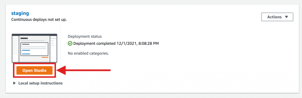
Once deployed, click “Open Studio” to browse your Amplify app configurations.
Explore the data model in the “Data model” section. In this case we have “Home” model with just a few fields to represent a listing.

Next, let’s use the content tab to auto-generate some random seed data for your app.
Click on “Content” and then select to “Auto-generate seed data” under the “Actions” menu to seed your database with sample data. Let’s create 5 records for now and also introduce the constraint of “Street address” to the address field to make the auto-generated seed data more semantically accurate.

Next, add in some image URLs to into the record’s “image_url” field. (Tip: if you don’t have a image URL handy, try using Unsplash’s random photo generator.)
Your content tab should look something like this:
Time to build the frontend. Let’s explore the new “UI Library” preview feature.
Seamless designer-to-developer hand-off
With Studio’s new “UI Library (Preview)”, you can sync components from Figma to Amplify Studio. Amplify also provides you a handy Figma file to get started faster. The Amplify Figma file includes both UI primitives and pre-built components. Studio can also sync any new components created in Figma as well!
Let’s clone the Figma file as Amplify Studio suggests. Note: this step will require you to have a free Figma account.
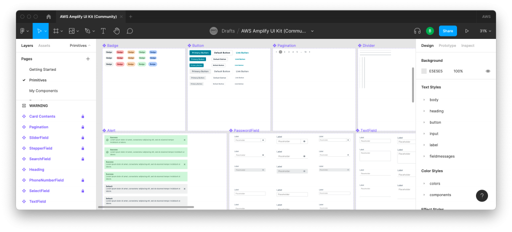
Explore the Amplify UI component primitives in the “Primitives” Figma page. You can also find a range of pre-built UI components in the “My Components” page.
Optionally, you can also create your new Figma component. You can skip this step and use the pre-built “CardB” component instead if you want. Design a new component in Figma like you’d normally do! I’ll create a new component with auto-layout support an image on top and a couple of Text elements below.

Back in Studio, paste in the Figma file link to import all the components from your Figma file. You can either choose individual components to import or import all of them via the “Accept all” button on the top right corner.

Bind UI components to data
With your UI library populated, let’s bind some of these components to data.
Select the component and click “Configure”. In the UI component editor, you can define component properties and then bind them to different UI elements. For our app, let’s add a new property called “home” and select the “Home” type.
To bind images, you can simply select the “src” property and bind it to the home’s “image_url” field.
Next, select the child elements and bind their “label” to a value from the listing property. We can bind the text element to the home’s address. For price, we can even use some lightweight syntax expression to have the UI render “Price: $” + “home.price” + “/night”.

To see how your component scales with different information and data, click on “Shuffle preview data” and Studio will shuffle through your app data and populate the component with live data.

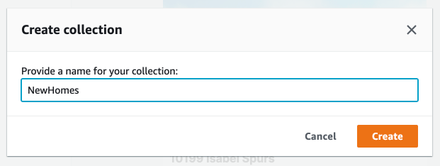
Create a collection
Individual components are great but most of the time you’ll want to show a “collection” of a component. With Amplify Studio, you can make a collection of any component by clicking the “Create collection” button on the top right corner. Configure all your layout options on the left hand side and then configure your data sources on the right hand side.
Let’s use a grid layout for this collection and set the column count to 3. In addition, let’s add 10px padding to all sides of the element to additional spacing.

Next, let’s modify the data set used to populate the collection and add a new sort condition to sort by the newest homes to oldest homes. Choose “Add sort”, then select “createdAt” and “Descending” as the sort condition.

Pull into your React app
Let’s get the component code into our React app! To get the starter React code, all you have to do is clone your fork of the GitHub repository, the command should look something like this:
git clone git@github.com:<GITHUB_USERNAME>/amplify-homes.git
Then change into the “amplify-homes” directory:
cd amplify-homesNote, if this is your first time setting up an Amplify project locally, you’ll need to install the Amplify CLI by running:
npm install -g @aws-amplify/cliThen, click on “Get component code” to retrieve the component code. In this sample repository, the “initial project setup”, which includes adding the correct dependencies and importing the default CSS styles, is mostly completed already. You only need to install all npm dependencies locally:
npm installNext, follow the instructions in the “Get component code” modal. Pull your UI components into your app’s code base:
amplify pull --appId <YOUR_APP_ID> --envName <YOUR_ENV>After the amplify pull, a few key files have been added to your React code base:
- “ui-components/” contains all UI components from your Figma file as React code
- “models/” contains the local representation of your data model, allowing you to use it with DataStore to fetch, update, and subscribe to your app data
- “aws-exports.js” defines all backend connection details such as API endpoints, API keys, or Amazon Cognito user pool ids
Now, let’s add the UI components to your app. Go to your App.js and import the UI component. Then, place them in the render function. Your App.js file should look something like this:
import './App.css';
import { NewHomes, NavBar, MarketingFooter } from './ui-components'

function App() {
  return (
    <div className="App">
      <NavBar />
      <NewHomes />
      <MarketingFooter />
    </div>
  );
}

export default App;
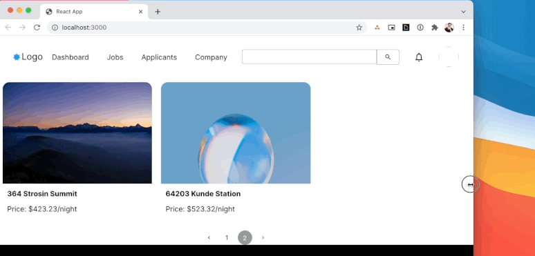
We also imported the “NavBar” element and the “MarketingFooter” as well to make the app more delightful faster. To test your app, run:
yarn startYou should see something like this in your browser:

Extend in Code
The generated UI components accept properties available on the “Flex” component or properties available on the “Collection” component.
For example, to make a component go full width you can use all the properties available on an Amplify UI “Flex” component. In this case, I’ve set width={“100vw”} for the NavBar and the MarketingFooter, so it scales with my browser window size. We can also enable pagination for NewHomes by setting the isPaginated and itemsPerPage properties.
import './App.css';
import { NewHomes, NavBar, MarketingFooter } from './ui-components'

function App() {
  return (
    <div className="App">
      <NavBar width={"100vw"}/>
      <NewHomes isPaginated itemsPerPage={3}/>
      <MarketingFooter width={"100vw"}/>
    </div>
  );
}

export default App;
Now, you can change the window size and also paginate through the collection as well.
There are many more customizations you can apply in code such as applying overrides to child elements, setting up onClick handlers for collection items, or set hover states on icons. Review Extend via Code in the Amplify Studio documentation.
Amplify UI Library – from Preview to General Availability
Amplify Studio’s UI library feature is currently still in developer preview. There is a range of improvements we’re making before general availability:
- Ability to define event-based actions within Studio (e.g. on clicking a component, go to a specific page)
- Add search, pagination, and filtering on collections
- Ability to define S3 storage bindings (e.g. link an avatar to a user’s profile picture)
- More UI components (color pickers, maps, avatar, file uploader)
? Success
Success! Your app is built! Ready to get started with your own brand new app? Get Started with Amplify Studio.
Please send us your feedback about the new UI Library feature of Amplify Studio via GitHub or our Discord community.