AWS Cloud Operations Blog
Enhance CloudWatch metrics with metric math functions
In June 2021, the Amazon CloudWatch team launched 14 new metric math functions. In this blog post, I’ll describe these new functions and show how you can use them to enhance your existing CloudWatch metrics, dashboards, and alarms.
Metrics are an important part of observability and monitoring. A numerical representation of data measured over time, metrics are useful for identifying trends, predictions, and anomalies. Metric math enables you to query multiple CloudWatch metrics and use math expressions to create new time series based on them. You can visualize the time series in the CloudWatch console, add them to dashboards, or create CloudWatch alarms. This allows you to better understand the operational health and performance of your infrastructure without the need to generate extra metrics at the source. In addition, by using time series, you can more easily spot trends and patterns.
MINUTE(), HOUR(), DAY(), DATE(), MONTH()
The MINUTE(), HOUR(), DAY(), DATE(), MONTH() functions take the period and range from the metric passed into the function and convert it into the minute, hour, day of the week, day of the month, or month of the year for each timestamp.
Consider an application that needs to be available between 9:00 am and 5:00 pm Monday to Friday. During other times, the application is scaled in and does not need to be alarmed on. By using a combination of DAY() and HOUR(), I can create an alarm that will be triggered during these hours only. In this example, the instance runs behind an Application Load Balancer. The metric being examined is the total number of requests (RequestCount) over a five-minute period.
The syntax for my new metric (m2) is as follows:
IF((DAY(m1)<6 AND (HOUR(m1)>=9 AND HOUR(m1)<17)),m1)
Let’s break it down.
m1 is the original metric (RequestCount). Days of the week are numbered 1 to 7 (Monday to Sunday) and hours 0-23. The math function now derives the DAY() and HOUR() value from the m1 metric based on this rule: Day of the week is “before Saturday“ and the hour is at or after 9:00 am and before 5:00 pm.
The following graphs show how this is displayed before and after the math function is applied.
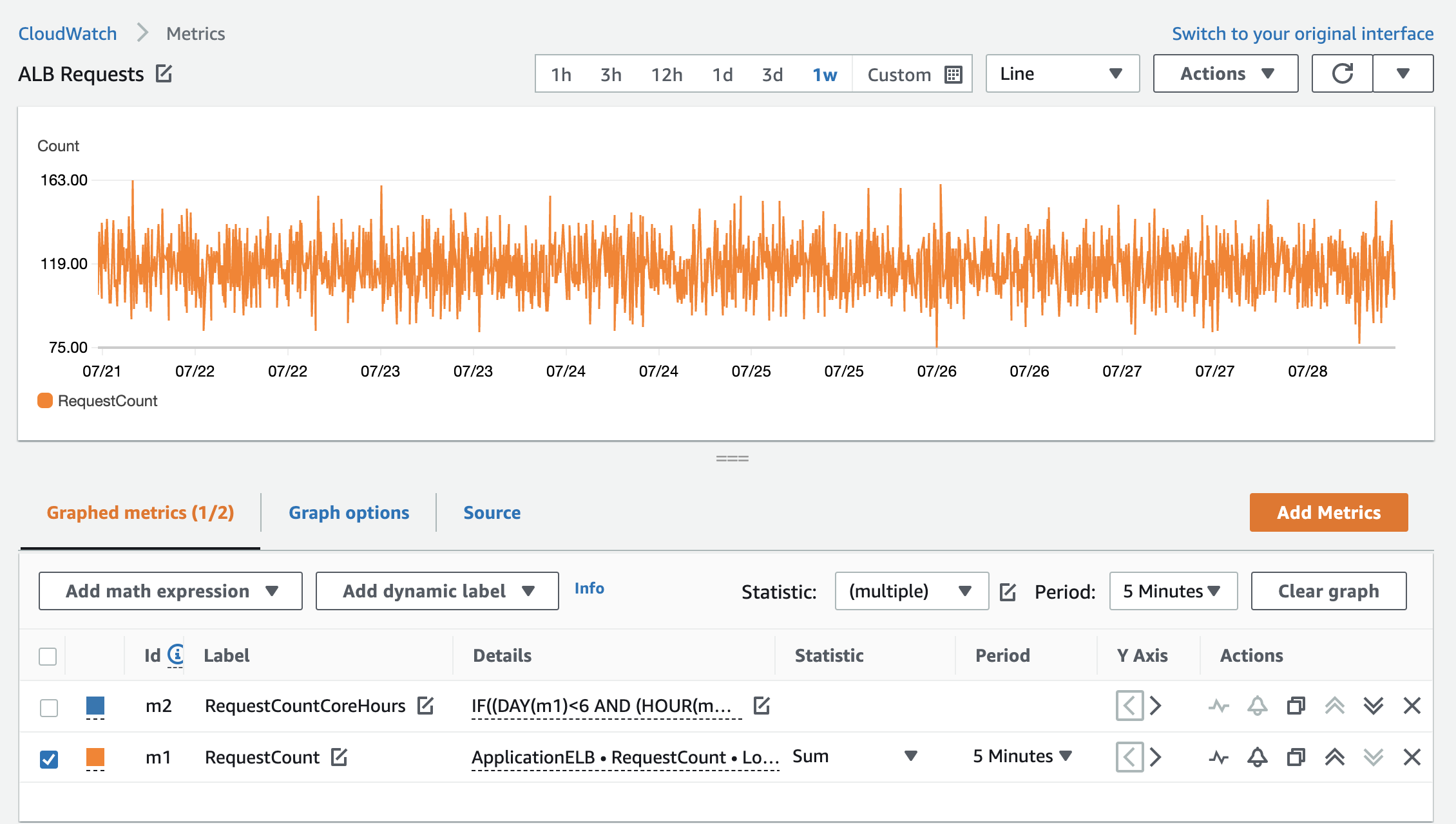
Figure 1: RequestCount over one week
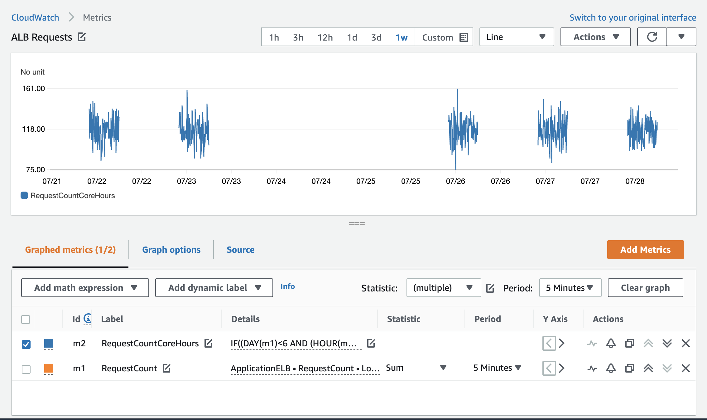
Figure 2: RequestCount with the Monday to Friday math function applied
You can now create a CloudWatch alarm on the new metric that will be triggered if the RequestCount value exceeds or drops below a specified threshold between 9:00 am and 5:00 pm (UTC) on Monday to Friday only.
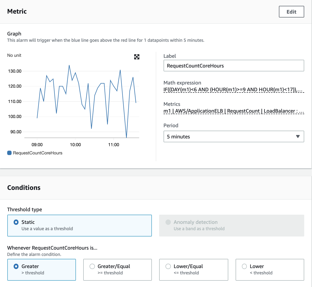
Figure 3: CloudWatch alarm with metric math expression
Here are two more examples for displaying metrics using these functions:
- Display metric values from April only: IF(MONTH(m1) == 4,m1)
- Display metric values from January 1 only: IF(DATE(m1) == 1 AND MONTH(m1) == 1,m1)
FILL(m1, REPEAT) and FILL(m1, LINEAR)
The FILL(m1, REPEAT) function is useful for displaying metrics that are sparse. By using the REPEAT keyword, you can fill missing values in a metric time series with the most recent actual value of the metric before the missing value. This means that instead of approximating a value for the missing metric based on the metric values you have, you use the actual value from the previous datapoint.
In the following example, I use a metric filter from the log group for the application. This creates a metric called Error (m1) in the AppLogs metric namespace. The errors in logs are sparse. Without the fill function, they are displayed in Figure 4 in lines and dots with large gaps in between.
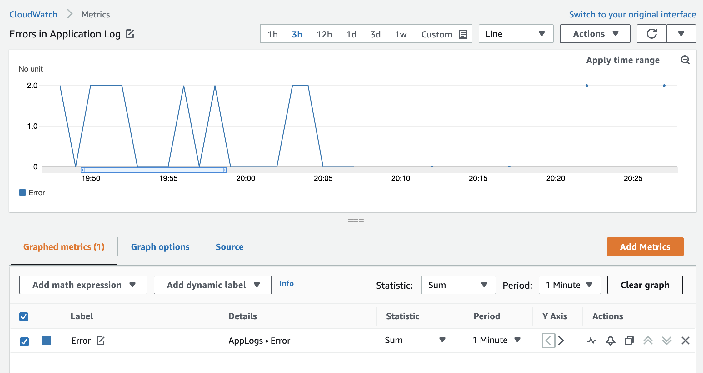
Figure 4: The Error custom metric without the fill function with sparse data points
By adding FILL(m1, REPEAT), the empty gaps are filled with the most recent value to give a more insightful visual, as shown in Figure 5:
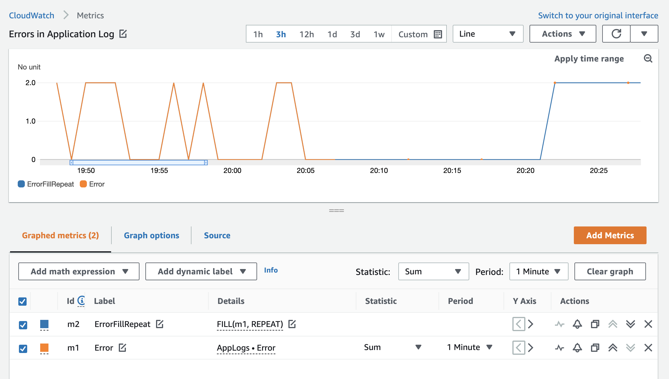
Figure 5: The Error custom metric with the fill function
The FILL(m1, LINEAR) function is also useful for displaying metrics that are sparse. Instead of displaying the previous actual value of the metric, you can use the LINEAR keyword to fill the missing value with a value calculated from the values at the beginning and the end of the gap. In this case, you can use approximation to achieve a higher precision by calculating the middle value based on the beginning and end of the gap (linear interpolation) to calculate the missing metric value based on the actual values you have.
Based on the example from the previous fill expression, this is how the errors are represented when using the LINEAR expression instead of REPEAT.
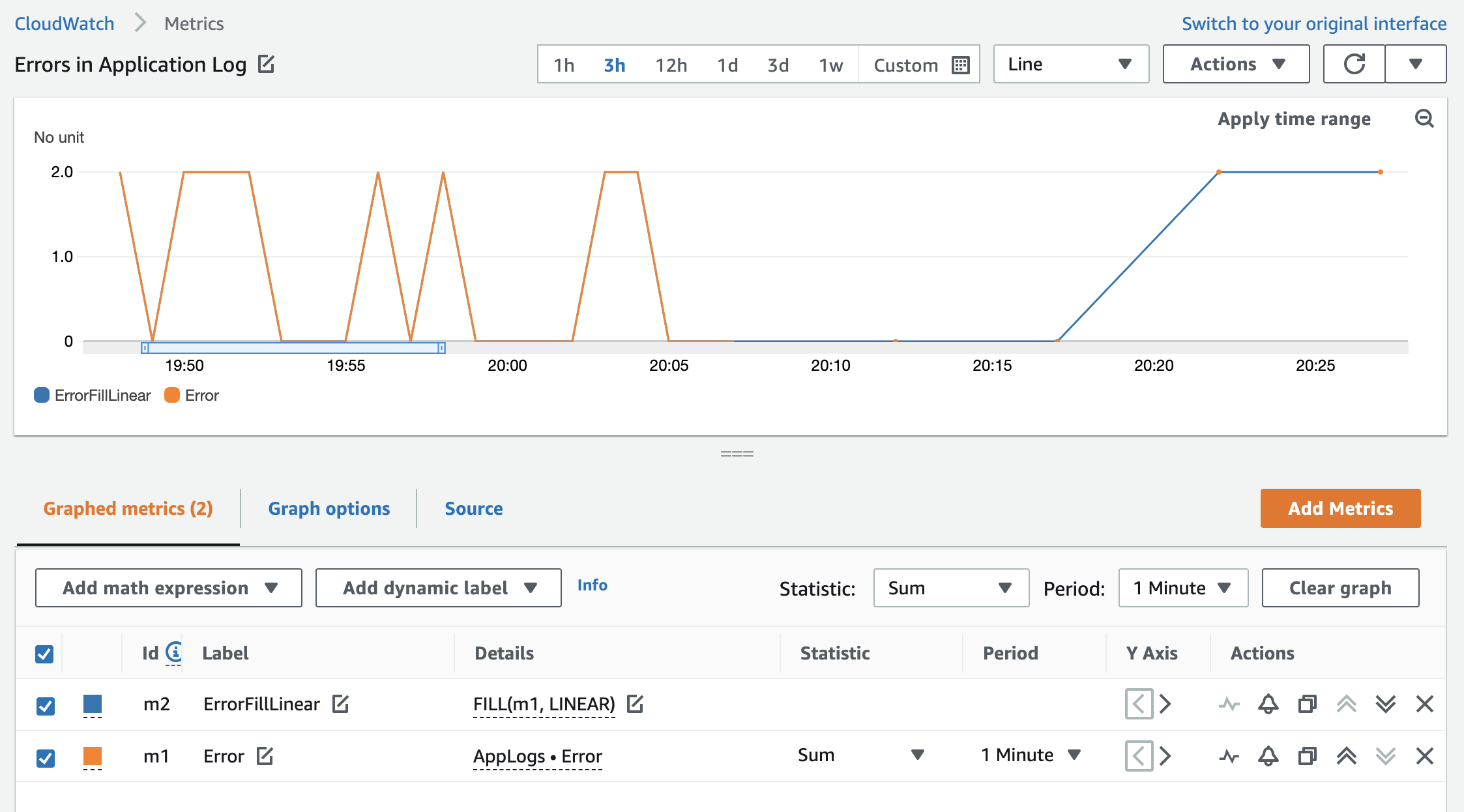
Figure 6: The Error custom metric with the fill function
RUNNING_SUM()
This function adds all metric values for a metric cumulatively.
This is useful if you want to see a running total for your metric for the time period on the graph (for example, counting the number of Amazon Simple Notification Service messages published in a day).
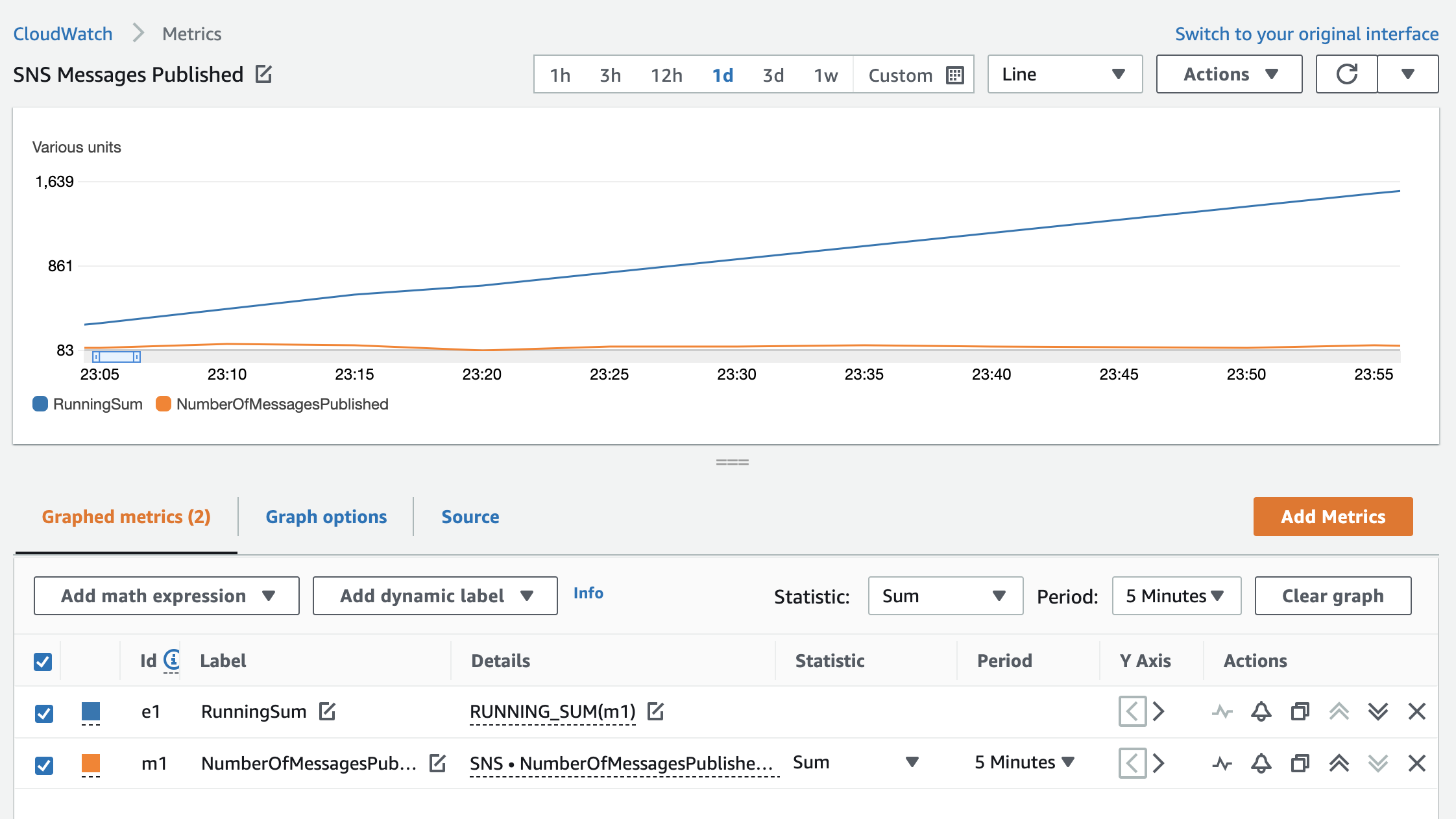
Figure 7: SNS NumberOfMessagesPublished metric and the running sum of published messages over one day
The graph shows a sum of SNS messages published in five-minute increments along with a running sum.
Counting the total values of all metrics is also useful in these cases:
- Incoming or outgoing bytes on a transit gateway to monitor service usage.
- Outgoing bytes on a NAT gateway to observe data leaving private VPC subnets.
- Incoming bytes for a log group to monitor the volume of incoming log data.
- Counting custom metric data values (for example, a running total of donations).
- Total requests received by a load balancer to spot anomalies in a steady workload.
DIFF()
This function measures the change in values over time. DIFF() returns the difference between each value in the time series and the previous value from that time series.
Using the load balancer example, if a number of new connections is typically steady, and the value drops substantially but not to 0, there might be an issue with new client connections (for example, new clients might not be able to obtain an access token for your application).
DIFF_TIME()
This function also measures the change in values over time, but it returns the difference in seconds between the current timestamp in the time series and the timestamp of the previous value.
This is useful to determine how much time has passed since the last value. For example, if you have a metric that is emitted every day when a daily job is executed, and the time since this ran decreases, you can deduce that this job ran unexpectedly. Or, if the time increases, the job did not run as expected. You can also use this metric to alarm accordingly, based on the value.
LOG(), LOG10()
These functions allow you to display metrics with a wide range of values between them in a compact way.
Consider an application that is serving traffic through Application Load Balancers. One Application Load Balancer typically receives a high volume of requests; the other receives a low volume of requests. When displayed on a graph, the variability of the second (lower) metric value over time appears smoother due to the range of data points displayed on the graph. This also means that trends are harder to spot. Comparing the same metric with LOG10() function narrows the gap between numerical values of the first and second metric and gives a clearer insight into the trend of requests for both Application Load Balancers.
Figure 8 shows a comparison of RequestCount metrics without the LOG(10) function.
Figure 8: RequestCount for two load balancers with varying loads
By using the LOG10(METRICS()) function, the request pattern for both Application Load Balancers has more definition.
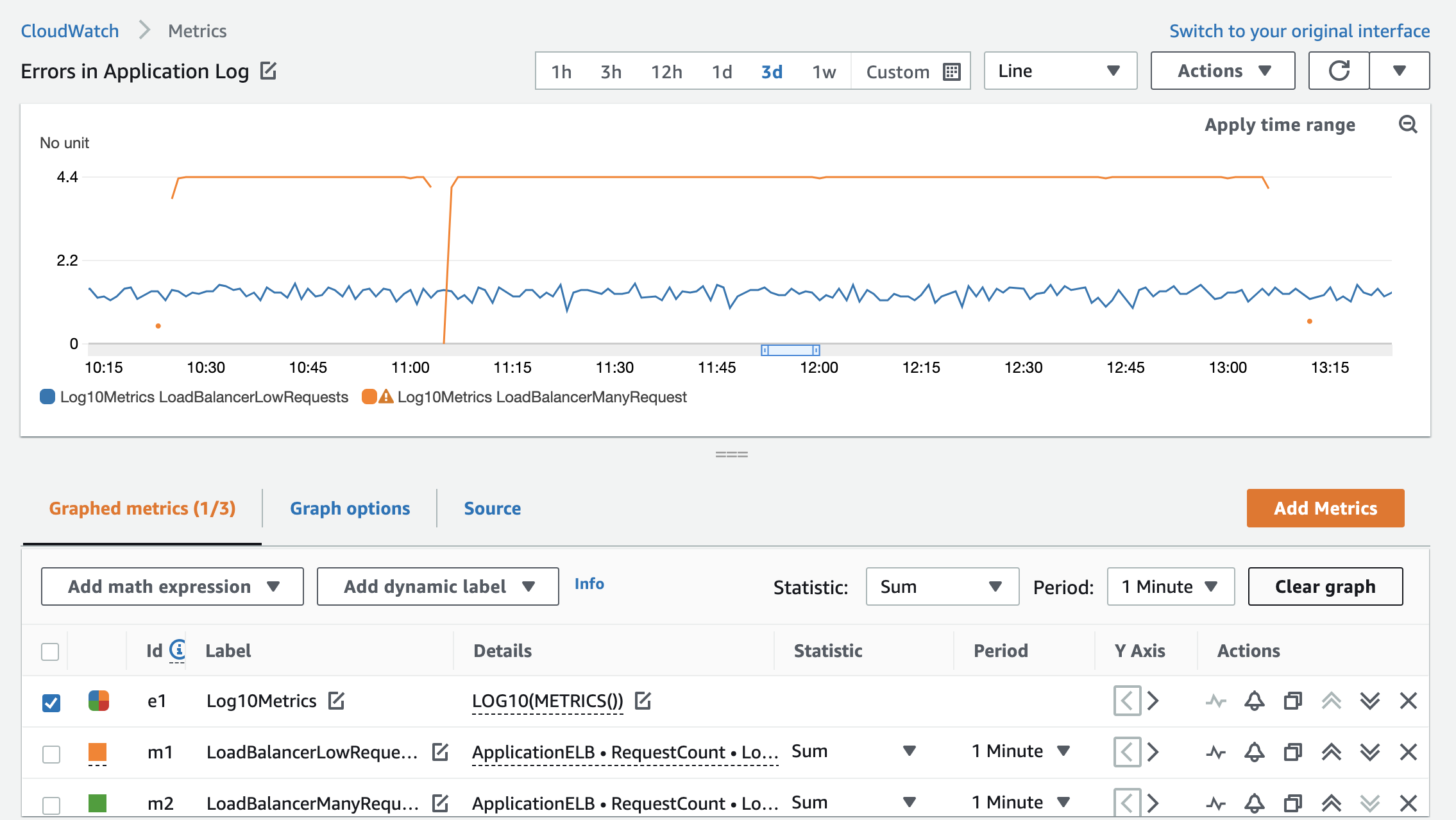
Figure 9: RequestCount metrics after the LOG10 expression is applied
TIME_SERIES()
This function allows you to graph the result of a scalar function as a time series. What does that mean? When you perform a calculation on a metric or metrics, it returns a single value that cannot be plotted on the graph. It will return an error. The TIME_SERIES function lets you display a single scalar value as a time series.
Figure 10 displays the sum of incoming requests to an Application Load Balancer in five-minute increments. If you want to add an average value for all requests for the full time range of the graph to visualize the pattern, you would calculate and plot it using the TIME_SERIES expression as follows:
TIME_SERIES(AVG(m1))
Note: This is not the moving average for the m1 metric. It’s the average of the sums over the full graph time range.
To further enhance the graph and add an upper threshold of 150 requests, you can also add the TIME_SERIES(150) metric math.
Now the graph displays the original sum of requests along with the calculated average and the threshold of 150 requests.
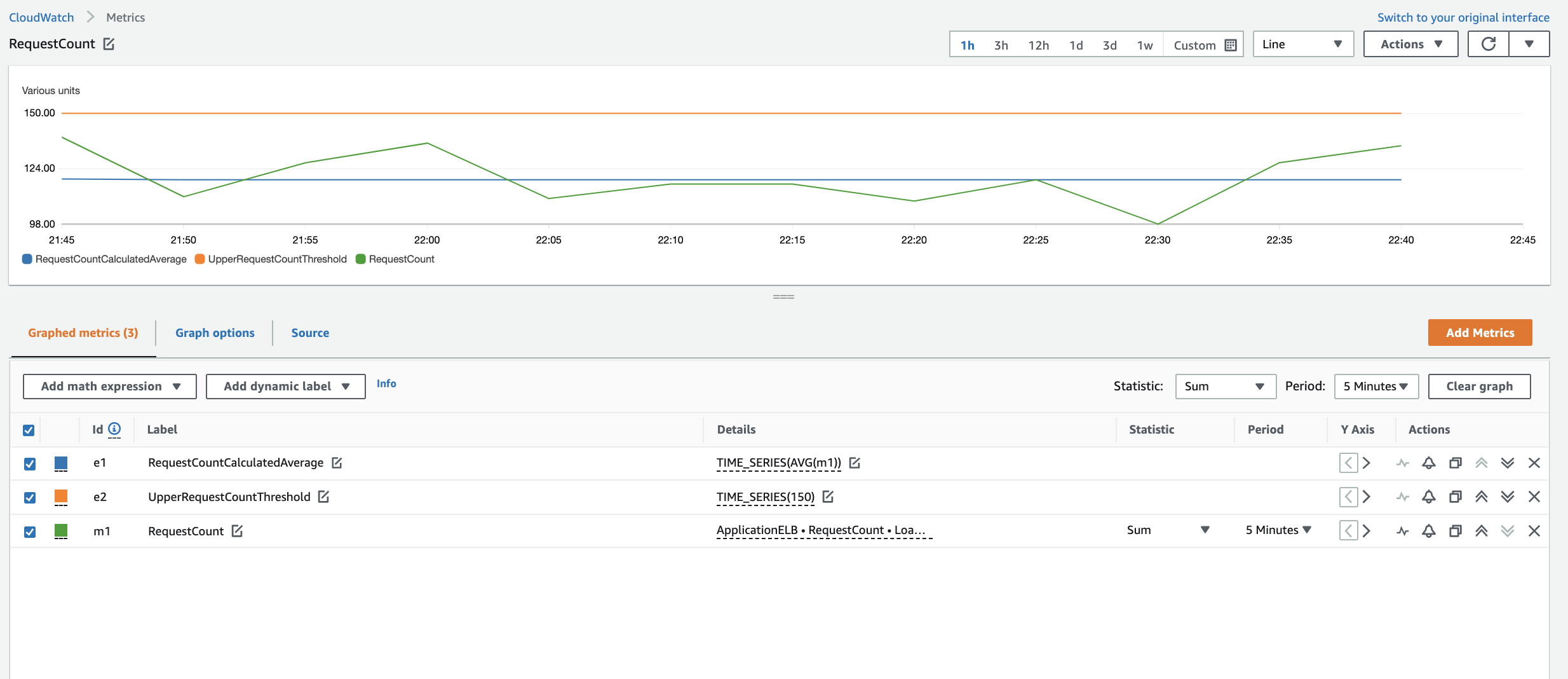
Figure 10: RequestCount metrics and time series expressions showing the static average of requests and a line at 150 requests
DATAPOINT_COUNT()
This function allows you to count data points that reported values or, in other words, how many times a metric value was received for a given metric.
When you use this function with TIME_SERIES, you can count occurrences over a time period. For example, you can count how many times in a week a host has reported an error: TIME_SERIES(DATAPOINT_COUNT(m1))
Conclusion
In this blog post, I shared the newly added metric math functions that you can use to enhance your existing CloudWatch metrics without generating additional metrics at source. For more information, see Using metric math in the Amazon CloudWatch User Guide.