AWS Cloud Financial Management
Trends Dashboard with AWS Cost and Usage Reports, Amazon Athena and Amazon QuickSight
Voiced by Amazon Polly
AWS cloud usage data is a critical component in the IT Financial Management process for AWS customers. As organizations grow in cloud maturity, the cloud usage data may become complex as usage incurs from distributed teams and businesses. Financial and Technology leaders need access to trends, signals, insights, and cost deviations to quickly understand and analyze the cloud usage.
The AWS Cost and Usage Reports (CUR) provide comprehensive data about your AWS costs, including information related to product, pricing, and usage. By including the Resource IDs and choosing hourly time granularity, CUR allows you to analyze your costs in greater detail and accuracy. You can download the CUR reports from the Amazon Simple Storage Service (Amazon S3) console, query the reports using Amazon Athena or load the reports into Amazon Redshift or visualize in Amazon QuickSight.
In the spirit of customer-obsession, teams within AWS have also built intelligence dashboards, such as Cost Intelligence Dashboard available from Well Architected Labs and CUDOS framework based on AWS Serverless technologies. These dashboards allow you to visualize trends across AWS accounts and AWS Service Categories. You can find step-by-step instructions to automatically ingest the CUR data into Amazon Athena and provision pre-built Amazon QuickSight dashboards, in either Cost Intelligence Dashboard, or CUDOs framework.
In this blog post, we will introduce an interactive Trends Dashboard, a recent addition to the CUDOS framework. It is a new Amazon QuickSight dashboard that helps you conduct trend analysis, such as year-over-year, quarter-over-quarter, and month-over-month. In addition, it provides the ability for you to forecast, spot trends, and receive alerts.
Trends Dashboard
The Trends Dashboard uses Amazon QuickSight’s ML-powered forecast computation that forecasts future metrics based on patterns of historic usage metrics. These forecasts enable customers to identify opportunities to purchase new or additional Savings Plans or Reserved Instances. The dashboard also has a visual to show AWS usage across a geographical map (excluding Amazon Web Services China Regions) based on usage, payer and linked accounts. By following the instructions outlined in CUDOS framework, users can see trends across additional dimensions like business units (BU), resource tags or any other data that can be combined with CUR.
Several AWS Serverless services like Amazon S3, AWS Glue, Amazon Athena, and Amazon QuickSight are also leveraged by the Trends Dashboard. At a high level, you create your CUR with details such as Resource IDs, hourly granularity, and choose Amazon Athena as the report data integration. Next, you integrate the CUR data with Amazon Athena using AWS Glue Crawler. Finally, you import the pre-built dashboards to Amazon QuickSight. You can refer to the pre-requisites and the solution walkthrough to create the Trends dashboard.
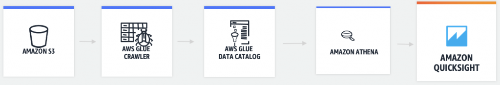
Figure 1: High-level architecture for Trends Dashboard
Key Features
Periodic Trends and Forecast: a set of visualizations of the yearly, monthly, and quarterly trends, along with monthly actuals.
You can also schedule delivery of reports or alerts (see the notification bell icon in Figure 2 below) from the dashboard and get notified when a threshold is met. Threshold-based alerts let you highlight changes to important metrics in your dashboard. For example, you can set alerts to notify whenever quarterly or monthly usage breaches against the thresholds you set.

Figure 2: Period over Period Visuals
Service Category Trends: a set of visualization trends grouped by AWS Service Categories.
Each service category is expandable to show individual AWS service usage trends with actual usage. Selecting any row acts as a filter for a more focused analysis of data. Both the trends and actuals help you plan for capacity, skill, and budget. All visuals within the Trends dashboard are included with One-click interactive filters. This point-and-click filtering feature allows you to cascade the selected data to act as a filter to all other visuals within the same dashboard sheet.

Figure 3: Spend by Service Category Visual
Service % Change (last 3 months): the percent of AWS service usage change during the last three months.
This visual shows a quick snapshot of what has changed recently and enables you to see if its in-line with your expected AWS cloud consumption. Each of the data point within this visual has the point-and-click filtering feature as well.

Figure 4: Service % Change Visual
AWS Account Trends: AWS CUR contains usage data based on PayerAccountId and UsageAccountId.
Often times customers need friendly account names instead of the PayerAccountId and/or UsageAccountId when viewing the usage reports. The Trends Dashboard uses AWS Organizations list-accounts API to get the account friendly name from all the accounts in an organization. With Trends Dashboard, you have the ability to filter, view trends based on AWS Organizations account names, PayerAccountId and/or UsageAccountId.

Figure 5: AWS Account Trends Visual
Filter Controls: the ability that allows customers to filter data based on a number of fields like date range, PayerAccountId, UsageAccountId, AWS service, charge type, and others.
Customers also have an option to select between Unblended and Amortized costs. Unblended costs represent your usage costs on the day they are charged to you. Amortized costs help finance owners view costs on an accrual basis rather than a cash basis.

Figure 6: Filter Controls
Global Usage map – geospatial charts (Maps) and regional metrics for AWS usage across a geographical map.
This visual lets customer quickly identify the AWS regions where their workloads run and the size of their usage. In addition, the field controls and the point-and-click filter feature allows you to drill down to a specific region usage data.

Figure 7: Global Usage Visual
Conclusion
In this post, we explained how Trends Dashboard can help you with proactive trends and insights to understand AWS cloud usage. This dashboard is one of the many examples of visualizations that you can build using native AWS services, such as AWS Cost and Usage Report, Amazon QuickSight. Once imported, you can customize the dashboard by adding additional data from Trusted Advisor, Support cases, Personal health dashboard data, and other sources. Visit our Trends Dashboard Workshop and get started today. We encourage you to send us your feedback and questions to us via cudos-feedback@amazon.com.