Front-End Web & Mobile
6 New AWS Amplify Launches for Frontend Developers
Today, the AWS Amplify team has six brand new launches to share with you — all addressing common requests from our community. In this post, we’ll share improvements to our documentation site, Next.js 14 support, custom authentication providers, React Native social sign in, and UI components.
New documentation site
Head over to docs.amplify.aws to check out the brand new documentation site for Amplify. The site has a full visual redesign using Amplify UI components — we’ve reorganized content to improve discoverability, and make it easier to find the information you need. The new architecture structures the documentation around use cases, like adding authentication to your app, rather than the specific tools like the CLI or libraries. Hopefully, this will make it much easier to learn how to build fullstack applications with Amplify. There is also a new how Amplify works page which aims to help understand all the parts of Amplify and how you can use them together.
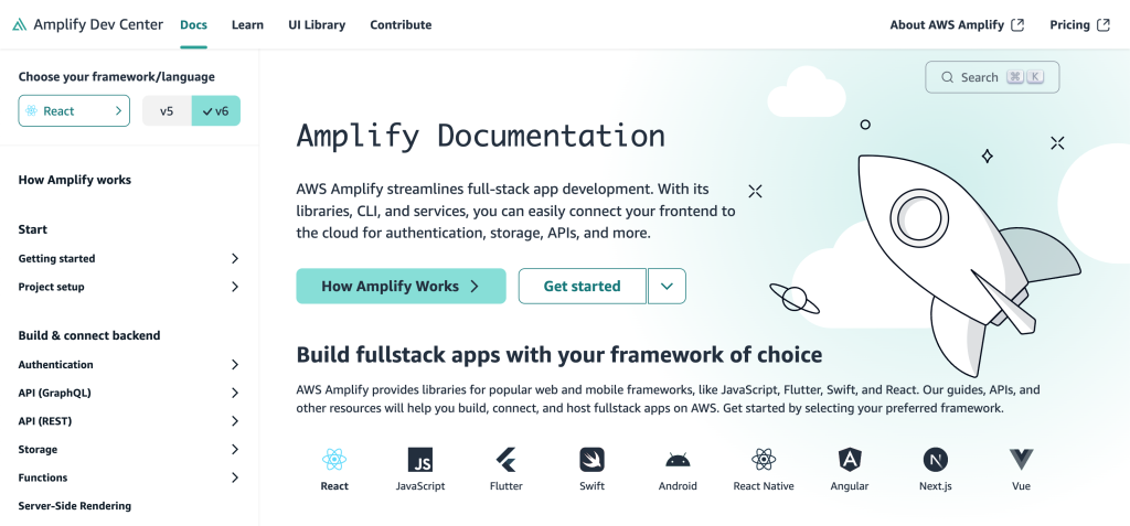
Checkout the docs to see what’s changed
Support for Next.js 14
Recently, we’ve added support for Next.js 14 with our hosting and JavaScript library. Earlier this week we released a major update to our Amplify JavaScript library. Version 6 has full compatibility with Next.js 14, including one of it’s most popular new features Server Actions. With the new generateServerClientUsingCookies function, you can now safely run server components with Server Actions.
Let’s take a look at this in action inside a Next.js 14 application that is already connected to an AWS AppSync backend.
First, we’ll add in a new utils/server-utils.ts file.
// server-utils.ts

import { cookies } from "next/headers";
import { generateServerClientUsingCookies } from "@aws-amplify/adapter-nextjs/api";

import config from "@/amplifyconfiguration.json";

export const serverClient = generateServerClientUsingCookies({
  config,
  cookies,
});
Let’s create a server action that deletes a post in a server component.
// page.tsx
import * as mutations from "@/graphql/mutations";
import { serverClient } from "@/utils/server-utils";
// ...
  async function deletePost(formData: FormData) {
    "use server";
    const id = formData.get("postId")?.toString();

    if (id) {
      const { errors } = await serverClient.graphql({
        query: mutations.deleteTodo,
        variables: {
          input: {
            id,
          },
        },
      });

      if (errors) {
        // handle errors
      }
    }
}
This delete function will be used as a Server Action to retrieve a postId for deletion. This allows us to handle a form submit on the server and grab the id so it can be passed to the input variables.
Amplify Hosting now has Next.js 14 support as well. To use this new feature, set amplify:al2023 as the value for the custom build image if this is the app’s first deployment. Conversely, if the app has already been deployed, then select the Amazon Linux: 2023 image from the dropdown.

This image has the latest version of Node 18 that Next.js 14 requires. It’s also possible to add nvm use 18 to your build settings if you are already using an image that has Node 18 on it.
Learn more about using Amplify with Next.js
Custom auth providers
You can now add custom token providers to Amplify Auth. This allows you to create your own custom auth token provider, when you are using your own token service, for example OIDC. You can now provide the tokens via the Amplify.configure method call. Below is a sample on how this could work:
import { Amplify } from 'aws-amplify';
import { TokenProvider, decodeJWT } from 'aws-amplify/auth';

// ...

const myTokenProvider: TokenProvider = {
  async getTokens({ forceRefresh } = {}) {
    if (forceRefresh) {
      // try to obtain new tokens if possible
    }

    const accessTokenString = '<insert JWT from provider>';
    const idTokenString = '<insert JWT from provider>';

    return {
      accessToken: decodeJWT(accessTokenString),
      idToken: decodeJWT(idTokenString),
    };
  },
};

Amplify.configure(awsconfig, {
  Auth: {
    tokenProvider: myTokenProvider
  }
});
You can also create your own custom credential provider directly from Cognito Federated Identities and not use User Pool federation. Here also you would provide it via Amplify.configure method call. Here is an example on how this may work.
import { Amplify } from 'aws-amplify';
import {
  fetchAuthSession,
  CredentialsAndIdentityIdProvider,
  CredentialsAndIdentityId,
  GetCredentialsOptions,
  AuthTokens,
} from 'aws-amplify/auth';

// Note: This example requires installing `@aws-sdk/client-cognito-identity` to obtain Cognito credentials
// npm i @aws-sdk/client-cognito-identity
import { CognitoIdentity } from '@aws-sdk/client-cognito-identity';

// You can make use of the sdk to get identityId and credentials
const cognitoidentity = new CognitoIdentity({
  region: '<region-from-config>',
});

// Note: The custom provider class must implement CredentialsAndIdentityIdProvider
class CustomCredentialsProvider implements CredentialsAndIdentityIdProvider {

  // Example class member that holds the login information
  federatedLogin?: {
    domain: string,
    token: string
  };

  // Custom method to load the federated login information
  loadFederatedLogin(login?: typeof this.federatedLogin) {
    // You may also persist this by caching if needed
    this.federatedLogin = login;
  }

  async getCredentialsAndIdentityId(
    getCredentialsOptions: GetCredentialsOptions
  ): Promise<CredentialsAndIdentityId | undefined> {
    try {

      // You can add in some validation to check if the token is available before proceeding
      // You can also refresh the token if it's expired before proceeding

      const getIdResult = await cognitoidentity.getId({
        // Get the identityPoolId from config
        IdentityPoolId: '<identity-pool-id-from-config>',
        Logins: { [this.federatedLogin.domain]: this.federatedLogin.token },
      });

      const cognitoCredentialsResult = await cognitoidentity.getCredentialsForIdentity({
        IdentityId: getIdResult.IdentityId,
        Logins: { [this.federatedLogin.domain]: this.federatedLogin.token },
      });

      const credentials: CredentialsAndIdentityId = {
        credentials: {
          accessKeyId: cognitoCredentialsResult.Credentials?.AccessKeyId,
          secretAccessKey: cognitoCredentialsResult.Credentials?.SecretKey,
          sessionToken: cognitoCredentialsResult.Credentials?.SessionToken,
          expiration: cognitoCredentialsResult.Credentials?.Expiration,
        },
        identityId: getIdResult.IdentityId,
      };
      return credentials;
    } catch (e) {
      console.log('Error getting credentials: ', e);
    }
  }
  // Implement this to clear any cached credentials and identityId. This can be called when signing out of the federation service.
  clearCredentialsAndIdentityId(): void {}
}

// Create an instance of your custom provider
const customCredentialsProvider = new CustomCredentialsProvider();
Amplify.configure(awsconfig, {
  Auth: {
    // Supply the custom credentials provider to Amplify
    credentialsProvider: customCredentialsProvider
  },
});
Learn more about custom auth providers
React Native social sign in
The Authenticator automatically takes your amplify auth configuration so you don’t need to make any changes to start using social sign-in other than getting the new version of the @aws-amplify/ui-react-native and the @aws-amplify/rtn-web-browser package.

Learn more about how to set up social sign in for React Native
Account Settings Components
Amplify UI now has two components for updating users’ authentication settings in a similar flow to the Authenticator component which provides sign in and sign up functionality. These components are cloud connected, meaning you don’t need to implement any additional logic to make them work with Amplify backends. They are fully customizable and theme-able. The ChangePassword component allows users to change their current password by entering a new one and confirming it.

The DeleteUser component allows users to permanently delete their accounts.

Learn more about the account settings components
Amplify UI React v6
To coincide with the Amplify JS v6 launch we have updated all Amplify UI packages to use Amplify JS v6. You will get the same bundle size improvements, plus UI also made some size improvements by removing some dependencies and cleaning up the codebase.
Rebuilt Tabs component
The Tabs component has been rebuilt from the ground up to be more composable and customizable.
<Tabs.Container defaultValue="Tab 1">
    <Tabs.List>
       <Tabs.Item value="Tab 1">Tab 1</Tabs.Item>
       <Tabs.Item value="Tab 2">Tab 2</Tabs.Item>
       <Tabs.Item value="Tab 3" isDisabled>
          Tab 3
       </Tabs.Item>
     </Tabs.List>
     <Tabs.Panel value="Tab 1">Tab 1 content</Tabs.Panel>
     <Tabs.Panel value="Tab 2">Tab 1 content</Tabs.Panel>
     <Tabs.Panel value="Tab 3" isDisabled>
       Tab 1 content
    </Tabs.Panel>
</Tabs.Container>
You can also use the tabs in a simpler way:
<Tabs
    defaultValue={'Tab 1'}
    items={[
      { label: 'Tab 1', value: 'Tab 1', content: 'Tab content #1' },
      { label: 'Tab 2', value: 'Tab 2', content: 'Tab content #2' },
      { label: 'Tab 3', value: 'Tab 3', content: 'Tab content #3' },
    ]}
  />
Rebuilt Expander (now Accordion)
Just like with the Tabs, we rebuilt the Expander component to be more composable and to use the semantic HTML elements <details> and <summary>. We renamed the component Accordion to be more in line with other UI libraries.
<Accordion.Container>
  <Accordion.Item value="Accordion-item">
    <Accordion.Trigger>
      What is an Accordion?
      <Accordion.Icon />
    </Accordion.Trigger>
    <Accordion.Content>
      An Accordion contains all the parts of a collapsible section.
    </Accordion.Content>
  </Accordion.Item>
  <Accordion.Item value="unique-value">
    <Accordion.Trigger>
      This is the item title
      <Accordion.Icon />
    </Accordion.Trigger>
    <Accordion.Content>
      The `children` of the Accordion are displayed here.
    </Accordion.Content>
  </Accordion.Item>
</Accordion.Container>
Similar to the Tabs component, you can also use it with a simpler API:
<Accordion
  items={[
    {
      trigger: 'Is it accessible?',
      value: 'accessible',
      content: 'Yes! It uses HTML native elements: <details> and <summary>.'
    },
    {
      trigger: 'Can I customize the styling?',
      value: 'styling',
      content: 'Of course! See the section on CSS Styling below.'
    },
    {
      trigger: 'Is it a great way to organize content?',
      value: 'content',
      content: 'Most definitely!'
    }
  ]}
/>
See the migration guide for more details
CSS Layers and split files
If you are unfamiliar with CSS layers, they can help you wrangle specificity issues by allowing you to group together CSS into separate layers so that certain layers will take precedence even if the CSS selector doesn’t have a higher specificity. Now that CSS Layers is widely adopted in browsers we added some new CSS files that you can use to take advantage of CSS layers. CSS layers is opt-in, change .css to .layer.css for example:
`import '@aws-amplify/ui-react/styles.layer.css';`
We also split up the CSS files to give you control over what parts of our styles to import. Each component has its own CSS file, plus a base CSS file that has base Amplify UI styles and a reset CSS file. You can use these files like this:
import '@aws-amplify/ui-react/reset.layer.css' // global CSS reset
import '@aws-amplify/ui-react/base.layer.css' // base styling needed for Amplify UI
import '@aws-amplify/ui-react/button.layer.css' // component specific styles
Theming updates
We have also made it easier to theme Amplify UI. You can now add arbitrary design tokens to the theme and reference and use them in your components. Setting the primary and secondary color of the theme was tedious because you had to map each shade to values (ex. 10, 20, 40, 60, 80, 90, 100). Now you can, for example, just add primaryColor: 'red' at the root of your theme to :
const theme = createTheme({

 primaryColor: 'red',

 secondaryColor: 'green',

 });
Conclusion
Today, AWS Amplify is announcing six new launches that help build full-stack applications faster. All of our launches are inspired by the community, so please reach out via our GitHub or Discord with any ideas or feedback you have. To learn more about how you can build with Amplify, visit our documentation.