AWS Database Blog
Visualize query results using the Amazon Neptune workbench
In this post, we look at the new visualization features recently added to the Amazon Neptune workbench and released on August 12, 2020. These additional capabilities allow you to produce an interactive graph diagram representing the results of your Gremlin and SPARQL queries. We look at some Gremlin-specific features and then do the same for SPARQL. Finally, we look at some of the more advanced ways you can modify the visualizations. As a sidenote, this entire post was produced using the workbench.
Installing the new features
If you had previously configured the Neptune workbench, all you need to do to pick up the new features is to stop and restart your Jupyter notebook on the Amazon SageMaker console. If you had not previously installed the workbench, you can launch a new notebook on the Amazon Neptune console. As part of this update, two new example notebooks are installed. These take you on a tour of all the new features in detail for both Gremlin and SPARQL queries. For step-by-step instructions on installing these new features, see the following:
- Using the Neptune Workbench with Jupyter Notebooks
- Using Neptune’s Getting Started notebooks
- Graph visualization in the Neptune workbench
After installing the latest workbench, you should check the version number to make sure you have the latest. You can do this with the %graph_notebook_version command. You should see a version of 1.27 or higher.

It’s also a good idea to make sure that the connection to the Neptune server is working. You can do this with the %status command. See the following screenshot.

Loading some sample data
The Neptune workbench has a %seed command that you can use to load the sample data that the queries in this post use. Simply create a new cell in your notebook, enter %seed, and run the cell. You’re prompted to enter your Language (graph type) and Data set. In this post, we look at both Gremlin and SPARQL queries. If you want to try all the examples, you should install both the Gremlin and SPARQL datasets. In both cases, for Data set, choose airports. After you choose Submit, the data starts to load. Loading the data should only take a few seconds.

Seeing a visual representation of your Gremlin queries
The property graph data loaded by the %seed command is a model of the worldwide air route network. There are vertices for airports, countries, and continents. There are edges between airports and between the countries, continents, and airports. Each airport has a set of properties, and the edges between airports have a property that represents the distance in miles.
You can find the dataset at the GitHub repo. You can visually explore the results of any Gremlin query that returns a path. When you run such queries, you see a Graph tab in the query results area alongside the Console tab. Because Gremlin queries allow you to use by modulators to modify the representation of path results, there are some rules concerning how results are rendered visually. These rules are worth remembering. The default behavior for vertex and edge path results that are not modified using by modulators is to use their labels to annotate the visualization.
In some cases, the Neptune notebook visualizer can figure out for itself whether an element in a path result represents a vertex or an edge and, in some cases, the direction the edge follows. We present two straightforward examples of such queries. Because the first query doesn’t contain any edge information in the path result, the visualizer can’t automatically determine the edge direction.
In the second query, the edge direction can be determined because an outE step is included:
When no by modulators are provided, the visualizer uses the vertex and edge labels to annotate the elements of the diagram. However, when by modulators are used, it’s not possible for the visualizer in all cases to decide on its own which path elements represent a vertex and which represent an edge. The following code is an example of such a query:
Additionally, the visualizer can’t always decide which direction an edge follows. In this case and when using by modulators, the visualizer allows you to provide some special hints to assist in producing the desired diagram.
Query visualization hints
You can specify query visualization hints using either -p or --path-pattern after the %%gremlin cell magic. The syntax in general is:
The names of the hints reflect the Gremlin steps most commonly used when traversing between vertices and behave accordingly. The hints used should match the corresponding Gremlin steps used in the query. The hints can be any combination of those shown in the following list, separated by commas. The list must not contain any spaces between the commas.
vinvoutveineoute
We can provide visualization hints for the query shown earlier as follows:
If you run the query with and without the hints present, you can observe the differences. Without the hint, the visualizer can’t determine if the dist property relates to a vertex or an edge, and therefore defaults to using a vertex.
Adjusting the visualization layout and other settings
You can further adjust many of the visualization settings using the following two commands. We look at using both near the end of this post.
%graph_notebook_vis_options%%graph_notebook_vis_options
Exploring routes from Palm Springs using Gremlin
Given the preceding information, we can start writing some queries and creating visualizations. Let’s start by writing a Gremlin query to find 10 routes from the Palm Springs (PSP) airport. When we run the query, by default we see the results shown in text form on the Console tab. Choosing the Graph tab yields a picture. You can move the vertices by choosing them (left-click) and dragging. You can zoom in and out using the + and – icons or by moving the scroll wheel on a mouse or using the zoom gesture on your laptop or tablet. You can pan (move) the whole diagram around by choosing (left-click) on a part of the diagram where there are no vertices or edges and dragging. If you hover the mouse over a vertex, a pop-up appears containing the text used to label that vertex in the diagram. If you choose the picture (right-click), a menu appears that allows you to copy the diagram to the clipboard or save it as a PNG file. This is useful if, for example, you create a diagram that you want to share with others.
We use the following code for our query:
The following screenshot shows the results on the Console tab.

The following screenshot shows the results on the Graph tab.

So far, our diagram looks quite nice, but there are no arrowheads showing us which direction the routes are in. This is because the results of our query don’t give the visualizer enough information to figure this out by itself. However, we can easily add arrows to our diagram. This time we add a hint after the cell magic: %%gremlin -p v,inv. This tells the visualizer that there will be a vertex followed by another vertex, connected by an outgoing edge. This is all the visualizer needs to know where to put the arrow heads in the diagram.
The following screenshot shows the updated diagram with the arrows added.

Now all that’s missing is to add the route distances as labels on the edges. Let’s also change the query so that the vertex labels are city names rather than airport codes. To do that, we need to change the query to include explicit references to the edges and the vertices. We also need to change the hint to the visualizer to let it know that there are edge properties in the result set. Vertex labels are truncated and replaced, and have an ellipsis (…) added if they’re longer than 10 characters. Hovering over a vertex causes a tool tip to appear that shows the full text.
The following code is our updated query:
The following screenshot shows the updated visualization and a tool tip.

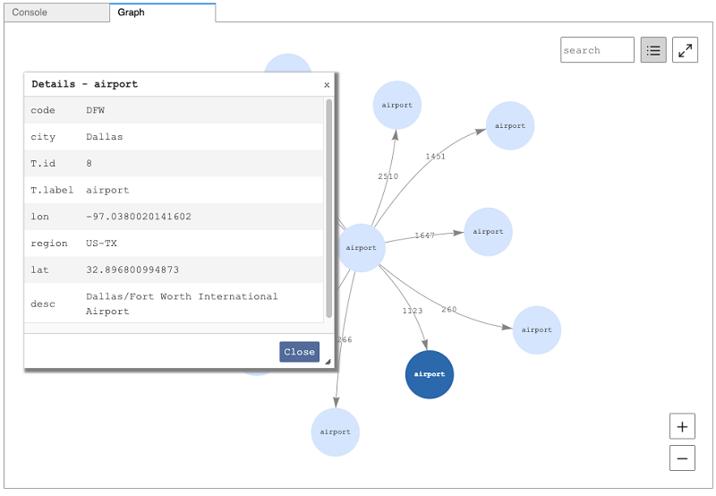
Introducing the Details view
If your Gremlin query results include a key-value map, as generated by the valueMap step, you can hover the mouse over a vertex to see many of the results, but it’s sometimes nicer to see them in a table. Choosing a vertex and then choosing the Details view icon pops up a table showing a scrollable list of the results. You can move the pop-up window around and make it larger or smaller as suits your preference. We use the following Gremlin query to produce these results:
The following screenshot shows the Details window containing information about the selected airport.

Rather than have the full set of keys and values used for vertex labels, we can instead have the vertex label used. It’s still possible to get all of the properties from the Details view. We can modify the query to include labels using with(WithOptions.tokens) after the valueMap step:
The following screenshot shows the labels from the valueMap to label the vertices.
Routes between New Zealand and Australia
The last Gremlin query we look at for now produces a more interesting result. Imagine we want to find all routes that start in New Zealand and end in Australia. The following Gremlin query does just that. When we run the query and look at the resultant diagram, we can see all the different ways New Zealand and Australia are connected within the dataset. Towards the end of this post, we take one more look at a similar Gremlin query and explain how to change the way the visualization is created using a more left-to-right, hierarchical view setting.
The following screenshot shows the routes that were found on the Graph tab.

Seeing a visual representation of your SPARQL queries
The RDF graph data loaded by the %seed command is derived from the same dataset used in the preceding Gremlin examples. In this version, RDF triples are used to represent airports, countries, continents, and their respective properties. There are additional triples that represent routes between airports and between the countries, continents, and airports. The dataset takes advantage of RDF named graphs to represent the equivalent of edge properties that represent the distance between airports.
You can find the original dataset in CSV form on the GitHub repo.
The following SPARQL PREFIX shortcuts are helpful when working with this data:
The RDF version of the dataset was created by converting the property graph CSV files into N-Quad format files using the Amazon Neptune CSV to RDF Converter tool.
You can explore the results of many SPARQL queries. When running such queries, you see a Graph tab in the query results area alongside the other tabs. You must follow a few requirements if you want to have a visualization drawn.
The visualizer looks for specific variable names in the SELECT clause. If the visualizer encounters a ?s before it encounters a ?subject, it uses any subsequent ?p and ?o variables for the visualization. Likewise, if it encounters a ?subject first, it looks for ?predicate and ?object variables. The simplest form of this would be:
However, the following code is also allowed, but only ?s, ?p, and ?o are used for the visualization. The table view still shows all variables used.
Although the previous example is allowed, it might be confusing to someone reading your query. So a more typical case might be:
In this case the visualizer uses ?s, ?p, and ?o.
To summarize, you can use whatever variable names you like in your queries, but only those following the patterns we explained are used in the visualization. By default, if present, the rdfs:label triple value is used to label graph components in the visualization.
Query visualization hints
By default, a visualization only includes triple patterns where ?o represents another triple resource. In other words, if ?o is of type uri or bnode (blank node), all other ?o binding types, such as literal (string or integer), are considered to be properties on the ?s node. You can see these on the Details view on the Graph tab. If you want to also include literal values in your visualization as vertices, which often is the case, you can specify a hint. See the following code:
This tells the visualizer to include all ?s ?p ?o results in the graph diagram. You see this hint used in many of our examples. Feel free to experiment by running queries with and without the hint to see the differences to the visualization.
Adjusting the visualization layout and other settings
As with Gremlin queries, you can further adjust many of the visualization settings for SPARQL queries using the following two commands:
%graph_notebook_vis_options%%graph_notebook_vis_options
Exploring routes from Palm Springs using SPARQL
We’re now ready to start writing SPARQL queries and creating visualizations that are similar to the Gremlin ones. As we did with Gremlin, we can start by writing a SPARQL query to find 10 routes from the Palm Springs (PSP) airport. When we run a SPARQL query, the results by default are shown using a table view. If the query can be shown visually, there is also a Graph tab. Results from SPARQL queries also have a Raw tab, which allows us to see the query in the form it was returned by the query engine. This is similar to the Console view used for Gremlin queries.
We use the following query:
The following screenshot shows the Table tab.

The following screenshot shows the Graph tab.

So far, we just see the unmodified triples in the table and graph views. This is something we can improve upon in the next query.
The visualizer takes advantage of any PREFIX shortcuts you use. If we modify the query to include an additional PREFIX called res:, it’s used to label the vertices. This makes the diagram more readable. The following code is our updated query:
The following screenshot shows that PREFIX name is used to label the vertices.

We would have a nicer visualization if we could see the airport codes rather than the fully qualified triple values. We can do that by adjusting the query and giving the visualizer the –expand-all hint:
The following screenshot shows the results of running the modified query. This looks a lot nicer and is easier for a human observer to understand.

Visualizing RDF triples as a graph
Sometimes it’s nice to see all of the triples related to a specific vertex in the graph diagrammatically. The next query helps us achieve that. We use a FILTER step to retrieve just the literal values connected to the PSP vertex. Again, using the –expand-all hint tells the visualizer to draw the results as a star graph.
The following screenshot shows the PSP airport properties drawn as a star graph.

Using the Details view with SPARQL queries
If we remove the --expand-all hint from our previous query, the star graph becomes a diagram containing a single vertex. However, the results are still available to us via the Details view.

Adding route distances to the visualization
To make the visualization more interesting, we can change the query so that the visualization includes the route distance as the edge labels. To do this, we take advantage of the fact that the RDF dataset uses named graphs to simulate the same edge properties found in the property graph data. The following query is still quite simple and the results are a lot nicer:
The following screenshot shows the diagram with the distances added.

Routes between New Zealand and Australia: Revisited
To finish up our SPARQL examples, let’s write a query that does the same thing we did earlier in Gremlin. When we run the query, the results look similar to before. Although Gremlin and SPARQL each have specific things they do very well, this demonstrates that you can express a lot of common graph queries easily in either language.
The following diagram looks a lot like the one we created earlier using Gremlin.

Changing the visualization settings
Neptune notebooks use an open-source library called Vis.js to assist with drawing the graph diagrams. Vis.js provides a rich set of customizable settings. For the documentation for most of the visualization settings used in this notebook, see vis.js. For more information about graph network drawing, see Network.
To see the current settings used by your notebook, you can use the %graph_notebook_vis_options line magic command. To change any of these settings, create a new cell, copy the results, make some edits, and use %%graph_notebook_vis_options to change them (note the two percent signs indicating a cell magic).
These settings give you a lot of flexibility to customize your visualizations in whichever way you prefer. At any time, you can restore the default settings by running a cell containing the command %graph_notebook_vis_options reset.
Producing a hierarchical diagram
For some types of queries, using a hierarchical view is quite pleasing. We can enter the following JSON code into a cell containing the %%graph_notebook_vis_options command. The JSON code contains settings that instruct the visualization engine to produce a more hierarchical view; in this case specifically, a left-to-right view. This type of configuration is useful if the result of your query is tree-like in nature. For our use case, it also works well for looking at airline routes that have a start, some intermediate stops, and a destination. See the following code:
The following Gremlin query looks for up to five routes from Palm Springs to Wellington, New Zealand.
The following screenshot shows the query results without hierarchical view settings in place.

The following screenshot shows the query results with hierarchical view settings.

Summary
In this post, we showcased many of the new visualization features now available in the Neptune workbench. We encourage you to experiment with the sample data in this post or your own data to further explore all of the features. As we mentioned earlier, two new example notebooks are installed along with the workbench that make it easy to get started with query visualizations. Let us know what you think of this new experience. All that is left for now is to wish you happy visual graphing with Neptune!
About the Author
 Kelvin Lawrence is a Principal Data Architect focused on Amazon Neptune and many other related services. He has been working with graph databases for many years, is the author of the book Practical Gremlin and is a committer on the Apache TinkerPop project.