AWS Cloud Financial Management
AWS Cost Explorer’s New Look and Common Use Cases
Update: By April 19, 2023, you will no longer be able to roll back to the old Cost Explorer UI. Feel free to submit feedback in the console. We’ll continue improving the experience.
The following blog was published on Nov.8, summarizing the Cost Explorer UI changes made in October this year. We’ve since incorporated your feedback in our recent updates and have called out these in the blog below with rationale and instructions.
AWS Cost Explorer has recently updated its user interface on October 11, 2022 and from what we’ve heard, you have mixed feelings about it. Most of you rely on Cost Explorer cost and usage visuals and its data breakdown to analyze how much you’ve spent and may spend on AWS within a given period. It is important for us to make sure Cost Explorer continues to bring you the information you need in a user-friendly manner.
Background
The AWS Cost Explorer UI update is part of an AWS console wide migration to the latest AWS Design System that allows a more consistent and modernized user experience across the console that is built on a newer, actively updated web framework. The new system improves the security posture and allows the console’s codebase to be independent from each other. This way, it can make concurrent development possible and handle traffic loads better and easily facilitate expanding into new regions. Finally, the new framework also allows us to implement new features in the Console to improve user experience.
Cost Explorer New UI
The new Cost Explorer UI introduced a summary widget above the graph and the ability to search through the results in the cost and usage breakdown table view. The header of the graph has been updated to “Cost and Usage Graph”, and the title of the report name will show as a “New cost and usage report” until you save the report to the library with a custom name. Please note the “Total cost” in default is a summary of your cost from the past 6 months.
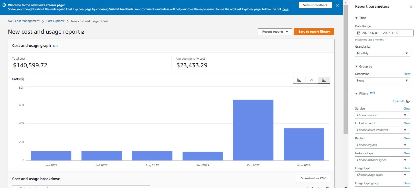
Figure 1: Cost Explorer UI update: Title, total cost, date range
The Cost Explorer graph now uses a new color palette that has been through extensive accessibility studies. In the past month, we’ve added more varieties of color families, so you can easily distinguish the different colors within a graph. We’ve also improved the readability of the graph. As you move your mouse cursor over a particular element of the chart, for example, one part of a bar in the stacked bar chart, a pop-up window will show up next to your cursor that dynamically highlights the selected legend with relevant data in bold, in addition to other legends in the same bar. This way, you will be able to spot the data associated with the component in the graph you’re interested in, in relation to others.
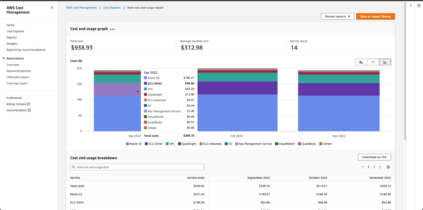
Figure 2. Graph with dynamic selection highlight
From the graph above, you can see a “service count”, which is a new widget introduced as part of the Cost Explorer UI update. This is to inform you how many values are included in your results. As in the actual graph, only the top 9 most used services will be displayed and the 10th result will be in the aggregated format for the remaining results (previously, we showed 5 results and 6th result was an aggregate of the remaining results).
When we introduced the option of “relative” for time range this October, in addition to “absolute”, the intent was to allow quick selection of past and future time frames relative to the date when you use the tool. However, we understand that it can come across as confusing without the calendar view. In the latest rollout, we removed the “relative” or “absolute” option, and instead you will have the simplified experience you’re used to, where you can select a past and future time range and immediately see how that time range reflects in the calendar view. Please note that if you saved a report with an auto-selected range, the duration will remain the same and the date range will update according to when you open the saved report.
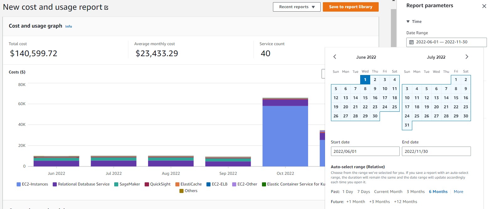
Figure 3: Cost Explorer date range selector
Back in our October UI change, we changed how you add dimension filters with 3 steps: “dimension”, “operator”, and “values”. The intent was not to list all the dimension options. But the seemingly simplification of the UI change did increase the number of clicks for you. As part of our latest UI update, we will prioritize the ease-of-use for you by listing all common filters on the page and you can click on “more filters” to expand to the list of full 18 dimensions. We also improved the load time for drop down values in filters.
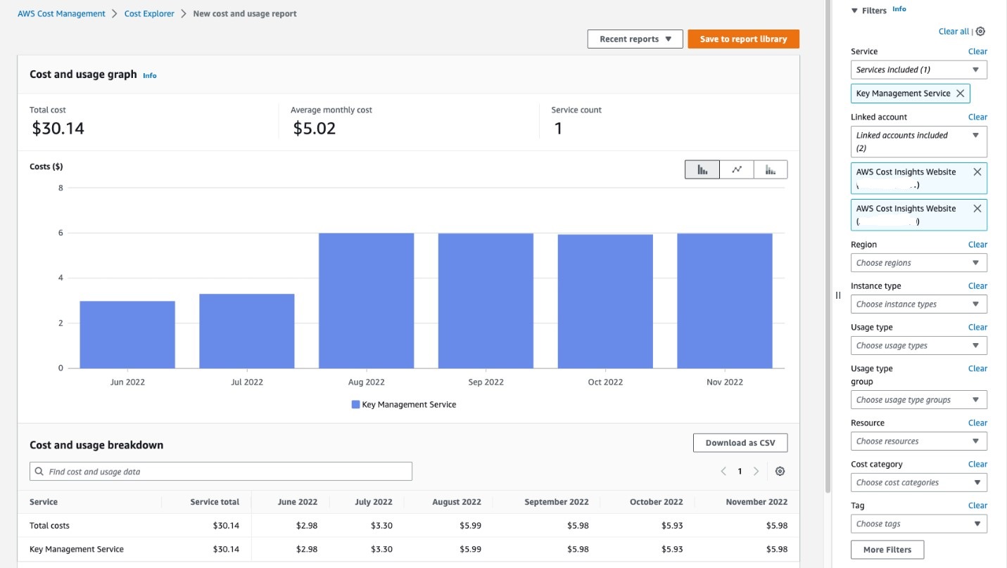
Figure 4: Dimension filter selection direct access in the panel
For those of you who have a standardized way of using dimensions, you can also manage your “filter preference” by showing or hiding the dimensions on your page and your preference will be saved for when you visit the page next time.
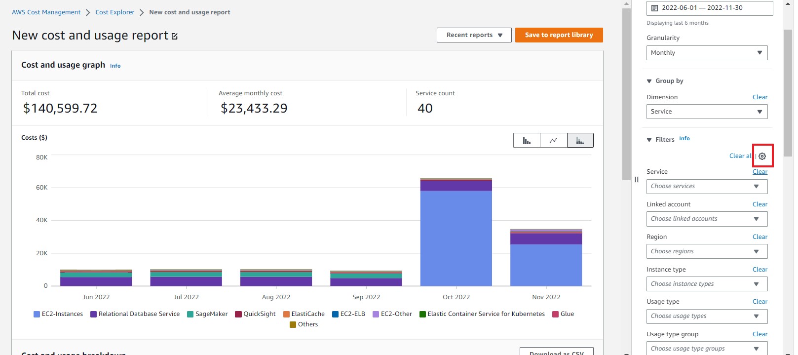
Figure 5: Gear icon for the filter preference selection
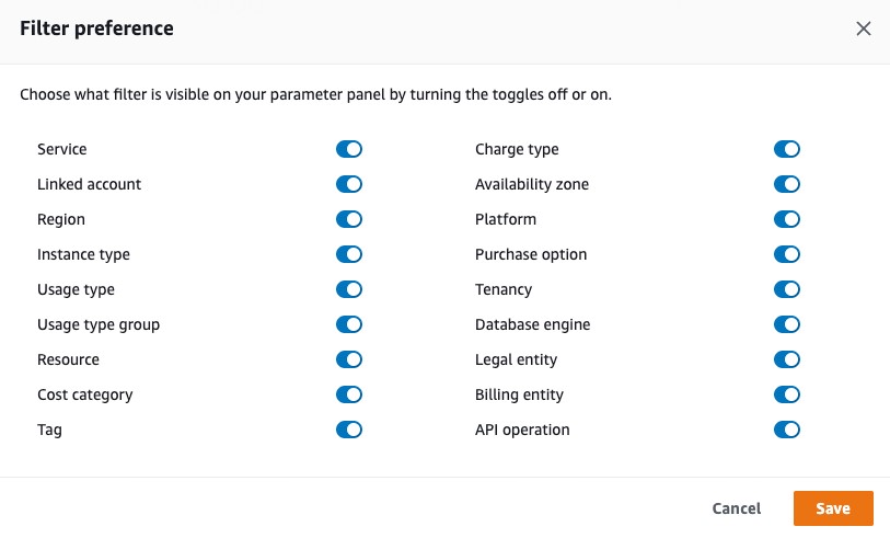
Figure 6: Filter preference selection
We’ve also enabled the “split panel” view, which means that as you scroll down and select your dimension at the right side of the screen, your graph in the left side will stay, so you don’t lose sight of your graph.
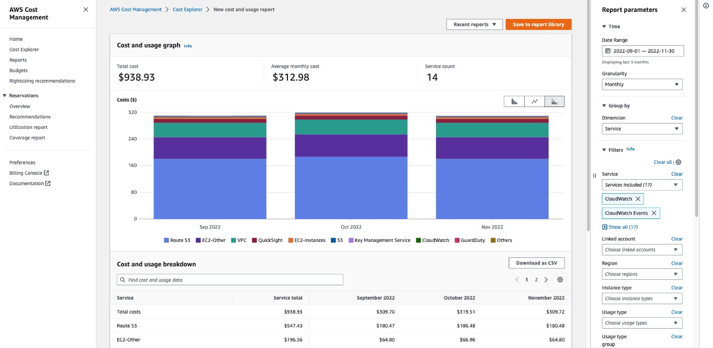
Figure 7. Split panel view
As part of the AWS console wide UI update, you now have the option to edit the visual display of your AWS consoles to be in light or dark mode in the account setting. In the recent update, we have adjusted and fine-tuned the display of Cost Explorer graphs to better adapt to the dark mode with no visual discrepancies.
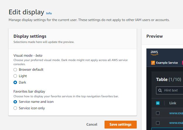
Figure 8. display visual mode in the account setting
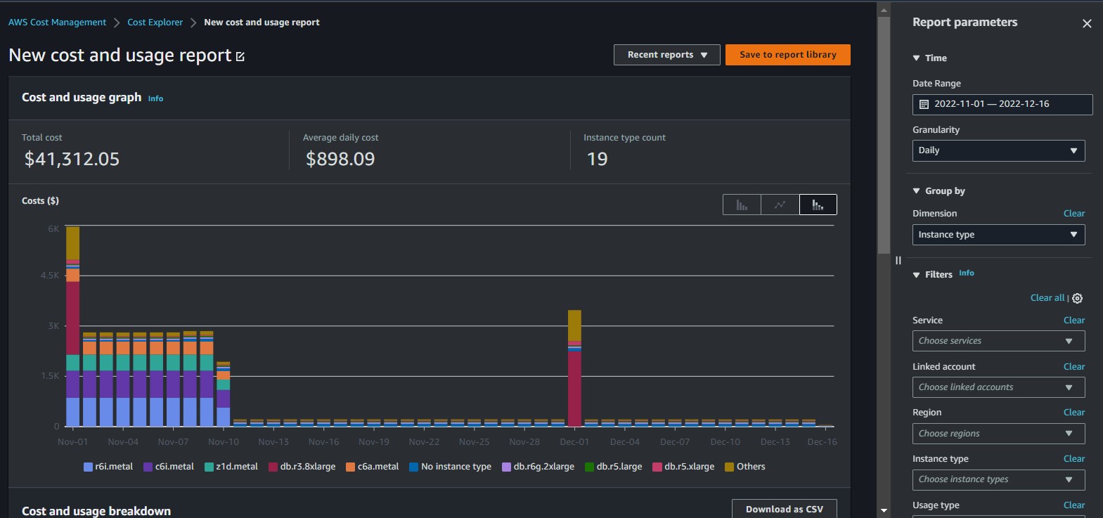
Figure 9. Cost Explorer in dark mode
Lastly on the “group-by” dimension selection, we have removed the “checkbox” to prevent the assumption of multi-selection.
Commonly used reports in AWS Cost Explorer
Cost Explorer allows you to visualize your AWS cost and usage information either at the aggregated level or a granular level of your choice. The service for the most part is free of charge, except for API access and the hourly and resource granularity data (see pricing information).
We want to take this opportunity to highlight a few commonly used Cost Explorer reports with the filter combinations that can help you dive deeper into a few service costs.
Monthly Trend: On the Cost Explorer home page, you can quickly get a cost summary and trend analysis report of the current month. This is a snapshot view for you to review and understand the growth trend of your AWS spend from last month and the main cost drivers for this month.
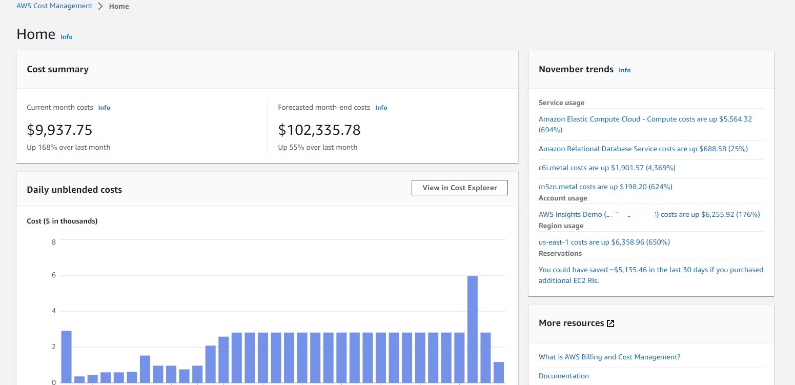
Figure 10: Cost Explorer Home Page: Monthly Summary and Trend
Amazon EC2 Hourly Unit Cost
EC2 is usually the top cost driver for many of your AWS bill. It is safe to assume that as your team increases the adoption of EC2 resources, you will witness the increase of your total EC2 cost as well. However, you can use the EC2 Hourly Unit Cost to evaluate the efficiency of your EC2 usage. To do this, you can filter by “Service: EC2”, and add the filter “Usage type groups: EC2 Running Hours”. You can download the CSV report to do the actual math for the EC2 hourly unit cost.
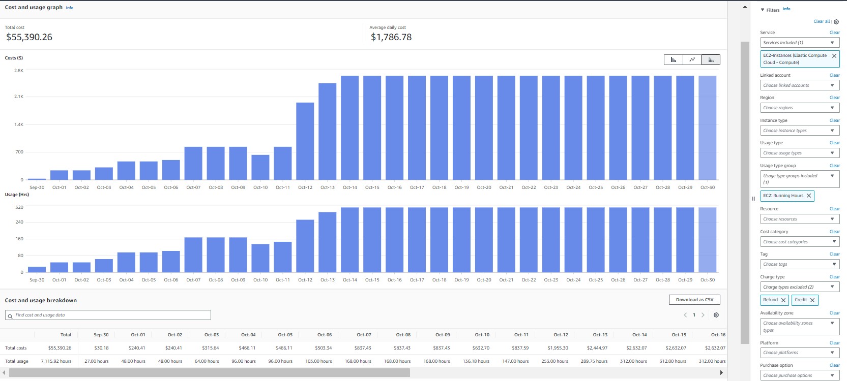
Figure 11. AWS Cost Explorer: Amazon EC2 Hourly Unit Cost
There are several ways to use AWS Cost Explorer to discover the opportunities to improve the cost efficiency of your EC2 spend: 1) EC2 Rightsizing recommendations to detect any idle or underutilized instances, 2) EC2 instance type, and 3) charge type.
Instance Type
By grouping your EC2 cost by “instance type”, you will be able to see if any of your EC2 resources are still using instances from the previous generations and refer to this upgrade path to leverage the better price/performance ratio of the newer generation instances.
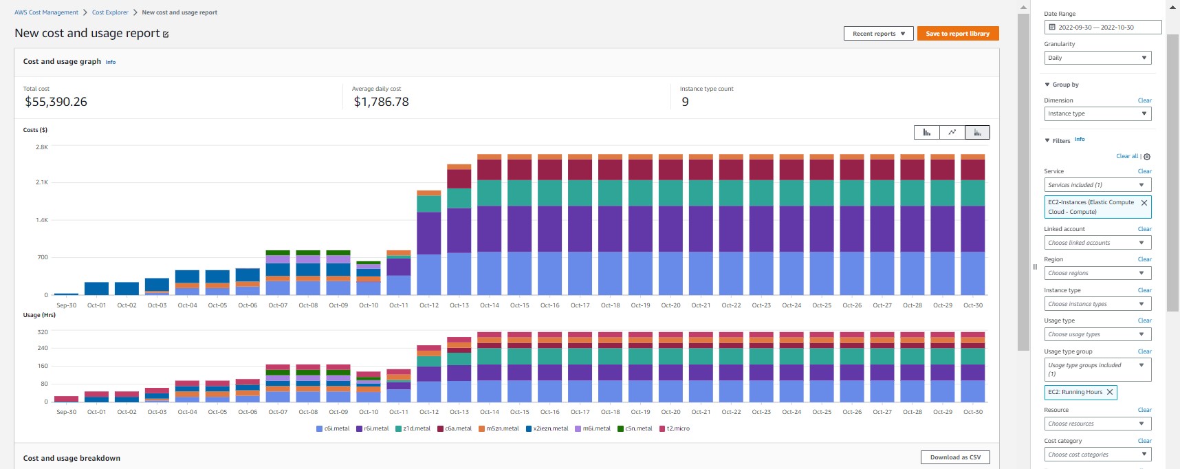
Figure 12. Cost Explorer: EC2 Instance type
Charge Type
For your stable, predictable EC2 usage, you can consider purchasing AWS Compute Savings Plans, and/or EC2 Savings Plans for discounted rates. The EC2 cost graph grouped by “Charge Type” gives you a visual to understand your EC2 usage coverage by the different pricing models. The dollar amount of Savings Plans in my demo account is quite limited. And the demo account doesn’t have other pricing model, e.g. Spot instances, which offers a steeper discount for EC2 usage that leverages spare EC2 capacity. But Spot instances is a good option for flexible workloads, for instance, data analysis, batch jobs, background processing, and optional tasks, that can tolerate potential interruption.
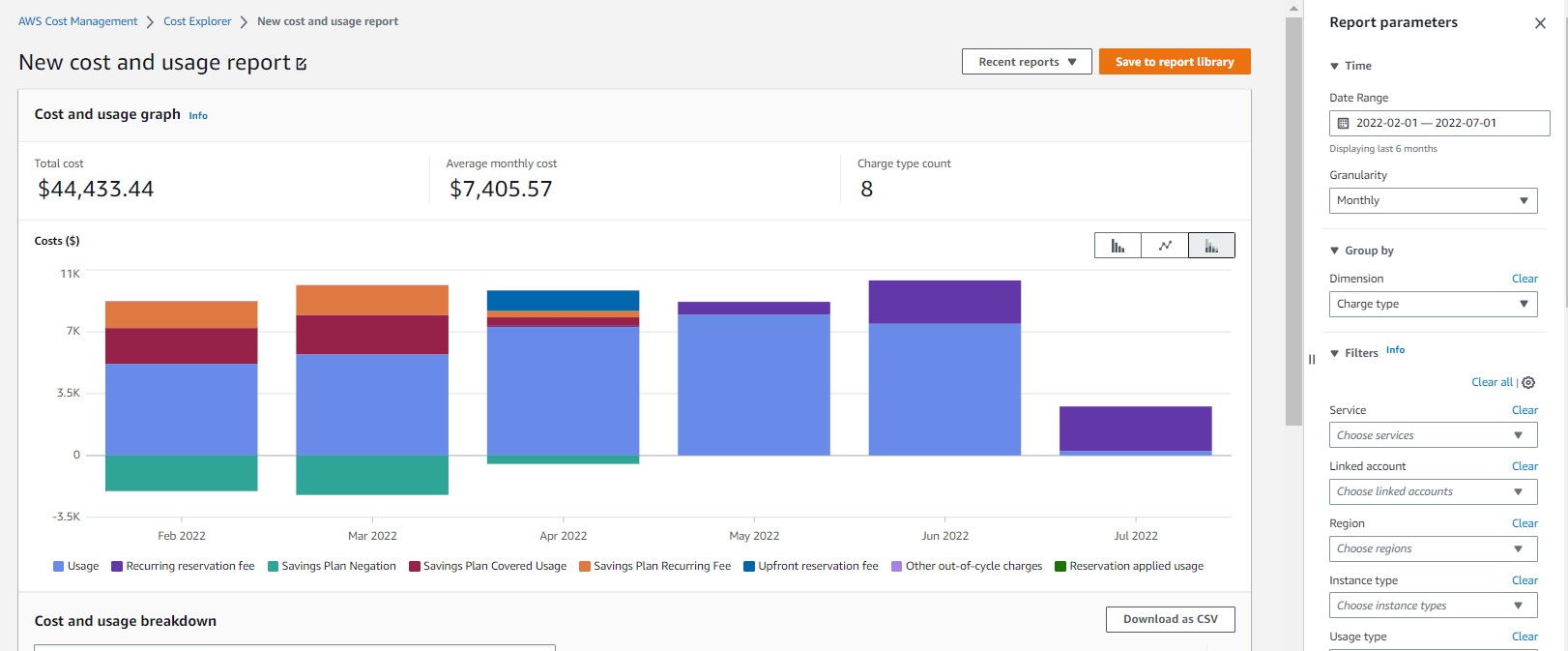
Figure 13. Cost Explorer: EC2 charge type
Amazon S3 Usage Type
Many of you want to understand the cost components of your Amazon S3 usage. For this, you can use the filter “Service: S3”, and Group by “Usage Type” to display the various components and look for the top cost driver. In the example below, “Requests-Tier1” is the No.1 cost component. By referencing the bill, you’ll learn that “Request-Tier1” refers to the “PUT, COPY, POST, or LIST requests” to S3 buckets. From there, you can further understand who are incurring these requests, by either “group by: linked account”, “tag”, or “Cost Categories”. You can also group by “API operation” to deep dive on your S3 cost.
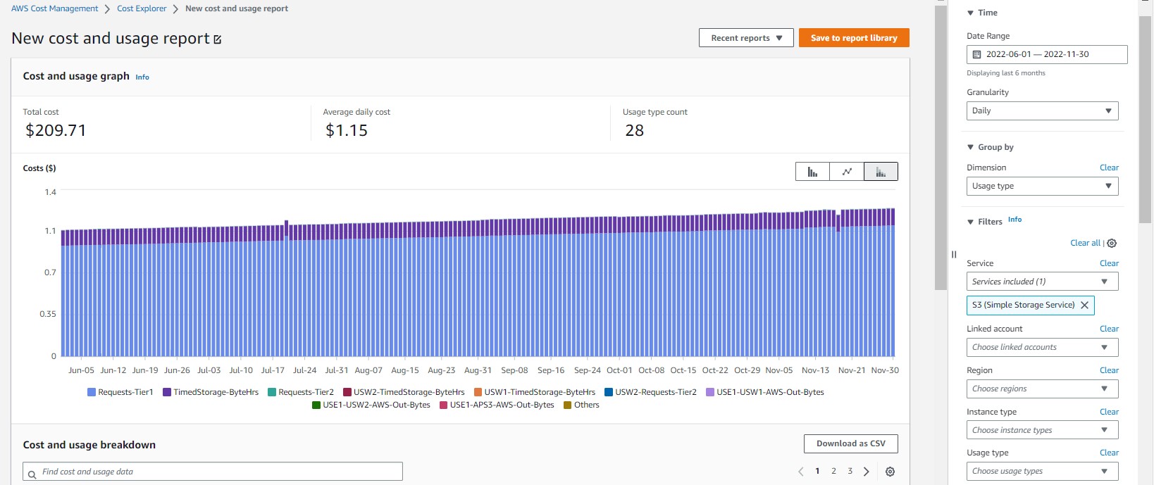
Figure 14. Cost Explorer: S3 Usage Type
Conclusions
We hope this blog post shed some light on the recent Cost Explorer UI updates and some of the common ways you can use the tool to visualize your AWS cost and usage data for any trend and cause analysis and discover cost saving opportunities. We appreciate all the feedback you’ve shared with us on the new Console user experience and we plan to introduce continuous improvement and new features iteratively.