AWS Marketplace
Data visualization in AWS using AWS Data Exchange and Amazon QuickSight
Until now, finding the right third-party data to help uncover insights for your business has remained a slow and cumbersome process. With AWS Marketplace’s new service, AWS Data Exchange, you can now search, sample, and subscribe to data products across any industry. AWS Data Exchange’s catalog gives AWS customers access to data sources. You can use these datasets to experiment with your analytics and machine learning (ML) workloads. You can connect data from AWS Data Exchange with Amazon QuickSight to distill key insights into visualizations.
Amazon QuickSight is a business intelligence (BI) service that makes it easy to deliver insights to everyone in your organization. Amazon QuickSight lets you create and publish interactive dashboards that include ML-powered insights. You can access it from any device, and you can embed it in to your application, portal, and website.
In this blog post, I show how to build your BI insights using Amazon QuickSight using a dataset from AWS Data Exchange. This post focuses on two things:
- showing the visuals you can prepare using available datasets in AWS Data Exchange
- how Amazon QuickSight can provide meaningful insights to those datasets.
A step-by-step guide showing how to subscribe to AWS Data Exchange dataset can be found in this blog post: AWS Data Exchange – Find, Subscribe To, and Use Data Products.
Prerequisites
For your data visualization, you need the following AWS services and prerequisites.
- Amazon Simple Storage Service (Amazon S3) object store to store the data source
- AWS Glue to crawl the dataset and prepare metadata without loading them into any database. This reduces the cost of running an expensive database. Instead, you can store and run visuals from raw data files stored in an Amazon S3 bucket.
- Amazon Athena to query the Amazon QuickSight dataset for manual data analysis
- Amazon QuickSight to help your stakeholders identify key drivers for their business
Preparing the data
Before you can create effective data visualizations, you must prepare your data.
Subscribe to and store your data
- In the AWS Data Exchange console, subscribe to the NinthDecimal QSR Visitation dataset. Refer to this step-by-step guide for how to subscribe to an AWS Data Exchange dataset.
- In the AWS Data Exchange console left side menu, navigate to Subscriptions, select the dataset, and find the Revision to copy the latest dataset revision available. Select the asset(s) you want and select Export to Amazon S3. Select the bucket you created in the Prerequisite for storing data. Select Export.
Prepare and load data for analysis
- Create a new crawler. In the AWS Management Console, open the AWS Glue console. In the navigation pane, select Crawler. Choose Add crawler and follow the instructions in the Add crawler wizard. In the Add a data store page, point to your S3 bucket as the data source.
- Create an Identity and Access Management (IAM) role for your crawler. In the AWS Glue Add crawler wizard, create IAM role for your crawler under Choose an IAM role. This role gives your crawler programmatic access to your dataset in S3 and enables it to prepare metadata for analysis.
- Run your crawler. Complete the remaining steps in the Add crawler Choose finish. This redirects you to the AWS Glue Crawlers home page. Select Run it now?
- Manually check your data. In the AWS Glue console, select Databases from the left side menu. To manually check the dataset, in the left side menu, navigate to Database and select Tables underneath it. Select the check box next to and select View data. This takes you to the Amazon Athena console.
- Validate your data. In the Amazon Athena console, you can run one-time, SQL-style queries to manipulate and validate your dataset. I used Athena to manually validate how many features I have in the dataset, filter any null or missing values, validate data type, and check the data format. For example, you can check whether a date column is in DD-MM-YYYY or YYYY-mm-DD format. Here’s how to do that:
- Validate number of features: In the left sidebar, select your Database from drop down menu. To visualize columns, select the and click Preview Table.
- Validate null or missing values:
- e.g: SELECT * FROM “cubiq-sales-grocery”.”cubiq_sales_grocery_data” where col1 = null;
- Check the data format: Follow step to see the data type of each column or feature.
Creating a data visualization
- Navigate to QuickSight from the AWS Management Console.
- Verify that QuickSight, S3, and AWS Glue are all using the same Region. To do this, select the Region on the upper right corner.
- Create a new visualization. In the QuickSight console upper left corner, select New analysis, and then select New dataset.
- In Create a dataset, select Amazon Athena as your data source from the list of data sources shown in console.
- Follow the wizard to enter a Data source name, and then click Connect. From Choose your table, select the Database you created through Glue Crawler during Prepare and load data for analysis. In the wizard, select Visualize.
- Select the visualization type you prefer from Visual types. I am using the bar graph, scatter plot, and line graph.
- Select the fields you want to visualize from the Fields list.
Example visualizations
Example 1: which day is busier for popular fast-food chain restaurants?
Here is a business use case I used the previous steps to answer: is Wednesday or Thursday a busier day for popular restaurant chains?
To answer this question, I created a bar chart with groupings of popular restaurant chains to compare data on September 31 (Wednesday) to October 1 (Thursday). The following bar chart shows that Thursday was a busier day.
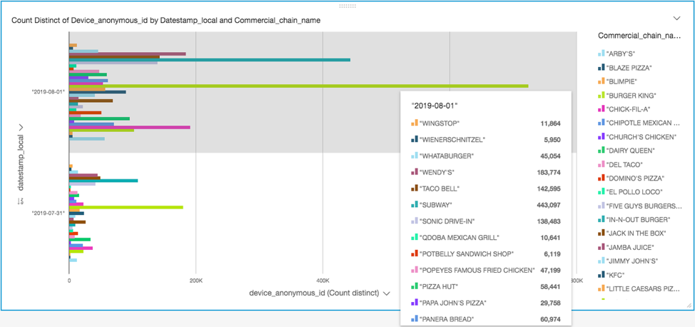
To replicate this visualization, in step 3 of Creating a data visualization, follow these steps:
- On the menu dropdown, select Duplicate visual.
- For Visual types, select Horizontal bar chart.
- From the Fields list, select device_anonymous_id for the X axis and datestamp_local as the Y axis.
Example 2: which popular fast-food restaurant chain has the highest visitation?
You can use the same restaurant visitation dataset to identify commercial chains that have the highest visitations.
I made a scatter plot visualization to group the restaurant chain names and color-code them. To do this, used the Device anonymous id field on the X axis and the Datestamp field on the Y axis. This creates the following visualization.
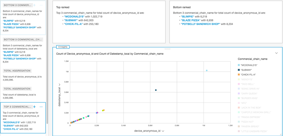
To replicate this visualization, in step 3 of Creating a data visualization, do the following:
- On the menu dropdown, select Duplicate visual.
- For Visual types, select Scatter graph.
- From the Fields list, select device_anonymous_id for the X axis and datestamp_local as the Y axis.
Tip: build your own insights
In the top left corner of the scatter graph visualization, note that automated insights are provided. QuickSight automatically prepares insights based on inbuilt ML algorithms. You can also choose to have your own insights built. To do so, do the following:
- In QuickSight’s top navigation, select Add.
- On the left side, you can see a short description of each of the available insights to add to your visual. Select on the plus sign (+) next to the ones you want to add.
Example 3: finding sales anomalies
A common scenario in sales cycle is to identify anomalies in sales during a period of time. Business, sales, marketing, and procurement stakeholders analyze historical anomalies in their sales cycle for consideration in future strategy planning. I created the following visualization of sales anomalies by date.
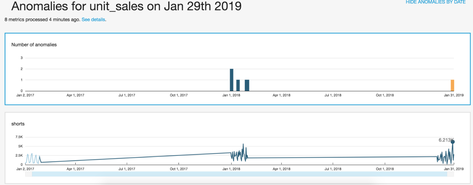
- To prepare this visualization, first I looked for an AWS Data Exchange sales dataset that has at least one dimension in the Time field well, at least one measure in the Values field well, and at least one dimension in the Categories field well. I subscribed to this dataset.
- Then I followed the rest of the steps for Preparing the data and Creating a data visualization. For step 3c of Creating a data visualization, do the following:
- From the QuickSight console, select Insight from Visual types.
- From the Computation dropdown menu, select Customize insight and then Anomaly detection.
- From Fields list, select the Date, Unit sales, and Category Select Apply.
- On the visualization, there is a date range selection scroll bar under the graph. Drag to adjust the date range.
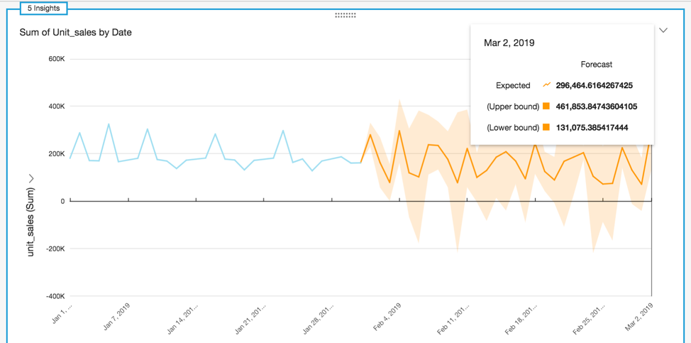
Example 4: forecasting based on historical data
The following screenshot shows a visualization forecasting unit sales for the next 30 days using QuickSight ML Forecasting.
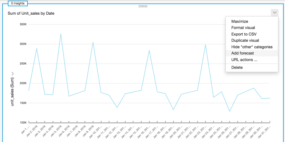
To make a forecast from historical data using this restaurant dataset, do the following:
- In step 3c of Creating a data visualization, on the left side menu, select Line chart from the available Visual types.
- Select Date field for the X axis and Unit_sales field for the Y axis. As shown in the previous screenshot, the visualization automatically builds ML insights that display in the top left corner.
- Select the arrow in the upper right to open the dropdown menu. Select Add forecast. This adds a forecast based on the historical data.
Conclusion
In this blog post, I showed how to use datasets available in AWS Data Exchange to build visualizations in Amazon QuickSight. I showed how to create visualizations that answer business questions, including which day of the week is busier, which restaurant is busiest, where sales anomalies are, and what the sales forecast is.
Find more information on AWS Data Exchange here. For more information on QuickSight, visit Amazon QuickSight.
About the author
 Pranabesh Mandal is a Solutions Architect in AWS. He has over a decade of IT experience. He is passionate about cloud technology and focuses on Analytics. In his spare time, he likes to hike and explore the beautiful nature and wild life of most divine national parks around the United States alongside his wife.
 Mohsen Malik is a Global Category Lead on the AWS Data Exchange team, covering Retail, Marketing, Location, and Energy categories. Mohsen joined Amazon in 2018 as a Senior Product Manager on retail before joining AWS.