AWS Database Blog
Get Started with Amazon Elasticsearch Service: Filter Aggregations in Kibana
September 8, 2021: Amazon Elasticsearch Service has been renamed to Amazon OpenSearch Service. See details.
Welcome to this introductory series on Elasticsearch and Amazon Elasticsearch Service (Amazon ES). In this and future articles, we provide the basic information that you need to get started with Elasticsearch on AWS.
You figured out how cool Elasticsearch is, and now you’re sending your Apache web logs to Amazon Elasticsearch Service. You pop open Kibana to visualize some data—now what? One thing you can do is use filter aggregations to visualize different portions of your data on the same chart. Doing that helps you detect changes in the way your consumers are interacting with your website.
For the purposes of this post, I’ve loaded sample Apache web log data from NASA from July 1995. If you want to follow along, you can learn how to load this dataset into Amazon Elasticsearch Service by following the steps in this AWS Database blog post.
During July 1995, there were two shuttle missions: STS-71, which landed July 7, and STS-70, which took off July 13 and landed July 22. (Read this article on Wikipedia to find out how woodpeckers delayed the launch of STS-70 until after the landing of STS-71!) We would expect NASA website users’ interest to peak for each of these missions on each of these days. And, the traffic to the website reflects that interest:

Creating the visualization
In the preceding graph, you can see the month of July as time slices along the X-axis and the count of requests for STS-70 and STS-71 on the Y-axis. Here’s how to build this visualization.
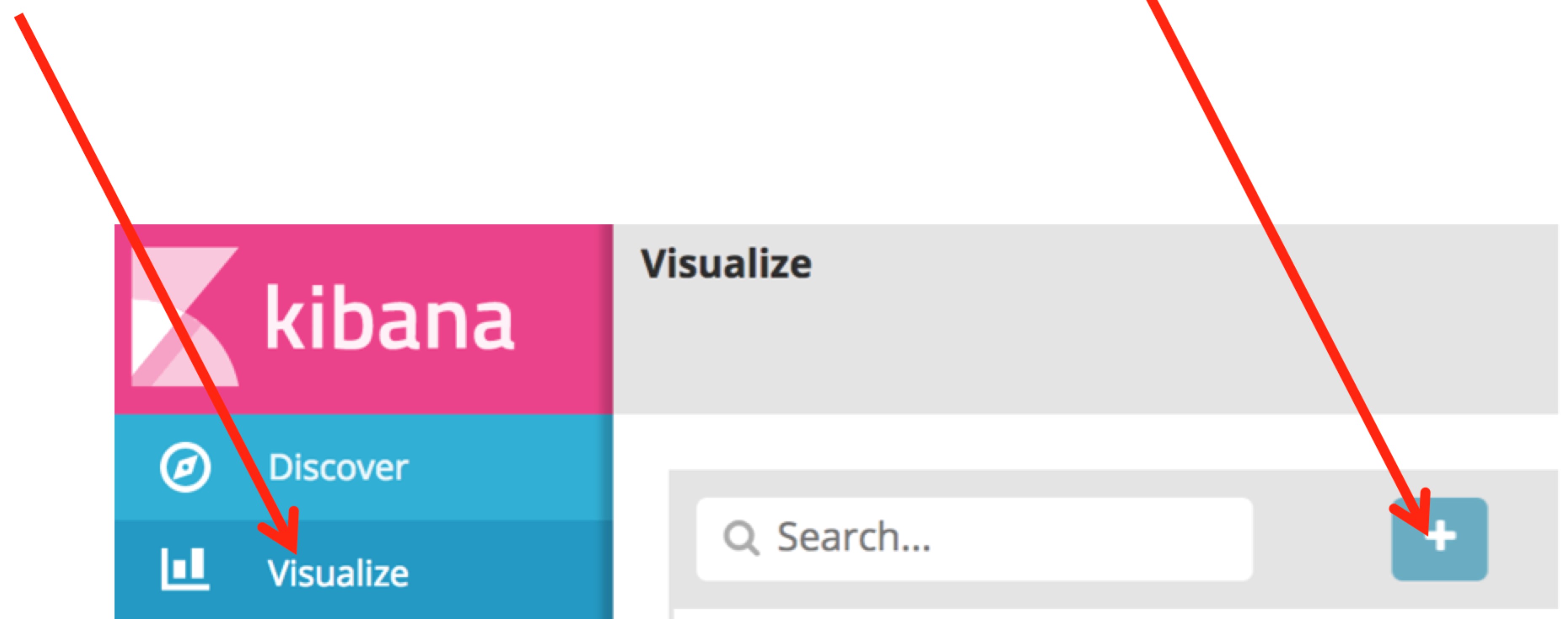
Go to your Kibana dashboard and choose Visualize. Then choose the plus sign (+) to create a new visualization:
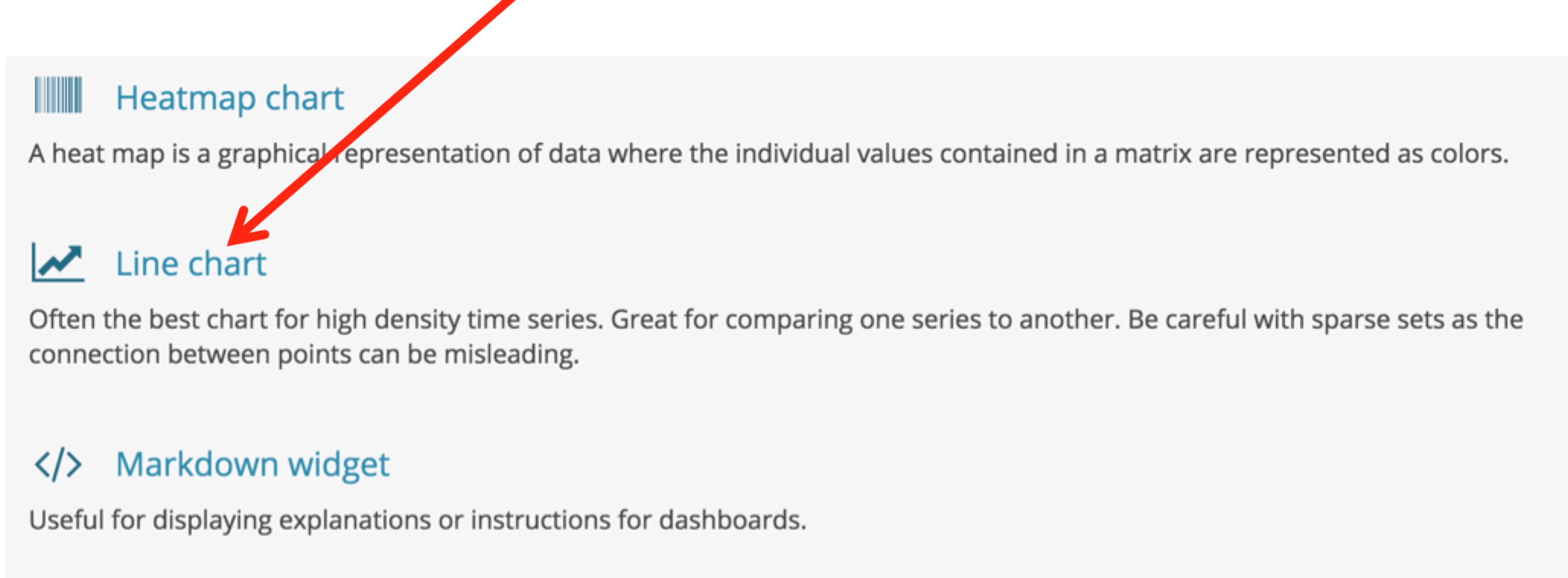
You see a number of different types of visualizations that you can build. Come back later and explore these visualizations! For now, choose Line chart.
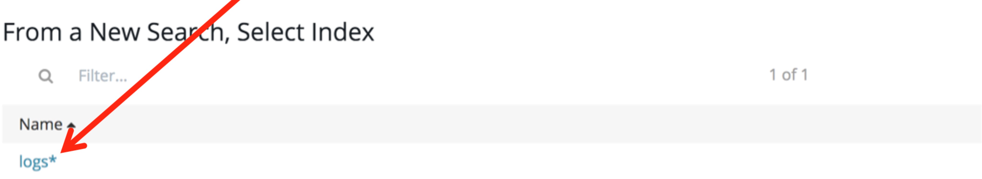
From the Choose search source page, choose the index that you want to work with. In my case, I am sending my log data to indexes that begin with “logs.” This is the pattern that I set when I first ran Kibana.
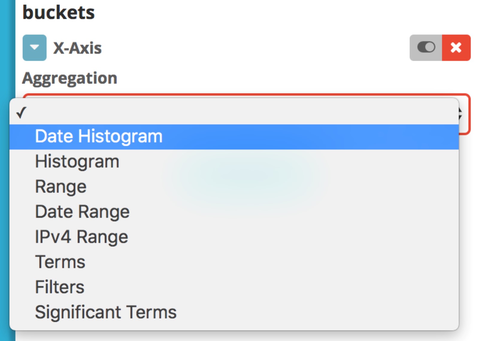
Now you need to set the aggregations that you want to use. The Y-Axis aggregation defaults to Count. Leave that one as it is, and choose X-Axis under Select buckets type. Then choose Date Histogram in the Aggregation drop-down list.
It’s common when working with Kibana visualizations to use a Date Histogram first. The resulting visualization automatically splits the underlying data into equivalent, time-based buckets. You can see this by choosing the Go button () now. You get a line graph of all the counts of requests (Y-Axis) by time (X-Axis).
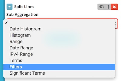
We’re going to subdivide this graph to show the requests for STS-70 and STS-71 together. Choose Add Sub Buckets, and then choose Split Lines. This allows you to build a sub-aggregation, further dividing the time-based buckets by other criteria. Choose the Filters aggregation.
In the Filter 1 text box, you can enter an Apache Lucene syntax query (or the Elasticsearch Query DSL) to select out records that you want to count. I used request:”STS-70″ to grab all the traffic that includes “STS-70” in the URL. Choose Add Filter to add one or more additional filters. I added another filter request:”STS-71″ to grab the requests that have “STS-71” in the URL.

As a side note, my “request” field is an analyzed field. If I used just request:STS-70 or request:STS-71 as my filter query, the query would be analyzed and contain two terms: “STS” and “70” or “71.” The first term, STS, would match all the requests that contain both STS-70 and STS-71, and the counts would be the same for both filters. Using double-quotes turns the query into a phrase query, matching the respective mission numbers exactly.
Choose the Go button (![]() ), and you should see the graph that appeared at the beginning of this post.
), and you should see the graph that appeared at the beginning of this post.
Summary
You can apply filter aggregations in many of Kibana’s visualizations to compare data series that are specified by the contents of the underlying log lines. Try them out with area charts, pie charts, and vertical bar charts to bring out the underlying usage of your website, application, or other logs.
About the Author
 Dr. Jon Handler (@_searchgeek) is an AWS solutions architect specializing in search technologies. He works with our customers to provide guidance and technical assistance on database projects, helping them improve the value of their solutions when using AWS.