AWS Developer Tools Blog
New — Analyze and debug distributed applications interactively using AWS X-Ray Analytics
Developers spend a lot of time searching through application logs, service logs, metrics, and traces to understand performance bottlenecks and to pinpoint their root causes. Correlating this information to identify its impact on end users comes with its own challenges of mining the data and performing analysis. This adds to the triaging time when using a distributed microservices architecture, where the call passes through several microservices. To address these challenges, AWS launched AWS X-Ray Analytics.
X-Ray helps you analyze and debug distributed applications, such as those built using a microservices architecture. Using X-Ray, you can understand how your application and its underlying services are performing to identify and troubleshoot the root causes of performance issues and errors. It helps you debug and triage distributed applications wherever those applications are running, whether the architecture is serverless, containers, Amazon EC2, on-premises, or a mixture of all of these.
AWS X-Ray Analytics helps you quickly and easily understand:
- Any latency degradation or increase in error or fault rates.
- The latency experienced by customers in the 50th, 90th, and 95th percentiles.
- The root cause of the issue at hand.
- End users who are impacted, and by how much.
- Comparisons of trends, based on different criteria. For example, you can understand if new deployments caused a regression.
In this post, I walk you through several use cases to see how you can use X-Ray Analytics to address these issues.
AWS X-Ray Analytics Walkthrough
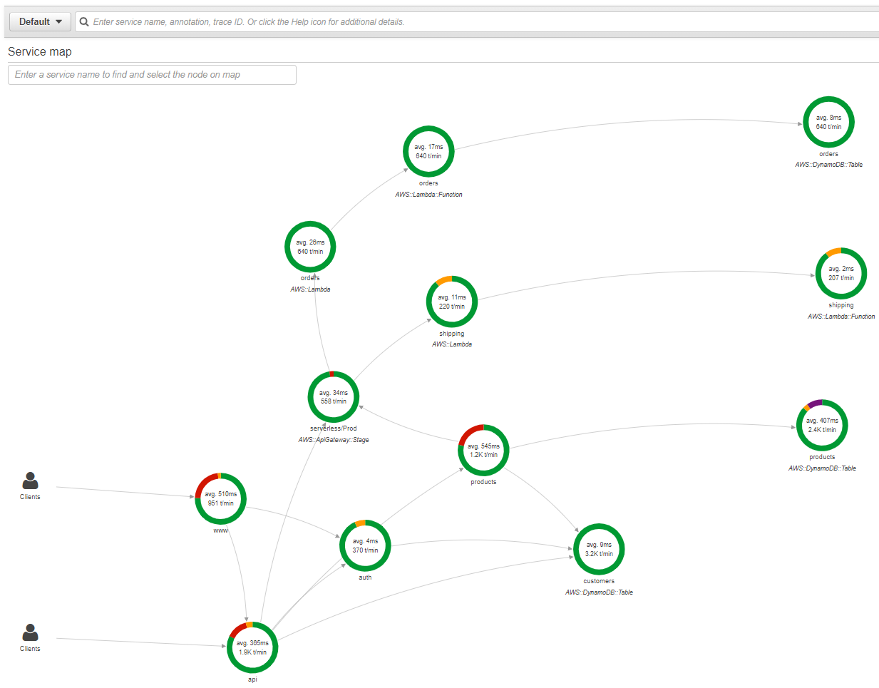
The following is a service map of an online store application hosted on Amazon EC2 and serverless technologies like Amazon API Gateway, AWS Lambda, and Amazon DynamoDB. Using this service map, you can easily see that there are faults in the “products” microservice in the selected time range.
Use X-Ray Analytics to explore the root cause and end-user impact. Looking at the X-Ray Analytics console, you can determine that the 50th-percentile customers have latency of around 1.6 seconds. The 95th-percentile customers have latency of more that 2.5 seconds using the response time distribution.
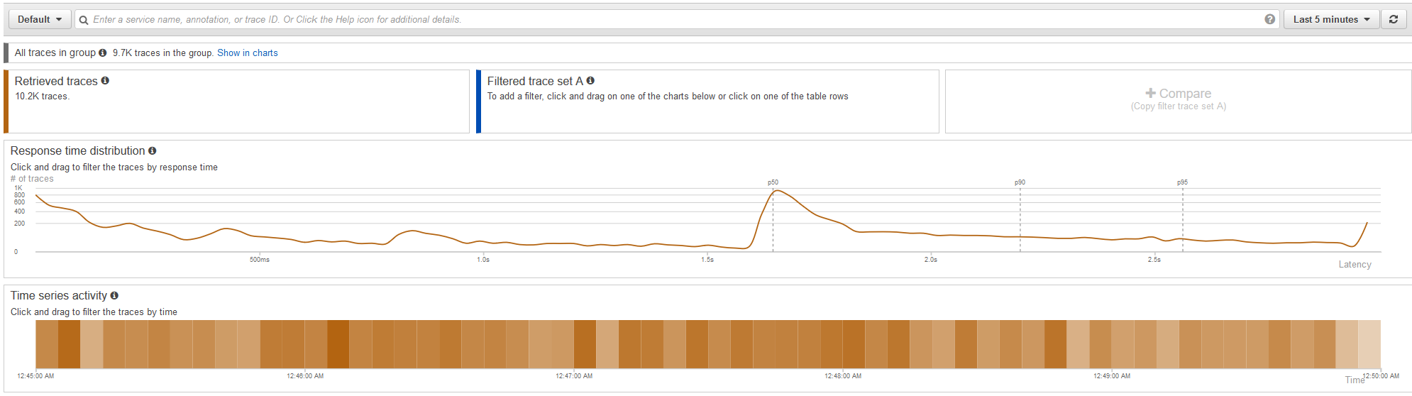
This chart also helps you see the overall latency distribution of the requests in the selected group for the selected time range. You can learn more about X-Ray groups and their use cases in the Deep dive into AWS X-Ray groups and use cases post.
Now, you want to triage the increase in latency in requests that are taking more than 1.5 seconds and get to its root cause. Select those traces from the graph, as shown below. You see that all the numbers in the chart, like Time series activity and tables, are automatically updated based on the filter criteria. Also, a new Filtered traces trend line, indicated in blue, is added.
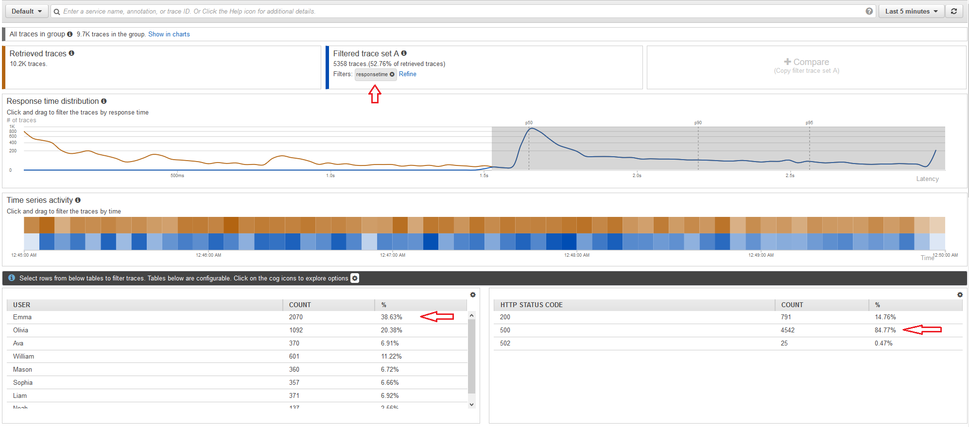
This Filtered trace set A trend line keeps updating as you add new criteria. For example, looking at the following tables, you can easily see that around 85% of these high-latency requests result in 500 errors, and Emma is the most impacted customer.
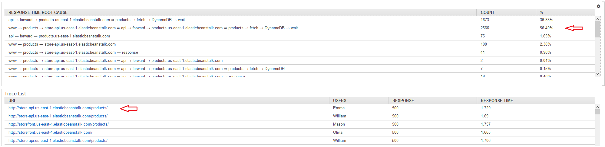
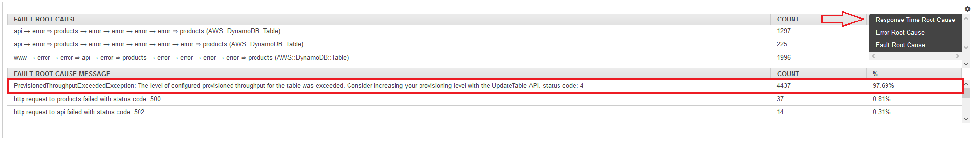
To focus on the traces that result in 500 errors, select that row from the table and see the filtered traces and other data points getting updated. In the Root Cause section, see the root cause of issues resulting in this increased latency. You can see that the DynamoDB wait in the “products” service has resulted in around 57% of the errors. You can also view individual traces that match the selected filters, as shown.
Selecting the Fault Root Cause using the cog icon helps in viewing the fault exception. This indicates that the configured, provisioned throughput capacity of the DynamoDB table has exceeded its capacity, giving a clear indication of the root cause of the issue.
You just saw how you can use X-Ray Analytics to detect an increase in latency and understand the root cause of the issue and end-user impact.
Comparison of trends
Now, see how you can compare two trends using the compare functionality in X-Ray Analytics. You can use this functionality to compare any two filter expressions. For example, you can compare performance experience between two users, or compare and analyze whether a new deployment caused any regression.
Say that you have deployed a new Lambda function at 3:40 AM. You want to compare five minutes before and five minutes after the deployment was completed to understand whether any regression was caused, and what the impact is to end users.
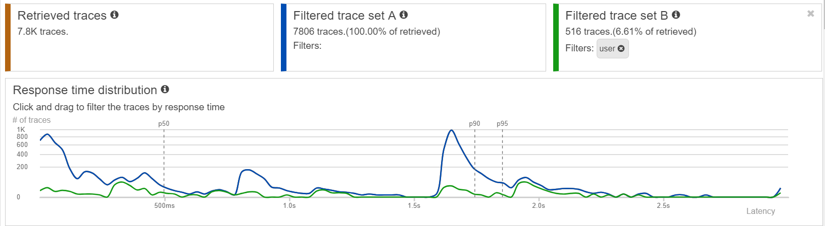
Use the compare functionality provided in X-Ray Analytics. In this case, two different time ranges are represented. Filtered trace set A, starting from 3:35 AM to 3:40 AM, is shown in blue, and Filtered trace set B, starting from 3:40 AM to 3:45 AM, is shown in green.
In compare mode, the percentage deviation column that is automatically calculated clearly indicates that 500 errors decreased by 32 percentage points after the new deployment was completed. This gives a clear indication to the DevOps team that the new deployment didn’t cause any regression and was successful in reducing errors.

Identifying outlying users
Take an example in which one of the end users, “Ava,” is complaining about degradation in performance experience from the application. None of the other users have reported this issue.
Use the compare feature in X-Ray Analytics to compare the response time of all users (blue trend line) with that of Ava (green trend line). Looking at the following response time distribution graph, it’s not easy to notice the difference in end-user experience based on the data.
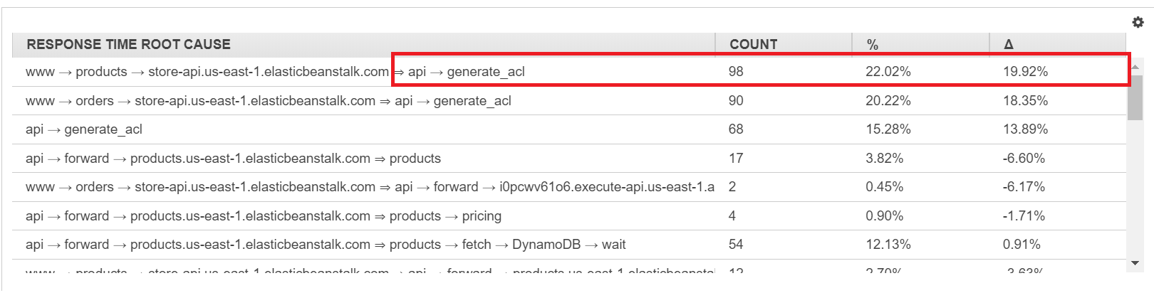
However, as you look into the details of other attributes, like the annotations that you added during code instrumentation (annotation.ACL_CACHED) and response time root cause, you can get actionable insights. You see that the performance latency is in the “api” service and related to the time spent in the “generate_acl” module. Correlate that to the ACL not being cached, based on the approximate 55% delta that you see in Ava’s requests compared to other users.

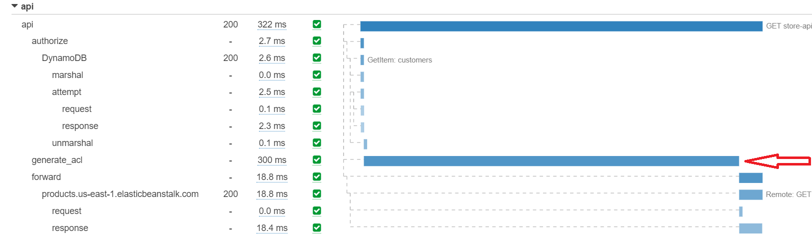
You can also validate this by looking at the traces from the trace list and see that there is a 300-millisecond delay added by the “generate_acl” module. This shows how X-Ray Analytics helps correlate different attributes to understand the root cause of the issue.
Getting Started
To get started using X-Ray Analytics, visit the AWS Management Console for X-Ray. There is no additional charge for using this feature.