AWS Big Data Blog
Build machine learning-powered business intelligence analyses using Amazon QuickSight
Imagine you can see the future—to know how many customers will order your product months ahead of time so you can make adequate provisions, or to know how many of your employees will leave your organization several months in advance so you can take preemptive actions to encourage staff retention. For an organization that sees the future, the possibilities are limitless. Machine learning (ML) makes it possible to predict the future with a higher degree of accuracy.
Amazon SageMaker provides every developer and data scientist the ability to build, train, and deploy ML models quickly, but for business users who usually work on creating business intelligence dashboards and reports rather than ML models, Amazon QuickSight is the service of choice. With Amazon QuickSight, you can still use ML to forecast the future. This post goes through how to create business intelligence analyses that use ML to forecast future data points and detect anomalies in data, with no technical expertise or ML experience needed.
Overview of solution
Amazon QuickSight ML Insights uses AWS-proven ML and natural language capabilities to help you gain deeper insights from your data. These powerful, out-of-the-box features make it easy to discover hidden trends and outliers, identify key business drivers, and perform powerful what-if analysis and forecasting with no technical or ML experience. You can use ML insights in sales reporting, web analytics, financial planning, and more. You can detect insights buried in aggregates, perform interactive what-if analysis, and discover what activities you need to meet business goals.
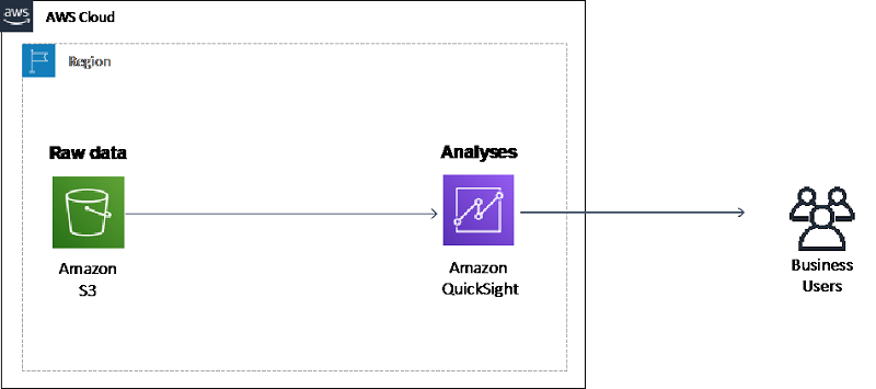
This post shows you how to import data from Amazon S3 into Amazon QuickSight and create ML-powered analyses with the imported data. The following diagram illustrates this architecture.
Walkthrough
In this walkthrough, you create an Amazon QuickSight analysis that contains ML-powered visuals that forecast the future demand for taxis in New York City. You also generate ML-powered insights to detect anomalies in your data. This post uses the New York City Taxi and Limousine Commission (TLC) Trip Record Data on the Registry of Open Data on AWS.
The walkthrough includes the following steps:
- Set up and import data into Amazon QuickSight
- Create an ML-powered visual to forecast the future demand for taxis
- Generate an ML-powered insight to detect anomalies in the data set
Prerequisites
For this walkthrough, you should have the following prerequisites:
- An AWS account
- Amazon Quicksight Enterprise edition
- Basic knowledge of AWS
Setting up and importing data into Amazon QuickSight
Set up Amazon Quicksight as an individual user. Complete the following steps:
- On the AWS Management Console, in the Region list, select US East (N. Virginia) or any Region of your choice that Amazon QuickSight
- Under Analytics, for Services, choose Amazon QuickSight.If you already have an existing Amazon QuickSight account, make sure it is the Enterprise edition; if it is not, upgrade to Enterprise edition. For more information, see Upgrading your Amazon QuickSight Subscription from Standard Edition to Enterprise Edition.If you do not have an existing Amazon QuickSight account, proceed with the setup and make sure you choose Enterprise Edition when setting up the account. For more information, see Setup a Free Standalone User Account in Amazon QuickSight.After you complete the setup, a Welcome Wizard screen appears.
- Choose Next on each of the Welcome Wizard screens.
- Choose Get Started.
Before you import the data set, make sure that you have at least 3GB of SPICE capacity. For more information, see Managing SPICE Capacity.
Importing the NYC Taxi data set into Amazon QuickSight
The NYC Taxi data set is in an S3 bucket. To import S3 data into Amazon QuickSight, use a manifest file. For more information, see Supported Formats for Amazon S3 Manifest Files. To import your data, complete the following steps:
- In a new text file, copy and paste the following code:
- Save the text file as
nyc-taxi.json. - On the Amazon QuickSight console, choose New analysis.

- Choose New data set.
- For data source, choose S3.
- Under New S3 data source, for Data source name, enter a name of your choice.
- For Upload a manifest file field, select Upload.
- Choose the
nyc-taxi.jsonfile you created earlier. - Choose Connect.

The S3 bucket this post uses is a public bucket that contains a public data set and open to the public. When using S3 buckets in your account with Amazon QuickSight, it is highly recommended that the buckets are not open to the public; you need to configure authentication to access your S3 bucket from Amazon QuickSight. For more information about troubleshooting, see I Can’t Connect to Amazon S3.After you choose Connect, the Finish data set creation screen appears. - Choose Visualize.

- Wait for the import to complete.
You can see the progress on the top right corner of the screen. When the import is complete, the result shows the number of rows imported successfully and the number of rows skipped.
Creating an ML-powered visual
After you import the data set into Amazon QuickSight SPICE, you can start creating analyses and visuals. Your goal is to create an ML-powered visual to forecast the future demand for taxis. For more information, see Forecasting and Creating What-If Scenarios with Amazon Quicksight.
To create your visual, complete the following steps:
- From the Data source details pop screen, choose Visualize.
- From the field list, select
Lpep_pickup_datetime. - Under Visual types, select the first visual.Amazon QuickSight automatically uses the best visual based on the number and data type of fields you selected. From your selection, Amazon Quicksight displays a line chart visual.
 From the preceding graph, you can see that the bulk of your data clusters are around December 31, 2017, to January 1, 2019, for the
 Lpep_pickup_datetimefield. There are a few data points with date ranges up to June 2080. These values are incorrect and can impact your ML forecasts.To clean up your data set, filter out the incorrect data using the data in theLpep_pickup_datetime. This post only uses data in whichLpep_pickup_datetimefalls between January 1, 2018, and December 18, 2018, because there is a more consistent amount of data within this date range. - Use the filter menu to create a filter using the
Lpep_pickup_datetime - Under Filter type, choose Time range and Between.
- For Start date, enter
2018-01-01 00:00. - Select Include start date.
- For End date, enter
2018-12-18 00:00. - Select Include end date.
- Choose Apply.

The line chart should now contain only data with Lpep_pickup_datetime from January 1, 2018, and December 18, 2018. You can now add the forecast for the next 31 days to the line chart visual.
Adding the forecast to your visual
To add your forecast, complete the following steps:
- On the visual, choose the arrow.
- From the drop-down menu, choose Add forecast.

- Under Forecast properties, for Forecast length, for Periods forward, enter
31. - For Periods backwards, enter
0. - For Prediction interval, leave at the default value
90. - For Seasonality, leave at the default selection Automatic.
- Choose Apply.

You now see an orange line on your graph, which is the forecasted pickup quantity per day for the next 31 days after December 18, 2018. You can explore the different dates by hovering your cursor over different points on the forecasted pickup line. For example, hovering your cursor over January 10, 2019, shows that the expected forecasted number of pickups for that day is approximately 22,000. The forecast also provides an upper bound (maximum number of pickups forecasted) of about 26,000 and a lower bound (minimum number of pickups forecasted) of about 18,000.

You can create multiple visuals with forecasts and combine them into a sharable Amazon QuickSight dashboard. For more information, see Working with Dashboards.
Generating an ML-powered insight to detect anomalies
In Amazon QuickSight, you can add insights, autonarratives, and ML-powered anomaly detection to your analyses without ML expertise or knowledge. Amazon QuickSight generates suggested insights and autonarratives automatically, but for ML-powered anomaly detection, you need to perform additional steps. For more information, see Using ML-Powered Anomaly Detection.
This post checks if there are any anomalies in the total fare amount over time from select locations. For example, if the total fare charged for taxi rides is about $1,000 and above from the first pickup location (for example, the airport) for most dates in your data set, an anomaly is when the total fare charged deviates from the standard pattern. Anomalies are not necessarily negative, but rather abnormalities that you can choose to investigate further.
To create an anomaly insight, complete the following steps:
- From the top right corner of the analysis creation screen, click the Add drop-down menu and choose Add insight.

- On the Computation screen, for Computation type, select Anomaly detection.

- Under Fields list, choose the following fields:
fare_amountlpep_pickup_datetimePULocationID
- Choose Get started.

- The Configure anomaly detection
- Choose Analyze all combinations of these categories.
- Leave the other settings as their default.You can now perform a contribution analysis and discover how the drop-off location contributed to the anomalies. For more information, see Viewing Top Contributors.
- Under Contribution analysis, choose
DOLocationID. - Choose Save.
- Choose Run Now.The anomaly detection can take up to 10 minutes to complete. If it is still running after about 10 minutes, your browser may have timed out. Refresh your browser and you should see the anomalies displayed in the visual.
- Choose Explore anomalies.

By default, the anomalies you see are for the last date in your data set. You can explore the anomalies across the entire date range of your data set by choosing SHOW ANOMALIES BY DATE and dragging the slider at the bottom of the visual to display the entire date range from January 1, 2018, to December 30, 2018.
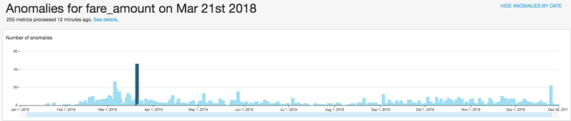
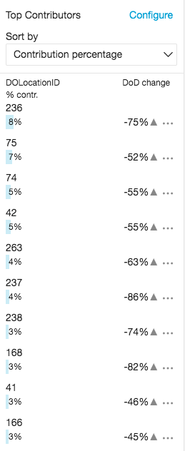
This graph shows that March 21, 2018, has the highest number of anomalies of the fare charged in the entire data set. For example, the total fare amount charged by taxis that picked up passengers from location 74 on March 21, 2018, was 7,181. This is -64% (about 19,728.5) of the total fare charged by taxis for the same pickup location on March 20, 2018. When you explore the anomalies of other pickup locations for that same date, you can see that they all have similar drops in the total fare charged. You can also see the top DOLocationID contributors to these anomalies.
What happened in New York City on March 21, 2018, to cause this drop? A quick online search reveals that New York City experienced a severe weather condition on March 21, 2018.
Publishing your analyses to a dashboard, sharing the dashboard, and setting up email alerts
You can create additional visuals to your analyses, publish the analyses as a dashboard, and share the dashboard with other users. QuickSight anomaly detection allows you to uncover hidden insights in your data by continuously analyzing billions of data points. You can subscribe to receive alerts to your inbox if an anomaly occurs in your business metrics. The email alert also indicates the factors that contribute to these anomalies. This allows you to act immediately on the business metrics that need attention.
From the QuickSight dashboard, you can configure an anomaly alert to be sent to your email with Severity set to High and above and Direction set to Lower than expected. Also make sure to schedule a data refresh so that the anomaly detection runs on your most recent data. For more information, see Refreshing Data.
Cleaning up
To avoid incurring future charges, you need to cancel your Amazon Quicksight subscription.
Conclusion
This post walked you through how to use ML-powered insights with Amazon QuickSight to forecast future data points, detect anomalies, and derive valuable insights from your data without needing prior experience or knowledge of ML. If you want to do more forecasting without ML experience, check out Amazon Forecast.
If you have questions or suggestions, please leave a comment.
About the Author
 Osemeke Isibor is a partner solutions architect at AWS. He works with AWS Partner Network (APN) partners to design secure, highly available, scalable and cost optimized solutions on AWS. He is a science-fiction enthusiast and a fan of anime.