AWS Big Data Blog
Exploring the public AWS COVID-19 data lake
The AWS COVID-19 data lake—a centralized repository of up-to-date and curated datasets on or related to the spread and characteristics of the novel coronavirus (SARS-CoV-2) and its associated illness, COVID-19—is now publicly available. For more information, see A public data lake for analysis of COVID-19 data. Globally, there are several efforts underway to gather this data, and AWS is working with partners to make this crucial data freely available and keep it up-to-date.
This data is readily available for you to ask questions, blend it with your own datasets, and create new insights in your own data lake. AWS is supporting Northwestern University in performing research developing pandemic-surveillance methods. Ariel Chandler, health informatics PhD candidate, says, “The AWS COVID-19 data lake provided me access to public data easily so I didn’t have to do the heavy lifting to get access to information that should be at everyone’s fingertips. Access to the AWS Data Exchange and these processing tools are helping to track, report, and visualize the spread of COVID-19 across the state to aid with the Illinois public health response. The data lake uses a wide range of data sources, including consumer and location data, to inform which communities are most at risk. That information is used to guide the provision of medical and social services to those who need them the most during this crisis.”
You can also produce new ways to query the information and publish those insights back into the data lake. Data may come from public websites, data purchased via data providers on AWS Data Exchange, or internal systems.
This post walks you through accessing the AWS COVID-19 data lake through the AWS Glue Data Catalog via Amazon SageMaker or Jupyter and using the open-source AWS Data Wrangler library. AWS Data Wrangler is an open-source Python package that extends the power of Pandas library to AWS and connects DataFrames and AWS data-related services (such as Amazon Redshift, Amazon S3, AWS Glue, Amazon Athena, and Amazon EMR). For more information about what you can build by using this data lake, see the associated public Jupyter notebook on GitHub.
The data for this post is from the following sources:
- COVID-19 Data Hub data set– accessed via the COVID-19 data lake
- Rearc – USA Hospital Beds – COVID-19 | Definitive Healthcare – accessed via the COVID-19 data lake
- Foursquare – COVID-19 Foot Traffic Data – accessed via AWS Data Exchange
This data lake is comprised of data in a publicly readable Amazon S3 bucket. For a complete selection of COVID-19 data, see Data related to COVID-19 available for Research & Development. For instructions on subscribing to data products, see AWS Data Exchange – Find, Subscribe To, and Use Data Products.
Solution overview
This walkthrough includes the following steps:
- Installing the AWS CLI
- Configuring Amazon SageMaker
- Exploring the data through the Data Catalog
You also explore four analyses and their visualizations:
- County-level percent changes
- Foot traffic to public venues
- Impact of number of cases on hospital beds
- Impact of population density on hospital beds
Prerequisites
This post assumes that you have configured access to the data using an AWS CloudFormation template. For instructions, see A public data lake for analysis of COVID-19 data.
You also need access to an AWS account with permissions to do the following:
- Create a CloudFormation stack
- Create AWS Glue resources (catalog databases and tables)
- Launch Amazon SageMaker notebooks
Installing the AWS CLI
Your first step is to install the AWS CLI and configure it for the us-east-2 Region. This is where the COVID-19 public data lake exists.
If you plan to work locally in Jupyter, you should set up a virtual environment for installing Python packages. Make sure that the following Python packages are installed: plotly, pandas, numpy, and awswrangler.
Configuring Amazon SageMaker
To configure Amazon SageMaker, complete the following steps:
- Create your Amazon SageMaker notebook instance in
us-east-2(the database and tables you created in the post A public data lake for analysis of COVID-19 data are in that Region). - Record the IAM role you use for the notebook instance.
- Modify the IAM role assigned to the notebook instance to add the policies
AmazonAthenaFullAccessandAWSDataExchangeSubscriberFullAccess. - Create a Jupyter notebook on your new notebook instance.
Make sure the following Python packages are installed: plotly, pandas, numpy, awswrangler. For more information about installing external Python packages, see Install External Libraries and Kernels in Notebook Instances.
Exploring the data through the Data Catalog
When the CloudFormation stack shows the status CREATE_COMPLETE, you can view the tables the template created. You’re now ready to explore the data and its visualizations. This post provides four examples of visualizations.
County-level percent changes
The COVID-19 Data Hub data set is a global data set tracking the number of confirmed cases and deaths, by location, updated daily. Data sources include the New York Times and the European CDC. The data is collected by Tableau Software.
You can visualize the percent increase of a US county’s infected population over a day with this data. For example, if a county has a population of 1,000 and its infected population increases from 10 to 100 from Monday to Tuesday, then its infected population increased from 1% to 10%.
The following visualizations show the increase in the percent of population infected from March 29, 2020, to March 30, 2020, in New York City and surrounding areas. The more yellow a county, the larger increase of cases occurred. Gray counties increased less than 0.01% from March 29 to March 30.

The following visualization zooms in on New York counties. The yellow county is New York County (the borough of Manhattan), with an increase of 0.23% of its population with COVID-19 from March 29 to March 30. The blue counties to its east are Nassau County and Suffolk County, with 0.07% and 0.05% increases, respectively. The blue-green county north of New York County is Westchester County, with an increase of 0.08%.

The accompanying notebook allows you to vary the date parameter to visualize various rates of increase and zoom out of the map to visualize the entire United States.
Foot traffic to public venues
Foursquare – COVID-19 Foot Traffic Data is a daily aggregated and anonymized percentage dataset that demonstrates how foot traffic to various venues (such as airports, gyms, and grocery stores) has changed since February 19, 2020, in different metro areas. To obtain the following visualizations, you download the data from AWS Data Exchange and use Amazon SageMaker notebooks to visualize.
The following visualization uses the foot traffic data to plot the change of foot traffic to various venues after February 19. The plot shows how public traffic to shopping malls, clothing stores, casual dining chains, and airports have a sharp decline after the National Emergency Declaration on March 13. On the other hand, traffic to grocery stores, warehouse stores, and drug stores have sharp increases in the same period.
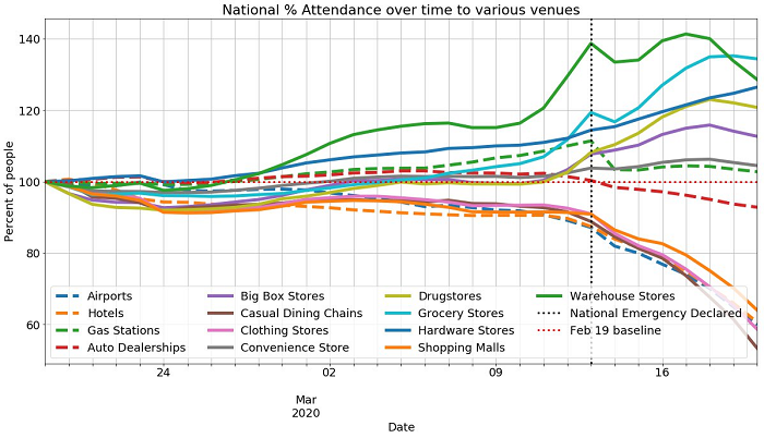
You can make similar plots for various metro areas, including New York City, San Francisco/Oakland, Los Angeles, Seattle, and 19 different venues with the accompanying notebook.
Impact of number of cases on hospital beds
The following visualizations use Enigma – Global Coronavirus (COVID-19) Data (Johns Hopkins) and Rearc – USA Hospital Beds – COVID-19 | Definitive Healthcare to analyze how the growing number of COVID-19 cases affects local hospitals. The hospital bed dataset is a dataset of the numbers of licensed beds, staffed beds, ICU beds, and the bed utilization rate for hospitals in the United States.
The first plot shows the growth in the number of hospitalized cases over 75 days in Cook County. The hospitalized cases are calculated with a 10% hospitalization rate, which means 10% of all COVID-19 cases for Cook County result in hospitalization. In the accompanying notebook, the hospitalization rate is a parameter, so you can visualize how various hospitalization rates have different healthcare needs. To generate this plot, you use the daily COVID-19 case information from COVID-19 Data Hub to simulate the number of hospitalized cases and use the Definitive Healthcare hospital bed data to calculate the total hospital capacity for Cook County.

The second visualization is a hospital utilization plot by county for the entire United States. The more yellow a county, the more its healthcare resources are burdened with a 20% COVID-19 hospitalization rate. Counties in gray have less than a 5% hospitalization rate.

As with the previous visualization, you can simulate various hospitalization rates in the accompanying notebook to visualize how COVID-19 burdens health care resources around the country. You can also change the data parameter to visualize how healthcare resource requirements change over time.
Impact of population density on hospital beds
The following visualization visualization uses Coronavirus (COVID-19) Data Hub, Rearc – USA Hospital Beds – COVID-19 | Definitive Healthcare, and US Census County-Based Data to compare the confirmed cases and available hospital beds per square kilometer for two different counties. The Enigma dataset provides case data; the Rearc dataset provides hospital bed information throughout the country, which is aggregated at the county level. The number of cases and beds is normalized by the land area in square kilometers using the US Census County data.
In the accompanying notebook, you can change the scope of visualization, the number of entities, and the bed resources. The following visualization provides cases and licensed beds per square kilometer at the county level for Alameda and San Diego counties.

These examples are a few of the innumerable analyses you can run on the public data lake.
Cleaning up
You incur no additional cost for accessing the AWS COVID-19 data lake beyond the standard charges for the AWS services that you use. For example, if you use Athena, you incur the costs for running queries and the data storage for the query result in Amazon S3, but incur no costs for accessing the data lake. Depending on the Amazon SageMaker instance you choose, you may incur Amazon SageMaker fees. For more information, see Amazon SageMaker Pricing.
To avoid recurring charges, shut down and delete the Amazon SageMaker instance, any S3 buckets you created, and disable auto-subscriptions for AWS Data Exchange.
Conclusion
Combining our efforts across organizations and scientific disciplines can help us win the fight against the COVID-19 pandemic. With the AWS COVID-19 data lake, you can experiment with and analyze curated data related to the virus, and share your own data and results. We believe that through an open and collaborative effort that combines data, technology, and science, we can inspire insights and foster breakthroughs necessary to contain, curtail, and ultimately cure COVID-19.
For more information about the public AWS COVID-19 data lake visit: https://aws.amazon.com/covid-19-data-lake/.
About the Authors
 Ninad Kulkarni is a data scientist in the Amazon Machine Learning Solutions Lab. He helps customers adopt ML and AI solutions by building solutions to address their business problems. Most recently, he has built predictive models for sports customers for on-screen consumption to improve fan engagement.
 Colby Wise is a data scientist and manager at Amazon Machine Learning Solutions Lab, where he helps AWS customers across different industries accelerate their AI and cloud adoption.
 Jason Berkowitz is the Americas Data & Analytics Professional Services Practice Lead. He comes from a background in Machine Learning, Data Lake Architectures and helping customers become data-driven. He is currently working helping customers shape their data lakes and analytic journeys on AWS within Professional Services.