Artificial Intelligence
Plan the locations of green car charging stations with an Amazon SageMaker built-in algorithm
While the fuel economy of new gasoline or diesel-powered vehicles improves every year, green vehicles are considered even more environmentally friendly because they’re powered by alternative fuel or electricity. Hybrid electric vehicles (HEVs), battery only electric vehicles (BEVs), fuel cell electric vehicles (FCEVs), hydrogen cars, and solar cars are all considered types of green vehicles.
Charging stations for green vehicles are similar to the gas pump in a gas station. They can be fixed on the ground or wall and installed in public buildings (shopping malls, public parking lots, and so on), residential district parking lots, or charging stations. They can be based on different voltage levels and charge various types of electric vehicles.
As a charging station vendor, you should consider many factors when building a charging station. The location of charging stations is a complicated problem. Customer convenience, urban setting, and other infrastructure needs are all important considerations.
In this post, we use machine learning (ML) with Amazon SageMaker and Amazon Location Service to provide guidance for charging station vendors looking to choose optimal charging station locations.
Solution overview
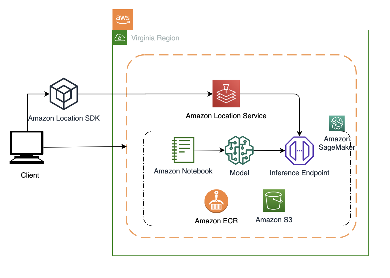
In this solution, we focus use SageMaker training jobs to train the cluster model and a SageMaker endpoint to deploy the model. We use an Amazon Location Service display map and cluster result.
We also use Amazon Simple Storage Service (Amazon S3) to store the training data and model artifacts.
The following figure illustrates the architecture of the solution.
Data preparation
GPS data is highly sensitive information because it can be used to track historical movement of an individual. In the following post, we use the tool trip-simulator to generate GPS data that simulates a taxi driver’s driving behavior.
We choose Nashville, Tennessee, as our location. The following script simulates 1,000 agents and generates 14 hours of driving data starting September 15, 2020, 8:00 AM:
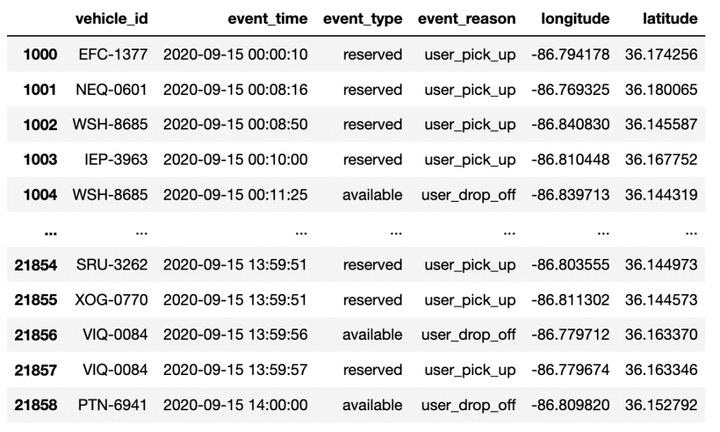
The preceding script generates three output files. We use changes.json. It includes car driving GPS data as well as pickup and drop off information. The file format looks like the following:
The field event_reason has four main values:
- service_start – The driver receives a ride request, and drives to the designated location
- user_pick_up – The driver picks up a passenger
- user_drop_off – The driver reaches the destination and drops off the passenger
- maintenance – The driver is not in service mode and doesn’t receive the request
In this post, we only collect the location data with the status user_pick_up and user_drop_off as the algorithm’s input. In real-life situations, you should also consider features such as the passenger’s information and business district information.
Pandas is an extended library of the Python language for data analysis. The following script converts the data from JSON format to CSV format via Pandas:
The following table shows our results.
There is noise data in the original GPS data. This includes some pickup and drop-off coordinate points being marked in the lake. The generated GPS data follows uniform distribution without considering business districts, no-stop areas, and depopulated zones. In practice, there is no standard process for data preprocessing. You can simplify the process of data preprocessing and feature engineering with Amazon SageMaker Data Wrangler.
Data exploration
To better to observe and analyze the simulated track data, we use Amazon Location for data visualization. Amazon Location provides frontend SDKs for Android, iOS, and the web. For more information about Amazon Location, see the Developer Guide.
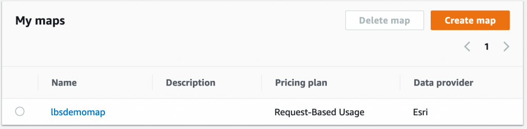
We start by creating a map on the Amazon Location console.
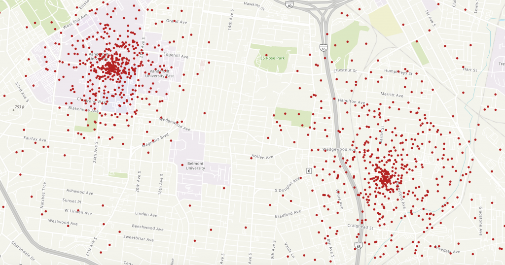
We use the MapLibre GL JS SDK for our map display. The following script displays a map of Nashville, Tennessee, and renders a specific car’s driving route (or trace) line:
The following graph displays a taxi’s 14-hour driving route.

The following script displays the car’s route distribution:
The following map visualization shows our results.
Algorithm selection
K-means is an unsupervised learning algorithm. It attempts to find discrete groupings within data, where members of a group are as similar as possible to one another and as different as possible from members of other groups.
SageMaker uses a modified version of the web-scale k-means clustering algorithm. Compared to the original version of the algorithm, the version SageMaker uses is more accurate. Like the original algorithm, it scales to massive datasets and delivers improvements in training time. To do this, it streams mini-batches (small, random subsets) of the training data.
The k-means algorithm expects tabular data. In this solution, the GPS coordinate data (longitude, latitude) is the input training data. See the following code:
Train the model
Before you train your model, consider the following:
- Data format – Both protobuf recordIO and CSV formats are supported for training. In this solution, we use protobuf format and File mode as the training data input.
- EC2 instance selection – AWS suggests using an Amazon Elastic Compute Cloud (Amazon EC2) CPU instance when selecting the k-means algorithm. We use two ml.c5.2xlarge instances for training.
- Hyperparameters – Hyperparameters are closely related to the dataset; you can adjust them according to the actual situation to get the best results:
- k – The number of required clusters (k). Because we don’t know the number of clusters in advance, we train many models with different values (k).
- init_method – The method by which the algorithm chooses the initial cluster centers. A valid value is random or kmeans++.
- epochs – The number of passes done over the training data. We set this to 10.
- mini_batch_size – The number of observations per mini-batch for the data iterator. We tried 50, 100, 200, 500, 800, and 1,000 in our dataset.
We train our model with the following code. To get results faster, we start up SageMaker training job concurrently, each training jobs includes two instances. The range of k is between 3 and 16, and each training job will generate a model, the model artifacts are saved in S3 bucket.
Evaluate the model
The number of clusters (k) is the most important hyperparameter in k-means clustering. Because we don’t know the value of k, we can use various methods to find the optimal value of k. In this section, we discuss two methods.
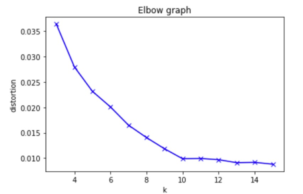
Elbow method
The elbow method is an empirical method to find the optimal number of clusters for a dataset. In this method, we select a range of candidate values of k, then apply k-means clustering using each of the values of k. We find the average distance of each point in a cluster to its centroid, and represent it in a plot. We select the value of k where the average distance falls suddenly. See the following code:
We select a k range from 3–15 and train the model with a built-in k-means clustering algorithm. When the model is fit with 10 clusters, we can see an elbow shape in the graph. This is an optimal cluster number.
Silhouette method
The silhouette method is another method to find the optimal number of clusters and interpretation and validation of consistency within clusters of data. The silhouette method computes silhouette coefficients of each point that measure how much a point is similar to its own cluster compared to other clusters by providing a succinct graphical representation of how well each object has been classified.
The silhouette value is a measure of how similar an object is to its own cluster (cohesion) compared to other clusters (separation). The value of the silhouette ranges between [1, -1], where a high value indicates that the object is well matched to its own cluster and poorly matched to neighboring clusters. If most objects have a high value, then the clustering configuration is appropriate. If many points have a low or negative value, then the clustering configuration may have too many or too few clusters.
First, we must deploy the model and predict the y value as silhouette input:
Next, we call the silhouette:
When the silhouette score is closer to 1, it means clusters are well apart from each other. In the following experiment result, when k is set to 8, each cluster is well apart from each other.
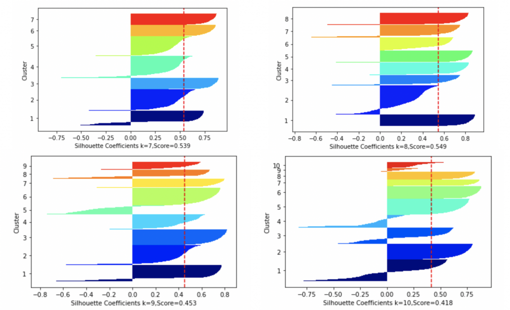
We can use different model evaluation methods to get different values for the best k. In our experiment, we choose k=10 as optimal clusters.
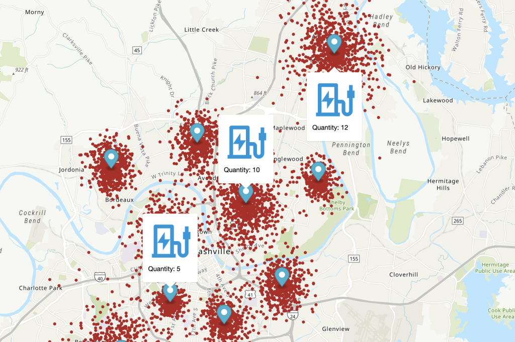
Now we can display the k-means clustering result via Amazon Location. The following code marks selected locations on the map:
The following map visualization shows our results, with 10 clusters.

We also need to consider the scale of the charging station. Here, we divide the number of points around the center of each cluster by a coefficient (for example, the coefficient value is 100, which means every 100 cars share a charger pile). The following visualization includes charging station scale.
Conclusion
In this post, we explained an end-to-end scenario for creating a clustering model in SageMaker based on simulated driving data. The solution includes training an MXNet model and creating an endpoint for real-time model hosting. We also explained how you can display the clustering results via the Amazon Location SDK.
You should also consider charging type and quantity. Plug-in charging is categorized by voltage and power levels, leading to different charging times. Slow charging usually takes several hours to charge, whereas fast charging can achieve a 50% charge in 10–15 minutes. We cover these factors in a later post.
Many other industries are also affected by location planning problems, including retail stores and warehouses. If you have feedback about this post, submit comments in the Comments section below.
About the Author
 Zhang Zheng is a Sr. Partner Solutions Architect with AWS, helping industry partners on their journey to well-architected machine learning solutions at scale.