Artificial Intelligence
Explaining Bundesliga Match Facts xGoals using Amazon SageMaker Clarify
One of the most exciting AWS re:Invent 2020 announcements was a new Amazon SageMaker feature, purpose built to help detect bias in machine learning (ML) models and explain model predictions: Amazon SageMaker Clarify. In today’s world where predictions are made by ML algorithms at scale, it’s increasingly important for large tech organizations to be able to explain to their customers why they made a certain decision based on an ML model’s prediction. Crucially, this can be seen as a direct move away from the underlying models being closed boxes for which we can observe the inputs and outputs, but not the internal workings. This not only opens up avenues of further analysis, so as to iterate and further improve on model configurations, but also provides previously unseen levels of model prediction analysis to customers.
One particularly interesting use case for Clarify is from the Deutsche Fußball Liga (DFL) on Bundesliga Match Facts powered by AWS, with the goal of uncovering interesting insights into the xGoals model predictions. Bundesliga Match Facts powered by AWS provides a more engaging fan experience during soccer matches for Bundesliga fans around the world. It gives viewers information on the difficulty of a shot, the performance of their favorite players, and can illustrate the offensive and defensive trends of their team.
With Clarify, the DFL can now interactively explain what some of the key underlying features are in determining what led the ML model to predict a certain xGoals value. An xGoal (short for Expected Goals) is the calculated probability of a player scoring a goal when shooting from any position on the pitch. Knowing respective feature attributions and explaining outcomes helps in model debugging, which in turn results in higher-quality predictions. Perhaps most importantly, this additional level of transparency helps build confidence and trust in your ML models, opening up countless opportunities for cooperation and innovation moving forward. Better interpretability leads to better adoption. Without further ado, let’s dive in!
Bundesliga Match Facts
Bundesliga Match Facts powered by AWS provides advanced real-time statistics and in-depth insights, generated live from official match data, for Bundesliga matches. These statistics are delivered to viewers via national and international broadcasters, as well as DFL’s platforms, channels, and apps. Through this, over 500 million Bundesliga fans around the world gain more advanced insights into players, teams, and the league, and are delivered a more personalized experience and the next generation of statistics.
With the Bundesliga Match Fact xGoals, the DFL can assess the probability of a player scoring a goal when shooting from any position on the field. The goal probability is calculated in real time for every shot to give viewers insight into the difficulty of a shot and the likelihood of a goal. The higher the xGoals value (with all values lying between 0–1), the greater the likelihood of a goal. In this post, we take a closer look at this xGoals metric, diving into the inner workings of the underlying ML model in order to determine why it makes certain predictions, both for individual shots and across entire football seasons’ worth of data.
Preparing and examining the training data
The Bundesliga xGoals ML model goes beyond previous xGoals models in that it combines shot-at-goal event data with high-precision data obtained from advanced tracking technology with a 25-Hz frame rate. With real-time ball and player positions, a bespoke model can determine an array of additional features such as the angle to the goal, the distance of a player to the goal, a player’s speed, the number of defenders in the line of shot, and goalkeeper coverage, to name just a few. We used the area under the ROC curve (AUC) as the objective metric for our training job, and trained the xGoals model on over 40,000 historical shots at goals in the Bundesliga since 2017, using the Amazon SageMaker XGBoost algorithm. For more information on the xGoals training process with the Amazon SageMaker Python SDK and XGBoost hyperparameter optimization, see The tech behind the Bundesliga Match Facts xGoals: How machine learning is driving data-driven insights in soccer.
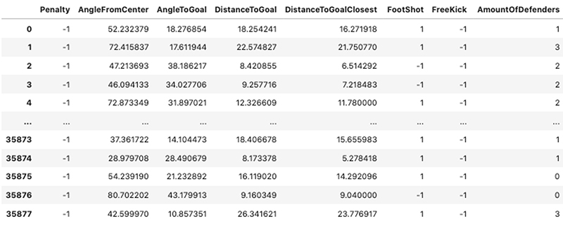
When we look at a few of the rows of the original training dataset, we get an idea of the types of features we’re dealing with; a mix of binary, categorical, and continuous values across a large dataset of attempted shots at goal. The following screenshot shows 8 of the 17 features used for both model training and explainability processing.
SageMaker Clarify
SageMaker has been instrumental in allowing novice data scientists and seasoned ML academics alike to prepare datasets, build and train custom models, and later deploy them into production across a wide array of industry verticals, including healthcare, media and entertainment, and finance.
Like most ML tools, it was missing a way of diving deeper and explaining the results of said models, or investigating training datasets for potential bias. That has all changed with the announcement of Clarify, which offers you the ability to detect bias and implement model explainability in a repeatable and scalable manner.
Lack of explainability can often create a barrier for organizations to adopt ML. Theoretical approaches for overcoming this lack of model explainability have undeniably matured in recent years, with one standout framework becoming a crucial tool in the world of explainable AI: SHAP (SHapley Additive Explanations). Although a full explanation of this method is beyond the scope of this post, at its core SHAP builds out model explanations by posing the following question: “How does a prediction change when a certain feature is removed from our model?” The SHAP values are the answer to this question—they directly compute the contribution of a feature’s effect on a prediction in terms of both magnitude and direction. With its roots in coalition game theory, SHAP values aim to characterize the feature values of a data instance as players in a coalition, and subsequently tells us how to fairly distribute the payout (the prediction) among the various features. An elegant feature of the SHAP framework is that it’s both model agnostic and highly scalable, working on both simple linear models and deep, complex neural networks with hundreds of layers.
Explaining Bundesliga xGoals model behavior with Clarify
Now that we’ve introduced our dataset and ML explainability, we can start to initialize our Clarify processor, which computes our desired SHAP values. All the arguments in this processor are generic and are related only to your current production environment and the AWS resources at your disposal.
First, let’s define the Clarify processing job, along with the SageMaker session, AWS Identity and Access Management (IAM) execution role, and Amazon Simple Storage Service (Amazon S3) bucket with the following code:
We can save the CSV training file to Amazon S3, and then specify the training data and results path for the Clarify job as follows:
Now that we have instantiated the Clarify processor and defined our explainability training dataset, we can start to specify our problem-specific experimental configuration:
The following are important input parameters to note, as seen in the preceding relevant code snippet:
- BASELINE – These baselines are crucial for calculating our model explanations. There is a baseline value for each feature. For our experiments, we use the average for continuous numerical features and the mode for categorical features. For more information, see SHAP Baselines for Explainability.
- NBR_SAMPLES – The number of samples to be used in the SHAP algorithm.
- AGG_METHOD – The aggregation method used to compute global SHAP values, which in our case is the mean of absolute SHAP values for all instances.
- TARGET_NAME – The name of the target feature that the underlying XGBoost model is trying to predict.
- MODEL_NAME – The (previously) trained SageMaker XGBoost model endpoint name.
We directly pass the important parameters into our clarify.ModelConfig, clarify.SHAPConfig, and clarify.DataConfig instances. Running the following code sets the processing job in motion:
Global explanations
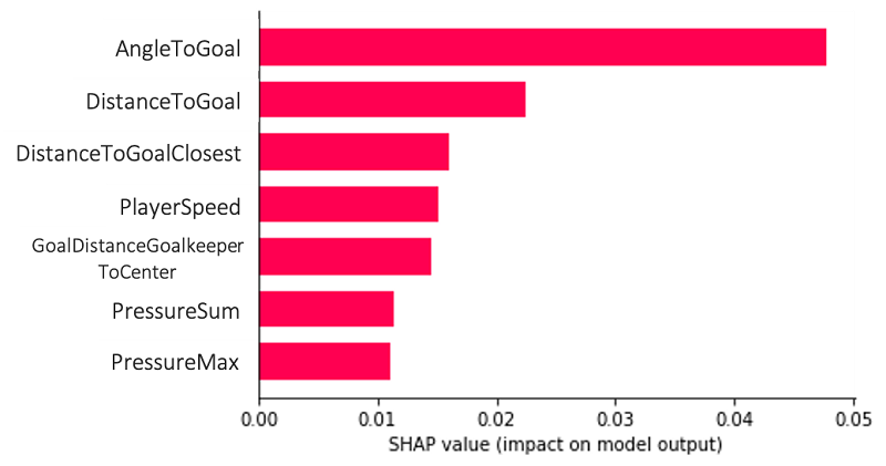
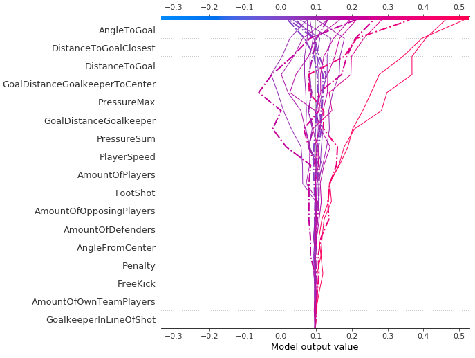
After we run our Clarify explainability analysis over the entirety of our xGoals training set, we can quickly and easily view the global SHAP values and their distribution for each feature, thereby allowing us to map how either positive or negative changes in the value of a given feature affects the final prediction. We use the open-source SHAP library to plot the SHAP values that are computed inside our processing job.
The following plot is an example of a global explanation, which allows us to understand the model and its feature combinations in aggregate over multiple data points. The features AngleToGoal, DistanceToGoal, and DistanceToGoalClosest play the most important roles in predicting our target variable, namely whether a goal is scored or not.
This type of plot can go even further, providing us with more context than the bar chart, a greater level of insight into the SHAP value distribution for each feature (allowing you to map how changes in the value of a given feature affect the final prediction), and the positive and negative relationships of the predictors with the target variable. Every data point in the following plots represents a single attempt at a goal.
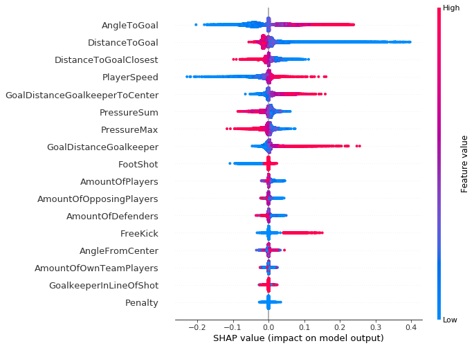
As suggested by the vertical axis on the right side of the plot, a red data point indicates a higher value of the feature, and a blue data point indicates a lower value. The positive and negative impact on the goal prediction value is shown on the x-axis, derived from our SHAP values. From this you can logically infer, for example, that an increase in the angle to goal leads to higher log odds for prediction (which is associated with True predictions for a goal being scored or not).
It’s worth noting that for regions that have an increased vertical dispersion of results, we simply have a higher concentration of data points that are overlapping, which gives us a sense of the distribution of the Shapley values per feature.
The features are ordered according to their importance, from top to bottom. When we compare this plot across the three seasons (2017–2018, 2018–2019, and 2019–2020), we see little to no change in both the feature importance and their associated SHAP value distribution. The same is true across all the individual clubs in the Bundesliga competition, with only a handful of clubs deviating from the norm.
Although none of our match events were penalties (all having a feature value =1), it must still be included in the Clarify processing job because it was also included in the original XGBoost model training. We need to have consistency between the two feature sets for model training and Clarify processing.
xGoals feature dependence
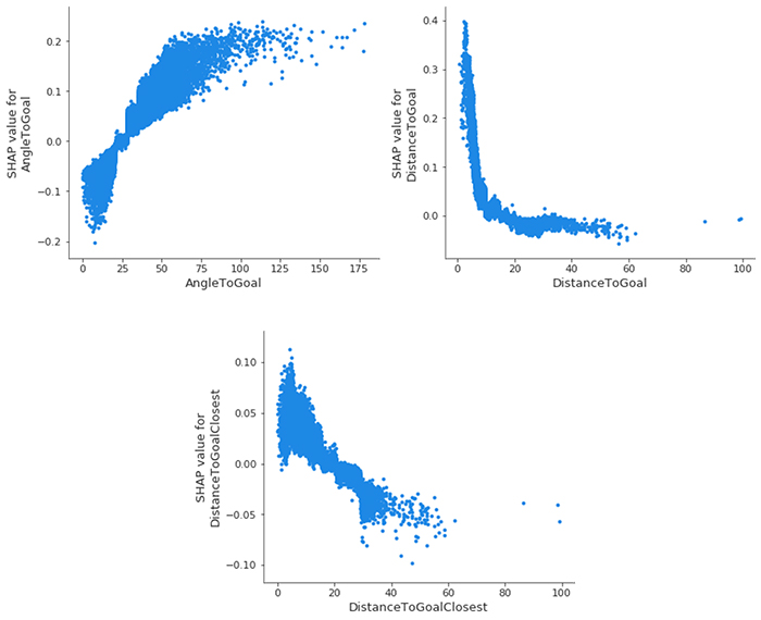
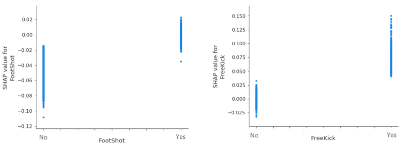
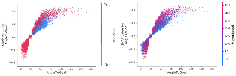
We can dive even deeper and look at the SHAP feature dependence plots, arguably the simplest global interpretation. We simply select a feature and then plot the feature value on the x-axis and the corresponding SHAP value on the y-axis. The following plot shows that relationship for our most important features:
- AngleToGoal – Small angles (< 25) decrease the likelihood of there being a goal, whereas larger angles increase it.
- DistanceToGoal – There is a steep drop (mimicking a logarithmically decreasing function) in the likelihood of a goal occurring as you move further away from the goal center. Beyond a certain distance, it has no impact on the SHAP value; all other things being equal, a shot from 20 meters is just as likely to go in as it is from 40 meters. This observation could perhaps be explained by the fact that players within this range are only going to be taking a shot for some special reason that would increase their chances of goal; be it the keeper being off of their line or there being no defenders nearby to close the player down and block the shot.
- DistanceToGoalClosest – Unsurprisingly, a large correlation exists here with
DistanceToGoal, but with far more of a linear relationship: the SHAP value decreases monotonically as the distance to the closest point of the goal increases.
When we take a closer look at two of our (less influential) categorical variables, we see that, all other things being equal, a header invariably decreases the likelihood of a goal, whereas a freekick increases it. Given the vertical dispersion around the 0 SHAP value for FootShot=Yes and FreeKick=No, there is nothing to conclude about their effects on goal predictions.
xGoals feature interaction
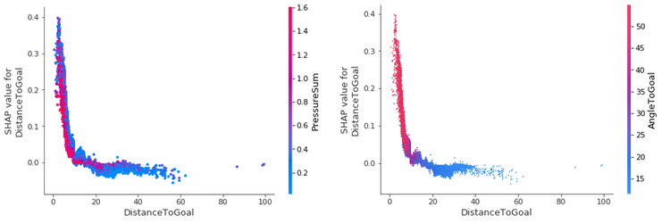
We can improve the dependence plots by highlighting the interaction between different features—the additional affect, after we take into account the individual feature effects. We use the Shapley interaction index from game theory to compute the SHAP interaction values for all features to acquire one matrix per instance with dimensions F X F, where F is the number of features. With this interaction index, we can then color the SHAP feature dependence plot with the strongest interaction.
For example, suppose we want to know how the variables DistanceToGoal and PressureSum interact, and the affect they have on the SHAP value for the DistanceToGoal. PressureSum is calculated by simply summing all the individual pressures of opposing players on the shooter. We can see a negative relationship between the DistanceToGoal and the target variable, with the likelihood of a goal increasing as we get closer to the goal. Unsurprisingly, a strong inverse relationship exists between DistanceToGoal and PressureSum for those match events with a high goal prediction; as the former decreases, the latter rises.
Nearly all goals that are scored close to the goal are hit with an angle greater than 45 degrees. As you move further away from the goal, the angle reduces. This makes sense; how often is it that you see someone score a goal from the sideline when 40 meters out?
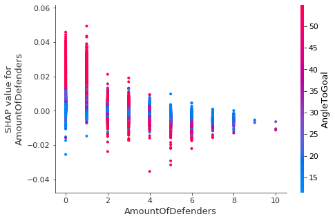
Keeping in mind that, based on the preceding results, a high angle to goal increases the likelihood of scoring a goal, we can look at the SHAP value of the number of defenders and determine that this is only the case when only one or two defenders are near the attacker.
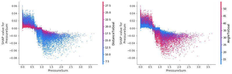
Looking back closely at our initial global summary plot, we can see some uncertainty (represented by the dense clustering around the zero SHAP value mark) for the features PressureSum and PressureMax. We can use interaction plots to deep dive into these values and try to unpack and identify what is causing this.
Upon inspection we see that, even for the two most important features, they have a very minimal effect on changing the SHAP value of PressureSum. The key takeaway here is that when little to no pressure is on a player, a low DistanceToGoal increases the likelihood of a goal, while the inverse is true for when there is a lot of pressure close to the goal: the player is less likely to score. These affects are again reversed for the AngleToGoal: as the pressure increases, we see an increased AngleToGoal decreasing the SHAP value of PressureSum. It’s reassuring to have our feature interaction plots confirm our preconceived ideas of the game, as well as quantify the various powers at play.
Unsurprisingly, few headers were scored with an angle less than 25. More interestingly, however, when comparing the affects that a header or FootShot has on the likelihood of a goal being scored, we see that for any given angle in the range 25–75, a header reduces it. This can be simplified as follows: if your favorite player has the ball at their feet while at a wide angle to the goal, they’re more likely to score it than if the ball is soaring through the air!
Conversely, for angles greater than 25, a player moving at a slow speed towards the goal reduces the likelihood of a goal compared to a player moving at a greater speed. As we can see from both plots, a noticeable divide exists between the impact that AngleToGoal < 25 and AngleToGoal > 25 have on the goal prediction. We can start to see the value in using SHAP values to analyze seasons’ worth of data, because we have quickly identified a universal trend in the data.
Local explanations
Our analysis so far has focused solely on explainability results for the entire dataset—global explanations—so we now explore some particularly interesting matches and their goal events, looking at what is referred to as a local explanation.
When we look back at one of the most interesting games of the 2019–2020 season, where Bayer 04 Leverkusen beat Borussia Dortmund in a 4–3 thriller on February 8, 2020, we can look at the varying affects each feature has on the xGoals values (the model output value we see on the horizontal axis). We see how, starting from the bottom and working our way up, the features start to have an ever-increasing impact on the final prediction, with some extreme cases showcasing how AngleToGoal, DistanceToGoalClosest, and DistanceToGoal really have the final say in our XGBoost model’s probability prediction. The dashed lines are those match events in which a goal occurred.
When we look at the sixth goal of the game, scored by Leon Bailey, which the model predicted with relative ease, we can see that many of the (key) feature values are exceeding their average, and contributing toward increasing the likelihood of a goal, as reflected in the relatively high xGoals value of 0.36 in the following force plot.
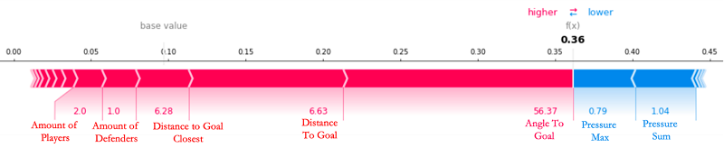
The base value that we see is the average xGoals value across every attempted shot in the Bundesliga in the past three seasons sits at 0.0871! The XGBoost model starts its prediction at this baseline, with positive and negative forces that either increase or decrease the prediction. In the plot, a feature’s SHAP value serves as an arrow that pushes to increase (positive value) or decrease (negative value) the prediction value. In the preceding case, none of the features are capable of counteracting the high AngleToGoal (56.37), low AmountOfDefenders (1.0), and low DistanceToGoal (6.63) for this shot at goal. All qualitative descriptions (such as small, low, and large) are in relation to the average values across the dataset for each respective feature.
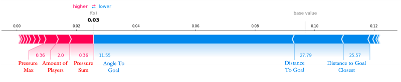
At the other extreme, there are certain goals that our XGBoost model can’t predict and the SHAP values can’t explain. Voted to be the best goal of the 2019–2020 season by 22% of Bundesliga viewers, Emre Can’s jaw-dropping strike was given a near-zero (3%) chance of going in and, taking into account his great distance from the goal (approximately 30 meters) and at such a flat angle (11.55 degrees), we can see why. The only features working to increase his chances of scoring were the fact that he had very little pressure on him at the time, with only two players in the local vicinity capable of closing him down. But this was clearly not enough to stop Can. As has always been the case in football, every aspect of a shot can be too perfect that no human, let alone an advanced ML model, can predict their outcome.
Let’s take a look at Can’s goal in action, brought to life in 2D animation simply by using the positional tracking data of the players at the time of the goal.
Conclusion: Implications for Bundesliga Match Facts
The primary implications for Bundesliga Match Facts powered by AWS going forward are twofold. The experimental results in this post demonstrate that we have:
- Begun automating the process of exploring and analyzing goal prediction data at scale, in novel ways
- Offered a model explainability and bias platform that can be improved on for the further capture of interesting and significant shot patterns
In real-world scenarios as complex as a football game, conventional or logic-specific rule-based systems start to break down upon application, failing to offer any sort of match event prediction let alone an in-depth explanation of how it was made. When we apply Clarify, we can both enhance goal prediction models and contextualize football match events on a per-play basis.
As technology for capturing football data has advanced dramatically in recent years, so too have the models that we can use to model this growing mountain of data. As the complexity, depth, and richness of the Bundesliga Match Facts dataset continues to grow, the team is continuously exploring new and exciting ideas for additional match facts and how to tweak our best in-production models in light of insightful explainability results. This, in tandem with inevitable and ongoing Clarify updates and improvements, opens up a wealth of exciting avenues going forward for both xGoals and Bundesliga Match Facts.
“Amazon SageMaker Clarify brings the power of state-of-the-art explainable AI algorithms to the fingertips of our developers in a matter of minutes and seamlessly integrates with the rest of the Bundesliga Match Facts digital platform—a key part of our long-term strategy of standardizing our ML workflows on Amazon SageMaker,” reports Gabriel Anzer, Data Scientist at Sportec Solutions (STS), a key partner organization of Bundesliga Match Facts powered by AWS.
Whether this solution allows fantasy football players an edge in their local league, provides managers with an objective assessment of a player’s current (and predicted) future performance, or serves as a conversation starter for notable football pundits in identifying offensive and defensive trends for particular players and teams, you can already appreciate the tangible value created across all areas of the football ecosystem by applying Clarify to Bundesliga Match Facts.
About the Authors
 Nick McCarthy is a Data Scientist in the AWS Professional Services team. He has worked with AWS customers across various industries including healthcare, finance, and sports & media to accelerate their business outcomes through the use of AI/ML. Outside of work he loves to spend time travelling, trying new cuisines and reading about science and technology. Nick’s background is in Astrophysics and Machine Learning and, despite occasionally following the Bundesliga, he has been a Manchester United fan from an early age!
 Luuk Figdor is a data scientist in the AWS Professional Services team. He works with clients across industries to help them tell stories with data using machine learning. In his spare time he likes to learn all about the mind and the intersection between psychology, economics and AI.
 Gabriel Anzer is the lead data scientist at Sportec Solutions AG, a subsidiary of the DFL. He works on extracting interesting insights from football data using AI/ML for both fans and clubs. Gabriel’s background is in Mathematics and Machine Learning, but he is additionally pursuing his PhD in Sports Analytics at the University of Tübingen and working on his football coaching license.