Artificial Intelligence
Build forecasts and find anomalies from your data with Amazon QuickSight ML Insights
As technology is advancing, your business is collecting more and more data from different sources. After collecting so many data points, it is often challenging to find the right insights to help your business grow. Dashboards are great at visualizing your data, based upon how you built them, but not always great at finding hidden insights such as anomalies or outliers from your data. They help people find data, but not data finding people. As your data collection scales, you have to change from the former to later to avoid scaling head count. Your business may not have the time or resources to see more than high-level trends, or may only gain deep insights from a small subset of data.
These limitations can hinder your ability to make informed business decisions. Amazon QuickSight has built-in, machine learning (ML)-powered anomaly detection, which can help you save time and resources on ML model building, training, hyperparameter tuning, inferencing, and deployment tasks. You also get deep insights from millions of metrics and billions of data points at scale.
This post walks you through how to use ML Insights to create helpful visualizations and forecasts. The walkthrough uses the following AWS services:
- Amazon QuickSight to build the ML insights and visualization
- Amazon Athena to query the Amazon QuickSight dataset for manual data analysis.
- AWS Glue to crawl the dataset and prepare metadata without loading it into a d This reduces the cost of running an expensive database; you can store and run visuals from raw data files stored in an inexpensive, highly scalable, and durable S3 bucket.
- Amazon S3 to store the data source.
Preparing your dataset
To get started, you need to collect, clean, and prepare your datasets for Amazon QuickSight. This post uses Amazon S3 as the data source, but you can use any Quicksight supported data sources we have like Redshift, Athena, RDS, Aurora, MySQL, Postgres, MariaDB and more to query and build your visualization. This post uses three datasets:
- Airlines Delay from the data.world website
- House Sales in King County, USA from the kaggle website
- Supermarket sales from the kaggle website
The visualizations in this post are from after cleaning the data, changing the data type, and filtering the data to reflect the dimensions required for the given use case.
To prepare your supermarket sales dataset, complete the following steps:
- On the AWS S3 console create S3 bucket by selecting Create bucket.

- For Bucket name provide a suitable name and select region where you want to build your visualization and select Create Bucket.

- Download the public data set on your local machine.
- Select the S3 bucket and choose Upload, navigate to the downloaded dataset file in your local machine.

- Select the dataset file and choose Upload.

- On the AWS Glue console, create a crawler that runs on a CSV file to prepare the metadata.
- For Crawler name, enter a name for your crawler; for example,
sales-data. - Choose Next.

- In the Add a data store section, for Choose a data store, choose S3.
- For Crawl data in, select Specified path in my account.
- For Include path, enter the path to your S3 bucket. You can include multiple data stores if you have them.
- Choose Next.

- In the Choose an IAM role section, select Create an IAM role.
- For IAM role, enter the role that AWS Glue needs to access Amazon S3.
- Choose Next.

- In the Create a schedule for this crawler section, for Frequency, choose when you want the crawler to run on your data. For this post, choose Run on demand.

This gives you the flexibility to decide how frequently you want the dataset updates to reflect on your metadata. - In the Configure the crawler’s output section, for Database, choose the database that contains the table for the crawler to use.
- Choose Next.

- After you create the crawler, choose Run Crawler.The crawler can take up to a few minutes before it is complete.

- On the AWS Glue console, under Databases, choose Tables.
- Choose the database you created.
- Choose View table.
- From the Action drop-down menu, choose View data.

This step takes you to the Athena console. Athena gives you the flexibility to run one-time queries to analyze your data manually when you need it. For example, you can check which product line members prefer to purchase with a credit card or Ewallet by entering the following code in the Athena Query Editor:The following screenshot shows the query output.

- After you create the database, on the Amazon QuickSight console, choose New analysis.

- Choose New Data set.

- Choose Athena as your data source.
- For Data source name, create a name; for example, sales-data.
- Choose Create data source.

- In the Choose your table section, choose your database in Athena.
- Select any tables you want to visualize.
- To edit any object in your dataset, choose Edit/Preview data.
- Choose Select.

The following screenshot shows what the data looks like if you change the data type for theDatefield fromString to Date. This opens a data preview section.

- In the Date column, choose the data type String.A window pops up with the available data type options.
- Choose Date.
- Choose Save.

Visualizing the data
You’re now ready to create some visualizations. This post uses datasets regarding supermarket sales, flight data, and housing sales.
Supermarket sales
This post uses the Supermarket sales dataset from the kaggle website. This time-series dataset is perfect for trend and anomaly detection for retailers who want to quickly find anomalies in historical sales and sort by branch, city, date and time, and customer type.
To analyze total sales during 2019 and the top product sale contributors, complete the following steps:
- On the Amazon QuickSight console, choose supermarket_sales_data analysis, which you created earlier.

- Choose Add.
- Choose Add insight.

- From the Computation drop-down menu, choose Anomaly detection.

- Choose Select.
- In the Field wells section, for Time, choose date.
- For Values, choose total (Sum).
- For Categories, choose product line.

A new configuration page opens. - Choose Save.

- Choose Run now.

Amazon QuickSight filters the selected dimensions and populates an anomaly on the total sale. On the left hand panel, Amazon QuickSight contribution analysis shows you the top customers that contributed to a spike in sales cycle. See the following screenshot.

Flight delays
Anomaly detection is also useful for other businesses; for example, airlines that operate from multiple locations across the nation. This post uses the Airlines Delay dataset from the data.world website. This public dataset uses data from the US Department of Transportation, and tracks the on-time performance of domestic flights. Airlines can detect anomalies that contribute to departure delays. You can follow the same steps from the preceding section to create the anomaly visualization. See the following screenshot.

Using the autonarrative feature
Although graphs and charts can provide insights on data most of the time, you still need to understand what you can learn from the data so you can explain what the graphs mean to your partners and peers.
The autonarrative feature in Amazon QuickSight provides straightforward explanations that you can use to prepare for executive discussions. Depending on your data and the charts in your dashboard, Amazon QuickSight provides many insights and natural language narratives automatically.
Adding suggested insights
Amazon QuickSight provides suggested insights that you can add to your visualizations. This post demonstrates how to add more insights to the supermarket sales and flight delay datasets.
You can also add custom insights from a pre-built set of computations. For more information, see Adding Custom Insights to Your Analysis.
Supermarket sales
You may want to know the top three payment types that customers used during 2019 in retail stores. You can use the supermarket sales dataset to break down data by product line and payment type. Complete the following steps:
- On your supermarket_sales_data analysis, under Visual types, choose the table icon.
- For Field wells, choose product line and payment.

- Under Insights, add any suggested additional insights to your visualization by choosing the +

The following screenshot shows additional details when you choose your preferred insights.

Airline mover delays
You can use the airline dataset from earlier to analyze the top airline mover delays in January, 2018, compared to earlier delays. Use the same steps as before with the flight delays dataset. See the following screenshot.

ML-powered forecasting
You can collect data points from customer transactions to forecast future sales. Analytics teams often have to build complex algorithms and ML-powered solutions to build and present those projections. Amazon QuickSight uses ML to simplify this problem with its built-in ML-powered forecasting and what-if analysis. You can get visual projections from your data without any expertise in ML or data analytics.
Supermarket sales
To demonstrate ML-powered forecasting, this post uses the dataset of supermarket sales to forecast product sales in both weekly and quarterly trends. The sales dataset has data grains of multiple data points. For more information about appropriate data points, see Dataset Requirements for Using ML Insights with Amazon QuickSight.
To perform ML-powered forecasting, complete the following steps:
- On your supermarket_sales_data analysis, under Visual types, choose the line chart
- For Field wells, for X axis, choose date.
- For Value, choose total (Sum).

- On the visual, from the drop-down menu, choose Add forecast.

This creates a line chart forecast. See the following screenshot.

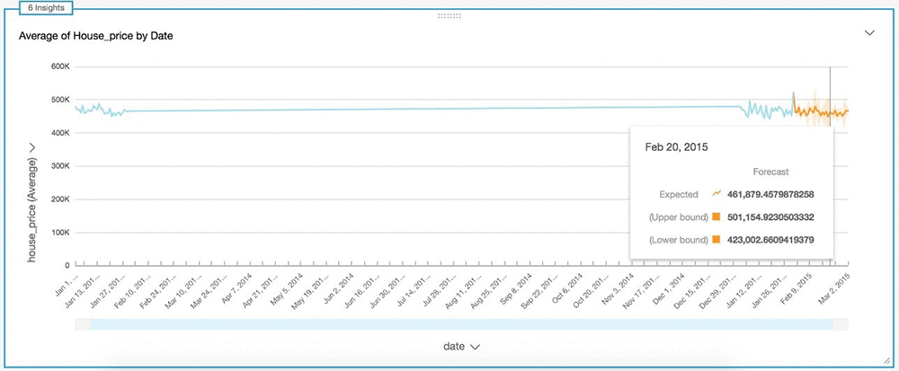
House sales
Another popular business use case for ML forecasting is forecasting house sale pricing using historical data. This post uses the House Sales in King County, USA dataset from the kaggle website, which consists of housing data from King County, Washington.
To create a forecast for average house price sorted by date, follow the steps in the preceding section. The following screenshot shows a line chart forecast.
Conclusion
This post demonstrated how to build powerful insights using Amazon QuickSight ML Insights, which can help you find anomalies in your data, create projections, and more. For more information about customizing ML Insights, see Amazon QuickSight Announces General Availability of ML Insights.
About the Authors
 Pranabesh Mandal is a Solutions Architect at AWS. He has over a decade of IT experience working with enterprise customers. He is passionate about cloud technology and focuses on Analytics. In his spare time, he likes to hike and explore the beautiful nature and wild life of most divine national parks around the United States alongside his wife.
 Karthik Odapally is a Senior Solutions Architect at AWS. He promotes a Data-driven culture within his team and is passionate to share his work alongside his customers at AWS Re:Invent conferences. In his spare time, he bakes cookies and cupcakes for family and friends here in the PNW. He loves vintage racing cars.