AWS Public Sector Blog
Using ArcGIS GeoAnalytics Engine on Amazon EMR to predict rideshare demand

Rideshare demand prediction is a well-explored topic in academia and industry, with abundant online resources offering diverse modeling frameworks tailored to different geographic contexts. A challenge with rideshare demand prediction, however, is that the trip data required to calibrate or train models can be exceptionally large.
In this post, we explore the challenges of big data analytics and showcase how ArcGIS GeoAnalytics Engine, a spatial analytics library for the Apache Spark environment, can be used on Amazon EMR to effectively address these problems. Amazon EMR is the industry-leading cloud big data solution for petabyte-scale data processing, interactive analytics, and machine learning (ML) using open source frameworks such as Apache Spark, Apache Hive, and Presto. GeoAnalytics Engine on Amazon EMR makes more than 160 spatial functions and tools available to integrate across analytic workflows at scale.
In this example use case, we explore rideshare data from Chicago. The growth of ridesharing in Chicago has resulted in tremendous amounts of spatio-temporal data, with millions of trip records in any given month. Scaling this out to facilitate analyses of temporal patterns or to expand the geographic scope can easily result in hundreds of millions, or even billions, of records.
While analyzing this massive dataset can help uncover factors (such as demography, road network, or characteristics) influencing rideshare patterns and their spatial variation across city areas, the datasets required can quickly become unwieldy to work with. GeoAnalytics Engine on Amazon EMR can make the analysis feasible and aid in spatial prediction strategies. It can also let you efficiently manage rideshare service operations, enhance revenue, inform appropriate public policy, and guide investment decisions.
Predicting rideshare demand at scale can be challenging because it involves integrating diverse datasets from various databases, data lakes, and warehouses, including rideshare trip records, sociodemographic information, road networks, and environmental attributes.
Thus, data scientists working on Spark-based big data platforms need the right set of tools to meet the challenges of processing and analyzing multi-source location-based datasets at scale before proceeding to the modeling and prediction steps.
In this post, we present an end-to-end analytical workflow to predict rideshare demand, with a special focus on data engineering—a crucial and often time-consuming step in any data science project that uses location analytics.
Using Esri GeoAnalytics platform on AWS
In this demonstration, we use GeoAnalytics Engine on Amazon EMR. The first step to getting started is deploying the GeoAnalytics Engine library within the Amazon EMR cluster. To configure your Amazon EMR cluster with GeoAnalytics Engine, follow these installation instructions. A deployment example can be found in the Big Data Analytics with Amazon EMR and Esri’s ArcGIS GeoAnalytics Engine blog post. A typical data analytics pipeline with GeoAnalytics Engine on your Amazon Web Services (AWS) Cloud is shown in Figure 1.

Figure 1. Architectural diagram of the solutions described in this post. The major components are Amazon EMR, Amazon QuickSight, an Amazon Simple Storage Service (Amazon S3) bucket, and Jupyter Notebooks in EMR.
Importing GeoAnalytics libraries
To perform data engineering and spatial modeling, we need essential PySpark and GeoAnalytics Engine libraries. Additionally, we use some open source modeling libraries to show how GeoAnalytics Engine fits within your existing data science workflows.
import geoanalytics
import geoanalytics.sql.functions as ST
from geoanalytics.tools import AggregatePoints

from spglm.family import Poisson, Binomial
from mgwr.gwr import GWR as GW
from mgwr.sel_bw import Sel_BW
import numpy as np

from pyspark.sql.functions import
from pyspark.sql import functions as F
Loading datasets for the project
With GeoAnalytics Engine, we can work with any of the standard data sources recognized in Spark but also use location-based datasets for geographic analysis (for example, .csv files, Parquet, GeoParquet, GeoJSON, Feature Service, File Geodatabase, and Shapefile). In this example, we use the following datasets to predict rideshare demand in Chicago.
- Transportation Network Providers – Trips (2019) from the City of Chicago – To model and predict rideshare trip counts at the census tract level
- Smart location data from the US Environmental Protection Agency (EPA) – For explanatory variables in the model
- ArcGIS Living Atlas – For demographic data
- Crimes – 2022 – For crime data
Data engineering
Our data engineering steps include ingestion, geo-enablement (that is, creating geometries), data wrangling (such as cleaning and aggregations), and geo-enrichment (that is, spatial joins of different datasets).
Data ingestion, geo-enablement, and wrangling
First, we read the Chicago Transportation Network Providers dataset of 2019 in a .csv format directly from our Amazon S3 bucket as a Spark DataFrame. This data has more than 50 million records. Since .csv does not store geometry natively, we use the ST_Point function from the GeoAnalytics Engine library to turn the latitude and longitude columns into a new point geometry column in the Spark DataFrame so spatial analysis can be performed.
# Read-in Chicago rideshare data and geo-process

from pyspark.sql.types import DoubleType
from pyspark.sql.types import IntegerType


trip_data = spark.read.option("header", True).csv("s3a://ga-engine/Transportation_Network_Providers_-_Trips_-_2019.csv")

trip_data_cleaned = (trip_data
                    .withColumn("point", ST.srid(ST.point("Pickup Centroid Longitude","Pickup Centroid Latitude"), 4326))
                    .withColumn("Start_Time", to_timestamp("Trip Start Timestamp", "MM/dd/yyyy hh:mm:ss a"))
                    .withColumn("End_Time", to_timestamp("Trip End Timestamp", "MM/dd/yyyy hh:mm:ss a"))
                    .withColumn("Trip_Seconds", trip_data["Trip Seconds"].cast(IntegerType()))
                    .withColumn("Trip_Miles", trip_data["Trip Miles"].cast(DoubleType()))
                    .withColumn("Fare", trip_data["Fare"].cast(DoubleType()))
                    .withColumn("Tip", trip_data["Tip"].cast(DoubleType()))
                    .withColumn("Additional_Charges", trip_data["Additional Charges"].cast(DoubleType()))
                    .withColumn("Trip_Total", trip_data["Trip Total"].cast(DoubleType()))
                    .withColumn("Trips_Pooled", trip_data["Trips Pooled"].cast(DoubleType()))
                    .st.set_geometry_field("point")
                    .select("Trip ID", "point", "Start_Time", "End_Time", "Trip_Seconds", "Trip_Miles", "Fare", "Tip", "Trip_Total", "Shared Trip Authorized")
                    )

trip_data_cleaned1 = trip_data_cleaned.withColumn('Shared_Trip',
                                                  F.when((F.col("Shared Trip Authorized") == 'true'), 1)\
                                                      .otherwise(0))
trip_data_cleaned2 = trip_data_cleaned1.filter((trip_data_cleaned1.Trip_Seconds >= 60) & \
                                               (trip_data_cleaned1.Trip_Miles >= 0.1) & (trip_data_cleaned1.Fare >= 2.5))

trip_data_cleaned2.persist().filter(col("point").isNotNull()) \
.select("Trip ID", "point", "Start_Time", "Trip_Seconds", "Trip_Miles", "Fare", "Tip").show(3)
Running this code snippet produces useful data as shown in Figure 2.

Figure 2. Shows a table with the example results of running the code snippet for 3 ridesharing trips including 7 columns for each trip: Trip ID, Point Location, Start Time, Trip Seconds, Trip Miles, Fare, and Tip.
Next, using a lightweight plotting method called st.plot, we can visualize this point geometry on a street base map to see the spatial distribution of our trip data.
One of the helpful features in the GeoAnalytics Engine library is the availability of four different Esri base map styles that can be selected for plotting spatial data, providing the necessary geographic context to the data. The plotted data in Figure 3 shows rideshare trip locations (that is, centroids of census tracts), major roads, and the basic layout of the city, which allows us to understand the spatial coverage and distributions of the origins of the rideshare trip records.
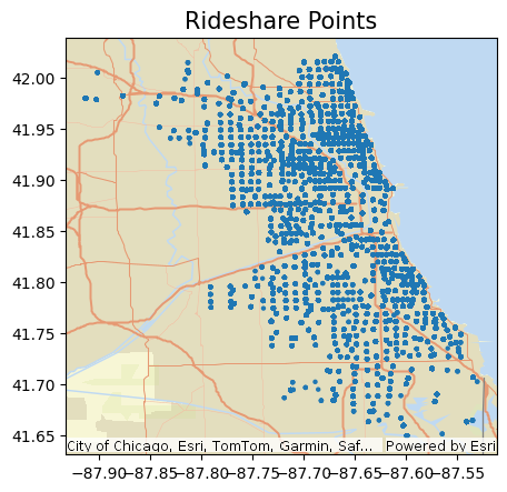
Figure 3. Shows a Map of Chicago, Illinois with rideshare points plotted against Esri Basemap. The points are closely bunched, showing location density that is heavily concentrated above downtown Chicago Illinois.
Besides plotting millions of point geometries on a street base map, how else can we visually and analytically explore spatial patterns of information associated with rideshare trips? We can aggregate that information (seen in Figure 3) into some spatial units such as custom hexagonal or square bins or any desired administrative boundaries such as county or census tract polygons.
Data aggregations
To explore spatial patterns of trip characteristics such as counts, trip distance, fare and tip amount, and trip share percentage, we can aggregate different data attributes into spatial boundaries (such as census tracts or hex bins). GeoAnalytics Engine enables us to read in census tracts the shapefile of Chicago from an Amazon S3 bucket as a Spark DataFrame, which natively includes polygon geometry. Now, we can use the Aggregate Points tool to quickly aggregate all of our points (more than 50 million of them) into bins of a specified size (such as square, hexagonal, or H3) or a polygon DataFrame (such as a census tract), and then create summary statistics (such as count, min, max, or mean) of the attributes that we need for our analysis.
Aggregating into census tracts
# Read-in census tracts

Chicago_Census_Tracts = spark.read.format("shapefile").load("/mnt/ga-engine/shapefiles/Chicago_Census_Tracts_Proj84.shp")

# Aggregate rideshare data to census tracts
from geoanalytics.tools import AggregatePoints

trip_data_agg = AggregatePoints() \
            .setPolygons(Chicago_Census_Tracts) \
            .addSummaryField(summary_field="Trip ID", statistic="Count") \
            .addSummaryField(summary_field="Trip_Miles", statistic="Mean") \
            .addSummaryField(summary_field="Trip_Seconds", statistic="Mean") \
            .addSummaryField(summary_field="Fare", statistic="Mean") \
            .addSummaryField(summary_field="Shared_Trip", statistic="Mean") \
            .addSummaryField(summary_field="Shared_Trip", statistic="Sum") \
            .run(trip_data_cleaned2)
After plotting the aggregated data, we can see in Figure 4 that the Chicago downtown core area and the O’Hare Airport exhibit significantly more trips compared to other locations across the city, while the rest of the city displays a relatively even distribution of trips.
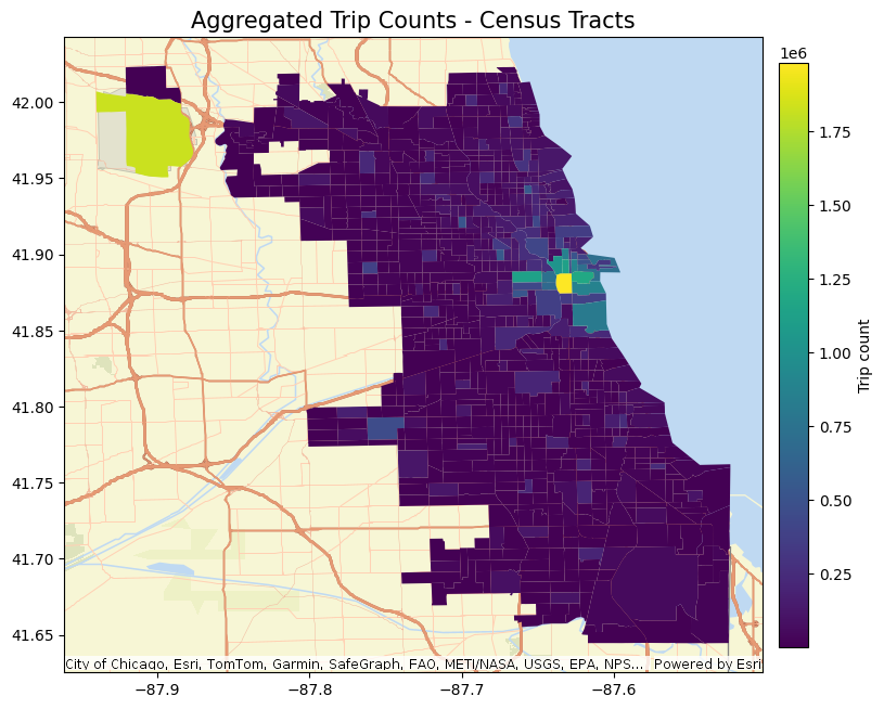
Figure 4. Shows map of Chicago, Illinois with aggregated trips alongside census tracts plotted against Esri Basemap displaying a density map. Chicago Airport highlighted in yellow located in the Upper West Side of Chicago and the Downtown Area of Chicago show the highest levels of concentration for aggregated trips by census tract.
Sometimes, the choice of a geographic boundary for aggregation can impact the observed patterns because different boundaries may reveal entirely different patterns. This issue is known as a modifiable areal unit problem (MAUP), which can unintentionally introduce spatial biases into statistical models. Therefore, it is wise to explore other custom aggregation options, such as employing hexagons or hierarchical bins like H3. Selection of the most appropriate aggregation scheme should be based on the specific requirements of the use case and the available domain knowledge, as shown in the preceding Figure 4.
In our statistical model, we use census tract-level aggregations for two reasons. The first is the granularity of our Chicago rideshare trip data is at the census tract level, and the second is other explanatory data we use are also at the census tract level.
Aggregating into H3 bins with resolution 8
This step uses aggregation onto the H3 standard type to group data for easier visualization.
# Aggregate data to H3 bins (resolution 8) - an example

chicago_trips_h3bins = trip_data_cleaned1 \
                .withColumn("bin", ST.h3_bins(F.col("point"), 8)) \
                .withColumn("bins", F.explode("bin")) \
                .groupBy("bins").agg(\
                    F.count("point").alias("Count_Trips"), \
                    F.sum(F.col("Trip_Seconds")).alias("Tot_Seconds"), \
                    F.mean(F.col("Trip_Seconds")).alias("Avg_Seconds"), \
                    F.sum(F.col("Trip_Miles")).alias("Tot_Miles"), \
                    F.mean(F.col("Trip_Miles")).alias("Avg_Miles"), \
                    F.sum(F.col("Fare")).alias("Tot_Fare"), \
                    F.mean(F.col("Fare")).alias("Avg_Fare"), \
                    F.sum(F.col("Tip")).alias("Tot_Tip"), \
                    F.mean(F.col("Tip")).alias("Avg_Tip"), \
                    F.sum(F.col("Shared_Trip")).alias("Tot_Shared_Trip"), \
                    ) \
                .select(ST.bin_geometry("bins").alias("bin_geometry"), "Count_Trips", "Tot_Seconds", "Avg_Seconds", "Tot_Miles", "Avg_Miles", "Tot_Fare", "Avg_Fare", "Tot_Tip", "Avg_Tip", "Tot_Shared_Trip")
We then exported the resulting H3 bins DataFrame to our ArcGIS Online (AGOL) portal as a hosted feature service layer and created this interactive web app, shown in Figure 5, that allows us to explore and compare spatial patterns of trip counts and average fare ($) and tip ($) amounts.
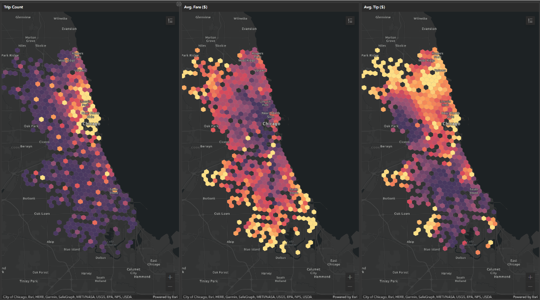
Figure 5. From left to right, three heat maps of Chicago, Illinois with the highest levels depicted with the color yellow compared to the lowest levels in dark purple. These images come from the ArcGIS web app. The first image focuses on Trip Counts showing the highest levels of Trips in Downtown Chicago. The second image focuses on Average Fare showing the highest levels of Fares in the outer regions of Chicago. The third image focuses on Average Tip showing the highest levels of Tips in the upper region of Chicago.
Geo-enrichment – adding context to the data
Now that we have gained a general understanding of the spatially variable patterns of rideshare trips at the census tracts and H3 bins levels, we can move on to data preparation for the modeling phase. For that, we need to bring in other datasets that provide relevant information associated with rideshare demand. Our objective is to identify a set of datasets and attributes that effectively explain the patterns of rideshare trips within the city. These predictor attributes need to be read from various sources, geo-processed, and enriched or joined with each other, as well as with our aggregated rideshare count data (called the “predictand”).
One of the explanatory datasets we use is the Smart Location Database (SLD) from the Environmental Protection Agency (EPA), which is at the census tract level. It has some interesting attributes like residential and employment density, access to destinations (such as walkability), and distance to transit, which can be informative of people’s travel behavior.
Additionally, we incorporate census data sourced from Esri’s ArcGIS Living Atlas, which provides valuable demographic variables such as population density and educational status. Furthermore, we include a crime dataset because crime rates can also impact rideshare patterns. Lastly, we bring in a Chicago boundary file because we need to clip our SLD dataset (originally for the entire US) so that it corresponds to the same geographic area as others.
# Read-in EPA SLD data and all Chicago datasets

epa_sld = spark.read.format("shapefile").load("/mnt/ga-engine/shapefiles/EPA_SLD_Database_V3_Proj.shp")
census_living_atlas = spark.read.format("shapefile").load("/mnt/ga-engine/shapefiles/EPA_SLD_Database_V3_Chicago_trunc_enrich_crimes.shp")
chicago_crimes_2019 = spark.read.option("header", True).csv("/mnt/ga-engine/Crimes_Chicago_2019.csv")
chicago_boundary = spark.read.format("shapefile").load("/mnt/ga-engine/shapefiles/Chicago_boundary.shp")

# Clip epa_sld for Chicago

from geoanalytics.tools import Clip
chicago_epa_sld = Clip().run(input_dataframe=epa_sld,
                    clip_dataframe=chicago_boundary)
Next, we join these three datasets with each other. Since the census and SLD datasets are both at census tract levels, we use attribute join based on common census tract IDs. The resulting DataFrame is then joined with the crime data, which contains point geometry based on the spatial relationships between the two datasets. In summary, the already aggregated crime data points at the census tract level (not shown here but can be achieved using the AggregatePoints() tool) are joined with the SLD_Census polygon DataFrame.
# Enrich / join datasets
# 1. Attribute join: census and SLD data based on common GeoIDs census tracts
# 2. Spatial join: census_SLD (polygon) and crime data (point) based on "intersect" spatial relationship

sld_census_joined = census_living_atlas.join(chicago_epa_sld,
                                              census_living_atlas["GEOID20"] == chicago_epa_sld["GEOID20"], "rightouter")

sld_census_crime_joined = sld_census_joined.join(chicago_crimes_2019,
                                              ST.intersects(sld_census_joined["poly_geom"], chicago_crimes_2019["point_geom"]))
Finally, we perform a join operation between the explanatory DataFrame (sld_census_crime_joined) and the rideshare DataFrame (trip_data_agg) based on the common attribute GEOID20. This results in a complete DataFrame that includes both the predictors and predictands required for the subsequent statistical modeling step.
chicago_all_data = trip_data_agg.join(sld_census_crime_joined,
                                              sld_census_crime_joined["geoid10"] == trip_data_agg["geoid10"], "rightouter")
Model and predict – Geographically weighted regression (GWR)
With the geo-processed DataFrame ready, we can now start statistical analysis and begin addressing the questions that were initially posed:
- What factors influence rideshare patterns?
- Are there spatially varying relationships between rideshare and those factors?
To model and predict rideshare demand, we use geographically weighted regression because this approach enables us to model spatially varying relationships and make predictions by fitting a regression equation to each feature in the dataset.
GWR can be helpful to answer questions like does crime occur near places that have a certain demographic and economic profile? Or, in this use case, are the factors influencing high rideshare demand consistent across the study area? The following Figure 6 provides an example.
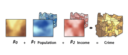
Figure 6. Shows different regression types such as Crime Data, Population Data, and Income Data that can be used to calculate a geographically weighted regression for a Crime Model.
Before calibrating GWR, we need to explore our dataset to see how the attributes are correlated and whether there is any multicollinearity. This is a crucial step in the process because results are unreliable in the presence of two or more variables that are redundant or together—they tell the same story.
While we are not demonstrating how this is calculated here, we did perform an evaluation step based on Pearson correlation coefficients and variance inflation factor to identify the variables that were highly correlated so we could remove them from the analysis. We identified a subset of explanatory variables that do not exhibit multicollinearity and included them in the model calibration: total violent crime, average employment density, and average population density (these attributes are from the explanatory datasets that were processed and joined earlier).
Calibrate GWR model
GeoAnalytics Engine provides a tool for performing GWR, but here, we are using an open source library called Multiscale Geographically Weighted Regression (MGWR). This is a Python implementation of MGWR. We have opted to use an open source library in this instance to highlight how GeoAnalytics Engine can be used in conjunction with external, non-Spark libraries for these calculations. Typically, it is not required to use Spark to run spatial modeling steps because the big data is reduced in size after it is processed and aggregated into geographic units. While the MGWR library includes both GWR and MGWR model classes, in this use case, we use GWR with a Gaussian model type since the dependent variable, rideshare trip count, is now (fairly) normally distributed after performing the log-scaled transformation.
To perform spatial prediction, we randomly sample and separate approximately 70 percent of data records into model calibration and 30 percent into prediction sets, respectively.
# Prepare datasets for model calibration and prediction

chicago_all_data = chicago_all_data.fillna(0)

import pandas as pd
chicago_2019_pd = chicago_all_data.toPandas() # Make sure geometry is present as separate long and lat columns

c_y = chicago_2019_pd['log_trip_count'].values.reshape((-1,1))
c_X = chicago_2019_pd[['pct_no_car', 'employment_density', 'job_entropy', 'pct_bach',
                       'intersection_density', 'pop_density_2020',
                       'total_commuters', 'violent_crime_count']].values
u = chicago_2019_pd["Long"]
v = chicago_2019_pd["Lat"]
coords = list(zip(u,v))

# Randomply sample into calibration and prediction sets
# (Use ~30% of samples for prediction)
np.random.seed(908)
sample = np.random.choice(range(868), 220)
mask = np.ones_like(c_y, dtype=bool).flatten()
mask[sample] = False

cal_coords = np.array(coords)[mask]
cal_y = c_y[mask]
cal_X = c_X[mask]

pred_coords = np.array(coords)[~mask]
pred_y = c_y[~mask]
pred_X = c_X[~mask]
While calibrating a GWR model, perhaps the most important parameter to consider is the neighborhood or bandwidth, which refers to the distance band or number of neighbors used for constructing each local regression equation. As shown in the following code snippet, Sel_BW class is used to identify the distance bandwidth or number of neighbors with the lowest Akaike information criterion (AIC) as the neighborhood size. Additionally, we choose the default adaptive bisquare kernel for the local weighting scheme parameter. The default model family is Gaussian. To learn more about these parameters and the logic behind choosing them, visit the GWR tool reference documentation.
# Model calibration

from mgwr.gwr import GWR
from mgwr.sel_bw import Sel_BW

gwr_selector = Sel_BW(cal_coords, cal_y, cal_X)
gwr_bw = gwr_selector.search(criterion='AICc')

model_gwr_chicago = GWR(cal_coords, cal_y, cal_X, gwr_bw)
gwr_results = model_gwr_chicago.fit()
gwr_results.summary() Figure 7 depicts the model summary that shows a strong fit for the model with an adjusted R2 of 0.91.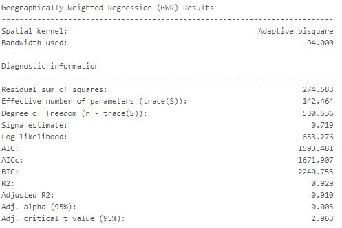
Figure 7. The GWR resulted in an adjusted R2 value of 0.91, which means that 91% of the variance in rideshare demand can be explained by the model’s predictors. This is considered very high value indicating a strong fit between the model and the data.
Prediction
Following the model calibration, we predict rideshare trip count for the prediction dataset, which is approximately 30 percent of the original dataset that was previously set aside. We note that the correlation coefficient between the actual and predicted trip counts is 0.9. Next, we create a new pandas DataFrame to include point coordinates of the data records that include actual and predicted trip counts. After that, we create point geometry from point coordinates, which we then intersect with our census tract polygon DataFrame. This helps us visualize actual compared with predicted results at the census tract level.
# Make prediction

scale = gwr_results.scale
residuals = gwr_results.resid_response

pred_results = model_gwr_chicago.predict(pred_coords, pred_X, scale, residuals)
preds = pred_results.predictions
pred_df = pd.DataFrame({'X': pred_coords[:, 0], 'Y': pred_coords[:, 1], 'Pred': preds[:, 0], 'Actual': pred_y[:, 0]})

pred_sdf = spark.createDataFrame(pred_df).withColumn("point", ST.point("X","Y", 26971))

print(np.corrcoef(pred_results.predictions.flatten(), pred_y.flatten())[0][1])
Export data and results
Now, we can write the resulting DataFrame to a feature service, which will allow for the exported data to be visualized in different ways in an ArcGIS environment. Additionally, this data can be exported to different data lakes and warehouses or to formats such as Parquet, GeoParquet, and geoJSON to build custom web apps or dashboards.
Explore prediction results
We can explore actual compared with predicted rideshare trips through an interactive media web application in ArcGIS Online or other custom web applications after we publish the data as a hosted feature service layer. The following code snippet shows how a DataFrame can be exported with a spatial geometry column to ArcGIS Online. To learn more about writing data to an ArcGIS feature service, visit the Esri Community blog post, Storing output data to ArcGIS feature services.
# Write out predictions as spatial format
# -- First, spatial join GWR output to Census Tracts (polygons)

df_pred_tracts = census_living_atlas.join(pred_sdf, ST.intersects(census_living_atlas["geometry"], pred_sdf["point"]))
df_pred_tracts.drop("point")

service_name = "Rideshare_predictions"
layer_name = "Rideshare_predictions_2019"

# Register a GIS with the ArcGIS Online or Portal for ArcGIS user that the feature service is shared with
geoanalytics.register_gis("myGIS", "https://arcgis.com", username="yourusername", password="yourpassword")

#Write new feature service
df_pred_tracts \
        .write.format("feature-service") \
        .option("gis", "myGIS") \
        .option("serviceName", service_name) \
        .option("layerName", layer_name) \
        .save()
In this case, we directly plot the actual and predicted trip counts using the st.plot method. In Figure 8, the map on the left shows the actual trip counts within the census tracks, and the map on the right shows the predicted counts, both of which represent log-scaled counts.
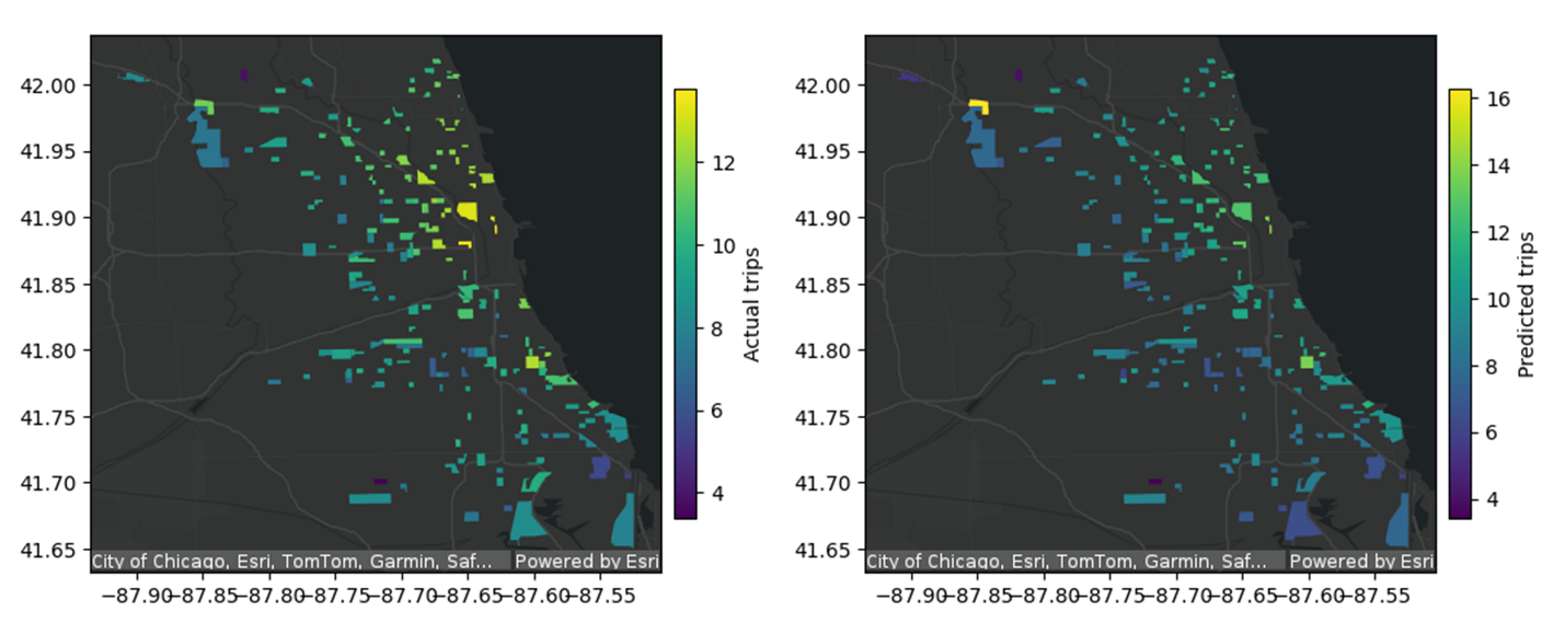
Figure 8. Shows two maps of Chicago, Illinois. The first map shows actual trip counts overlayed on Esri basemaps, with the highest levels of trips (depicted in yellow), located in the downtown Chicago area. The second map shows predicted trip counts overlayed on Esri basemaps, with the highest level of predicted trips located in the Airport and downtown areas of Chicago.
Our visual exploration of the predicted values against ground truths also shows that the GWR prediction performed quite well over the sampled locations in Chicago. It is worth noting that the rideshare demand prediction workflow example shown in Figure 8 is relatively simplistic because we have not explored all relevant datasets that could be predictive of rideshare trip counts and other parameterizations for the GWR model.
For instance, there are other relevant and key factors like time, traffic, gas prices, and weather that should be considered in the modeling process. Additionally, different parameterizations (for example, for neighborhood or bandwidth or local weighting scheme) in the spatial model calibration and prediction steps should be experimented with and validated based on expert domain knowledge to ensure that the developed model is not only statistically significant but also reliable to inform important public policy decisions. Given that, insights derived from the spatial prediction and data exploration steps shown here can be used in taking appropriate actions to improve vehicle scheduling, utilization, response time, and traffic congestion.
Visualizing with Amazon QuickSight
Amazon QuickSight’s geospatial visualization capabilities have revolutionized the way businesses analyze and present location-based data. With its intuitive interface and powerful mapping tools, QuickSight allows users to create stunning visual representations of geographical information, from simple point maps to complex heat maps and custom regions. One of the most exciting features is the ability to embed external maps into dashboards using iframes, enabling seamless integration of specialized mapping services or custom-built maps. This functionality extends across both web and mobile platforms, ensuring that your geospatial insights are accessible and interactive regardless of the device your audience is using. By leveraging QuickSight’s geospatial features and iframe embedding, organizations can create comprehensive, data-rich dashboards that provide deep insights into location-based trends and patterns, ultimately driving more informed decision-making. The image below shows two different methods to visualize this data in Amazon QuickSight.
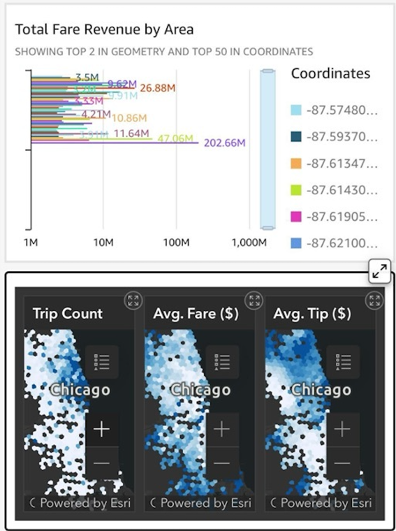
Figure 9. Shows two example methods to visualize data using Amazon QuickSight via web or mobile space embedding Esri data via iframes creating insights for decision makers. In this example we display the Total Fare Revenue by Area in Chicago, Illinois via a bar graph and a heat map.
Summary
This post showcased an end-to-end analytical workflow using ArcGIS GeoAnalytics Engine and other libraries within a Spark environment. These libraries were used in tandem to perform geospatial big data processing, spatial pattern analysis, and predictive modeling. We also demonstrated how interactive map-based visualizations powered by GeoAnalytics Engine and Amazon QuickSight provide support across the analytical workflow.
The rideshare demand prediction example highlighted how ArcGIS GeoAnalytics Engine can be used for big data workflows in cloud computing environments. The GeoAnalytics Engine library within AWS facilitates the analysis and delivery of the key results generated throughout the workflow so that analysts and decision-makers across organizations can effectively manage their complex datasets.
With quick and easy geo-enablement of big data, the ability to enrich and join spatial and nonspatial datasets, and support for spatial modeling and prediction, ArcGIS GeoAnalytics Engine is a valuable tool for analysis involving spatial data. Additionally, it works in conjunction with other libraries, allowing for the development of ML models using spatially smart big datasets. If you’re interested in getting started with ArcGIS GeoAnalytics Engine or want to learn more, you can visit the product page for more information about this powerful solution. Check out the AWS Partner Network Blog post, Big Data Analytics with Amazon EMR and Esri’s ArcGIS GeoAnalytics Engine, to read about another use case.